Designing a mobile app can be a real challenge. On top of limited real estate, designers have to deal with other demands. Some of these include the need to consider the principles of motion and the behavior of mobile users.
Most important of all is to ensure that the user experience of the app is as frictionless as possible. A slight hiccup in the course of using an app could relegate it to the club of abandoned apps – downloaded, used once, forgotten. How then do we avoid that fateful outcome?
By learning from the experience of those before us. Mobile UX design may be a young field but new ideas emerge ever so often. After many rigorous trials and tests, these ideas evolve into must-know principles. To achieve a seamless user experience for your mobile app, we look at these 4 fundamental mobile UX principles.
1. Consistency

The first fundamental mobile UX principles is consistency. Users expect to feel a sense of continuity when using an app. Discontinuity disrupts the experience and plucks the user out of it. The user is then challenged to re-learn something they once believed to know.
Consistency is not only for mobile app visual design but everything else from copy to motion. It’s important to think of the app as a whole and to design each part to integrate with the whole. What’s more, you need to think of your app as part of a whole device. It’s not an isolated product, it’s part of a family of apps.
Each operating system introduces standard guidelines for interface design. Users become familiar with the interaction patterns of each OS. Inconsistency between an app’s interaction design and that of the device causes friction. Thus, we cannot stress enough the importance of being familiar with the guidelines. We also asked experts on how to design an iOS app that everyone wants to use and shared some good Android UX design tips, if you’re keen to go deeper into the topic.
When designing a cross-platform mobile app, this fundamental mobile UX principle becomes even more crucial. You need to maintain a balance between branding and app design consistency across platforms. Who your users are, what devices they use, and how strong your brand is are important questions to ask. To get cross-platform UI design right, have a look at our in-depth article on designing mobile apps for different platforms.
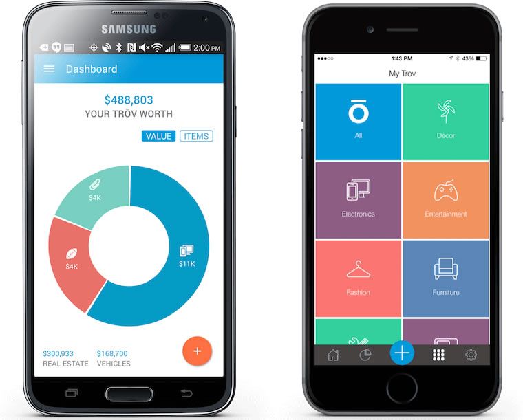
In July 2015, we featured Trōv, a handy app for cataloging all your stuff. One of the main reasons why we were particularly impressed by the app UI design is due to its consistency across different platforms. With effectiveness, the Trōv app maintains the same branding and experience regardless of device or OS. What’s even more impressive is that they managed to abide by the mobile UX principle of consistency while paying close attention to the iOS and Android UI guidelines.
2. Predictability
In the September 2015 edition of our Top 5 Mobile Interaction Designs, we featured the Geronimo app. Unfortunately, this revolutionary email app is no longer available due to persistent backend issues. Nonetheless, the UX lessons that Geronimo can still teach us are valuable. The unconventional gestural interactions of Geronimo made it a true novelty. But it was also unpredictable.
Few mobile apps that ignore the fundamental mobile UX principle of predictability actually become wildly successful. That is because predictability plays a big part in reinforcing self-assurance. When things turn out the way users predict, they feel a stronger sense of control. Being predictable maintains psychological and emotional equilibrium in the user. It requires less mental effort from the user and puts them at ease. Predictability is comfort.

To pull off an app like Geronimo requires true innovative thinking. In their case, they attempted to re-conceptualize email as a game. And fair enough, when it comes to games, much like psychological thrillers, we expect the unexpected. Even so, the mobile app design still incorporated UI elements of high predictability.
Imagine chucking an important work email with an accidental flick of the finger. Then not finding the undo button or the folder for trashed emails. When such unpredictable scenarios occur, users feel at loss. Helpless. This leads to stress and the association of negative emotions to your app.
This fundamental mobile UX principle of predictability is not to restrict your creativity. Geronimo stands as a great example of how an innovative spirit can not only transform the way we design for mobile but also the way that we deal with the mundane.
3. Easy to Learn

Mobile app designers and developers like to compliment app designs using the term ‘intuitive’. But yet, intuitive UI doesn’t actually make any sense if you think about it. None of us was born with the knowledge of how to interact with a touch screen. It’s something that we pick up through trial and error or by watching others. We learn to interact with a mobile app just as we learn to operate a vehicle.
‘Intuitive’ then actually means easy to learn. Easy to learn refers to few trials and hopefully no grave errors before a user gets the hang of how to use an app. The ideal number of trials should be just one. Besides using familiar UI patterns, how can one make a mobile app that’s easy to learn
This mobile UX principle is so fundamental but it’s actually a lot harder to implement than you would think. For the app design and development team, it is challenging to approach an all too familiar product from a novice perspective. You start to second-guess your designs. A plethora of ‘What if’ questions starts popping up.
At this point, the best way to clear your doubts is to test your designs with actual users. Observe the way users interact with your app prototype. Look out for blind spots. A user may not remember all that they’ve learnt from the first run. So it is important to ensure that he or is can infer or predict with ease the next time.
Mobile games such as Escape which we featured in August 2015 clear abides by this fundamental mobile UX principle. I remember the old days when gaming involved reading a book of instructions. Then, it became a set of overlay tutorials that nobody bothered to read because we just wanted to get straight to the game.
Escape makes use of a couple of short tutorials for the simple controls of the game. Then it helps the player to learn straight from the game with a few easy initial levels. Once you get the hang of it, the real action begins. Making sure that an app is easy to learn prevents user frustration and can enhance the experience.
4. Legibility

We have previously discussed the significant role content plays in design. Getting creative with copy is also a great way to make your app design stand out. We’ve even gone as far as to promote the use of real content as a mobile app prototyping best practice.
Content is an integral part of a mobile app experience. Most of the time, users interact with your app through its words. So it comes as no surprise that legibility is a fundamental mobile UX principle that all designers should pay attention to.
Having clear, well-written copy is not where it ends. Content has to be easy to digest. Part of a good app experience is not having to expend too much brainpower to understand what it’s all about. Using colors and icons to create clear visual hierarchies are good ways to ensure legibility. It’s also good to bear in mind the importance of accessible mobile UI design.
A good example of how adhering to this mobile UX principle improves the quality of an app design is Wildcard. We featured the innovative news app in our September 2015 edition of top mobile app UI designs. News articles can be long and a drab to read. Wildcard transforms the reading experience by focusing on legibility with the use of a card-based layout, suitable typefaces, and color contrasts.
From Mobile UX Principles to Interactive Mobile Prototypes
Keeping in mind these fundamental mobile UX principles makes for a good start. But designs need to be tested with actual users. Go from mobile UX principles to fully-interactive app prototype with the help of Proto.io. The drag-and-drop prototype builder is easy to use and our built-in native UI elements can get you started right away. You can also download the Proto.io app for iOS or Android to test your prototypes right in the device. Sounds good? Get started with a free 15-day trial.


