What takes an app from ‘meh’ to ‘WOW!’ could be something as subtle as simple screen transitions and UI animations. Mobile apps have directed the attention of many designers to the crucial interactive elements of a UI design. The user’s attention, however, is directed to the actual experience of using an app, made seamless and enjoyable with well-applied principles of motion and touch. In this month’s edition of the Top 5 Mobile Interaction Designs series, we’re delighted to inspire you with these amazing works of interaction design. In no particular order, here they are.
1. Angee by Angee Inc
Claiming to be the first truly autonomous home security system, Angee has some big shoes to fill. Currently on Kickstarter to raise funds, Angee also offers a sneak peek into what they say is the smoothest mobile experience. Angee aims to put control over your homes right into your hands, with a dazzling app design and UI animations.
The published designs promise an amazing app experience indeed. For an Internet of Things product to feel like magic, it requires a good amount of initial visual feedback to assure and reassure the user. as we can see from the video released by Angee, every state transition and animation in the app is well-placed and well-timed. From scrolling the timeline that details the activity in your home to switching to the office view. It really does seem like magic. I’m already looking forward to the product launch.
Support the Angee Kickstarter project here.
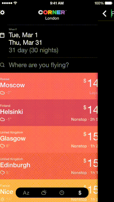
2. Corner by Corner LLC
I often wonder how we managed to travel on a budget back in the day when iPhones didn’t exist. It’s so effortless to snag a flight deal with apps like Corner and others that I’ve mentioned in the previous edition of our monthly series. Corner does an amazing job in smoothing out the entire flight search mobile experience and it helps you save money too.
Corner app has been designed for beauty and for easy navigation. Simply state where you’ll be flying from and when. Then, the app spins its magic and presents destinations in the form of cards. You can filter these by price, climate, and distance. The UI animations triggered by scrolling of the destination list is pretty awesome. It feels stylish and casino-like, as though someone is dealing you flashy cards as you go down the list. When you go back up, the cards are retrieved and stacked up.
3. Snapster by VK
Tired of Instagram? Need new filters that don’t scream vintage? Want to tweak your photos down to the last pixel? Well, Snapster might be a good alternative for you. Besides, Snapster packs in some great interaction designs providing a rather seamless user experience.
The controls feel very natural to the touch and transitions are top-notch smooth from the get go. The UI animations are subtle yet impactful. I particularly liked the ‘loading image’ sign. Apparently, Snapster has a large community of mostly non-English-speaking users, which pretty much casts aside that aspect of the app for me. Nonetheless, it’s a great intuitive app for editing photos.
Source: Pavel Shumakov Dribbble
4. Geronimo by Jumpin Labs (DISCONTINUED)
It’s too bad the app has been pulled from the App Store due to an unstable backend. Geronimo could’ve been our salvation in the fight against the email monster that we’re only too anxious to ignore, even though it never, ever stops growing. Why Geronimo still makes it to this list is due to the novel interaction designs of the app and what it can teach us. The Geronimo mobile app UI came across more like a playground rather than the typically sterile look and feel of most email apps.
The gestural interactions and UI animations are a little less than conventional. To chuck an email, you flick it to a corner. Emails are presented timeline style. You tilt your phone vertically to go through the day’s emails. Swiping left or right brings you to another day. As you can imagine, the app was full of surprises. Despite its early departure, we can perhaps take a leaf out of Geronimo’s book when re-imagining and inventing new ways of interacting with interfaces.
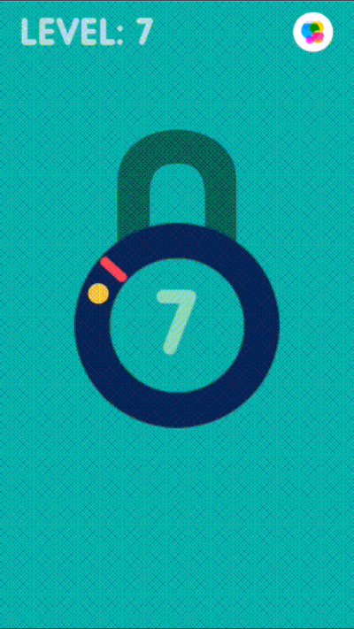
5. Pop the Lock by Simple Machine
There aren’t many apps that make you work hard. In fact, having users make too much effort is one of the biggest interaction design no-no. But Pop the Lock has successfully convinced users to work hard and users aren’t complaining about it. It’s part of the game, of course. Pop the Lock has an extremely simple gameplay. But the way it has been designed to hook a user’s attention is an excellent example of how simple ideas can go far in the mobile app world.
The UI animations, though few and simple, work so well to improve the game experience. The abrupt change of the background color to a startling red when you make a mistake and the sound effect of actually popping a lock are great ways to inject thrill to a simple game.
Get Pop the Lock for iOS.
Would you like to inspire others? Tweet us @protoio with recent mobile apps that boast some great interaction designs and we’ll share them with our readers.


