Sometimes, the mobile platform you use — or design for — can feel a bit like an identity. This is true of Android and iOS users and developers, but the roots of this commercial identity have a robust history in tech. Long before Apple’s iconic “Get a Mac” series of ads, pitting the hip Mac (personified by Justin Long) against the woefully uncool PC (represented by the incomparable John Hodgman), users of both Apple and Microsoft products drew lines in the sand based on their favorite OS.
If you were a PC user, you loved the power, choice and configurability of your chosen operating system, where Mac users adored the streamlined, user friendly experience, which also seemed to be optimized for artistic types. To this day, PCs are thought of as a mainstay for IT firms, while design agencies tend to be Apple shops. Brand preferences can run deep both for individuals and for industries.
But there will always be the users who go both ways. Maybe they own a PC for gaming, and a Macbook Air for browsing the Internet and photo editing. The same goes for today’s mobile OS rivalry between Google and Apple. Your ideal audience might comprise users who love their Samsung Galaxy or HTC phones, but also love to curl up on the couch with an iPad (or vice versa — maybe they love their iPhone but use a Nexus 7 to run their favorite Android apps).
Doubling Your Audience by Designing Apps for iOS and Android
From phones to tablets to phablets, there’s no need to choose between Google and Apple, especially when you can pick up a tablet for under $200. The same might be said for designing apps for both platforms. While some designers and shops identify as being iOS or Android only, there are plenty of tools and resources out there that make OS-agnostic design and development much more feasible. And with over one billion Android users, as well as over a billion iOS devices sold, designing for both platforms may mean adding some major heft to your audience.
Designing an OS-agnostic, device-agnostic app means potentially doubling your audience, but it can also incur double the headaches. That’s why we asked three cross-platform designers and developers what common mistakes people make when designing for both Android and iOS, and how they can fix them.
1. The wrong way: trying to squeeze a square peg into a round hole.
The right way: designing apps natively for each OS.
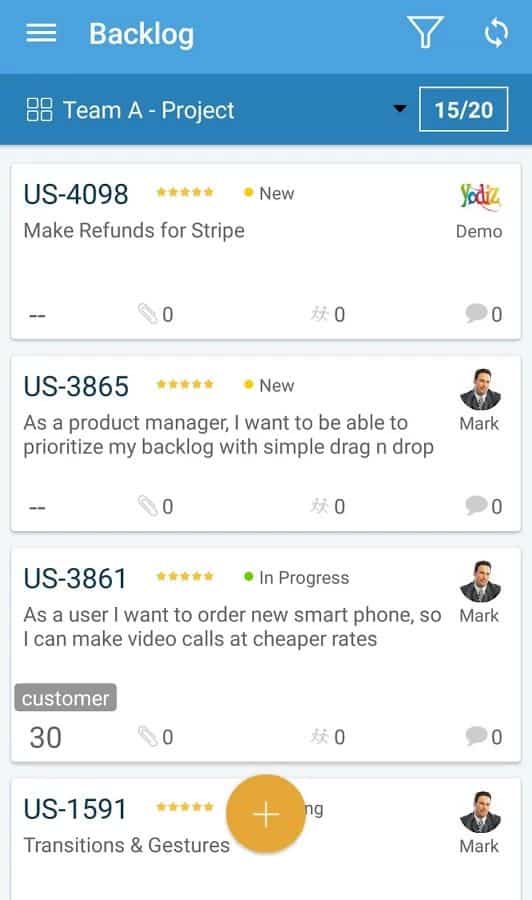
Shakeel Tabassam is the Co-Founder and CEO of Yodiz (@Yodiz_Team), an agile scrum tool, issue tracker and management platform available for both iOS and Android, so that everyone on your team can access it. The key to designing apps for both platforms, says Tabassam, is to design the app separately for each OS, rather than seeing one as a port of the other:
“Designing platform agnostic apps is a good idea in theory, but whether it succeeds depends on the app and its nature. Basic apps with minimal features — for example, an app that lists news, restaurants, weather, etc. — are a good fit for platform-agnostic design, and shouldn’t take an excessive amount of work to look good on both iOS and Android. However, as the complexity and feature set of application grows, it becomes more difficult to keep it platform agnostic, as one size doesn’t fit all
At Yodiz, we always develop apps natively, using native UI components by the platform. One mistake designers too frequently make is to port an iOS app to Android or vice versa without taking into consideration the different design needs of each OS. These platforms are totally different and users of each the platform have different ways of using their devices and apps.
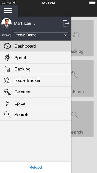
We design Yodiz apps independently for each OS, keeping the platform and UX in scope. We invest a lot of time designing the flow of our apps, and testing them for common UX pitfalls. Once the UX flow is approved by the entire team, we flesh out the UI in Photoshop, carving out each detail exactly the same as it would look in the real app. Colors, fonts, graphs are carefully chosen and graphics are designed very carefully. It’s a very time consuming process, but it allows us to visualize what exactly our app would look like in each operating system.
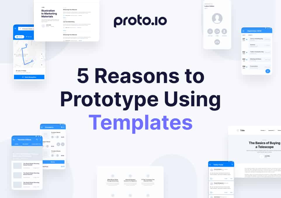
Using the right tools in every stage of the game makes the biggest difference. We heavily use Proto.io, Photoshop and WireframeSketcher. Proto.io makes the feedback process quicker and helps us to visualize the application better, including animations and interactions. For internal projects, we use PhoneGap to quickly build platform agnostic apps that all employees can access. By standardizing on a solid process with a good set of tools, you can spend more time making sure that your app looks seamless on both mobile platforms.”
2. The wrong way: rushing into platform agnosticism.
The right way: taking your time, doing the research and getting it right on one OS at a time.
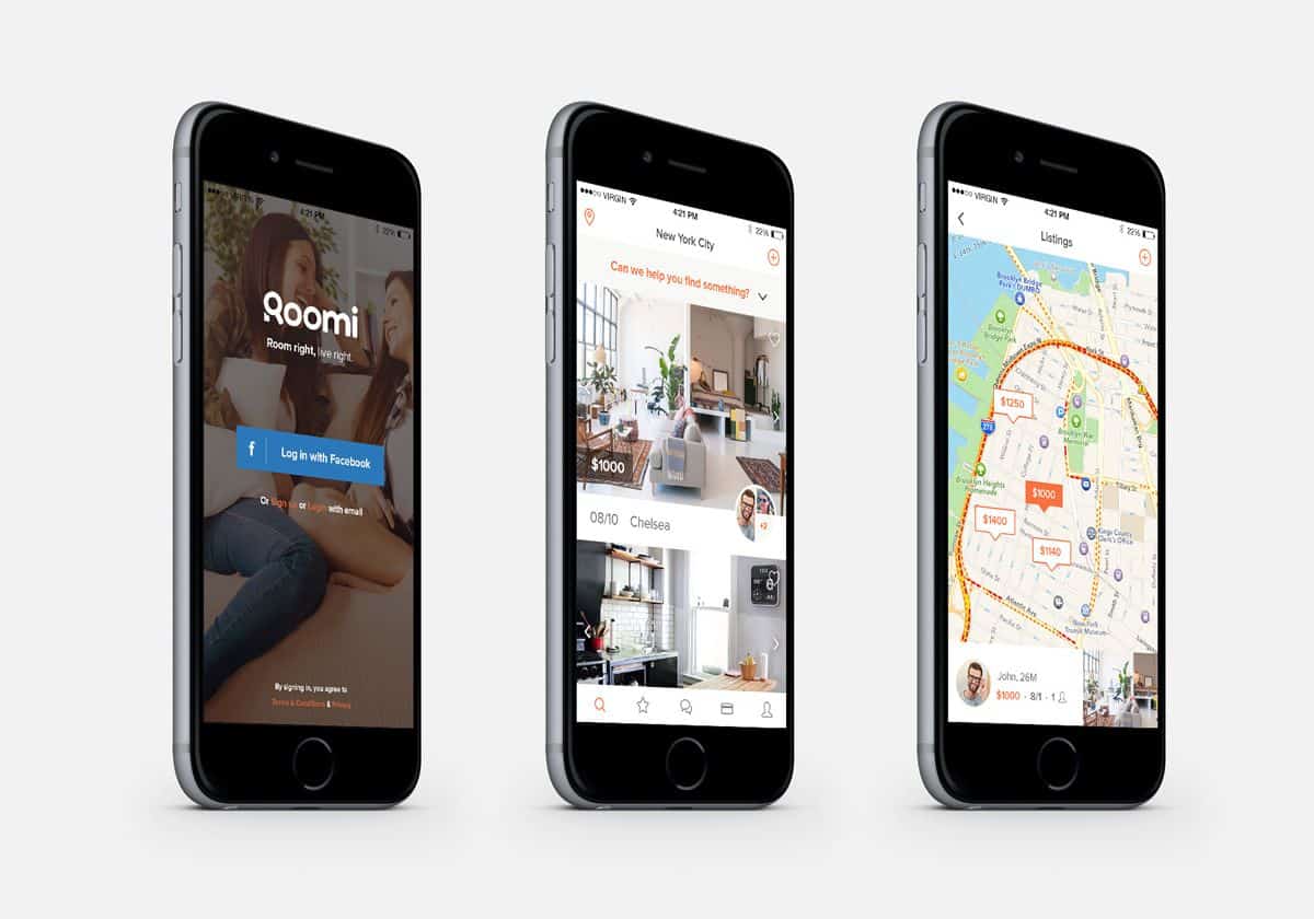
John Lin is Head of Product at Roomi (@RoomiApp), an iOS app that helps people meet their ideal roommates and find shared housing that suits their needs and budget. While currently available in iOS only, Roomi is working on reproducing its success in Android — but is also taking the time to make sure they do it right.
“Our iPhone app is already doing pretty well, having achieved hundreds of thousands of views, and we have been featured in several news articles about our product and design. In addition, we have an Android app that is in alpha testing phases, and we have been actively working with the Google designers to make sure that it is consistent with our iOS experience.
Creating a platform agnostic app is difficult. There are many differences between iOS guidelines and Google Material Design guidelines. Some of these differences include alternate uses of colors, animations, components — such as floating action buttons, toolbars and navigation.
With regards to color, for example, iPhone prefers a to make more use of white and transparent layouts while Google prefers to integrate more color. Google also makes use material design, treating elements on the screen like pieces of paper or cards. Taking care to ensure design details like header style, fonts and capitalization are consistent goes a long way in creating a seamless user experience between platforms.
The most common mistakes with regards to design that I see people make is not following the guidelines and common best practices. Many times, they are either unfamiliar with design or try to implement things on one platform that only belong on the other. For example, some users try to add floating action buttons to iOS. To avoid these mistakes, I recommend that designers read and understand the guidelines for both platforms.
Designers can also study apps that have good examples. There is no better iOS example than the latest iOS apps like iOS news, and for Android, Google apps like the PlayStore or Google+. Many popular apps like Facebook also do a good job implementing many design elements. Ironically, some apps that do it poorly come from Google, but on iOS. However, they tend to do these things more purposefully to match their material design. Lastly, in order to achieve the highest level of continuity, designers should use the same general pages, but modify each screen to fit the respective platform.”
3. The wrong way: designing apps that look like generic iOS or Android apps.
The right way: fusing the design languages of each platform with your brand’s specific look and feel.
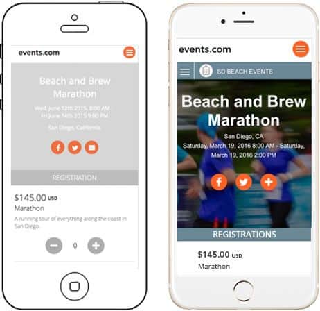
Cassie Byers is a Visual Designer at Events.com (@eventsdotcom), an online marketplace that unites event organizers and participants in a single place. For Byers, the challenge — and secret — to designing apps that look great on both Android and iOS is making sure your own brand voice isn’t suffocated by the respective design schemes of each platform.
“From a visual design standpoint, the key to designing apps that are platform agnostic is keeping consistent with the style guides of the operating systems, while adding that extra flair that comes with your own product’s style guide — this can be challenging! You want it to look like your brand so the user does not get confused, but add app characteristics so the mobile experience is seamless and modern.
Some apps that do this well are AirBnB, Instagram and Pinterest. Each uses popular patterns and tropes users come to learn quickly on each respective operating system. I actually can’t think of many successful apps that don’t tweak their design based on OS, although games in general have the same design. The reason games can get a pass here is that navigation, buttons and other controls do not exist in the same way on a game than they do on other apps.
One common pitfall I see when designers create a platform-agnostic apps is simply trying to be too “cool.” I think apps are perceived as trendy and modern, and sometimes designers get overzealous and forget about their product’s brand. You don’t want a user to go from your web app to your native app and see two completely different designs.
If you’re looking to port your iOS app to Android (or the other way around), my biggest piece of advice is to use the actual device! Don’t just Google ‘design differences’ or download a template. In order to figure out how apps work on a different device, and understand their patterns, you need to actually use the device and test the application on it.”

Designing Apps for Both Platforms Starts With Designing Great Prototypes
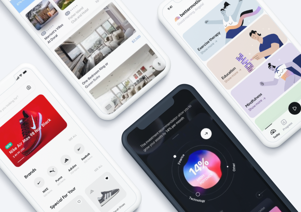
One of the best ways to see how your iOS app can look on Android (and vice versa) is to use a digital prototyping tool to quickly draft how the app will look using a library of readymade UI elements (for example, you can preview Proto.io’s Material Design UI library here). That way, you can quickly grab buttons, sliders, animations and interactions native to iOS or Android, and begin crafting the UX experience for the platform, without touching a line of code. Nail the experience in the prototyping phase, get user feedback, and then get started building out your platform-agnostic app!
Ready to start designing apps that look equally amazing on both iOS and Android? Sign up for a free 15-day trial of Proto.io today and see how easy it is to create realistic interactive prototypes in mere minutes.