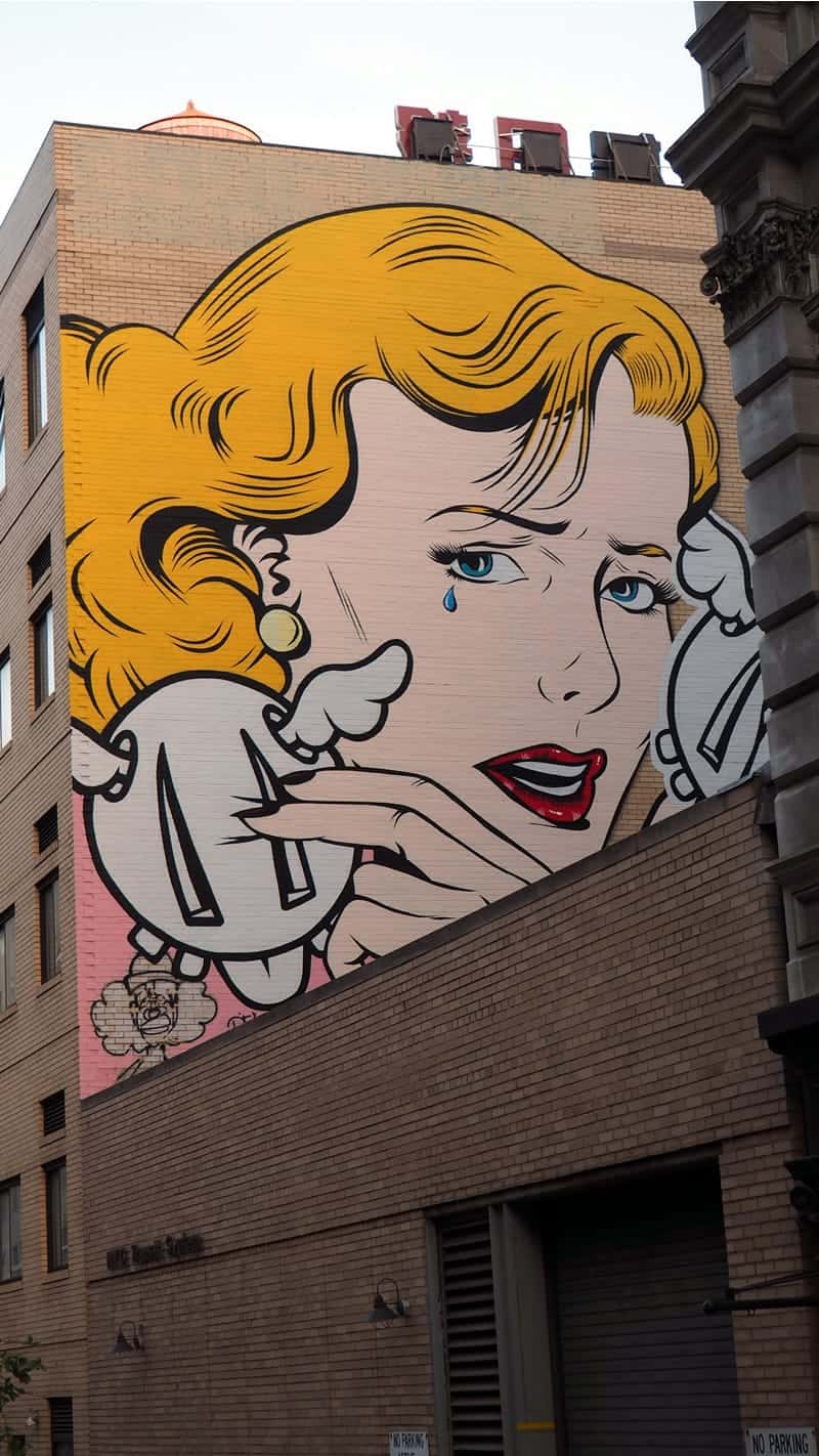
Everyone can name a favorite artist or a writer who changed their life, but many people struggle to name a single designer. And yet in many ways, design is a far more important part of our daily lives. You might not have a chance to read a story or contemplate a painting today, but you’ll engage with hundreds — if not thousands — of works created by designers.
From the billboards you travel past on the way to work, to the button you click to check your email or post a message, to the logo on your coffee cup, nearly everything has been shaped in one way or another by graphic design.

These design elements often have a seemingly trivial purpose, like advertising a product, or inspiring you to click a link — but their effect is far more profound. Design can aesthetically transform (and hopefully, improve) the world around us, and the little rituals of everyday life. The great designer Massimo Vignelli conveyed the importance of this transformation:
“The life of a designer is a life of fight. Fight against the ugliness. Just like a doctor fights against disease. For us, the visual disease is what we have around, and what we try to do is cure it somehow with design.”
In honor of World Graphic Design Day on April 27th, we’d like to bring this fight out of obscurity, and share a brief history of graphic design.
The First Graphic Designer?
For a profession that’s reshaped the surface of the world many times over, design is very young — less than a century old, in fact. William Addison Dwiggins was the first person to call himself a graphic designer in 1922. Dwiggins had a varied and fascinating career, doing everything from advertising to lettering, to book design, to illustration.
He was also an author, whose writing reflected his wide range of interests, addressing topics as varied as advertising layout and puppetry, but he’s best known for his typography work. Many of his classic typefaces such as Electra, Eldorado, Caledonia, and Metro are still common today.
Although he contributed to many design arts, Dwiggins didn’t really start any of them. People have been doing lettering and layout for as long as there have been letters, and illustrations go back much further. The ancient Greeks had a complex and systematic approach to design, and modern designers are still using Aristotle to better understand the design process 2300 years later. Dwiggins’ true contribution was to get people to start thinking of design as a practical skill set, rather than a purely artistic one:
“In the matter of layout, forget art and use horse-sense. The printer-designer’s whole duty is to make a clear presentation of the message…. This calls for an exercise of common sense and faculty of analysis rather than for art.”

That might seem like an obvious observation today, but with the painstaking hands-on work that went into design in the early 20th century, it was revolutionary. And it set the stage for everything that came after.
Design History and the Rise of Visual Propaganda
Old advertisements are kind of like a short essay, a picture book, and a pitch all rolled into one. From a modern design perspective, there’s a lot of redundancy. For example, look at this ad for a Milburn Light Electric, a car produced from 1915 to 1923. The ad asserts that the Milburn “has long sweeping lines and is strikingly beautiful by comparison with any other car of its type” right beneath an illustration of the Milburn! It’s almost like the drawing is just there to attract the eye so the copy can win you over.
An iconic World War II era propaganda ad like Rosie the Riveter is almost the exact opposite. Nothing is wasted. The image speaks for itself. The text merely complements the image and adds a slogan. It’s easy to draw a line straight from Rosie to the famous Shepard Fairey “Hope” poster made for the 2008 Obama campaign.
In many ways, the 1940s is when graphic design came into its own. Images became bold, modern and designed for maximum emotional impact. In part, this was driven by the need for effective, emotionally impactful propaganda. Getting an entire country to go from the business of everyday life to mobilizing to defeat an enemy is a daunting task, and an attractive illustration followed by a lot of small text wasn’t going to do it. Artists and graphic designers went beyond Dwiggins “horse-sense,” and learned to create designs that were confrontational, inspiring, and even jarring.
How the Advertising Boom Changed Design
Love it or hate it, you can’t understand the history of graphic design without grasping the changes in American culture in the 1950s. With much of the rest of the world rebuilding from the second World War, America was in a position of global power and prosperity, and businesses took note, giving rise to the advertising boom.
Most people associate the ad boom with television, but it extended far beyond that. The modern TV format, structured around advertising emerged, leading to a for-profit model based entirely around selling ads. It was a new form of storytelling around selling desire. Romance, sex appeal, and images of prosperity were used to entice consumers into buying luxury products.
And as Americans became saturated by mass media and surrounded by commodities, traditional lines between fine art and graphic design started to blur with Pop art. Many of the leading figures of the Pop art movement began their careers as graphic designers, including Ed Ruscha and Andy Warhol. Roy Lichtenstein appropriated images from comics and turned them into paintings. Warhol displayed screen prints of celebrities and even soup cans in galleries.

The transformation worked the other way, too. Graphic designers were free to experiment outside of the constraints traditionally imposed on commercial design and draw inspiration from almost anywhere, prompting an age of rapid evolution that has continued ever since.
The Computer Age
Computers didn’t immediately transform graphic design standards. For the first few decades, they weren’t much more than big, finicky, and extremely expensive calculators. Even in the 1970s, when early graphical computers like the Xerox Alto and Apple Lisa came out, they didn’t hold a lot of possibility for designers. Computing power and screen resolution were so limited that there wasn’t much room for creativity. The simplest design wasn’t just the best option — it was the only option.
But as computers got more powerful, UX designers had freedom to experiment. Visual metaphors like file folders and desktops began to take on a type of realism, enabled by shading, better resolution, and an expanding palette of colors.
Everything came to a head with the release of the original iPhone in 2007. With a multi-touch screen, vivid skeuomorphic design and kinesthetically intuitive gesture control, the computer became something more: a simulated world at your fingertips, which could hold practically any objects, textures, and interactions the designer wanted.

This eventually led to the first major digital design debate: skeuomorphism versus flat design. Apple initially wowed people with shiny, detailed three-dimensional objects, but took it a little far for some tastes. It seemed gimmicky and cluttered. The Windows Phone countered with flat design, using easily readable tiles in place of naturalistic textures. Although the Windows Phone was not a commercial success, it was in its own way every bit as important to graphic designers. You could exercise restraint and emphasize a clean and user-friendly layout over flash and flair.
Neither had quite the right answer, but somewhere in the middle graphic and UX designers found a balance: material design.
Material Design and the Modern Interface
Material design took the best elements of both approaches. From skeuomorphic design, it took visual metaphors — like shadows and containers that help users understand the interface. From flat design, it took the wisdom that you don’t have to simulate real objects — you can create an interface and visual language better suited to your use case. Designers started to develop more consistent conventions, so users could open a new app for the first time and understand how to use it.
The tools have improved along with the interfaces, giving graphic designers a freedom they’ve never had before. It’s easier to mockup sketches, experiment with shades, lines, and textures, and build elaborate layouts with simple gestures. Modern mobile app prototyping has even blurred the line between developers and users. Graphic designers can import sketches, build interactions, create and test an entire app — all without learning a line of code.

The Future of Graphic Design
Technology develops quickly. Wisdom takes time. Cutting edge technology like virtual and augmented reality give designers a new degree of freedom they’re just starting to explore. You can turn the room around you into an interface or pop up icons in the air. You can use your artistry and your ‘horse-sense’ to build a world of design elements that travels with the user, and interacts with the environment — and those tools are going to change our visual world in profound ways. Where’s it all leading? We can’t say for certain, but it’s going to be a lot of fun to find out.
Proto.io lets anyone build mobile app prototypes that feel real. No coding or design skills required. Bring your ideas to life quickly! Sign up for a free 15-day trial of Proto.io today and get started on your next mobile app design.
How has design changed your world? Let us know by tweeting us @Protoio!


