There’s a lot of debate in the mobile app design community over whether or not skeuomorphism is dead. Some proclaim there’s no need for it, since we’re pretty adapted to our digital lifestyle at this point. Others say it’s still necessary, or at the very least, still desirable on the user’s part. It’s what they’re used to and if you changed this design aesthetic dramatically, it would cause confusion, frustration, and maybe even cause you to lose users.
There’s merit to both arguments. While skeuomorphic design (melding elements from real life into the digital sphere) is comfortable and familiar to us, new design philosophies have changed the way our mobile devices look, act, and feel. Shouldn’t we be embracing these shifts in design trends? Is it time to say goodbye to skeuomorphism once and for all?

How Skeuomorphism Has Helped Us Adapt
When computers first started being produced for commercial sale, programmers leaned heavily on the concept of skeuomorphic design so their users could learn how to use their products. Tying the new digital sphere to things we were already accustomed to helped us learn how we could incorporate these new devices into our real lives.
The trash can on Mac platforms looked like an actual waste paper basket. Similarly, it was a recycle bin in Microsoft products (that still looked like a waste paper basket). Need to delete a file? Simply drag it over to the trash can and then release. It even sort of drops into the bin with a little sound effect (although it doesn’t really sound like something being thrown away). In addition, users could move individual files into folders by clicking and dragging — something they’d do in their real-life offices.
Since those early days, making the transition from analog to digital has gone pretty well overall. While some of us have struggled more than others, as a society, we’ve generally become comfortable with how this new realm looks and feels for us. We adapted to smartphones (with a few hiccups here and there), thanks to flashy keynotes and commercials, and now you can barely find an adult who doesn’t own one.
But when smartwatches hit the market a few years ago, we started over in a sense. Suddenly, our smartphone screens (the size of an index card or smaller) were reduced to a space around the same size as a postage stamp. We had to acclimate to an entirely new digital sphere and once again, skeuomorphism was there for us.
First of all, it’s easy to forget that smartwatches are essentially tiny computers we wear on our wrists. Some of the newer smartwatches are so traditionally designed that you might not be able to tell they’re not analog at first glance. They’re gorgeous.
The design of these watches (and every other smartwatch) is intrinsically skeuomorphic because they’re in the shape of an analog watch. The main difference from a visual standpoint is that the face on a smartwatch is typically black (to save the battery) — but when you raise your arm to check the time or tap on the face, it illuminates with an analog-looking clock face or the digital time (like a more modern alarm clock).
Is Material Design Taking the Place of Skeuomorphic Design?
In recent years, we’ve seen a few shifts in major design trends. We saw flat design emerge in Windows 8 in 2012, with iOS 7 not far behind in 2013. Drop shadows disappeared, gradients became less apparent, and suddenly, our phones and tablets lost their dimension. Everything looked as though it was on the same plane, but in many ways, it looked fresh. Our smartphones were ready for a little facelift after a half decade — even if we weren’t.
People had serious reservations about the introduction of flat design. Very few people really like change, but there were a lot of complaints about both Windows 8 and iOS 7, and the very first thing on most people’s list was the flat UI. Icons weren’t really “buttons” anymore, as much as they were just squares on our screens.
Skeuomorphism allowed for the icons to appear “pressable.” In real life, if we want to turn something on, we press a button, right? So it made sense that our icons should have a bit of depth, but now all that was gone. Was it less intuitive? Maybe. But by that point, we all knew we had to touch the icon to open the app, so perhaps it was time to let it go.
Regardless of anyone’s feelings about flat design, it was a short-lived experiment. In 2014, Google released their guide to material design. This new design philosophy relied heavily on elements of flat design, but also incorporated strong elements of skeuomorphic design.
In Google’s own words, “The material is grounded in tactile reality, inspired by the study of paper and ink, yet technologically advanced and open to imagination and magic.” Grounding mobile design in reality and being inspired by paper and ink sounds a lot like skeuomorphism, doesn’t it? They go on, saying “…the flexibility of the material creates new affordances that supersede those in the physical world, without breaking the rules of physics.”
While seemingly based on skeuomorphism, material design is still pretty flat. Google graciously brought drop-shadows back, but not as severely as we saw with the first iOS, helping to create a bit of depth in a more modern way. It seems to us that material design is a combination of flat and skeuomorphic design — acknowledging that users still prefer the comforts of skeuomorphism while allowing design elements to evolve with the technology.
So… Is Skeuomorphism Dead?
One could argue that, given that material design philosophy is based firmly in reality, skeuomorphic design is alive and well on many different platforms on the market today, incorporating many different elements of design.
Even now, calendar app icons look a bit like a daily calendar — the kind where you rip off a page each day. Our camera apps still resemble an actual camera. Clock apps usually incorporate a clock face. Video chatting apps like Facetime include a professional-style video camera. Even the newer Apple TV app is a rendering of a flat screen TV.
The save icon is still a floppy disk — but the mobile generation, generation Z, or whatever you want to call them, doesn’t know it’s a floppy disk. They don’t even know what a floppy disk is and how would they? They’ve never had to save anything to an object that wasn’t an internal hard drive. They’d sooner believe a real floppy disk is a 3D printed save icon.
But at this point, can you change the save icon to something else? What would it even be? Older generations, who depended upon skeuomorphic design to help them get acclimated, might not want it to change, because how would they find what they were looking for? Even newer generations who’ve never seen a floppy disk might not recognize it if it were something else, unless it literally said the word “save” on it.
What about the phone icon? Very few phones actually look like that anymore. Most people are getting rid of their landlines entirely, and those who haven’t ditched them have cordless phones. If mobile designers were to change that icon, what would it look like? A rectangle with a home button on it? Users wouldn’t know what it was. They’d be looking for that old-timey phone receiver.
And as for smartwatches, what they’ll look like in the future is still unknown. Chances are, people at Apple and Google are working on them at this very moment, but nothing has been released yet. Perhaps by then, we won’t need skeuomorphism because we’ll be used to it — or they’ll be implanted as chips into our wrists.

Incorporating Skeuomorphism Into Your Mobile App Design
Frankly, there’s no reason why skeuomorphic design elements can’t coexist peacefully in the same realm as material design elements. Letting the real world make its way into your mobile app design is perfectly and predictably relatable because we’re all influenced by our surroundings. Artists incorporate colors, textures, and architecture into their paintings, sketches, and even music, so why would we think mobile app designers are any different?
We say go for it. Let your industry affect your mobile app. Put the wood grain background on your home DIY app. Use texture in your fashion app so it looks like actual textiles. Add movement that makes sense (as long as it doesn’t compromise speed). Long live skeuomorphism, and may your mobile designs benefit from it.
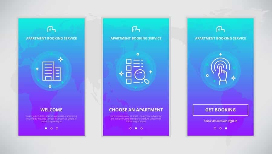
Want to incorporate skeuomorphism in your new mobile app design? Let us help you! Proto.io lets anyone build mobile app prototypes that feel real. No coding or design skills required. Bring your ideas to life quickly! Sign up for a free 15-day trial of Proto.io today and get started on your next mobile app design.
Do you wish skeuomorphism would just go away already? Or are you over this debate entirely? Let us know by tweeting us @Protoio!


