With 2017 coming to a close, business owners are getting ready for the new year — planning and budgeting away. As app designers, you should be looking into mobile design trends so you’re prepared for next year’s releases and updates. Anything you’re working on now should adhere to 2018 design standards so you’re not starting off on the wrong foot.
Some mobile design trends might seem like too much trouble to even undertake, and we certainly understand that sentiment. Do we really need to change our mobile app design every 6 months to fit the fleeting whims of the powers-that-be? We’re not really into that approach. Instead, we’re going to focus on trends that signal a shift in the industry or improve the user experience. These are the six mobile design trends we believe you need to be investing in now.

Seriously, Stop It with the Hamburger Menus
We talked about this shifting mobile design trend earlier in the year because a lot of major apps have gotten rid of their hamburger menus. Facebook and Spotify were two of the first to abandon these three little lines in their mobile apps — and many others have followed suit, including LinkedIn, Twitter, and Tumblr.
If your app still utilizes the hamburger menu and you’re reluctant to give it up, we get it. We know how versatile it can be. It seems so intuitive to those of us who’ve been using mobile apps from the beginning, but the main issue with them is that they aren’t intuitive for those who aren’t as tech savvy. If the user doesn’t realize it’s an icon, as opposed to a design choice, they’re not going to be able to find the information they need.
This mobile design trend is being replaced with a static menu at the bottom of the screen so menu items are never hidden from the user — and it’s already proving to be successful. Therefore, it’s time to let it go, Elsa-style. If your mobile app doesn’t move past the hamburger soon, it’s going to look outdated. Once you make the change, you may be surprisingly happy with the results. After implementation, Spotify found user interaction increased significantly.
Mobile App Prototyping
In our humble opinion, prototyping isn’t so much a mobile design trend as it’s simply a good business decision, but some people are just now catching on and we won’t fault them for it. Better late than never.

Prototyping is a great way to test your mobile app before it’s actually been built, which will help you save money later on in the development phase. A mobile app prototype is really a master communication tool because every detail of your design is already spelled out for your developer. This will cut down on the back and forth, leading to a quicker timeline to rollout.
And as for simplifying the user experience, prototyping helps smooth out the onboarding process because there are less glitches in the mobile app. This is not to say your users won’t find things wrong with your app — they will, guaranteed. But they aren’t going to find nearly as many problems as they would have if you’d skipped this step.
If you aren’t sure where to get started, we have a wealth of information to get the ball rolling, including a how-to guide and tips for securing seed funding using your prototype. We’re confident that once you try it, you’ll never build another mobile app without it.
Personalization
This mobile design trend has certainly been on the rise, but is going to become a much bigger deal in 2018. It’s not particularly surprising considering the degree of customization we’re seeing everywhere else in our lives. Netflix already recommends content based on what we’ve watched and Amazon recommends products based on purchase history, so having our mobile apps be a bit more customized isn’t a stretch of the imagination. People have come to expect it.
In mobile apps, this can be done in a similar manner — by examining user data and writing your code to incorporate personalization based upon how they’ve used the app in the past. But we think artificial intelligence offers a unique opportunity for your customer service department: you can bring in chatbots to help make your company more accessible.

One of the most common complaints among less technically-inclined mobile users is the inability to get a customer service rep on the phone. Have you ever tried to call Amazon? You basically can’t. You have to email them. Using AI in your mobile app design can help bridge the gap for users that might need a little extra help without the ongoing expense of a call center — all while creating a more personalized experience for your users.
Material Design Over Flat Design
Most of the experts seem to agree that this is one of the most important mobile design trends for 2018. Material design isn’t a new concept. Google sort of spearheaded this movement a couple years back and some designers have already jumped on the train, but it’s time for everyone else to move away from flat design, too.
Visual mobile design trends change every couple years. We’ve gone from skeuomorphism to flat to material all in the past decade. It can seem exhausting to keep up with all the changes, but it’s important to keep your mobile app looking refreshed and current. Users (especially the younger ones) will pick up on this immediately. They’ll begin to wonder: if you’re not on top of the design changes, what else aren’t you on top of?
If you need some help figuring out how to incorporate material design into your mobile app, look to Google’s principles for guidance. The major takeaways are to stay grounded in “tactile reality,” to be intentional in your design choices (from color to typography), and to incorporate motion in a way that adds value and helps focus attention where you want it to go. Material design brings the third dimension back by adding depth through shadows, color gradients, and motion. It’s kind of a happy medium between the consumer-friendly skeuomorphism concept and modern flat design.

Easier Logins
At this point, we have so many passwords, it’s impossible to remember them all. We tell our browsers and mobile apps to remember our logins so we aren’t constantly resetting them — because we cannot keep it all straight. We really need an Excel spreadsheet to keep them all organized, which isn’t particularly safe, now is it? Here, identity thieves, take all our data for every account we have everywhere on the internet!
We’ve already seen faster unlocking mechanisms on our phones with facial recognition and fingerprint scans, so there’s no reason to believe that we can’t have easier logins with mobile apps. Even the Amazon app allows you to sign in with touch ID, and we anticipate this mobile design trend to pick up steam in 2018.
If your mobile app doesn’t use fingerprint or facial recognition, you could incorporate verification codes instead of passwords. You could text a code like Google does for 2FA (with perhaps a security question to make sure the person requesting it is the true owner of the account). This should also keep accounts more secure, since a user ID and password won’t be enough to allow access to unauthorized users.
Support for Smartwatches
Smartwatches are more popular than they’ve ever been and we expect sales will continue upward in the foreseeable future thanks to the sleek Android designs. The Apple Watch has maintained its usual size and shape, but its design is a bit more modern than traditional watch-folks prefer. Google, on the other hand, has a wider variety of smartwatches that look — well, they look like watches. At first glance, you’d never know the difference.
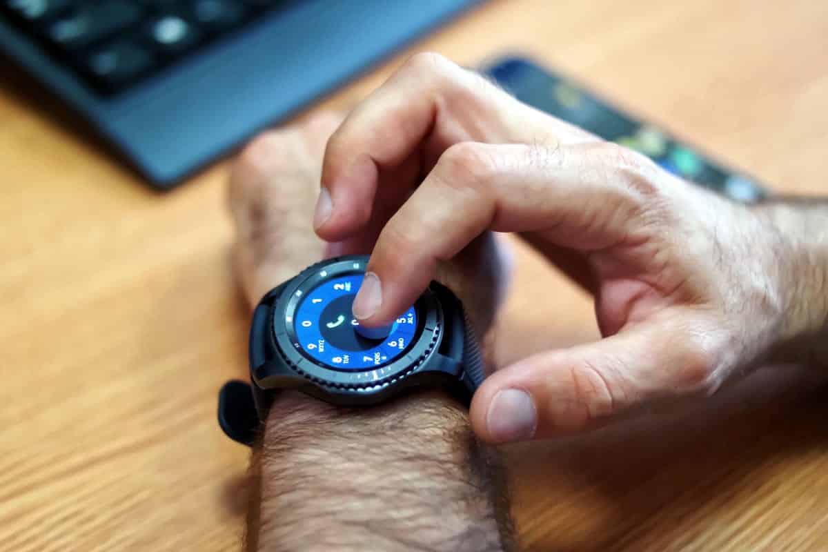
This mobile design trend will become increasingly important in 2018 as more people adopt this technology. The convenience of having a computer (and a phone) on your wrist is too good to pass up. And as the older generations are getting accustomed to smartphones, making the leap to a smartwatch isn’t necessarily as daunting as it may have seemed before.
What All These Mobile Design Trends Have in Common
As we alluded to earlier, the major theme in these mobile design trends is that they simplify the user experience and generally make things easier for everyone (except for maybe the designers and developers, who have to redo everything).
From our perspective, improving the user experience is what makes a mobile design trend a worthwhile investment — and that’s exactly how you should be looking at this. You’re investing in the future of your mobile app and in the process, you’re extending your product life cycle. After all, a happy customer is a loyal customer, so let’s focus on creating mobile apps that attract loyal users.
Proto.io lets anyone build mobile app prototypes that feel real. No coding or design skills required. Bring your ideas to life quickly! Sign up for a free 15-day trial of Proto.io today and get started on your next mobile app design. We can’t wait to see what you all come up with in 2018!
What mobile design trends do you think will be big in 2018? Let us know by tweeting us @Protoio!


