The mobile app industry is still pretty new, especially from a design perspective. Until the iPhone came out in 2007, no one had even come close to showing what a fully-realized smartphone interface was capable of — with the rapid progress of technology, perhaps we still don’t. We’ve gotten a lot better at understanding what makes for a good UX, but design standards are still evolving at a much faster rate than in other fields. At the same time, users already expect a near-flawless experience, and both Alphabet and Apple are pushing developers to adopt their ideals of good design.
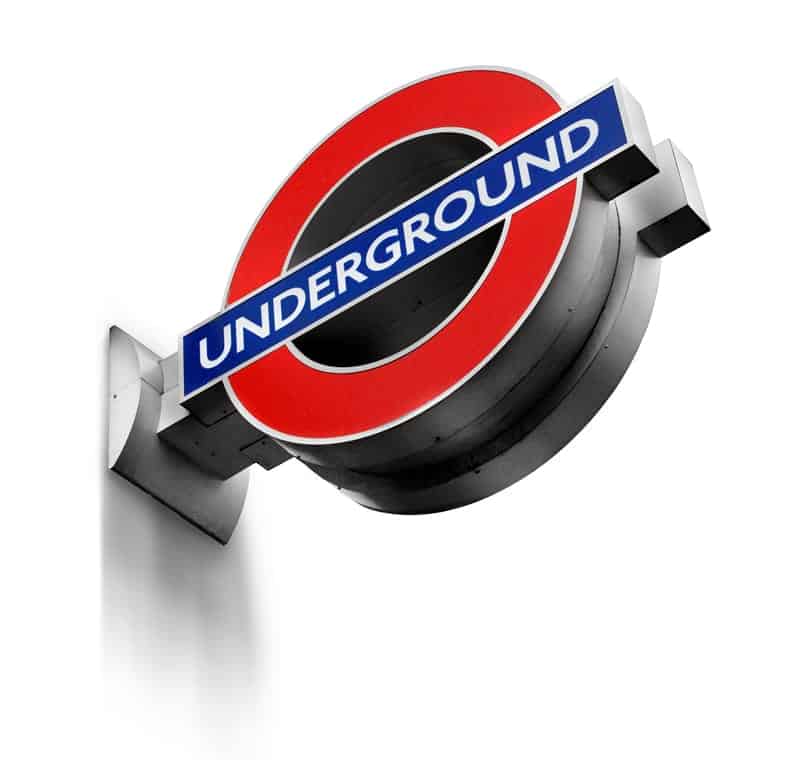
Learning About Design Standards… by Going Underground
It’s hard to predict exactly how mobile design ideals will change and become even more defined, but the London Underground (LU) might provide a hint. The LU recently developed a 225 page document on design standard called the London Underground Station Design Idiom. The Underground is the world’s first subway, and has been growing since 1863, without a single unifying stylistic plan or set of rules.
The Idiom was created to tie the LU together, by guiding all future station design and refurbishment by nine design principles. Each principle is a simple imperative like, “Achieve balance across the network,” “Create ambience with lighting,” or the enigmatic “Delight and surprise.” With that said, the document goes far beyond simply stating design commonplaces. The “Delight and surprise section,” for example, states the following rule:
“Every Underground station should include at least one moment of delight and surprise, to improve customers’ journeys and the working environment for staff. Such moments help put the network on the map, as a world-class leader of design.”
It then defines very specific rules for different elements that may delight and surprise. The “Celebrating heritage” subsection explains how to highlight each station’s architectural heritage and links the reader to specific guidelines for preserving “Underground Heritage” and a list of “buildings and other structures of design or historical importance” to ensure restorers understand which elements to preserve.
Other sections get deep into how stations should be laid out, how light can be used to create a functional, yet visually engaging atmosphere while helping passengers navigate — and even how to “achieve the right balance” between information, retail spaces, and advertising.
“Prioritise comfort for staff and customers,” gets its own entire section, but in a sense, it’s the topic of the whole document — to create an ideal experience for what business-savvy American audiences might refer to as “all stakeholders.” It’s an ambitious project. In its more than 150 years of existence, the Underground has seen a lot of different architectural and design styles come and go. According to The London Magazine, the LU experience ranges from rides through “a valley of beautifully arcaded brick walls, with pigeons circling overhead,” connecting stations with “gracious glass roofs,” to much less picturesque locations.
How did architecture get to this point, where design standards are treated as almost a science, and designers can create a single set of rules that might tie more than 150 years of history together? And how do we, as app designers, meet those high standards?
The Evolution of Architectural Design
The LU is a great example of changing design standards, because it’s a place where the past lives with the present — literally connected by a massive network of tracks. It’s easy to see different styles, and the way they expressed different concerns. The early Underground used steam locomotives and gas lighting, so early Tube stations were big, airy designs incorporating a lot of natural light, and plenty of ventilation to allow the smoke to disperse.
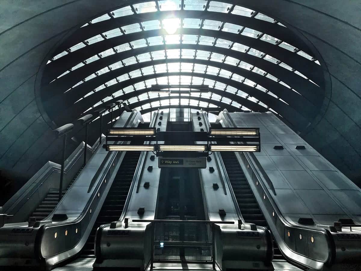
Later stations were impacted by different practical and aesthetic considerations. There were modernist stations like Arnos Grove in the 1920s and 30s, designed to adapt modern architectural design to the capabilities of modern building technology. Post-war stations were much simpler and less impressive — designed to cope with economic austerity as Europe recovered from the devastation. In the 1990s, stations like Canary Wharf were built to a different set of needs. Traffic was increasing with the growth of suburban sprawl, so the LU needed durable construction and massive spaces, and modern safety features, like screens that open as the subway doors do, protecting the crowded passengers from falling on the tracks.
But the Idiom is different — it doesn’t reflect a particular design philosophy or aesthetic, so much as a set design of standards based on accumulated knowledge. As technology and materials got better, the goal gradually changed from expressing the vision of an architect or an era, to meeting the needs of users.
The Development of Software Design
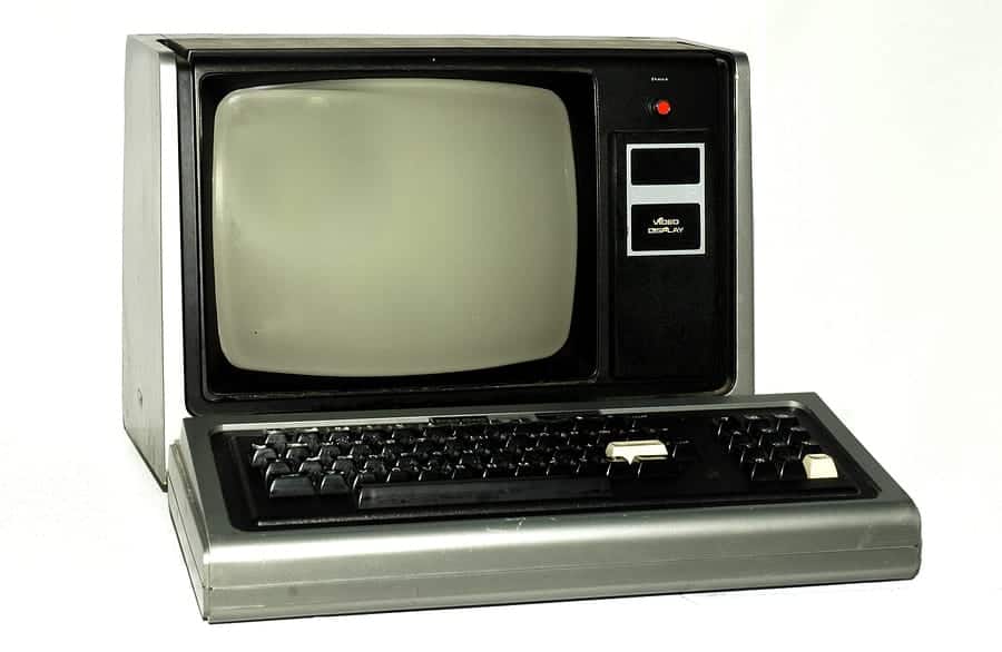
Apps have undergone a similar transformation. The first computer with something that started to resemble a graphical user interface was the Xerox Alto, created in 1973. It had simple black and white graphics, and a resolution of only 606 x 808, and wasn’t really fully graphical. The file manager organized files in two horizontal boxes, but they weren’t movable windows, like in a modern computer. However, the Alto did have some of the basic characteristics that defined the PC era, such as an arrow-shaped mouse pointer that could change shapes when it performed different tasks. As with the early Tube stations, it was limited by technology more than a design philosophy.
With the addition of Smalltalk, it got one step closer to resembling a modern desktop. Smalltalk was an object-oriented programming language, as well as a development environment and graphical UI. It had windows with title bars that could be moved around against a grey background. It didn’t offer the modern range of textures and shading (or even color), but you could tell which window was on top, because it would physically cover the window below it.
The Apple Lisa further refined what the GUI could do, adding pull-down menus, drag and drop controls to move and copy files and other innovations that would go on to be design standards. A range of competitors emerged over the next decades. A few, such as Windows, persisted into the present day. Others, like Acorn Computers, failed to catch on, but introduced important innovations — in the case of Acorn, anti-aliased fonts and a menu at the bottom of the screen to store icons for common applications.
As with architecture, design standards were often limited by technology and cost. Computers and monitors needed to be affordable, which meant it wasn’t necessarily the most advanced systems that succeeded, but the ones that could create a useful experience within a reasonable price range. For example, 1980s computers could support proportionally-spaced fonts, but used fixed-width fonts for usability because screen resolution was low.
As the technology continued to improve, however, screen resolution and processing power eventually ceased to be a limiting factor. There was more freedom to create an attractive and appealing interface according to a particular design philosophy. That’s when modern design standards started to emerge.

Modern Design — the Difference Between “Can Do” and “Should Do”
As we discussed in A Brief History of Mobile App Design, the 2007 release of the iPhone started a design revolution. The iPhone combined the first fully modern, multi-touch smartphone with rich, naturalistic skeuomorphic design. Objects had shadow and texture, which users could physically interact with in a way that hadn’t been possible before. Many app developers played with the realism, simulating actual objects in playful ways. But it wasn’t just for fun — there was a logic to it all: by combining simulated natural textures with GUI design standards, Apple created an immersive and intuitive experience. But was it the best way to interact with digital objects?
Microsoft said no, and opted for simplified, flat design with the Windows Phone. Icons didn’t have to shimmer and glow, they had to be readable, attractive and easy to access. The Windows Phone didn’t do well, but it did help start a debate that led to something a little like the Idiom: Material Design.
Just as the Idiom moved beyond asking “which architectural style is best?” to asking “how should a subway station be designed to accommodate its users?” material design moved beyond the skeuomorphic vs. flat design debate to ask how different elements of the device should interact. With material design, developers were able to transcend design styles, and finally reach for design standards.

Upholding Modern Standards in Design
Like the London Underground, the app world still has room for different styles. Skeuomorphism still has its place in apps designed to emulate real-world objects, such as the Moog Model 15 App, which meticulously recreates a vintage Moog synthesizer.
Other designers opt for extremely clean, simple design to emphasize ease of use or particular color palettes or flow to give the app a recognizable feel. The important thing is to think about your users — what will they use the app for? What behaviors are they expecting? What design features will they find convenient? What visual style will they find charming and attractive? Now that our computers are powerful enough to enable any user interaction we can imagine, we can go beyond what is possible, and focus on what our users need.
Proto.io lets anyone build mobile app prototypes that feel real. No coding or design skills required. Bring your ideas to life quickly! Sign up for a free 15-day trial of Proto.io today and get started on your next mobile app design.
Have an opinion on where design is heading? Want to show us an example of great app design? Let us know by tweeting us @Protoio!


