It’s sometimes hard to fathom now, but there was a bygone era — not even so long ago — during which a phone was just a phone, a device used to place and receive calls. Now, when you can use your smartphone to do everything from monitoring your blood sugar to transporting you to three-dimensional virtual fantasy worlds, actually placing a call sometimes feels like an antiquated method of getting in touch with someone. After all, why call your mom when you can use Facebook Messenger to send her a quick text, or FaceTime to have a conversation complete with body language?
And smartphones are only the tip of the mobile app design iceberg. The world abounds with devices that serve as mobile computers, from wearables (which have their own surprisingly long history) to tablets. The mobile revolution has transformed industries, created new ones, and left others in its wake. Those of us who still even frequent brick and mortar stores don’t bat an eyelash when we see cash registers replaced by iPads, or shoppers paying for their groceries using Android Pay or Apple Wallet. It’s no surprise, then, that mobile search has long since eclipsed desktop.
Today, Android and iOS users (including the many cross-platform aficionados among us) can download from a selection of literally millions of apps. But long before we were swapping faces on SnapChat, designers were paving the way for us to use our mobile devices to play games, do business and, yes, even change the world.
Let’s take a look at the history of mobile app design to this point, from the most rudimentary PDA applications to today’s most impressive accomplishments, and see if the paths we’ve forged to the present moment can show us where mobile app design will take us in the future.
1984: The Psion Organiser
When we think about the history of smartphones, we might think back to 2007, when Steve Jobs first introduced the world to the iPhone, or even to the first versions of the Palm OS launched in the 1990s.
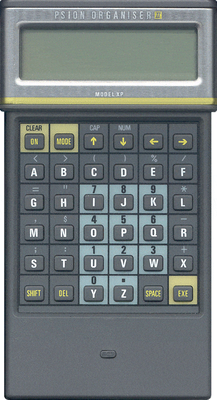
However, to kick off the history of modern mobile app design proper, we want to take you all the way back to the era of DeLoreans and New Wave. In 1984, Apple was already around (and making legendary commercials), though Android certainly wasn’t — Google cofounders Larry Page and Sergey Brin were only 11 years old at the time. Even though the idea of a computer in every home was a pipe dream in that era, a British company called Psion was already creating a computer that could fit in your purse or briefcase.
If the personal digital assistants of the 90s were the predecessors of today’s smartphones, then the Psion Organiser, thought to be the world’s first PDA, is the grandaddy of your favorite mobile “smart” device. Advertised as “the world’s first practical pocket computer,” the Psion Organizer was 14 by 9 centimeters, making it a pocket computer only for the most liberal definitions of “pocket.” By modern definitions of “computer,” it was also quite modest, with a mere two kilobytes of RAM and four kilobytes of ROM. However, for the time, it was an incredibly forward thinking device, and its six-month battery life is still enviable by contemporary standards.
A list of applications for the Psion II, the second iteration of the PDA, includes simple puzzle and adventure games, password protection programs and a “comprehensive file manager.”
Psion’s Electronic Piece of Cheese
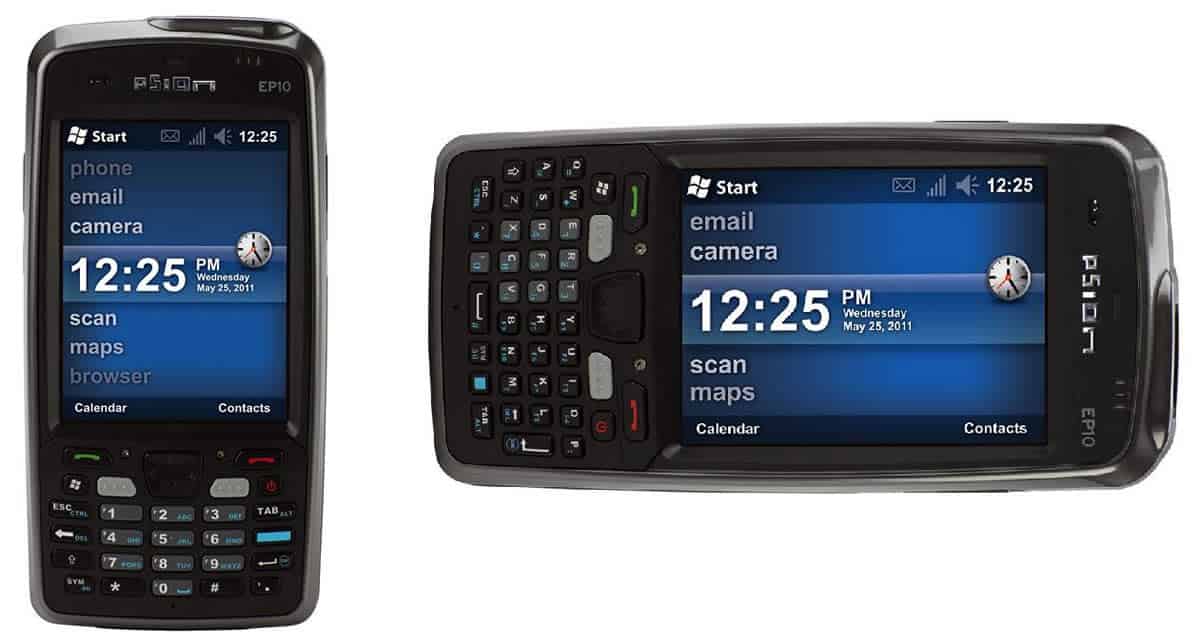
Where Psion would truly leave its legacy in the world of mobile app design, however, wasn’t in hardware but in software. Developed in the late 1980s and proliferating among multiple devices in the early 1990s, the Psion EPOC operating system powered many early personal digital assistants and enabled much more sophisticated applications than those possible on the Psion Organiser, including word processors and spreadsheets. Users could even download apps using a modem.
Originally a false acronym made to sound like the word “epoch,” which means era, the engineers behind EPOC would lovingly joke that the OS actually stood for “electronic piece of cheese.” However, the original meaning behind the name was fitting, given the reverberations that the operating system would have even into the era of iOS and Android devices. EPOC, you see, gradually became the precursor to the Symbian operating system, which powered Nokia smartphones until the company settled on the Windows Phone operating system for its handhelds. The Symbian OS was also used by other manufacturers now associated with Android, including Samsung and Motorola.
Not bad for a little piece of cheese.
1996: Birth of the Palm Pilot
When most people think of PDAs, however, there’s one major player that likely comes to mind: Palm. 1996 was an exciting year in technology — it was the year you could first fly around Mushroom Kingdom in three dimensions in Mario 64, as the Console Wars waged by Sega, Sony and Nintendo reached a fever pitch. It was the first year more email was sent than snail mail, and the year that Larry Page and Sergey Brin started developing Google (while the search engine wouldn’t launch for another year, you could still use Ask.com, and IMDB was ready for all of your movie questions).
But the real boon to mobile app design in 1996 was the release of the Palm Pilot PDA. With a choice of either 128 or 512 kilobytes of built-in memory (you could add up to 2 megabytes of RAM via the memory slot, but it would cost you), and with a 160×160 pixel monochrome screen, the Pilot was hugely influential both in its time and even today. Many of the features we now associate with modern smartphones, including touchscreens and data synchronization, were introduced in the 90s as features of the Palm Pilot.
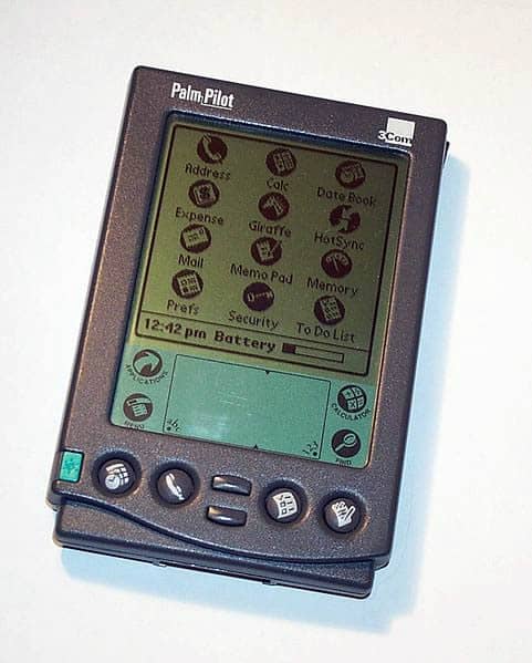
That made Palm’s transition between PDA operating system and smartphone OS a natural one, beginning with 2002’s Handspring Treo and ending with 2011’s Palm Pre. While PalmOS and WebOS certainly made their mark on mobile app design, ultimately, Palm couldn’t stand toe to toe with titans like iOS and Android.
1997: Snake on the Nokia 6110
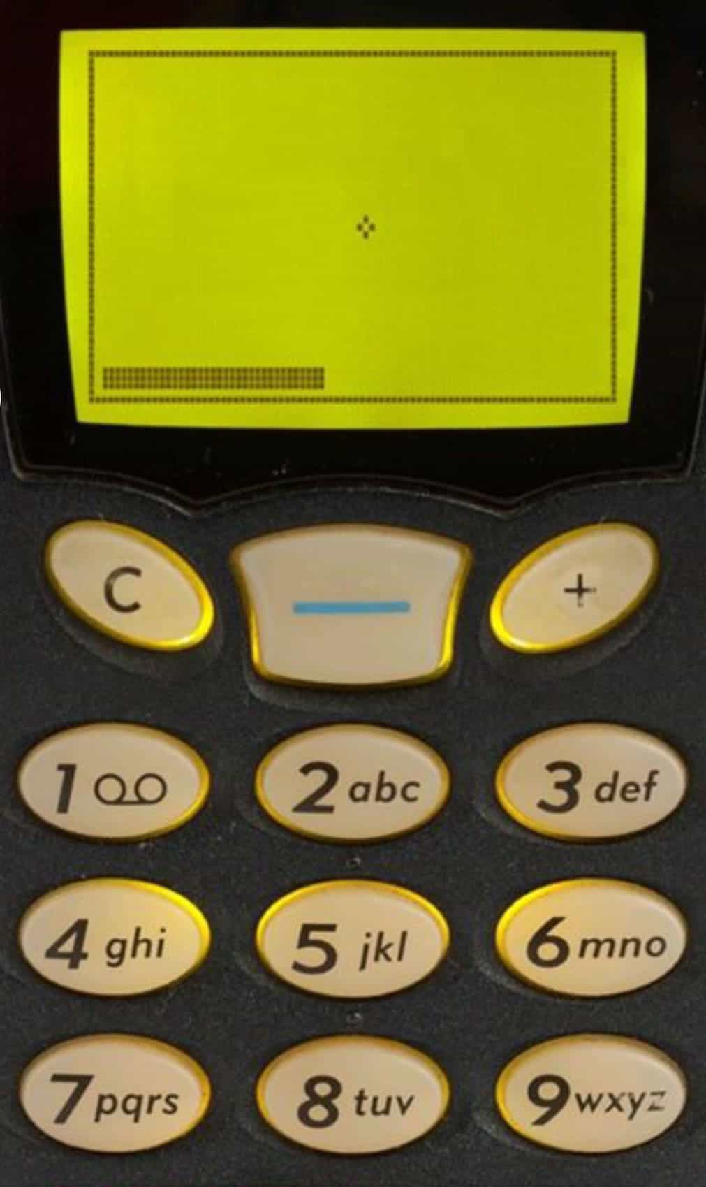
While not a smartphone, the Nokia 6110 made a major innovation when it came to mobile app design: it shipped with three games, the most famous being Snake.
While PDAs offered business professionals and other users a variety of practical apps including email and spreadsheets, Snake proved that mobile phones had another important thing to offer the world: fun. With ridiculously simple gameplay that scaled up in difficulty at a perfect rate, Snake had all of the elements of an addictive mobile game, without eating up too much memory or battery. With Snake, you could silently occupy yourself in line waiting for your Starbucks beverage, or on the train. It began a mobile app gaming phenomenon that would eventually lead to such smash hits as Angry Birds and Bejeweled, all with a simple reptile trying not to eat its own tail.
2007: The iPhone Changes Mobile App Design Forever
Millennials and mobile app design geeks may recall the 2007 Apple Worldwide Developers Conference with the same mix of wonder and nostalgia with which baby boomers remember Apollo 11. That’s when Steve Jobs introduced us to the iPhone for the first time, and permanently changed the game for mobile app designers and developers.
The multitouch screen that adjusted based on how the phone was tilted brought a whole new layer of possibilities for UX design, and the app marketplace was set up in such a way that app creators had a clear path for building and marketing their products — an advantage that only Android would be able to execute as effectively.
2008: Android Gives Apple a Run For Its Money
The world’s first commercially available Android device, the HTC Dream, was launched in 2008. At the time, there were plenty of operating systems to choose from for smartphone aficionados. Symbian still powered many phones, Palm was behind a number of devices and of course, there was BlackBerry, then a staple of the enterprise as well as legions of “CrackBerry” users.
However, it wouldn’t be long until Android and iOS would run the other games out of town, with the funding and developer muscle required to give users the features they craved with the security options enterprises and SMBs demanded. This is in great part due to their application ecosystems. Smartphone users, after all, go where the best apps are.
2010: Microsoft Enters the Fray and Flat Design Rules the Day
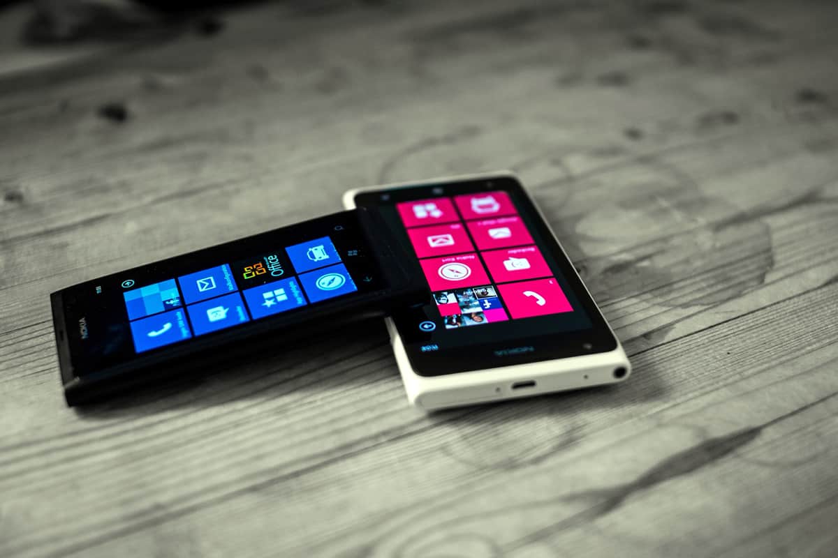
Okay, so you probably know, at maximum, a handful of people who have ever owned a Windows Phone. While Microsoft’s mobile operating system never stood a chance against the twin giants of iOS and Android, the OS still left mobile app designers speechless with its beautiful design language, and helped make flat design the undisputed cool kid on campus. Apple’s iconic use of skeuomorphism suddenly felt dated next to the Metro UI design language (now known as “Microsoft Design Language”) that had debuted on the ill-fated Zune before it made its way to Windows 8, Xbox 360 and Windows Phone.
The Microsoft Design Language emphasizes clean typography (including the highly readable Segoe typeface), flat planes and bright colors, and contrasts the digital approximation of real-world textures that were en vogue at the time. No longer did icons have to be waxed to the point of looking dripping wet, or so three-dimensional that their drop shadows had drop shadows. It was truly a new era of mobile app visual design, and one that would dominate until Google codified its Material Design philosophy a few years later.
2010: The iPad Revolutionizes Mobile App Design for Individuals And Businesses
“What’s the point of this?” one of your friends was bound to say in 2010, when Steve Jobs first introduced the world to the iPad tablet. “It’s just a big iPhone.” It wasn’t long until the portability, connectivity and power of the iPad found life at business meetings, in retail stores where cash registers used to be, at doctors’ offices and even onstage at metal concerts (need proof? Check out this video of Jordan Rudess, keyboardist of Dream Theater, making some gorgeous sounds on his iPad).
As had happened with the iPhone, Android would follow up with tablets using its own operating system, and the impact on mobile app design was immediate: now, apps had to be built to accommodate a much wider variety of screen sizes. This helped usher in the age of responsive design — not only for mobile apps, but also for website experiences.
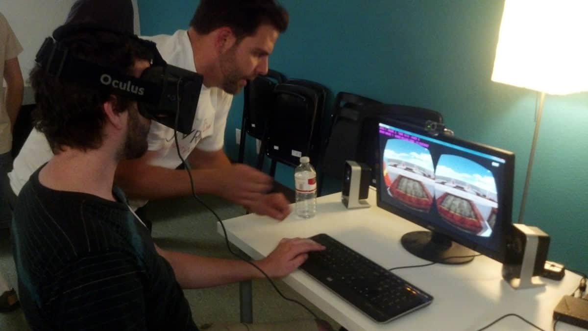
2013: Oculus Ships Their First Dev Kit, and Virtual Reality Becomes UX Reality
The result of a phenomenally successful 2012 Kickstarter campaign, the development of the Oculus Rift marked the first time virtual reality headsets seemed like a consumer product that could really catch on, despite multiple failed attempts in the 80s and 90s. The first iteration of the Rift was far from perfect, with a low resolution screen and the propensity to cause nausea and dizziness after too much use (if you still have a DK1, we recommend brewing a nice hot cup of ginger tea before slipping on the headset), but it was leagues ahead of any VR technology that preceded it.
More importantly, Oculus inspired a sense of wonder and awe in its users. A groundbreaking technology, virtual reality has the power to turn your sofa into the most thrilling roller coaster imaginable, or the cockpit of a racecar you could only dream of climbing into. It also offers untold educational opportunity, from giving medical students an up-close and personal look at the inside of the human body (even at the cellular level!) to taking geography students to the actual places in their textbooks, from the Louvre to the Great Pyramids of Giza.
There are many reasons all UX designers should get into virtual reality, but the fact that smartphone giants like Samsung and HTC have since released their own VR headsets is a big indication that the worlds of mobile app design and virtual reality are now inextricably linked. By plugging a Samsung smartphone into a headset, your phone — a technology, remember, that used to be relegated to the task of placing and receiving audio calls — transforms from a miniature computer to an immersive experience of new worlds, from outer space to fictional fantasy universes.
2014: Google Introduces Material Design
While Microsoft’s flat visual design language was massively influential around the turn of the decade, Google elevated the skeuomorphism vs. flat design debate by introducing a third option combining the best elements of both.
While flat design seemed like the natural (and refreshing looking) answer to the approximation of natural textures like wood and water used in skeuomorphic mobile app design, flat design had its own set of problems. The drop shadows and artificial depth of skeuomorphism served a practical function on top of their aesthetic function, making it clear where different UI elements lay on the screen. While the bright colors of Microsoft Design Language help make the user experience easier to follow, flat design apps without vivid color schemes suffered. Without any depth, it became harder for users to distinguish different options and clickable areas on, say, a Word 2013 toolbar.
The working title of Material Design was “Quantum Paper,” emphasizing the idea of “material as metaphor.” Instead of approximating real world materials, as with skeuomorphic mobile app design, Material Design presents a coherent language of digital materials — in other words, elements truly native to the world of mobile app design. Swipe a UI element and it will move with inertia that seems to make sense inside of the mobile phone. Objects appear to move closer or farther away from the screen as you interact with them. An entire set of physics, designed bespoke for smartphones, tablets and other “smart” devices, gives Material Design its beauty and usability.
To learn more about how Google revolutionized mobile app design and how to incorporate it into your app prototypes, read our complete guide to Material Design, which goes into depth about the philosophy behind Material Design, the history of its development and a few key best practices for mobile app designers.
2014: Apple Watch and Android Wear Bring Mobile App Design to the Wrist
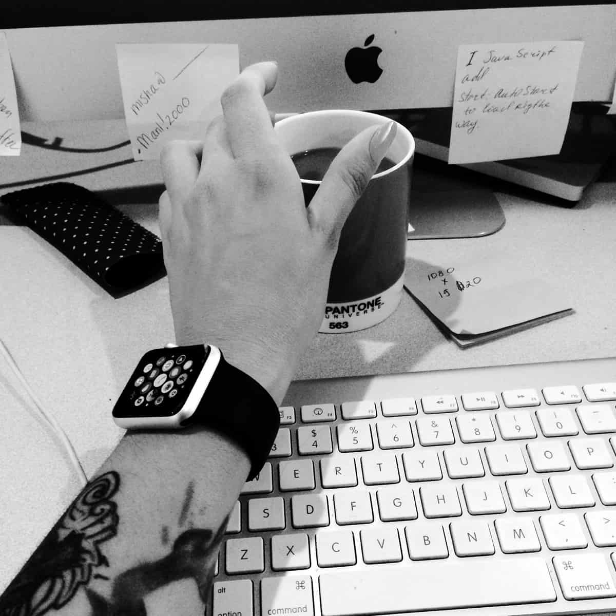
The plethora of smartwatch options from Android and Apple Watch certainly doesn’t constitute the world’s first foray into wearable computing. In fact, wearables have a long history dating back to a 17th century abacus ring. However, we can’t overstate how much the Apple Watch has already changed the way people think about UX design. Designing a user experience for such a small chunk of screen real estate means accommodating some new mobile app design paradigms, from glances to notifications, microgestures, haptic feedback and audio design.
Of course, Apple and Android aren’t the only players when it comes to wearable tech. In the smartwatch space, indie darling Pebble keeps innovating its wristwear offerings, including the potentially game-changing Pebble Core which can free your watch from your smartphone. In the realm of fitness wearables, Fitbit continues to prove how powerful a motivator social platforms and fashion accessories can be when it comes to getting your steps in.
With the evolution of wearable tech, it’s certainly an exciting time to be alive — and to be a fan of mobile app design.
Now: Proto.io Makes It Easier Than Ever to Create Mobile App Prototypes
Innovation in mobile app design can only continue to happen as more and more talent comes together to create great-looking apps. Inspired by the tenacity and creativity of mobile app designers and developers, we created Proto.io out of a deep, abiding love for new, exciting tech.
By making it easier for both veteran designers and entrepreneurs with little to no experience to bring their best mobile app ideas to life, and then showcase those ideas via Spaces, the folks here at Proto.io are working hard to help facilitate the next generation of game-changing mobile app design. From mobile games to wearables, if you can dream it, you can easily prototype it using Proto.io. Sign up for a free 15-day trial of Proto.io today to help build the future of mobile app design.
What do you think are the most important moments in mobile app design? What comes next? Let us know by tweeting us @Protoio!
