When thinking of user experience (UX) design, the image that usually comes to mind is a group of industrial designers gathered around a table bickering over button styles and colors, among other things. While the visual component of UX is no doubt a dominant element over others, UX implies that all sensory elements contribute to the overall experience of the individual with the product. The rise of mobile and wearable devices, like the much coveted Apple Watch, proves once again that UX design is essential to the making of a successful technological product. Wearables are ushering a new series of design considerations to be taken seriously. Taking the Apple Watch as our key example, we look at how UX design is in the midst of a transformation and what designers should bear in mind the next time they start a project that involves wearables.
Size Matters
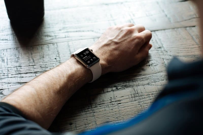
Not a popular phrase that many would like to hear. But when it comes to UX design for wearables, it’s true. Size matters. The overriding aspect of the Apple Watch that has been driving ongoing innovation in UX is its diminutive size. Like all wearables, the Apple Watch is defined by its lack of screen real estate, small form factor, and extensive use of gestures and lightweight interactions. If the Apple Watch reaches the adoption rates of its sibling iPod and iPhone products, it will surely define a generation of wearables.
Because of the size of the screen and the orientation/placement of the product in relation to the user, Apple designers clearly had to break the mold to create a rich, interactive experience. For example, lack of ample screen space means that messaging and display elements must be efficient and clear to understand. Furthermore, as watches in general are designed to be strapped on to one’s wrist and out-of-the-way (as opposed to devices like mobile phones, designed to be viewed front/center and top/down), interactions must be short and fast, as well as easy to dismiss.
The Apple Watch was designed with these considerations in mind, and for UX designers with mobile experiences, working within the constructs of the Watch will require a significant scaling down and condensing of presentation elements. In fact, this is in line with the current work of UX designers, much of which involves ‘trimming the fat’ or focusing the design of a product on the needs of the users while keeping fluff to the minimum.
But when it comes to wearables, who can resist the urge to do cool things with this new technology? Our ideas get bigger and bolder while the actual space to work on becomes much, much smaller. Designers and developers, in general, have to shift their thinking towards a paradigm of “big ideas, small space”. If you’re looking for detailed advice on this, be sure to check out our post on designing UI for wearables.

Micro-gestures and Limited Controls
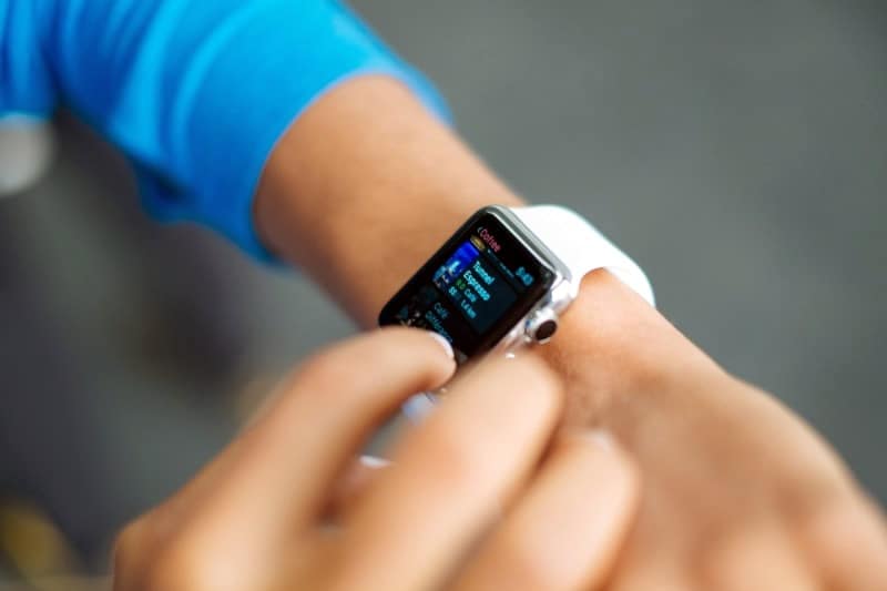
Sensory inputs are also scaled down and limited significantly when a product’s form factor must rest comfortably on a human wrist. For example, a single knob exists on the Apple Watch called the Digital Crown–its purpose is to allow for scrolling content without obstructing the view of the screen. Swipes and taps have also been redefined for a smaller screen, and an additional side button accesses the “Friends” screen quickly. Designers accustomed to the multiple buttons available on most mobile devices will need to adapt their design modalities to accommodate one-button interactions.
The shift from web to mobile has already brought to the forefront the importance of microinteractions. As users ditch their desktop in favor of their mobile devices at an increasing rate, UX designers have had to pioneer an area of research dedicated to studying mobile user behaviour. The rise of the Apple Watch will only further extend the need for such studies and how we can successful apply the insights gained to the field of interaction design.
Glances and Notifications
Again, because of the limited screen real estate, Watch UX concerns mostly deal with making the most out of scarce screen space. Glances–a prominent component of the Apple Watch–allows for viewing critical pieces of information at a “glance” without opening up the app in its entirety.
With a single swipe, users can access any enabled glances; this gives developers a new, albeit limited UX element to take advantage of. UX designers will need to consider how to condense critical pieces of information into modular, smaller pieces. And when it is not feasible to do so, what has to be done in order to relay the relevant information to the user. This requires UX designers to think beyond the scope of ‘one device’ and to anticipate the possibility of simultaneous user interaction across multiple devices.
Adding New Dimensions to Touch
Encapsulating more functionality into the same gestures and movements is critical to making the Apple Watch a truly useful connected device. This is especially true of the device’s new touch capabilities. In a nutshell, the Apple Watch can not only sense touch, but also the force and amount of pressure applied.
For example, the Apple Watch displays the current screen’s menu when pressed firmly. This new “Force Touch” feature effectively gives standard gestures like the classic ‘tap’ new dimensions in a smaller, compact form factor. In contrast to mobile phones interactions, Watch interactions give designers an extra element for refining and capturing user intent. This provides new opportunities as well as risks for designers and developers when it comes to soliciting and capturing mobile user input. How much force is too much force? How little is too little? These are new questions that UX designers must seek answers to in the near future.
In short, much of the Apple Watch’s UX philosophy is about creative approaches to doing more with less. To this end, there’s no doubt that competing products and vendors will follow suit. Arguably, one can’t get much smaller than the Apple Watch in terms of a wearable with a functional screen. It’s clear that Apple’s UX design principles per micro-devices have been meticulously thought out.
For UX designers looking for cues and guidelines in developing the next generation of wearables, starting with the Apple Watch is clearly a safe bet. Take a look at Apple’s human interface guidelines for developing apps for the Apple Watch and pay close attention to the differences as compared to designing for a regular mobile device. Keep in mind the new design considerations we raised above and you’ll be well on your way riding this new wave of UX design for wearable technology.


