Every so often, a mobile UI designer gets to feel like an honest-to-goodness pioneer. It’s hard to believe it’s been eight years since Apple announced the original iPhone, establishing a whole new platform for designers and developers to bring their ideas to life (Google, of course, hit back with the first Android smartphone a year later).
When the iPad came along, bringing with it the tablet trend, it didn’t feel like such a sea change. While designing for tablets and phablets means being aware of different device specs, the key elements of how users interacted with the mobile UI design — by interacting with touchscreens on a flat surface — remained the same. The surface simply grew.
With wearables, the design and development somehow feels more expansive, even as the devices we’re designing for are getting smaller. We’re not just talking smartphones, tablets and phablets (in a sense, one device done three ways). And heck, we’re not even just talking the Apple Watch or Android Wear. The wearable landscape is, as Walt Whitman might say, large and containing multitudes.
The funny part is, wearables aren’t even that new. In fact, they’re not new at all.
Wearable Tech: Old Concept, New Applications
Long before the Apple Watch was announced in 2014, and even before the FitBit craze started in 2009, people were experimenting with wearable computing. Even 17th century China had the abacus ring. Given that the abacus is widely considered to be the first example of a computer, the demand for wearable tech is almost as old as computing itself.
There are a number of things that make a wearable computer attractive. First and foremost, of course, is the convenience. Rather than digging through your pocket, purse or briefcase for a device or — heaven forbid — having to go to the desk to which your device is anchored, you can simply wear it as you would any other garment or accessory.
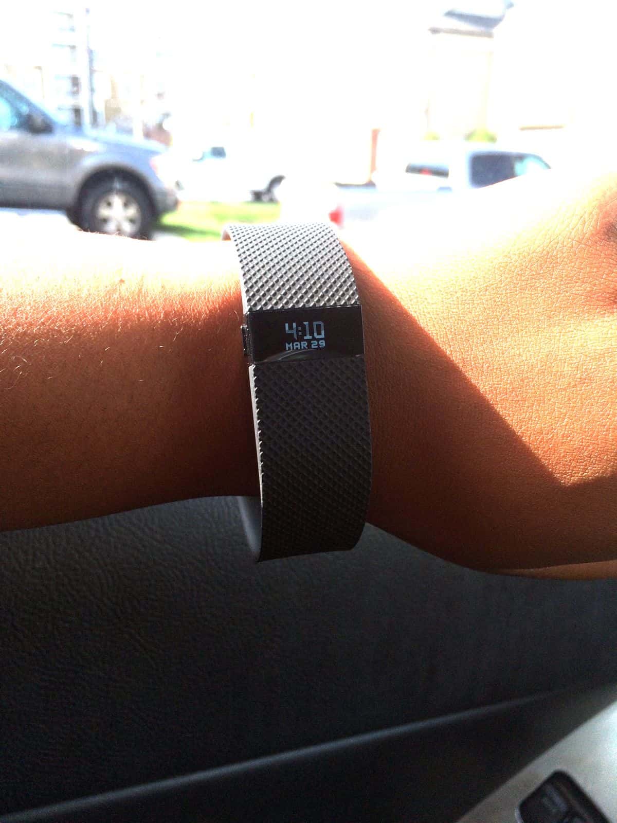
And then, there’s the science fiction, almost transhumanist aspect to wearable technology, the idea that you’re taking the human body and extending what it’s capable of doing. Theoretically, sure, you can count each step you’re taking, but why wouldn’t you simply put on a bracelet that does it automatically (and then plugs the data into charts related to other health markers, like sleep quality and heart rate?).
What Makes Wearable Technology Different?
Before crafting a mobile UI design philosophy for wearables, it’s important to understand what, exactly, a wearable is, and how it differs from your average smart device.
Like designing for the Internet of Things, designing for wearables means you need to think outside of the box a little. You’re not talking about an item users are necessarily holding in their hands — with the Internet of Things, you might be talking about a smart refrigerator that anticipates their cravings or counts their macros, or a thermostat that learns subtle patterns in a homeowner’s climate control preferences.
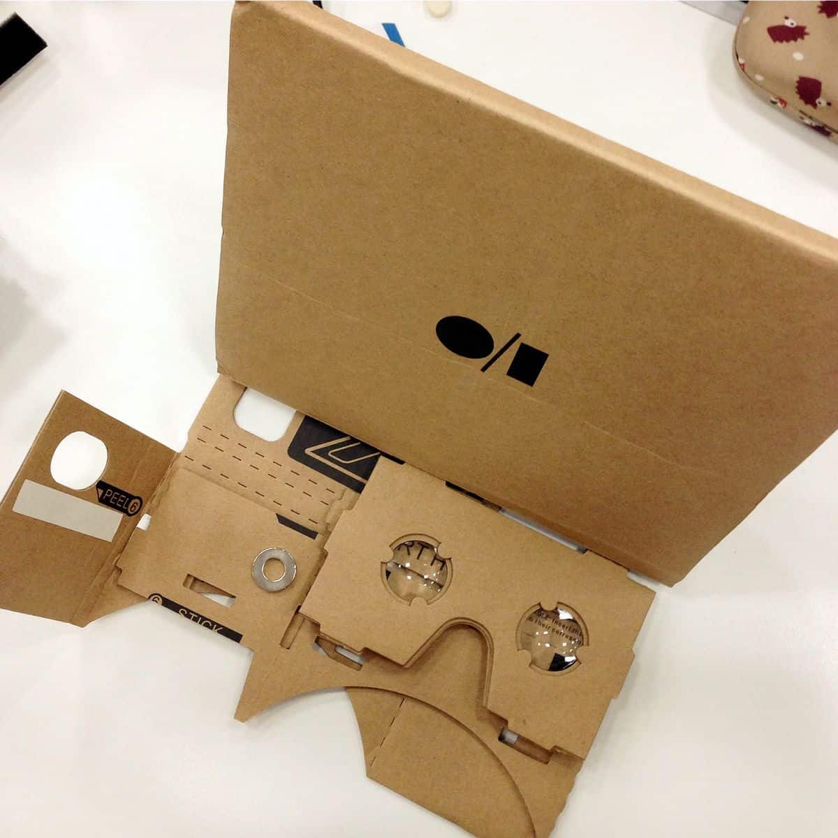
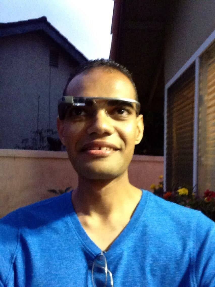
Unlike the Internet of Things, though, wearable smart technology doesn’t live under a roof. It lives on a human, and that’s where things get interesting. Think beyond the smartwatch: a wearable might be a shirt or a pair of shorts that track which muscles are firing when you do a deadlift. It could be the Microsoft Hololens, or the upcoming Google Glass 2 (but wait, you thought Google Glass died? In the immortal words of Monty Python, it got better). Heck, it could even be color-changing high heels.
When it comes to designing wearable technology, or developing for wearable tech, the human body is your canvas. Which brings us to our first mobile UI design tip…
1. Consider the needs of the body part wearing the device.
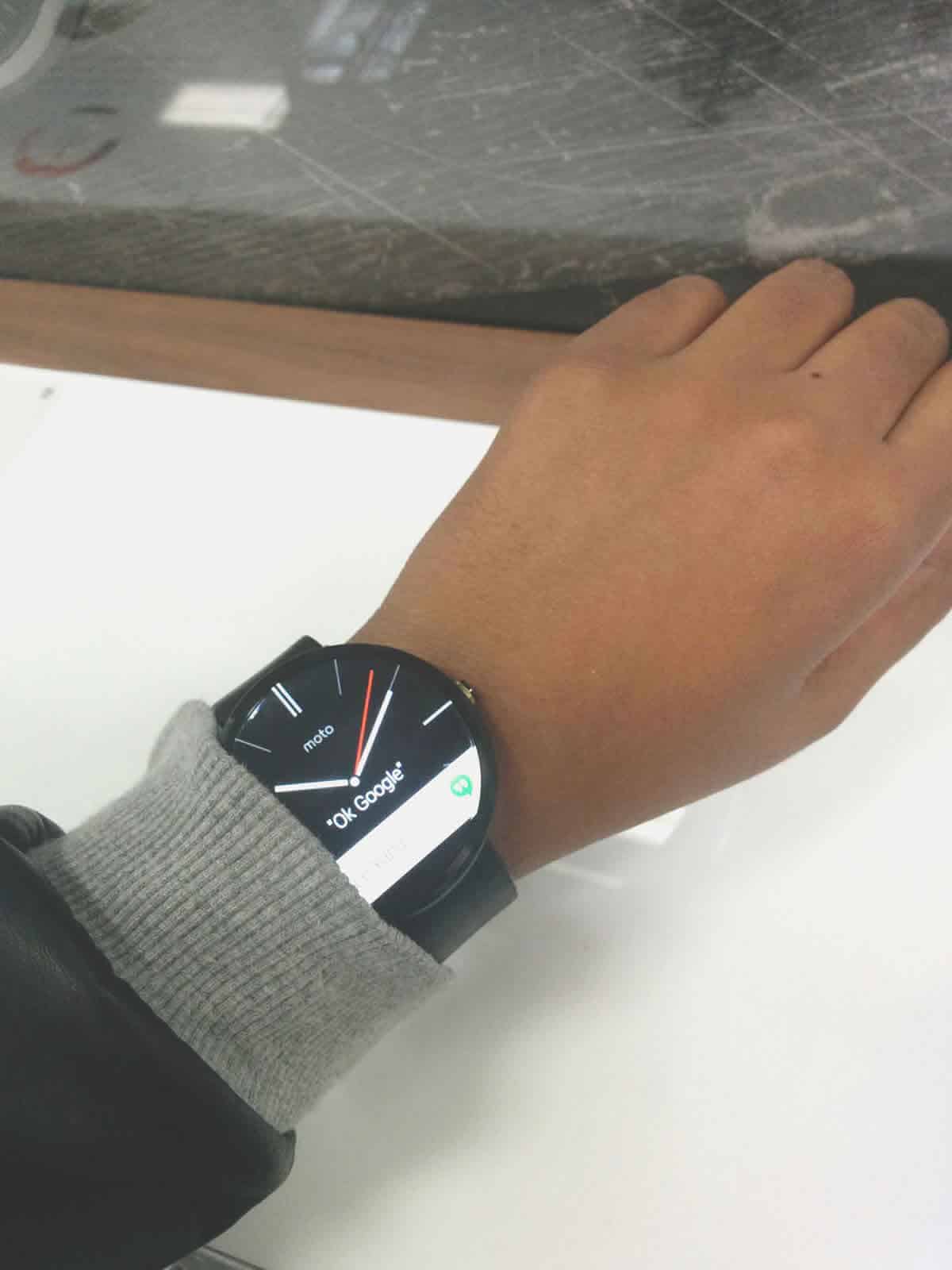
Let’s start with the wearables getting the most talk right now: smart watches. If you’ve never created a mobile UI design for the Apple Watch, chances are that your first try will involve a bit of frustration, constant sizing and resizing and grappling with how much content to include per screen (more on that later). The Apple Watch Human Interface Guidelines specify, for example, that you should only use a maximum two typefaces.
The reason things get cramped really fast is twofold: wrists don’t tend to afford a huge amount of real estate for elaborate mobile UI design, and watches are meant to be glanced at in passing. Most people don’t linger on their Rolex the way they do their iPhone unless they happen to be admiring the craftsmanship.
But a device meant to be worn on the feet would have its own set of needs — the same with a wearable garment, like a smart shirt. If you’re creating a device from scratch, remember that comfort and weight are important factors. For example, consider YONO Fertility Friend, an in-ear device that tracks a woman’s fertility by taking her basal temperature as she sleeps. For the device to be truly comfortable and accurate, it will need to be compatible with multiple sleeping positions, and secure enough that it won’t fall out with a bit of tossing and turning.
But then, what about the mobile UI design implications? Since you’re talking about a device so small it fits in your ear, you need to make sure the smartphone app it integrates with can communicate clearly with the wearable device, as well as with you about the device. What if the in-ear component does fall out in your sleep? Does the app sound an alert? How about an app connected to a wearable fitness device — will you get a push notification if your heart rate climbs dangerously high?
2. Remember that no two bodies are the same.
There’s a reason that the Apple Watch comes in two sizes, and Android Wear devices vary even more widely: people have wildly different wrist sizes. And while it’s tempting to think that the smaller devices are geared more toward women and tailor your mobile UI design thus, remember that a 6’1’’ woman may have a larger wrist than a 5’3’’ man. People, like wearables, contain multitudes.
This is important to remember whether you’re designing the wearable hardware or mobile UI (or both). Accessibility is more important than ever, as you’ll have to consider touch, vision, hearing, movement and other sensations (on a related note, wearables have incredible potential to help those with health problems or disabilities, like this smartwatch that can detect stress levels and seizure activity).
Size, comfort, accessibility. The more people able to wear your wearable and use your mobile UI design, the more successful you’ll be.
3. Wearables aren’t just tech. They’re also fashion. Never forget that.
One of the biggest hurdles wearables face is that they are out in the open. Unlike a slab of black plastic that you can hide in your pocket, a wearable device is something that can’t be hidden. More than that, they shouldn’t be — after all, having to hide a wearable because it’s ugly kind of defeats its whole point in the first place. You need to strike that balance between form and function.
That’s a lesson that Google learned the hard way with the first Google Glass. While the technology was undoubtedly cool, it turns out that not many people want to wear a pair of awkwardly chunky glasses on their face. (We’re hoping they get it right the second time around.)
While this might seem like more of a lesson for hardware designers than those who are trying to craft new apps, the reality is that an ugly app is just as bad as an ugly device. If your app is too distracting — say, maybe the mobile UI design is full of bright colors — or if it doesn’t really “fit” the profile of the device it’s running on, people aren’t exactly going to be rushing out to purchase it.
Remember that people who choose wearables, especially right now, are more likely to be early adopters, as the craze is still somewhat fresh. They’ll want the best of the best, both in terms of features and aesthetics.
4. Bring in the smartphone when it makes sense.
As much as wearables are trying to free users from having to rely on their smartphones, sometimes it’s necessary to redirect a user to their phone. While creating a completely freeing experience is the goal, it’s important to remember that wearables, while fashion statements, are also tools. Tools only really make sense when they are helping you accomplish a task. Once the tool starts to get in the way of the task — or worse, prevents that task from being completed — well, chances are it’s not going to be kept around for very long.
Yes, you should absolutely be trying to think of smart ways to display information to your user, but if it feels like you’re shoving a round peg in a square hole, then it’s probably best to rethink how you’re approaching your goal.
If your app requires the user to input a lot of text, they might be able to do it faster with their thumbs than pecking away with one finger at their wrist. While you might hate the idea of making them pull out their smartphone to fill in that information, forcing them to slow down when they could accomplish the same task faster by using their smartphone won’t exactly make users see your app as something they can’t live without.
5. Make the wearer feel like a superhero.
Technology is supposed to be cool. After all, why do most people like digital assistants? It doesn’t matter if it’s Siri, Cortana, or Google Now — there’s just something awesome about asking your phone a question and having it spit out the answer. While not all of us are billionaires, with a digital assistant, we can all feel a little bit like Tony Stark. If good apps should feel like magic, then wearables should feel like science fiction.

Wearables take this to the next level, giving us “superpowers” that would have seemed impossible just a few years ago. Want to be alerted when you’re approaching your destination? Wearables can do that. Want to be able to see a heads-up display of where you need to go? Wearables can do that, too. A weather app that vibrates your wrist when it’s about to rain? With wearable technology, that’s a possibility.
With that said, a poorly executed mobile UI design, or an ill-fitting device, will completely ruin the immersion that makes the user feel empowered. If you’re constantly tapping at your wrist because the wearable app isn’t sensitive enough to your gestures, you feel less like a superhero and more like an athlete with a bad hip.
6. Polish your wearable prototype.
Before you create an application, you need to build a prototype. In the case of wearables, you may need to build two separate prototypes: a mobile UI design prototype for the app that lives on a smartphone or tablet, and a physical prototype for the part that the user actually wears. This is the perfect time to test the comfort and usability of your app to a group of beta users.
But how find the right solution to prototype your wearable, when there are so many different variables? Sometimes it will take a bit of creativity, if you’re not dealing with a wearable that interacts with a smartphone, or an independently created device. But if you’re working on something that has any sort of standardized specs, like Android Wear, you simply need to ensure your digital prototyping solution is compatible with the medium you’re designing for.
Proto.io is a simple to use prototyping software that makes mobile UI design easy, whether you’re creating an iPad app, an Android game or even a wearable. With support for Android Wear and Apple Watch, Proto.io allows you to create a living, breathing digital prototype of your smartwatch mobile UI design. (Want more? Check out our realistic Apple Watch prototype and our dedicated Android Wear demo page)
While the wearable space is still brand new, full of indie devices and Apple Watches alike, the principles for designing an excellent piece of technology remain constant. Make the device, as well as the mobile UI design, as delightful to use as it is unobtrusive and intuitive, and you’ll have yourself a wearable winner.
What are your experiences designing wearables, or designing for wearables? What would you add to this list? Tweet us @Protoio to let us know — and show us those forward-thinking prototypes!


