One of the best ways to learn how to design apps online without sinking in a lot of costs is by studying the works of talented UI designers. We’ve already rounded up an extensive list of the best places online to find inspiration. To narrow the focus down specifically to mobile app UI design, our monthly Top 10 Mobile App UI series is your one-stop source for great UI design inspiration. We look for the best and the beautiful in recently published and updated apps. If you’re looking to showcase your latest creation on our blog, feel free to reach out to us @protoio. Here are the top 10 apps in UI design of the month, in no particular order:
1. Plane by Darling Dash
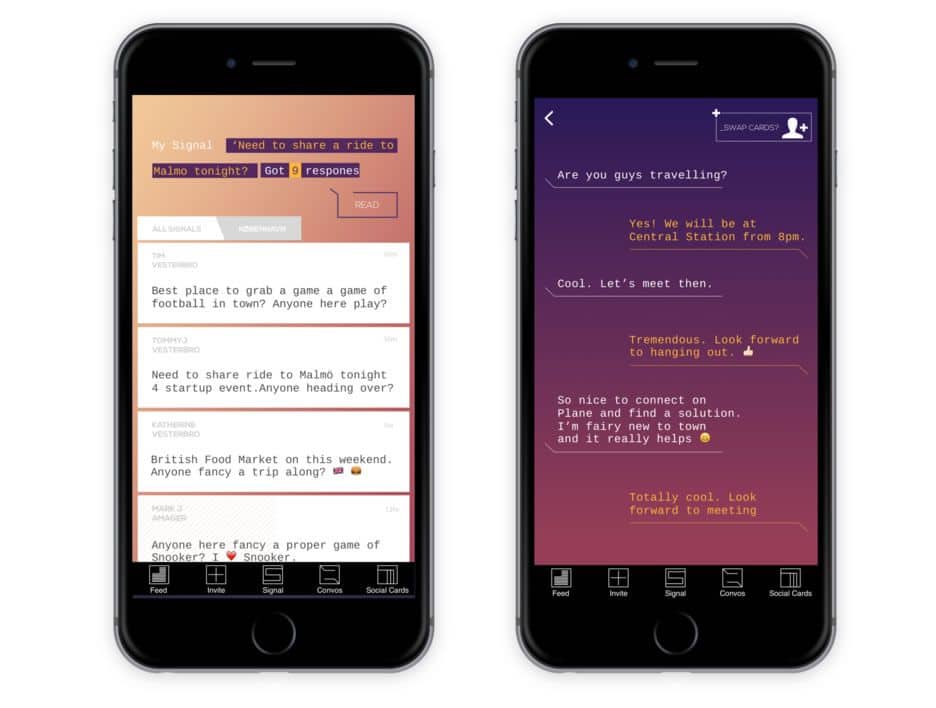
Meeting new people can be hard, especially if you’re new in town or aren’t particularly extroverted. It helps if you already have interests in common and what better way to connect with like-minded people than via the internet? Plane is a social icebreaker app that offers an alternative for people looking to meet new people in new places. Forget swiping or having to filter out the bots and sleazy folks on Tinder. With Plane, you send out a ‘signal’ in your city of choice and people respond with ideas of social activities to do. Given the high competition in this industry, we are yet to see how Plane will make its break. But I love the UI design of Plane app with its beautiful gradients and unique typography. It goes for an edgy, futuristic look that sets it apart from other social networking apps.
2. Great Italian Chefs by Great British Chefs
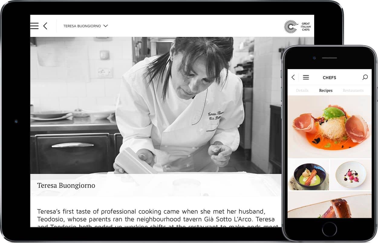
Want to cook like a great Italian chef? Well, there’s an app for that and guess what it’s called? You got it. Great Italian Chefs is a recipe app featuring 26 well-known chefs who represent the regional diversity of Italian cuisine. A clear and elegant typeface, visually balanced layout, and simplicity make up the app’s gorgeous UI design, which is as stunning as the food photography in the app. Honestly, I can’t name a single renowned Italian chef of today. But looking at the mouth-watering pictures in this beautiful app, I’m already convinced that these chefs deserve all the Michelin stars they could get. No doubt, being a great chef requires excellent food presentation skills as well as cooking skills. In that way, chefs and designers are not that different. Great Italian Chefs will inspire you and make you very hungry. So, you’re welcomed and buon appetito!
3. Reddit by Reddit
Love it or hate it, Reddit is a pretty big social news service and it’s only growing bigger, despite its reputation woes. The official Reddit app has long been overdue but is finally here. I’m not a big fan of the Craigslist-style web user interface of Reddit that focuses mainly on content delivery and not at all on UI design. It’s crowded, confusing and more importantly, it makes it almost impossible to discover subreddits. The native apps’ UI design, however, is a fresh change from what we’re used to seeing in the browser. Understandably so, as half of their users browse Reddit on mobile. The navigation is simpler, the content is well-spaced, a visual hierarchy exists and it is aesthetically pleasing to use the app. The native apps make it much easier to browse Reddit, discover new topics and to join in the discussion.
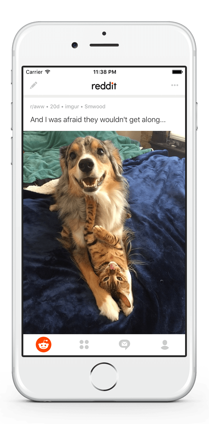
Get Reddit on iOS and Android.
4. Colony FM by Stealthie
The user experience online is not just a visual one. Much as we have worked to silence the web in recent years, we must not forget that sound can still be a very useful design resource. Colony FM is an app that narrates articles and stories published on the web, using the best voices the team could find. They’re now turning the written web into a curated audio library, an endeavour I find particularly exciting. The app’s UI design is also splendid in overall. Although the app focuses on audio content, the way it presents textual content also makes it very readable and pleasing.

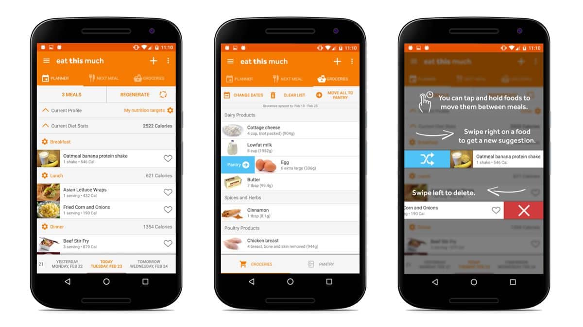
5. Eat This Much by Eat This Much
Diets are not easy, we all know that. It not only requires self-discipline and sheer will, it also needs a great deal of planning. After all, it’s not just a simple matter of calorie counting. You need to research which foods have higher nutritional values and find new recipes that promise tasty and healthy meals. Eat This Much is an app that wants to put your diet planning on autopilot. The app creates personalised meal plans based on your diet goals, preferences and budget. For such a powerful app fully-packed with features, the UI design of Eat This Much has been well thought out to simplify the whole diet process for users. I like the daily overview of meals that is easily noted with a quick glance and the use of images for ingredients instead of icons.
Get Eat This Much on iOS and Android.
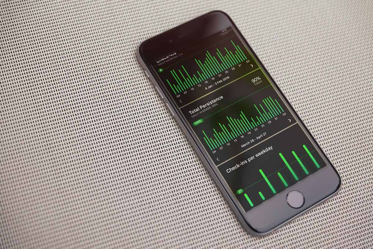
6. Today by Neybox Interactive
Trying to be more productive, healthy and happy? There’s no better to do that than to pick up a few good habits and build up the willpower to stick to them. Today is a fine-looking app that will help you get on track and dash your ways towards a better quality of life. How? With a stunning UI design and great features that were developed for the sole purpose of motivating and inspiring you to achieve your goals. Today offers pretty charts and counters in the form of well-designed cards to view your health data tracked from more than 30 different apps on your device. It also lets you track anything else with custom charts. Combine these cards to create your own unique dashboard. More impressive are the beautiful cover images in the photo gallery. You can add your own photos too. When you’re struggling to finish that final mile, what better way to motivate yourself than with visual reminders of the beauty of life?
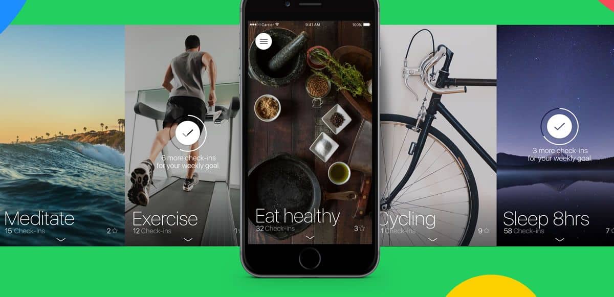
Get Today on iOS.
7. Remente by Remente
There has been a lot of interest lately in self-development. It seems like we’re finally getting it that humans are not just meant to work and that labour is not our sole source of life satisfaction. Modern day professionals want to also focus on themselves and of course, we’re using technology to help us in every way it can. Remente is a personal development app that goes beyond the usual app to increase mindfulness. It’s like having a pocket psychiatrist who is constantly concerned about the various aspects of your mental health. The app also offers articles and courses for mental training and self-improvement. For an app that’s supposed to help reduce your stress and anxiety levels, the UI design certainly produces that very effect. With good use of white space and bright colours, Remente app is a good example of effective flat design.
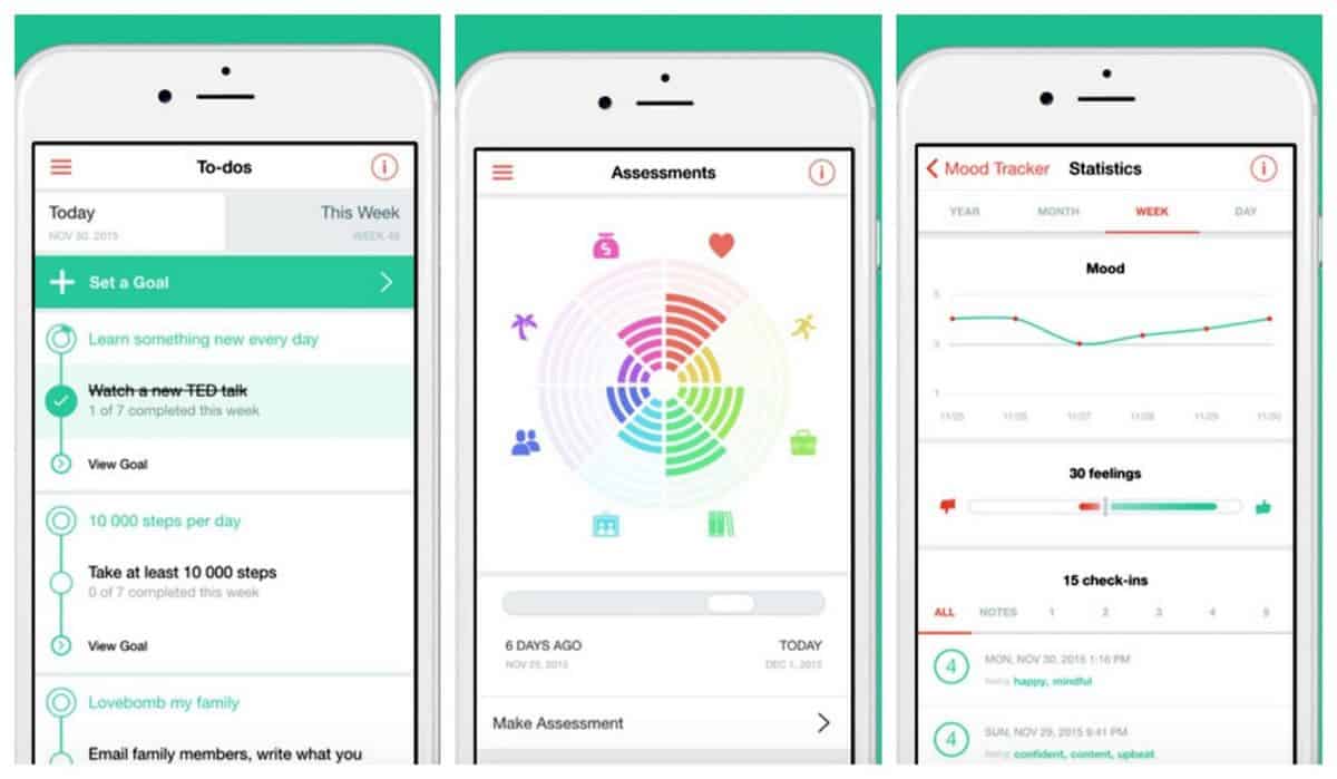
Get Remente on iOS and Android.
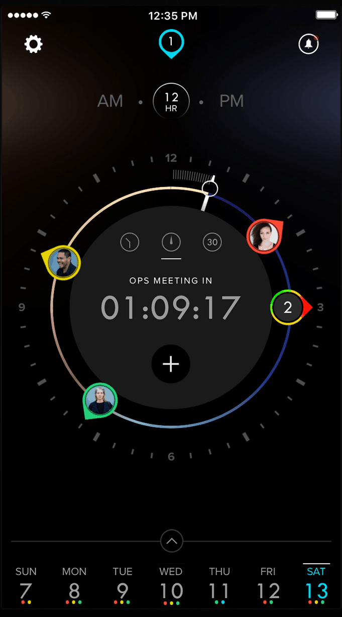
8. Dials Calendar by DayDials
Many of us start off the work day with a glance through our calendars. It becomes the routine way to set our mind into motion. What’s on the agenda? What appointments do we have for the day? All answered with a quick preview of the day ahead. Dials Calendar app offers an alternative to the default calendar view, which usually consists of grids or lists of to-do items. The unique UI design of Dials is a winner, no doubt. Your daily agenda is visualised in the form of a clock, with your appointments and to-dos marked out as icons. In the middle of the clock is a countdown timer to the next item on your agenda. The dark background and playful colours take the usually serious calendar app for a fun spin. Useful? Check. Cool factor? Check. What more could one ask for in a productivity app?
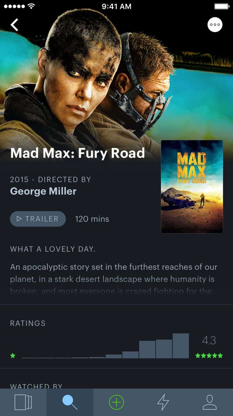
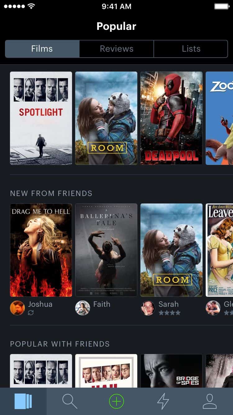
I love watching films, so much that I have a home theatre system setup at my place. However, I do not enjoy the process of finding a good film to watch. Browsing through catalogues online or on Netflix can be so tedious. Trying to figure out which review to trust is another chore altogether. For movie lovers, Letterboxd app can be a real lifesaver. The social network for film discovery has already been around on the web for a while now. Finally, cinephiles can turn to their iPhones to discover new films based on what their friends have enjoyed watching. Letterboxd lets you keep a film diary and build lists of your favourite films that you can share with friends. The UI design of Letterboxd is simple and good-looking, offering you all the information that you might want to know about a film in a clear view.
Get Letterboxd on iOS.
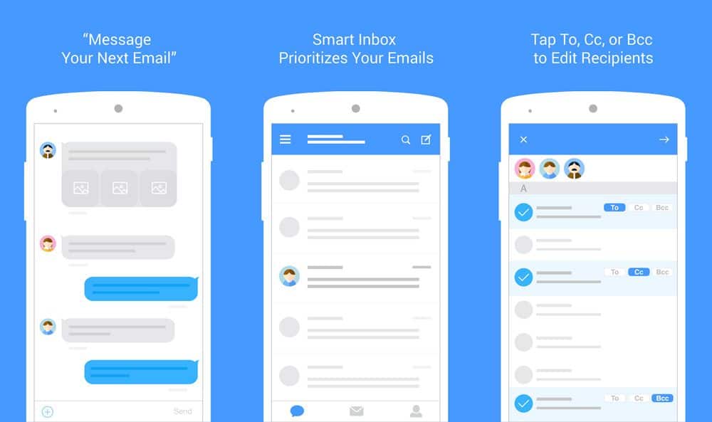
10. MailTime by MailTime
In a world where we’re increasingly relying on bots to replace personal assistants, it’s not too hard to imagine a future in which we hold regular conversations with our devices and apps. Kind of like in that movie “Her” but definitely without the creepy relationship part. MailTime wants to bring that future a little closer to us with their intelligent email-as-a-conversation app. The UI design resembles a messenger app rather than an email app. Instead of spending time sorting through emails, archiving the unwanted ones and possibly skipping over the important ones, MailTime’s smart inbox will filter out the real conversations from the newsletters and automated emails. Email threads become group chats. The app has been designed to help you keep your emails short and sweet. You can even assign tasks to people using the good old ‘@‘ sign made popular by Twitter.