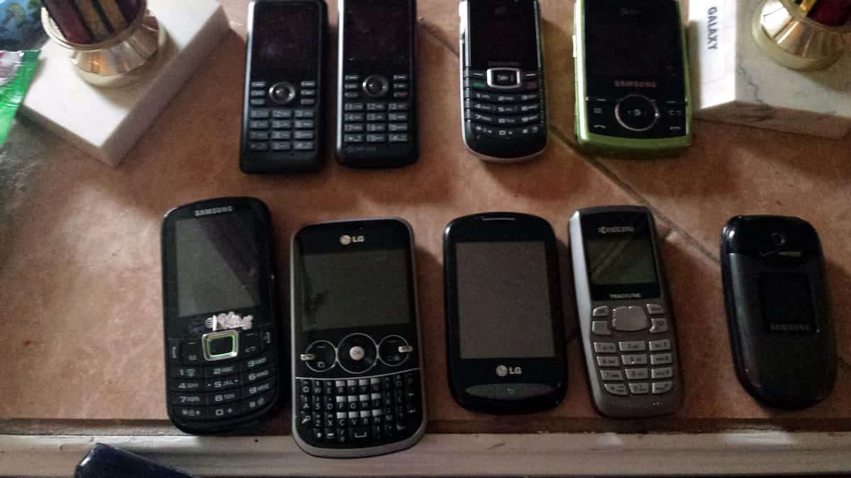
Designers and developers have been building screen-based user interfaces since the 1970s. In the early days of computer-based user experience design, the actual user experience wasn’t prioritized — instead, it was simply about what you could do with a limited amount of processing power and a monochromatic screen. The early UX designers weren’t trying to push beautiful pixels: they were just trying to make everything work.
As time went on, hardware evolved, the design possibilities grew, and the decades that followed featured rapid progress.
From text on a screen, to a fully-functional graphical user interface (GUI), its the job of a UX designer to help people make sense of their technology and what it can do. While in the early era of computing that meant teaching them how to use windows, tabs, and icons, in the contemporary era, it means making the most out of a (relatively) tiny screen and touch gestures.
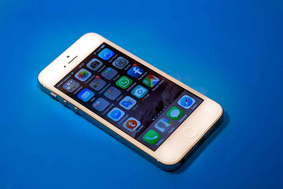
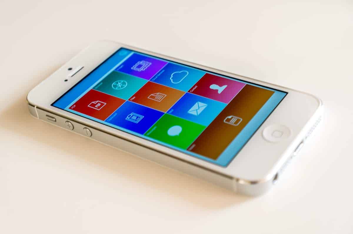
The iPhone was what kickstarted that revolution and fundamentally changed the principles of UX design. Here’s how the iPhone shifted our perspective on UX design and how it’s continued to evolve since then.
The iPhone User Experience Revolution
The use of button-free gesture control is the original iPhone’s best-known innovation, and one of the big reasons the iPhone was so successful. Steve Jobs is famous for his aversion to buttons. This first played out with the Apple mouse design. In 1999, Jobs was looking at a selection of designs for the Apple Pro mouse, and was immediately impressed with the button-free option. In fact, it was actually an unfinished prototype, which didn’t have buttons installed yet, but when Jobs pronounced it “Genius,” the team built the button free Apple Pro mouse.
With the iPhone, what had seemed like a quirk became a crucial principle of design for tablets and smartphones. Users could control everything from the screen, without the dedicated dialing buttons typical of other smartphones at the time. This made the iPhone clean, elegant, and consistent, and changed how users thought of their smartphone. It became less of a phone with extra added gizmos, and more of a multi-functional touch screen device.
This design innovation complemented what Professor Kalle Lyytinen sees as the biggest iPhone innovation: it’s capabilities as a fully-functional computer. Lyytinen points out that the iPhone wasn’t technologically exceptional at the time. It didn’t have the first touchscreen, and wasn’t the leader in memory, camera quality, connection speed or other specs when it came out. What it did have was “a fully capable computer operating system.”
In a similar way that UX design evolved as PCs gained faster processors and more memory, the iPhone suddenly opened up thousands of new possibilities for designers. Not only that, but the added functionality meant that the design had to teach users how to take advantage of their fully-functional computer.
The Evolution of Visual Design
When you’re trying to teach someone how to use something new, it’s best to start with something they know. By emulating “real world” objects and motion, skeuomorphism — the art of recreating and mimicking real objects as the backbone of your UX design — tried to do just that.
Skeuomorphism didn’t start with the iPhone. In fact, in a sense skeuomorphism was one of the first design philosophies applied to a computer. If you’re old enough to remember Windows 3.1 in 1992, the design philosophy was basically skeuomorphic, although crude by modern standards. Your files were in little folders. To print, you clicked on a little picture of a printer. When you wanted to delete something, you would drag it into a trash can. And folders could be opened on top of each other, as if they were stacked on a desktop.
As technology evolved, it started to feature more realistic images, more fluid interactions, richer textures and details. Consumers were wowed as UX design got ever more vivid and lifelike.
Unfortunately, UX designers arguably started to take it too far and as technology evolved, what was once charming soon became corny. When the technology was more primitive, making things as lifelike as possible was an obvious and intuitive choice. But at a certain point, it started to become cartoonish. Was there any reason this logo had to be shiny and three-dimensional? Did it enhance the user experience to tap a photo-realistic button and watch it depress in three dimensions, when the user knew they were actually tapping a flat screen?
Microsoft was the first company to rebel against skeuomorphism with Metro UI. Unlike previous skeuomorphic designs, Metro was flat and functional, putting usability over all else. It was bold, simple, and easy to navigate. Unfortunately, Microsoft wasn’t exactly a leader in the mobile phone market, and while Metro was praised, it didn’t catch on.
While Microsoft didn’t achieve market penetration, they did serve as a harbinger of a movement away from skeuomorphism to something a little less, well, literal. That movement became known as material design.
This UX design philosophy, championed by Google, was built around recognizing the design language as a metaphor. Edges, shadows and textures are drawn from life, but the goal isn’t realism in itself. The goal, as Google puts it, is to “create a visual language that synthesizes classic principles of good design with the innovation and possibility of technology and science.”
In one sense, material design is kind of doing what computer design has strived to do all along: use the user’s understanding of how objects behave in the physical world to create something more powerful and flexible than physical reality.
Responsive Design Principles Have Unified User Experience
When you could be reasonably sure that most of your users were using your UI on a desktop computer, designing for them was relatively easy. Now they might be on their desktop, or a laptop, or a tablet, or a smartphone. They might be pinching, zooming, or simply leaning their body forward. They might have a mouse and a keyboard, or just their thumbs. Or both. A UX designer has to make sense of all of that and make it look good across every platform.
Responsive design hasn’t completely solved these challenges, but it has made a lot of progress, and changed the way companies think about UX design. With responsive design, an app or a website is divided up into elements which react to the size and configuration of the device. A menu can widen out across the desktop screen, giving users more choice, then shrink to essential navigational elements on a smartphone. Big, bold horizontal graphics can stack on top of each other in portrait mode.
Responsive design has been driving us towards a unification of user experience across devices and modes. Many companies now go to great pains to ensure that their browser-based UX has the exact workflow and feel as their app does. As mobile apps have overtaken laptops and desktops as the predominant way users access software and the web, a mobile-first aesthetic has come to dominate both web design and software development.
However, responsive design has created its own problems. Different devices display uniquely, and something that’s intuitive and pleasant on your Apple tablet might be awkward and unwieldy on your Android device, or vice versa.
Try as you might, sometimes it just won’t be possible to make everything play nice together. This is compounded by the fact that new phones and tablets are always making their way to the market, which means getting your design to work on new resolutions that you couldn’t foresee.
Data-Based Design
Modern UX design poses challenges that would have been unthinkable a generation ago. Designers need to make complex user interactions clear and intuitive on a screen that can fit in your pocket, while also providing a similar experience on much larger devices. They need to make tasks that formerly demanded a 17” screen, keyboard and mouse accessible with a 4” screen and a thumb. They need to pack in enough functionality to make an app interesting and useful, while keeping everything simple and intuitive. And they need to do it for ever more demanding users, with a greater and greater range of options.
A good eye for design used to be enough. Now, it’s necessary, but not sufficient. Companies are increasingly moving to data-based design, relying on user testing to ensure they get all the details right.
Many companies are starting to employ user testing to address issues like flow, accessibility and user design preferences. Modern mobile app prototyping allows you to rapidly build a fully functional mockup of your app, and affordably test it across a full range of devices. You can trial multiple versions simultaneously, or get user feedback and suggestions, make changes and retest, all without the time and expense of programming and reprogramming the app.
However, many companies are still pretty primitive in the way they do UX design testing. In some case, they don’t watch users to learn how they’re actually interacting with the software, so all they get is self-reported data.
This data can still be useful for learning about user preferences, but it won’t necessarily catch user experience issues, such as button presses that fail to trigger functions consistently, or poor flow.
Other companies do test with user screen sharing, but don’t adequately factor in the user environment. For example, users may be testing the app prototype sitting down at a desk, but are more likely to use the actual finished app while walking around. This can lead to developers thinking their UX design principles are sound, when they actually are flawed.
Additionally, untrained testers can draw the wrong conclusions from user data, particularly around issues like usability testing. For example, testers recording user preferences may assume the apps users prefer are the easiest to use, but that’s not always the case.
For UX designers and product managers, learning how to more effectively integrate testing and other data sources into design decisions could be a major step in improving the user experience. They can start to get a very fine-grained view of how various app design decisions affect the user, from layout, to flow, to color to the precise size of buttons.
In fact, usability testing has already driven a refinement in UX design principles from the top down. Companies like Apple and Google carry out lots of testing, and use their findings to create their own style guides, both for in-house work and apps carried in their store.
The way menus are organized, the gestures that activate each function, the layout of apps and even the way developers use color palettes has become much more standardized. Even business apps are being composed around strict style guides to ensure consistent flow within the organization.

Proto.io Gives All Developers Access to Powerful UX Design Tools
In the past, data-based design was limited to big companies — small developers had to jump through hoops to get their hands on the same data. If you wanted to know how users were responding to certain UX elements, or how they were moving through your app, you had to do a lot of difficult ground work and often, that was simply out of the question.
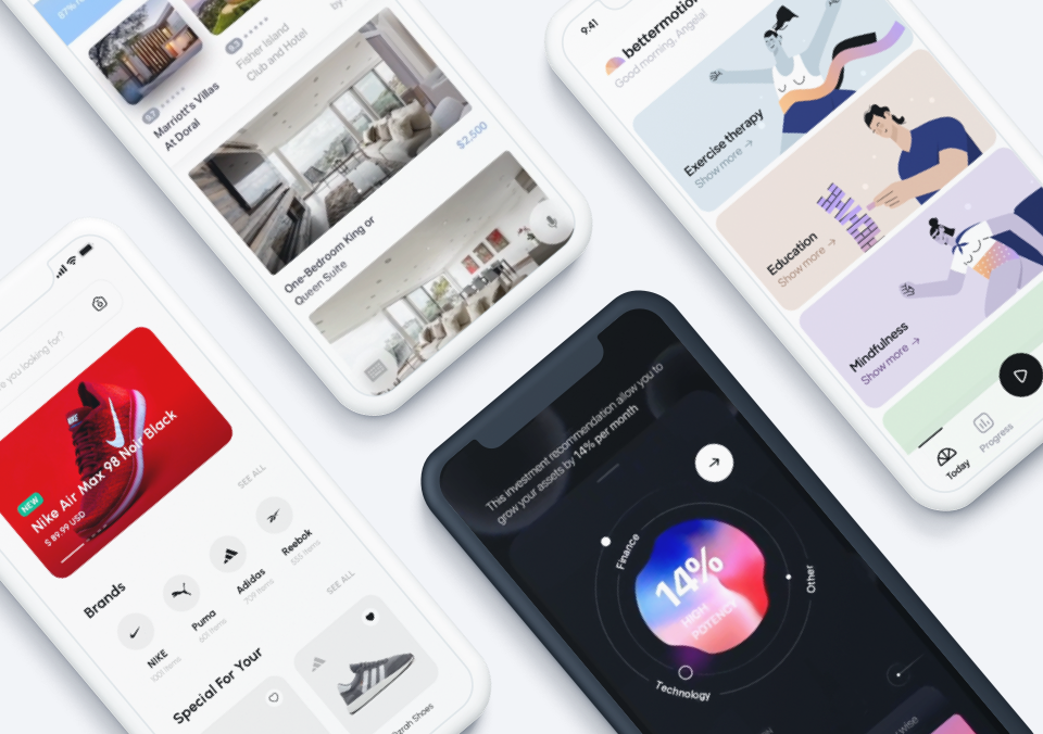
With Proto.io, that’s no longer the case. Anyone can easily prototype and test their app using Proto.io. You can even record how users move through your prototype, giving you access to the same data that big development houses use to create and refine their apps.
Of course, all the data and A/B testing in the world won’t magically manifest the perfect UI in front of you. At the end of the day, it’s up to you to create a design that is both beautiful and natural for your users to move through.
Proto.io lets anyone build mobile app prototypes that feel real. No coding or design skills required. Bring your ideas to life quickly! Sign up for a free 15-day trial of Proto.io today and get started on your next mobile app design.
What’s the most important change in design principles in the last ten years? Let us know by tweeting us @Protoio!