Have you come up with a brilliant app idea, but don’t know the difference between a font and a typeface, or think a hamburger menu is something you only see at a drive-through? Even entrepreneurs with little to no experience can create great apps with the right team and tools, but it doesn’t hurt to know your way around a wireframe.
Whether you’re new to mobile UI design, thinking about dipping your toes into app creation or just a curious user with a few great ideas, this guide will help get you on the right track when it comes to making your app look good — and, more importantly, feel good in a user’s hand.
Basic Principles of Mobile App Visual Design
One of the most common visual design mistakes beginner designers and entrepreneurs make is assuming that a mobile app is just a smaller version of a desktop app or website experience, with all of the same content, features, functionality and user interface elements. If this is a habit you fall into, now’s the time to abandon it and never look back. Mobile app UI design is its own distinct animal, and the constraints of devices, operating systems and user behavior dictate a much different experience than what would be appropriate on a larger computer.
Even if you have experience designing for other media and already have a knack for telling apart great visual design, designing apps for tablets and smartphones requires that you know at least a few things about the technology you’re working with. Screen size is an obvious parameter to look out for, but so are the speed and battery life of the actual device.
Additionally, Apple and Android both have their own design philosophies and recommendations for apps running on their respective operating systems. Following those guidelines helps your users feel a sense of continuity and competence when using your app — after all, they’re using other apps throughout the course of the day.
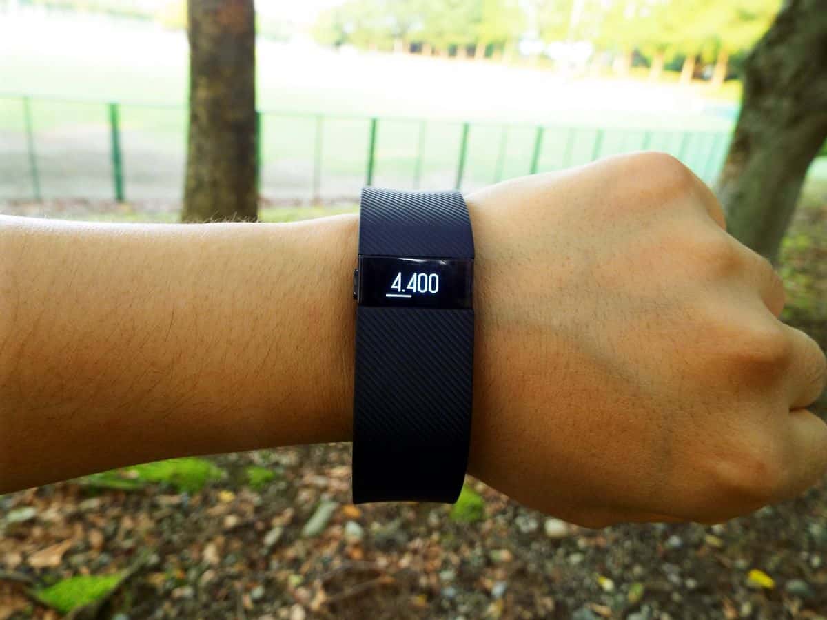
The same thing goes when you’re designing for wearables. The FitBit Flex or Charge, for instance, only have a skinny black strip in which to display their UI. How do they fit information like step count, floors climbed, calories burned and even the date and time into such a small space? And better yet, how do they make it so usable and good-looking?
By acknowledging the limitations of the space, prioritizing what the user needs to know and when (and, crucially, allowing users to change the order of screens to suit their own needs and priorities), and using simple, easy-to-recognize icons. There’s a reason everyone and their mother (and even the President of the United States!) seems to have a FitBit these days, and good visual design is part of it.
Don’t Overwhelm the Screen
Let’s get the obvious out of the way: mobile apps don’t give you a ton of screen real estate to work with, even in the age of phablets. One of the most important aspects of nailing mobile visual design is deciding what really needs to be on the screen at a given time.
Sounds simple, right? Well, once you start digging into it, it’s not always completely cut and dry. You might have an idea in your head of what you want the login screen to look like, but once you create a digital prototype, you might find that you can’t fit all the forms you originally wanted to (or you can, but it looks terrible and feels even worse). Alternatively, you might find that the elegantly simple login screen you had in mind is completely unintuitive to a user, who needs more guidance.
So how do you decide what goes where? Much of it comes with practice, user testing and getting a feel for what other apps get right, but there are some general guidelines to follow.
Don’t Overwhelm the User
When users first open your app, how will they know what to do? Is the experience intuitive? If not, how will you show your users around the various features and functionalities of your app?
Two important ways to ensure you’re hitting the sweet spot are setting a focal point and establishing a visual hierarchy.
As we’ve written before, prioritizing your screen such that some elements draw more focus than others is just good visual design regardless of the medium — this isn’t unique to mobile app UI. However, your UI will fail without a clear, solid hierarchy, and the limitations in space make it especially important that your focal point is easy to discern. This hierarchy helps your user know what to look at and what to do when interacting with your app.
When approaching visual design, take everything you want to include on an app screen and decide what’s most important for the user to look at. That element — whether it’s a photo, a bit of text, an input field or a button — should dominate your screen in terms of space and visual distinctiveness. Then, establish a hierarchy for everything else that will occupy the screen at that time.
Let’s use the login screen as an example again. The most important aspects of this screen are the fields in which the users will enter their names and passwords. If these fields are too small, or hidden in the corner, they’ll not only be harder for the user to spot, but they’ll also be harder to interact with (nobody likes to have to zoom in to type).
Gestures and Feedback
Wait — weren’t we talking about visual design, as in what the user actually sees? So what do gestures and feedback have to do with that? One of the peculiarities about visual design for mobile devices is that you’re not talking about a purely visual experience. What the user sees has to make sense with what the user is feeling, since your users will be touching your app to interact with it. You can’t divorce sight from touch when approaching your mobile UI.
For example, there are a few ways to tell a user that a button is a button. You may use shadows or other three-dimensional clues to show that it is an element the user should press or swipe, or animate it in such a way that the user knows to interact with it (and how to interact with it!).
But even the way the button moves might rely on what the user does. For example, if the user doesn’t swipe fully across the screen, the button may move a bit to the side before returning to its original position, waiting for a more confident gesture from the user. Or, if the button has to be pressed and held, it might return some haptic feedback indicating to the user when it’s okay to release. All of this factors into how you design and animate your UI elements.
If that all sounds complicated, imagine how it feels to a user who has never even heard of your app, much less seen the sketches and whiteboards in your office. This is why user onboarding is important — you might use arrows, instructional text and other visual clues to alert your users to the actions they need to take. Making these cues look good and feel intuitive is another important factor to take into consideration when approaching visual design for your mobile app.
Typography 101
There are a lot of fonts and typefaces out there. It’s not necessary to know every single one, or even most of what’s out there. The good news is that for most mobile apps, you only need to know a handful, because popular fonts are popular for a reason: a large number of people find them good-looking and readable.
You’re probably familiar, for example, with Helvetica (and if you would like a quick crash course in typography, you might want to check out the surprisingly entertaining documentary on Helvetica). From mobile UIs to train stations to brand logos, Helvetica has a near-universal appeal (though, like The Beatles or chocolate, everything has at least a few vocal detractors). And there’s a reason for that: it’s a simple, readable and pleasing-looking font.
Some fonts have been designed specifically with mobile in mind. For example, Microsoft’s Segoe UI was designed to be highly readable on device screens, even at small sizes. Similarly, Google developed Roboto for Android, and Apple uses San Francisco UI. Each OS has its own recommendations and guidelines when it comes to typography, but most can be boiled down to the same basic principles:
-
Keep it readable.
There are endless fonts out there to choose from, and some are very flashy and exciting looking. At the end of the day, though, the thing that matters most is how easy it is to read the text. It’s better to pick a simple sans serif font that doesn’t make you squint than a font that looks beautiful, but makes your users work for it. (And remember: good visual design is accessible visual design, and many of your users may have difficulties with eyesight. Make your UI as easy on the eyes as possible.)
-
Stick to one or two fonts.
This is sort of a corollary to “keep it readable.” There really is no need, from a mobile UI perspective, to use several different typefaces in your visual design — and it can often hurt readability. One font is fine, or two if you feel it’s absolutely necessary. To establish hierarchy using your typography, you should rely on different font sizes, weights and styles, not multiple typefaces.
-
Don’t reinvent the wheel.
Typography is a topic we could write books about, and there are plenty of people who devote their lives to the subject. Luckily, you don’t have to be one of them (unless you really want to!). If you’re just starting out, take a look at the fonts that similar apps are using, or use the specific typefaces the OS guidelines recommend. While that may sound like a less creative way to approach visual design, using SF-UI for an iOS app or Roboto for an Android app gives your user a more continuous mobile device experience, and guarantees that your app will be readable.
Color Theory for Mobile App UI Designers
Even more numerous than typefaces are colors. With so many infinite possibilities, it’s easy to come up with a color scheme for your mobile app that’s, well, less than extraordinary. Let’s face it: unless you’ve studied visual design or just have a knack for it, you can end up with a mobile UI that resembles some of the worse wardrobe decisions your parents made in the seventies (seriously, who told your dad that a mustard yellow leisure suit was a good idea, especially with powder blue platforms?).
As with typography, the OS you’re designing for probably has its own guidelines as to what you should look for in a color scheme. Regardless of the OS, though, a few recommendations are universal:
-
Limit your palette to two to four colors.
Your mobile app UI isn’t the time to show off your love of Lisa Frank. As with fonts, less is more when it comes to choosing a color scheme for your app. Too many colors and shades complicates your visual design, making it more difficult for users to find their way around your app and know what they should be interacting with.
-
Designate primary and accent colors, and use them appropriately.
You should use color in a way that tells users what’s going on, or what they should do. For example, elements the user needs to interact with (like menus or buttons) might be a different color — and that color might change once the user taps or swipes the element.
For each palette, you’ll choose a primary color or set of primary colors for the non-interactive elements of your UI, as well as an accent color to show interactivity. To put this into perspective, you shouldn’t use your accent color for blocks of text the user simply scrolls through or static illustrations, and you shouldn’t use your primary colors on buttons. If you use primary and accent colors consistently, your users will be able to navigate your app more intuitively.
-
Use color to make your design more readable, and choose colors that play well together.
There are a few factors that go into whether your colors will work well together in a scheme. One of the biggest things to consider is contrast: bright yellow won’t be very visible on top of lime green, for instance. However, just because two colors or shades contrast each other well doesn’t mean they’ll work well together. That bright yellow will also appear to “vibrate” if it’s on top of, or next to, a royal blue shade.
Why this happens could fill its own blog post, but to get you started with picking a color palette, try looking at the palettes Google and Apple specifically recommend in their respective visual design guidelines. Again, they’ve already done a lot of the work for you in terms of making visually pleasing decisions for your interface, so you can focus on providing the features and functionality your users want.
One more note: your color scheme makes a big difference when it comes to accessibility. When you run quality assurance on your mobile app UI, one thing you should test for is whether the app will be usable for those with color blindness (who may, for example, have problems discerning between red and green). One way you can make your app more accessible is to allow your users to choose from a selection of custom color palettes, so that their personal app experience is tailored to their visual needs and preferences.
Use a Mobile App Prototype to Test Your Visual Design Chops
Learning how to implement visual design effectively in mobile app UI is a gradual process, but one of the best ways to test out your aesthetic ideas is to create a digital prototype of your app.
With a mobile design prototype, you can quickly A/B test different aspects of your visual design, from fonts to colors to types of navigation. Not only can you test the app yourself, making adjustments as needed, but you can ask friends, family, colleagues and beta testers to give their feedback. After all, you can impress a room full of artists with a stunning design, but the opinions that matter most are those of your users.
If you’re feeling the creative bug set in, sign up for a free 15-day trial of Proto.io and get prototyping! Proto.io makes it easy to swap out and test different elements of your UI to perfect your visual design, even if you have no experience at all! Try it today to see how easy it is to create a living, breathing digital prototype of your mobile app idea.
