The way many non-designers feel about design is quite similar to the way I feel about wine. Now, I know absolutely nothing about wine, except that there are good wines and bad wines. I couldn’t tell the difference between a $300 Malbec from the mysterious valleys of the Andean region or a decent bottle bought at the store for $30. But I can tell you for sure when the wine is so terrible that I wouldn’t drink it even if you paid me.

The same goes for design. Anyone who’s not trained to critique usually winds up saying “Oh, that looks nice.” or, “No. Just no.” Or they might inevitably comment on the colors. Design, like wine, has a lot to do with tastes, preferences, and sensorial perception, all of which are highly subjective.
So what if you’re trying to tell apart great visual design? How do you know what to look out for? How to critique? Fortunately, there are certain fundamental principles to creating great visual design. In essence, you must know that design is so much more than just the aesthetic pleasure that it can invoke. We share 5 ways to help non-designers tell apart great visual design from the ones that merely suffice.
1. There is a focal point.
Great visual design is, in so many ways, like a captivating story. Think of it as Game of Thrones, which is extremely complex, yet you get it. Part of this is due to the overarching narrative that creates a focal point to the story. That is, “winter is coming and all men must die”.
Meanwhile, as this grand trajectory is progressively unfolding, there are multiple important stories that lend weight to the main narrative. Even though characters get killed off ever so regularly and they have physical appearances and names that are way too similar for my liking, there are still key characters you pay great attention to due to the emphasis placed on them. Such as… Platinum Blonde with Dragons, Philandering Dwarf Guy, etc.
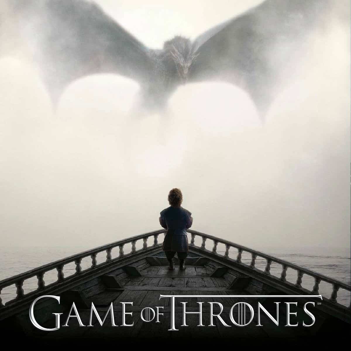
Source: HBO
Great visual design works very much in the same way. There is always a focal point that grabs your attention. You’re meant to remember it even if you don’t remember anything else along the way. Focal points are distinguished by their visual dominance.
You can discern a dominant element by its visual weight. That means that it’s the first to catch your eye. Visual weight can be created by manipulating an element’s shape, size, color, depth, texture, density, saturation, orientation, and the white space around.
When looking at a fresh new design to review, look for the Daenerys Targaryen in the design – the one thing that pops up. Observe how different details lend to its heavier visual weight. Determine if it deserves to dominate on a communicational level. If your users were to walk away from your product with only one image in mind, would that be it?
2. There is visual hierarchy.
Having established that great visual design is about communicating important details, it comes as no surprise that there should be a hierarchy. Visual hierarchy is about the ranking of importance of design elements. In order to achieve visual hierarchy, some elements need to dominate over others that in turn dominate over others until there’s nothing left to dominate.
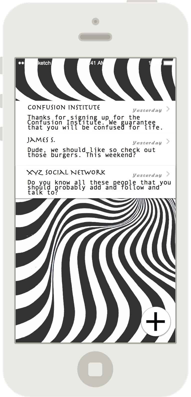
For example, let’s look at these two examples of a mobile app screen.
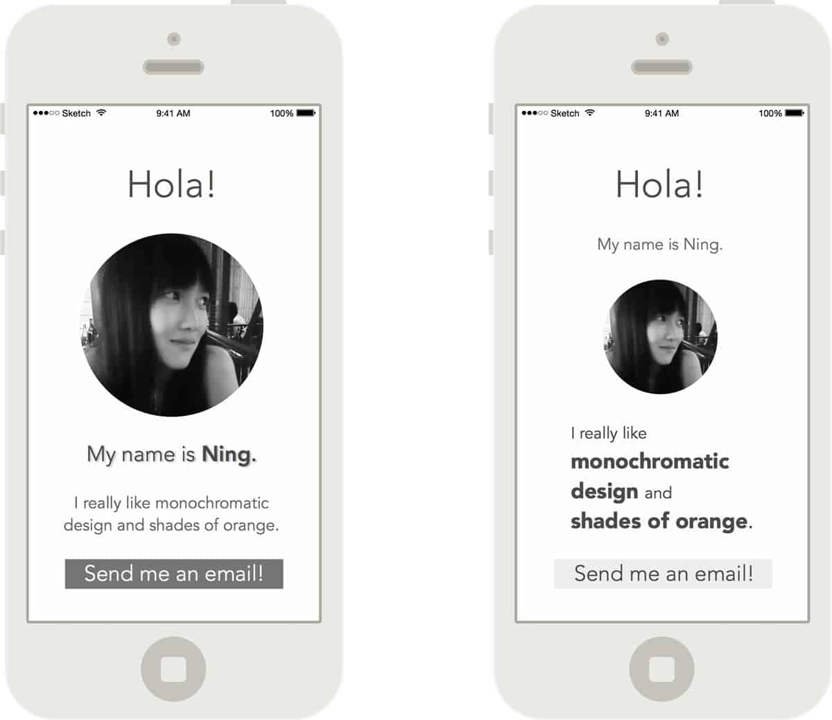
Just by looking at the design, you know how the content flows. You can tell where to begin and where to go next. You know how to make sense of it with a mere glance.
The screen on the left places much heavier emphasis on my profile picture and is likely to be a dating app. Unlike the screen on the right that resembles a social networking app for designers as the dominating elements contain information of my design preferences. How the screens have been designed already tells you all that.
Great visual design makes use of hierarchy to provide context. It guides your attention to make sense of the design by tapping into how you naturally perceive and comprehend the world around you. In this sense, we perceive visual hierarchy, we even recognize it, but we do not necessarily observe it.
Telling apart great visual design means teaching yourself to keenly observe for visual hierarchy. When reviewing a design, take a step back and scan through it. Bear in mind the following questions:
- What elements pop out to you?
- Are those elements important enough to be dominant?
- Are they too many?
- What comes next? And after?
- Can you quickly make a summary of what the design is communicating?
- Does it make sense, or does it feel more like a visit to the optometrist?
3. It makes you feel the appropriate emotions.
Emotion plays a big role in design. How a design provokes certain feelings in us, how it affects our mood, could mean the difference between a consumer and an advocate. How appropriate the feelings we have towards a product sets apart great visual design from the mediocre.
Look at this website example of a hypothetical company, Active Cats.
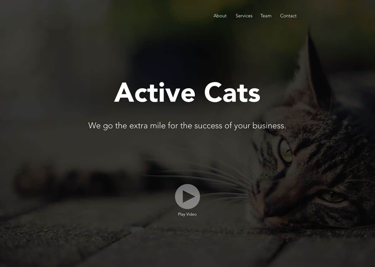
The design is mostly dominated by the background image of a sluggish cat lying on the ground. Even though they claim to go the extra mile for the success of my business, the overall mood of the design doesn’t give me a lot of confidence. I feel kind of relaxed when looking at this website. Also kind of fuzzy on the inside due to my fondness of cats. But certainly not at all a strong urge to go another mile for my business.
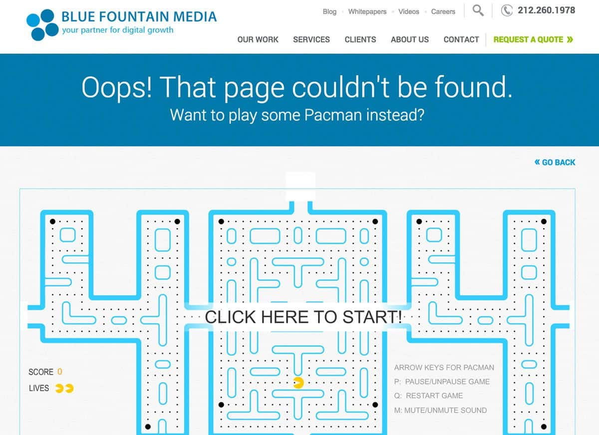
This other example from Blue Fountain Media shows the possibility of turning potentially negative emotions to positive ones. What is a typical reaction to 404 error pages? Something along the lines of “%&/%#∞÷!” isn’t unheard of. It’s an error and it’s frustrating. This creative 404 page transforms a mistake into a potential fun experience with the website.
Design is emotional. There’s no denying it. And emotions play a very important role in determining the success of a product. When reviewing, zone in on how a design as a whole makes you feel. Go through the different sections and imagine yourself using the design. Focus on your sentiments rather than your thought processes to evaluate. Ask a few people to look at the design and to ‘feel’ it in the same way.
4. It’s not a Pablo Picasso painting.
It is befitting to state, once and for all, that design is not art. No offense intended to Pablo. The roots of design can indeed be found in art. But if a design makes you feel like you’re trying to interpret a Pablo Picasso painting, the design has failed.
Great visual design is understood, not interpreted. It solves problems, not trigger polemic as art often does. Design addresses a certain problem, under a certain circumstance, with a certain solution. So if you’re looking at a design the same way that you’d attempt to decipher masterpieces at the Louvre, it’s time to rethink.
Review how well the elements within the design are differentiated and if it’s done so in a way that is easily understood.
- Is there a good use of white space?
- Or does it seem a tad cluttered?
- Is it well balanced?
- Is it symmetrical?
- Or if it makes use of asymmetrical design, does it become distracting or confusing?
- How consistent is the design?
Don’t be afraid to say outright to your designer, “I don’t understand this.” A great designer will always care more about how a design works and not just how it looks and feels.
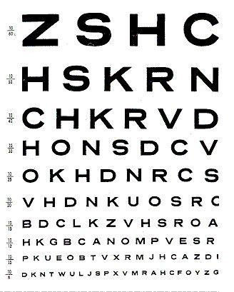
5. It doesn’t hurt your eyes.
How would you react to these images?
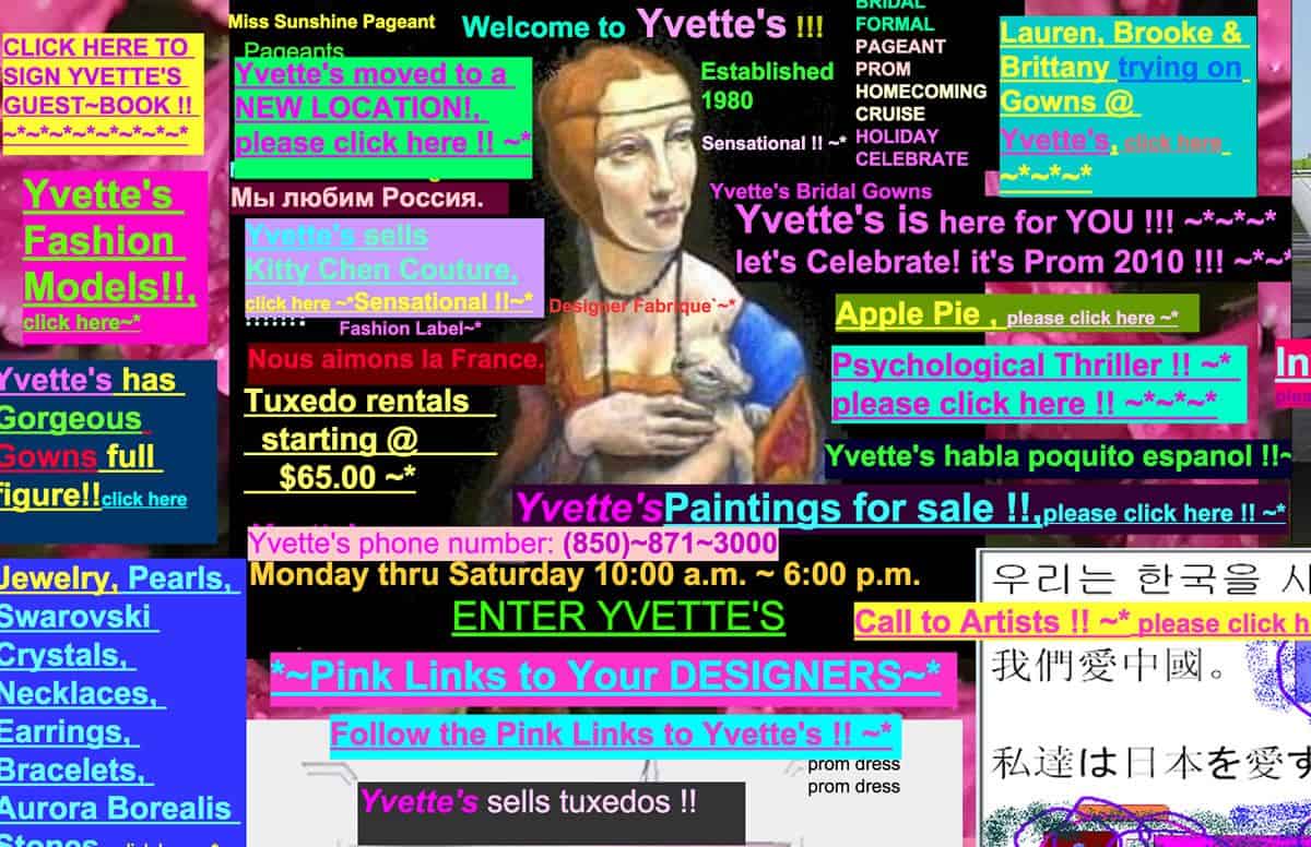
Source: Yvette’s Bridal
If you’ve yet to close the browser, please don’t as this is the end of vision-damaging images. The point I try to make is that great visual design, on top of being easily understood and effective in communication, is also aesthetically pleasing. It doesn’t hurt your eyes or make you want to scream.
While the above examples are only for illustrative purposes, it’s good to bear in mind that the subtle differences between one combination of color + typeface and another can be a game changer. Designers usually use colors that are consistent and appropriate for the brand personality. Also, having two fonts, one serif, and one sans-serif is the standard choice for most designers.
Designers don’t usually create something so jarring to the eye as the above examples (unless you’ve forgotten to pay them for months now). But a great visual designer knows how to combine colors and typefaces in a way that makes viewing content stress-free and surprisingly pleasant.
- How well does the contrast between the text and the colors work in the design?
- How well do they go together?
- Is the text highly legible or is there something to it that doesn’t make reading as easy as it should be?
- Does there appear to be a conflict between two or more typefaces?
- Do the colors and typefaces suit the personality of the product or the brand?
Do you have other great tips for non-designers to tell apart great visual design? Tweet us @protoio!


