These days, having the term ‘designer’ in your professional title implies certain things to most people. One of the common ones is the false impression that you do anything and everything related to ‘design’. Regardless of the type of designer you actually are.
As a matter of fact, I recently had a brief conversation with my elderly neighbor in the elevator. Although I was pajama-clad at midday, she is now utterly convinced that I am a fashion designer. Websites or UI did not ring a bell for her.
The design field encompasses a whole range of disciplines. Focusing merely on digital products, we can narrow them down to web design, interaction design, UX design, visual design, graphic design, mobile app design, typographic design and probably a couple more that I have yet to come across. Many of these disciplines cross over into one another. But the problem is when people believe that an expert in one discipline can effortlessly do the work of another.
For many designers, the leap from web to mobile app design is a must-do in order to survive in a highly competitive market. The question then is not why but how. While the Internet is full of good advice on how to become a mobile app developer, we set our focus in this post to share 5 things that you need to know if you are thinking of making that switch from web to mobile app design.
The Good News? It’s Still Design
Source: Shahir Zag
Although designing a mobile app is in so many ways different from designing for the web, the good news is that a whole bunch of skills and insights gained from your web design experience is and will continue to be applicable.
It is quite likely that you already work with grids and that you know what there is to know about colors, information hierarchies, user flows, patterns, typefaces and so forth. You might also have read a lot about UX design. Given your experience, you have a good eye on what makes or kills usability.
It is still design, after all. An inconsistent, overcrowded UI is as terrible a design for a the web as it is for a mobile app. No doubt, you are probably going to have to put aside many things that you have learnt through designing for the web. But when going from web to mobile app design, you already have certain knowledge that you can learn to apply to the mobile context.
The Diversity of Devices
Do all your non-tech-savvy friends go to you for mobile phone or tablet recommendations? If you have ever had the honor of being that ‘tech guy’, you would know without a doubt that the diversity of devices available in the consumer market today is no joke. Each one comes with a different screen size, pixel density, and their own set of input capabilities.
Source: Philip Wilson
While responsive web design has allowed us to design for websites that cater to different screen sizes in a relatively easy manner, native mobile apps are a lot less flexible in that sense. We have to take into account the diversity of devices when switching from web to mobile app design. We must ensure that the UI design can be accommodated to a variety of screen sizes and resolutions.
The Major Operating Systems
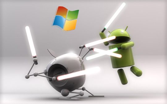
As of today, there are three major OS — iOS, Android, and Windows. The most important aspect of going from web to mobile app design is the need to consider the differences between these systems. We have to study and learn how the experience of using each OS is different.
Source: George Thomas
Just as an example, I have recently started working on designing an Android app for a personal project. I also switched to using an iPhone not too long ago. Unfortunately, I have already half-forgotten what it was like to use an Android device. I have to constantly remind myself that there is a back button on Android devices and that the drawer menu is the primary navigation pattern. And these are just a few of the subtle differences between the two OS.
When switching from web to mobile app design, it is crucial to be familiar with the iOS Human Interface Guidelines and Android Material Design Guidelines. More than that, mobile app designers should have plenty of personal experience using devices powered by different OS. They should also get a bit technical and read through some developer documentation to discover how to design for performance.
Another must-know of mobile app design for multiple platforms? Do not just port a design that is meant for one platform to another. That is a surefire way to kill usability. Learn by using apps in each of the platforms. Take note of the interaction patterns and the native UI components. Make use of UI kits to save time on replicating UI elements of each OS. Or use a powerful tool like Proto.io that comes with native built-in components to quicken your design process.
The Complexity of Simplicity
Compared to a website that can contain tons of features and content, the aim of a mobile app is usually to achieve simplicity. Simplicity does not mean easy to design. Instead, simplicity implies a greater complexity that has been thoughtfully reduced for ease of use. Therefore, designing for simplicity requires a good understanding of the complex whole. You have to know exactly what is needed for the app to serve its purpose. It is also knowing what should not be in there.
Always start with what your users want to achieve, which is something that you might have already picked up from doing web design. Many successful apps focus primarily on one single task that the user wishes to perform. Design your app around that one task and pick a few features that will be most used by your users to perform that task.
Designing for mobile apps can be a challenge for web designers wanting to cross over. The way we have been thinking about and designing for websites is generally quite static. We have beefed up the interaction part in recent years with Javascript and CSS3. Nonetheless, the essence of a website is not based upon motion and interaction.
Mobile app design, on the other hand, essentially falls under the realm of interaction design. This is where the complexity of simplicity hits us harder. Designing for interaction and micro-interactions is complex not only because it requires an understanding of the platform and the user, it has to be made to feel almost invisible.
If you are going from web to mobile app design, it is time to get rid of that static mindset. A good way to learn good interaction design is to observe and study in detail the most successful apps out there on different platforms. Have a look at our Top 5 Mobile Interaction Designs monthly series for a good start.
Another key issue to keep in mind while designing for mobile apps is ergonomics. Knowing how people use, hold and interact with their mobile devices will go a long way in helping you design for touch and voice.
The Fast-Paced World of Apps
Hundreds of apps are released daily. As I write this, more apps are zipping their way to the App Store and the Google Play store. This is a fast-paced world where your app idea today could very well be someone else’s most downloaded app next week. Unlike a website that could take its time to be made to pixel-perfection, a mobile app does not give you that same luxury of time.
Going from web to mobile app design, you have to keep up with a technology that keeps evolving by the day. Get to know the ins and outs of mobile technology, from location services to Bluetooth technology to fingerprint scanning to voice recognition, just to list a few to get you started. A good mobile app designer knows the industry like the back of his/her hand and can contribute to creating new types of innovative apps.
When actually designing mobile apps, apply lean UX to your app development cycle. Work in sprints that will get you to the learning and validation phase as soon as possible. When designing for mobile apps, you’ll find that prototyping everything is the way to go. Static or even heavily-annotated mockups can’t quite achieve the same effectiveness as a high-fidelity prototype.
Anxious to get started with prototyping but the coding skills under your belt are limited to HTML, CSS and JS? No problem. At Proto.io, we have you covered. Our mobile prototyping tool lets you build high-fidelity prototypes without any coding and it features UI libraries to adapt to your project’s devices. With the Proto.io app, you can download your prototypes and show them to clients or test them with users on the go.
Let’s make that leap from web to mobile app design together. Try Proto.io today.


