Accessibility isn’t just a nice to have — for mobile app designers and developers, building your app to accessibility specs helps your mobile UI design reach a broader audience, while becoming more usable for everyone. But what does accessibility even mean, and why is it so important?
The hows, whys and wherefores of accessibility design could fill a book, but a basic understanding of why accessibility matters and how to implement it into your mobile apps can go a long way. Let’s take a look at what you should know about accessible mobile UI design, from Android and iOS standards to tools and reference guides you should keep handy.
Top 4 Reasons Your Mobile UI Design Should Be Accessible
Accessibility, whether it entails installing a ramp in front of a brick and mortar business or adding closed captioning or transcripts to a broadcast or pre-recorded video, makes it easier for a wider variety of people to enjoy the same resources, products and services.
In mobile UI design, accessibility can mean many things, from making your UX customizable based on the user’s visual ability and preferences to using tactile cues to help guide the user from one screen or action to the next. Accessible mobile UI design puts your app in the hands of a variety of users with different physical capabilities.
Accessible web design is a big enough deal that search engines take it into account when calculating SEO. But what about accessible apps? It’s just as important for your mobile UI design to be accessible, and here’s why:
1. It’s just the right thing to do.
You could be that mobile app designer who prioritizes his or her “vision” over the needs of your potential users, regardless of whether they may have special needs. If you really think that your visual ideas are that genius that they justify exclusivity, or if you’re simply not willing to put in the time it takes to perform a thorough accessibility audit on your mobile UI design, well then, good luck to you.
However, we’d like to think that mobile apps aren’t just for those with perfect eyesight, hearing or tactile ability. If anything, mobile apps should help facilitate our lives. Just as Uber makes getting around your city (or a new city!) easier and MyFitnessPal takes the guesswork out of diet and exercise, mobile apps can — and should — make life easier for users, regardless of disabilities.
In fact, the smartphone and other mobile devices create brand new opportunities for wellness and accessibility. Apps like Pacifica can help users dealing with mood issues like anxiety, while apps like LookTel can help those with visual impairments count their money. Between smart devices, wearables and the Internet of Things, it’s not hard to imagine a world where having a disability, chronic illness or another special need doesn’t limit your ability to participate fully in activities other people may take for granted.
You can be part of this exciting future, or you can fall behind. Fortunately, with standardized accessibility guidelines, audit tools and other resources, creating a mobile UI design that’s usable and accessible for a broad audience doesn’t have to be rocket science.
2. It expands your potential audience and reach.
Of course, making your mobile UI design accessible isn’t just some noble measure. Simply put, the more people who can use your app, the more people will use your app. To put this in a little bit of perspective, nearly 20 million Americans have “difficulty lifting or grasping,” while eight million have vision impairments and 7.6 million have hearing impairments, according to accessibility statistics. That’s more than 35 million potential users to whom you’ll be expanding the reach of your mobile app. That’s more than 10% of the entire population of the United States.
While it’s easy to think of people with special needs with regard to smart device usage as a small chunk of the population, that really isn’t the case. A significant number of your potential users will need features like voice recognition or custom view controls. Build those into your mobile UI design or risk losing those customers.
3. Accessible design is good design.
Yes, the number of people who absolutely require the accessibility features you incorporate into your mobile UI design is pretty huge, but here’s the thing: those same accessibility features are good for virtually everyone who uses your app.
Some of the accessibility features Android and Apple both suggest for designers and developers are just good, common sense design. For example, Android recommends labeling functional mobile UI components that have “no visible text” (like icons) with “meaningful descriptions.” This is an excellent example of a design best practice you should be putting into play anyway!
Other accessibility best practices, like keeping your mobile UI design uncluttered, eliminating any copy or visual elements you don’t absolutely need and making your app as intuitive to use (with options for those who need help learning their way around), contribute to a more streamlined, simple and magical mobile app experience. Page your way through any accessibility guide and you’ll find many recommendations that read like common sense design best practices.
4. Accessibility can force you to be creative.
Talk to a poet sometime, especially if it’s a poet who prefers rhyme and strict meter. While at first glance, the strict rules of a Petrarchan sonnet or even a haiku seem like they would restrain a writer’s creativity, if you think about it, the opposite is the case.
If you’re writing a poem without any rules (or devices like alliteration or assonance), you can simply put down whatever words populate in your head, in the order that you think them. However, when you’re forced to count or accent certain syllables, or follow a strict rhyme scheme, suddenly you have to think outside the box and choose words that might not have come naturally or automatically to you.
That stretch outside of your comfort zone? That’s where the best creativity happens!
If you’re digging into accessible mobile UI design for the first time, or are forced to change an aspect of your current design to meet a new accessibility requirement, what might seem like a minor annoyance at first could be a creative blessing in disguise. For example, you may have to simplify your design, reducing the number of elements on a single screen or changing button size or gestures. Or, you may realize you need to change the color scheme or contrast in order to help make your mobile UI design more readable to someone with color blindness or another visual difficulty.
In each of these cases, you’re being asked to reach for a tool not found in your usual bag of tricks. This could be just the thing to distinguish your current mobile UI design from others in your portfolio if your apps have started to look a bit too similar lately.
Is Your Mobile UI Design Accessible? 6 Important Things to Look For
Truly accessible mobile UI design is an ongoing process of keeping up with technological advancements and trends, but to get started, here are six OS-agnostic, high-level rules you should be following to make sure your app is easy to use for a wider audience:
1. Keep it simple.
Simplicity is such an important and universal design imperative that we’ve rehashed it plenty of times before, but it bears repeating that simple mobile UI design is more accessible. While it seems intuitive that a crowded layout with too much information per screen makes for a more confusing experience for the average user, too many visual stimuli at once can create a stressful experience for users who have visual processing disorders and learning challenges.
2. Build your mobile UI design for customization.
While as a designer, it’s easy to want to have control over every tiny aspect of your mobile UI design, sometimes you have to let it go — and this is especially true when it comes to accessibility.
Remember that not only will your users have different needs in terms of visibility, audio and learning, but they’re also using different devices with different specs. That means that making your mobile UI design customizable is important for all of your users, not just those with special accessibility needs. A few things you should be making adjustable include font size, overall zoom and magnification, color scheme and contrast and touchscreen gestures.
Make sure that these accessibility and customization options are easy to find via your options menu, as well as any help documentation that you include with your mobile app.
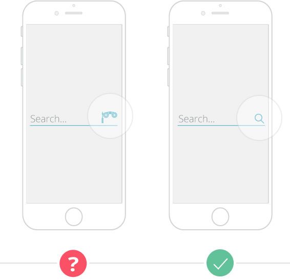
3. Use easily recognizable cues and metaphors.
You know how you’ll sometimes see a joke in your Facebook feed about how high school students saving their documents today have to click on a floppy disk icon, despite never having actually used a floppy disk? While it’s an interesting thing to ponder, it speaks to the universality of certain visual metaphors. Today’s kids know, almost instinctively, that a disk icon means “save,” while a trashcan icon means “delete,” because they’ve been using those icons over and over throughout their lives.
Creativity is never a bad thing, but sometimes, reinventing the wheel results in more than a waste of productivity. Many mobile UI design tropes exist because they work, from iconography to menu placement. When designing your app, strive for a unique look and feel, but always ask yourself: “Would this layout feel familiar and intuitive to a new user?”
4. Be smart with color.
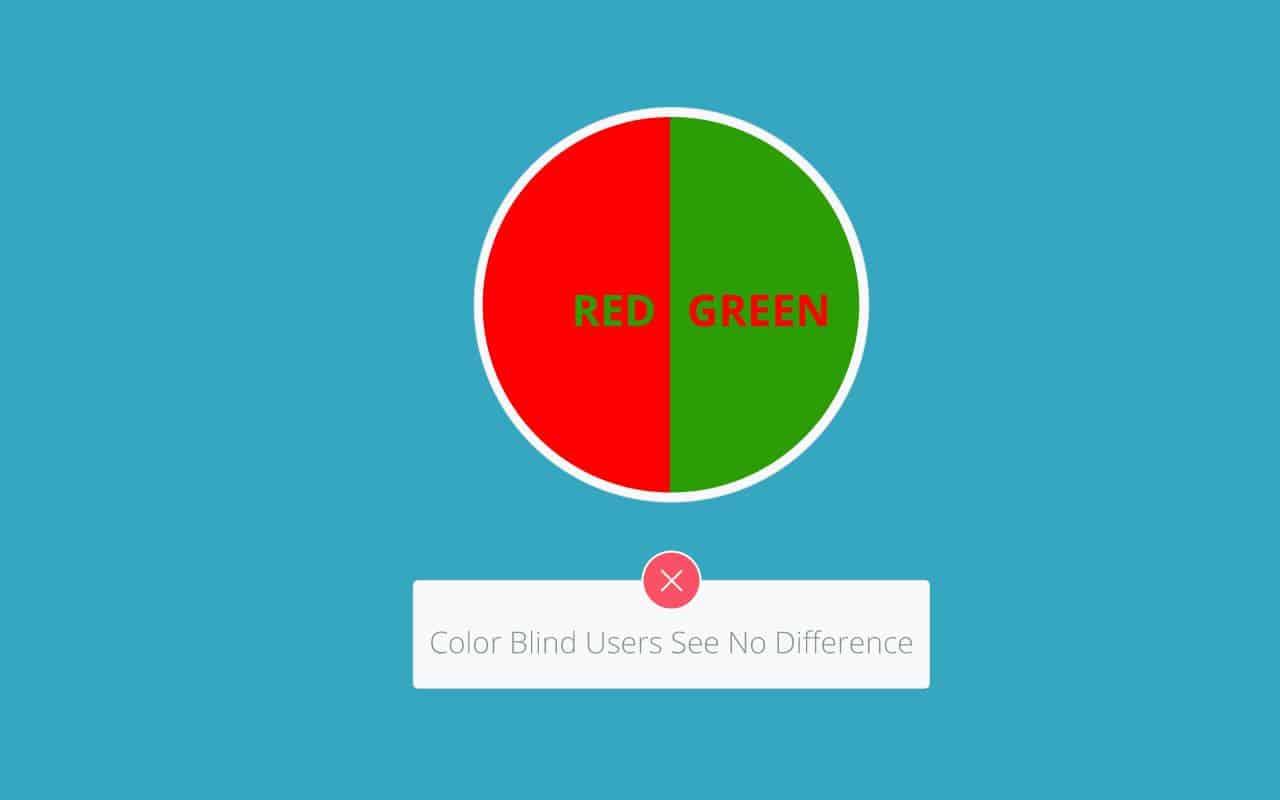
Is color the primary method of discerning different visual elements in your mobile UI design? If so, you may want to revisit your app to improve accessibility. Certain color schemes will make the user experience difficult for those with color blindness and other visual impairments, but with a few tweaks, you can make your design more accessible without losing what makes your mobile UI design so special.
These adjustments can be as simple as adjusting the shades of the color you’re using, adding patterns or textures to certain elements to make them distinguishable regardless of color or, as earlier suggested, building visual customization into your app so that users can adjust the UI as necessary.
5. Make your text size visible and high-contrast.
Tiny text is an annoying strain on just about every user, but for someone with visual challenges, it can render the app virtually unusable. Again, making sure that the user can zoom in and out as needed is an important aspect of accessible mobile UI design, but it’s not the be-all end-all of text readability.
It’s also important to ensure that different text styles have a wide enough contrast that a user can easily distinguish between headings, subheads and body text. This doesn’t just help users with special visual needs, but also users with learning difficulties or processing disorders. Organizing your visual and information hierarchy in a way that’s easy to digest isn’t just great accessibility practice — it makes the user onboarding process smoother and easier for virtually everyone who picks up your app.
6. Define form labels, and make sure they make sense.
Remember that many of your users are accessing your mobile UI design via a screen reader, which relies on your code to explain what’s going on in your app to a user who may not be able to see the actual screen. Because of this, it’s important that you label each of your forms accurately and logically. This guide does a good job of walking you through the process of defining your form labels, as well as what the experience looks like for your users.
4 Great Resources for Accessible Mobile UI Design
Whether you’re new to accessible design or just looking to brush up on your knowledge, these four resources will be indispensable to your next project:
1. The Center for Universal Design.
Coined by architect Ronald L. Mace, universal design refers to the philosophy that any product should be designed such that anyone can use it, regardless of ability. If you want to dig deep into the principles of universal design before implementing it in your mobile apps, The Center for Universal Design is the place to start! While it’s not specific to mobile UI design, it can help you take a look at accessibility as a big picture. Plus, looking at examples of good design from other industries can help you approach your craft from a new angle.
2. The Android and iOS Accessibility Guidelines.
If you didn’t bookmark the Android and iOS accessibility guidelines the first time they were mentioned in this article, do it now and we won’t judge you. Both platforms have specific recommendations for accessible mobile UI design, as well as advice on how to implement them in both the design and the development stages of your mobile app project.
3. The World Wide Web Consortium (W3C) Mobile Accessibility Guidelines.
Whether you design for Android, iOS, other mobile platforms, wearables or the Internet of Things, certain accessibility principles apply to any mobile application. As such, W3 has published a working draft of its accessibility guidelines for “mobile web content, mobile web apps, native apps, and hybrid apps.”
These guidelines address general principles of accessible mobile UI design, like “consistent layout” (don’t move your menu around from screen to screen) and “clear indication that elements are actionable” (make it obvious that a button is a button), though unlike with Android and iOS, the W3 document won’t give developers specific code or tools to implement these recommendations.
However, that makes the W3 guide a perfect beginning point for anyone who wants to learn the fundamentals of accessible mobile UI design, and a perfect reference for designers who, unlike developers, may not want to be mired in too many technical details.
4. Your testing and quality assurance team.
We’ve said it before, and we’ll say it again: quality assurance and testing can make or break your mobile UI design. Your QA team isn’t just there to make sure that your app doesn’t crash or stall out. They’re there to make sure that all aspects of the way your mobile app looks and runs are good to go, and this can (and should!) include accessibility.
Create a list of internal accessibility guidelines (using the iOS, Android and W3C resources to start, as well as any further research or best practices you want to implement), create a checklist and make sure your QA team is well-trained on what to look for and how to look for it. If it fits your project scope and budget, you may want to consider outsourcing, as there are third-party firms who specialize in accessibility audits. In this case, the accessibility auditor can work closely with your QA personnel to make sure each recommendation is implemented in the final product.
Building Accessibility Into Your Prototype
While a digital prototype won’t have all of the features that make an app accessible, particularly when it comes to the nitty-gritty back-end development details, your prototype is the first place you can test the accessibility of your mobile UI design. Use it to A/B test the intuitiveness and usability of your layout, including an accessibility questionnaire and making tweaks as necessary. Then, once you’ve developed the actual beta, you can focus on back-end optimizations.
Ready to make your mobile UI designs accessible? Begin by stepping up your prototype game. With Proto.io, you can create true-to-life digital prototypes of your apps, whether you design for Android, iOS or even wearables. The simple drag-and-drop editor makes it quick and easy to A/B test various aspects of your design to create the most usable, intuitive app possible. Sign up for a free trial of Proto.io and give it a spin.
What suggestions would you add to this guide? Send us a tweet (@Protoio) and let us know!


