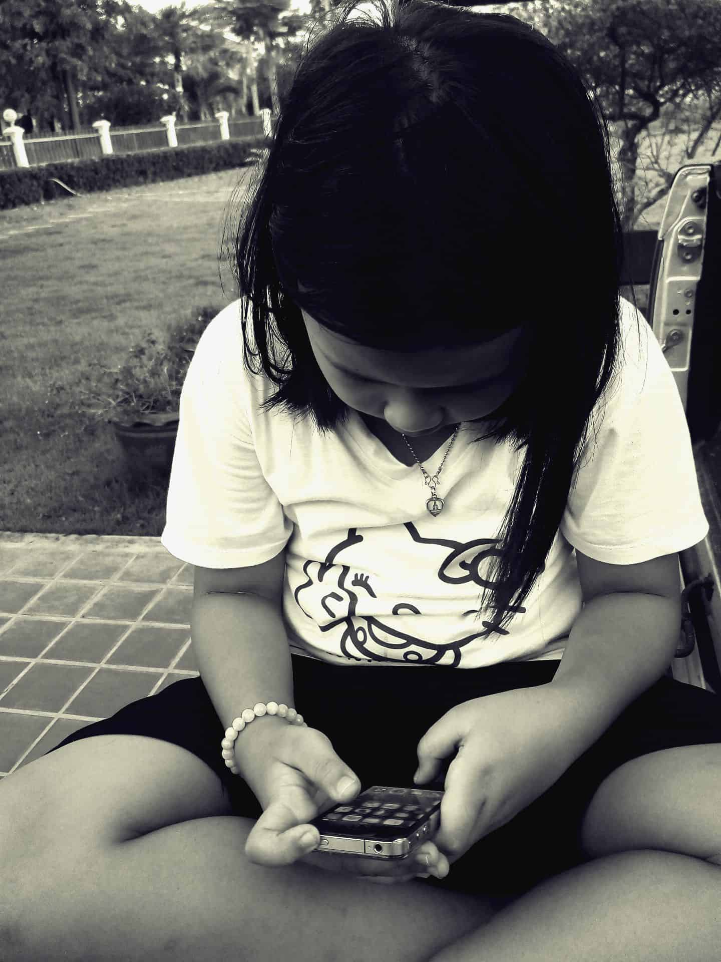
If you’re a mobile app designer, pay attention the next time your kids, nieces or nephews are watching TV or playing with a mobile app. Which apps do they keep coming back to, and why? Which gestures seem to work best for them? How do they react with certain elements of the UI design: with surprise, joy or confusion?
The way children learn, play and develop can teach us a lot about designing for mobile, from keeping layouts simple and uncluttered to creating easy-to-use, gesture-based designs. If you’re intrigued by how the human mind works — and how it relates to designing for mobile — consider the following four lessons our youngest mobile users can teach us:
1. You (and your users!) are never too old to learn.
From the hue and cry you might hear from some youngsters as they’re dragged off to the bus stop, you’d think that learning new things is anathema to children. But when you look at the wealth of educational apps available to that young cohort, you get a very different picture. Ansel and Clair: Little Green Island may look like the most obviously appealing game for children, with its bright colors, tropical island setting and fun gameplay, but it also teaches kids about science and ecology. Sushi Monster allows children not only to play with their food but also to practice their math skills.
Simply put, kids love to learn, provided they’re doing it in a fun way. They derive a sense of satisfaction and pride from acquiring new skills that they can show off to their parents and peers. “Look what I can do!” is common playtime banter, and there’s nothing quite like the childlike feeling of showing your dad an A+ on your report card, or playing a song on the piano for the first time.
So what does this have to do with designing for mobile? As it turns out, a love of learning doesn’t have to stop just because you have your diploma (or your college degree, or your Ph.D.). Feeling a sense of accomplishment (for example, from learning or mastering a new skill) leads to greater self-esteem and well-being in both children and adults.
Need proof? Take a look at DuoLingo, a language-learning app with broad appeal both to adults and to children (The Family Education Network even cited it as one of their recommended 20 Free Educational Apps for Kids, and noted that DuoLingo is for ages six and up). With 70 million users across the globe, DuoLingo proves that people have a blast learning new skills.
![]()
Using Gamification and Scaffolding When Designing for Mobile
If we were to take two things DuoLingo does exceptionally well that apply broadly to mobile app design — even if you’re not in the business of making educational apps — we’d go with gamification and scaffolding.
Gamification is old news by now, with everyone from business time trackers to Starbucks getting in on the rewards action. The whole premise of gamification hinges on that sense of accomplishment we just went over. Even if it’s something small, like a drop-down notification announcing you’ve accomplished some milestone (like translating your first sentence into Spanish), you get that tiny little dopamine buzz that motivates you to continue using the app.
Scaffolding isn’t as common a vocab word in the mobile design world, though anyone who has taken an educational psychology course should recognize it. To oversimplify a bit, scaffolding is the process of helping a child learn by building a concept piece by piece and using tools and cues to help move the learner from one skill level to the next.
DuoLingo does this by starting users with a challenging, but not overwhelming set of vocab words to start off with. Once they master a few sets of vocab, they move on to parts of speech and grammar, each time incorporating the lessons they learned in the past.
There are a few ways you can make the most of scaffolding when designing for mobile. You might, for instance, program your app to give the user a tutorial the first time they install it, or simply include a few visual clues to get them started (for example, an animated arrow pointing to the button they have to press).
Between scaffolding and gamification, you’ll encourage your users with easy-to-grasp new information, and reward them for using and mastering your app. The end result is a pleasurable user experience — and that’s an A+ in our book.
2. Be accessible, because users come in all shapes, sizes and kinds.

One of the challenges of designing for mobile is taking into account the different specs of each device, including the actual size of the device. First there were smartphones, then there were tablets, and then there were phablets. Apple used to be Old Faithful when it came to consistent device sizing, and then they introduced the iPhone 6 Plus.
All these different specs can make QA a puzzle, but it’s not just the size of the phone you have to worry about — your users also have vastly different hand sizes, as well as disparate behaviors when holding their phones. Some cradle their devices, some hold them in both hands and some use one hand to hold the phone and the other to interact with it.
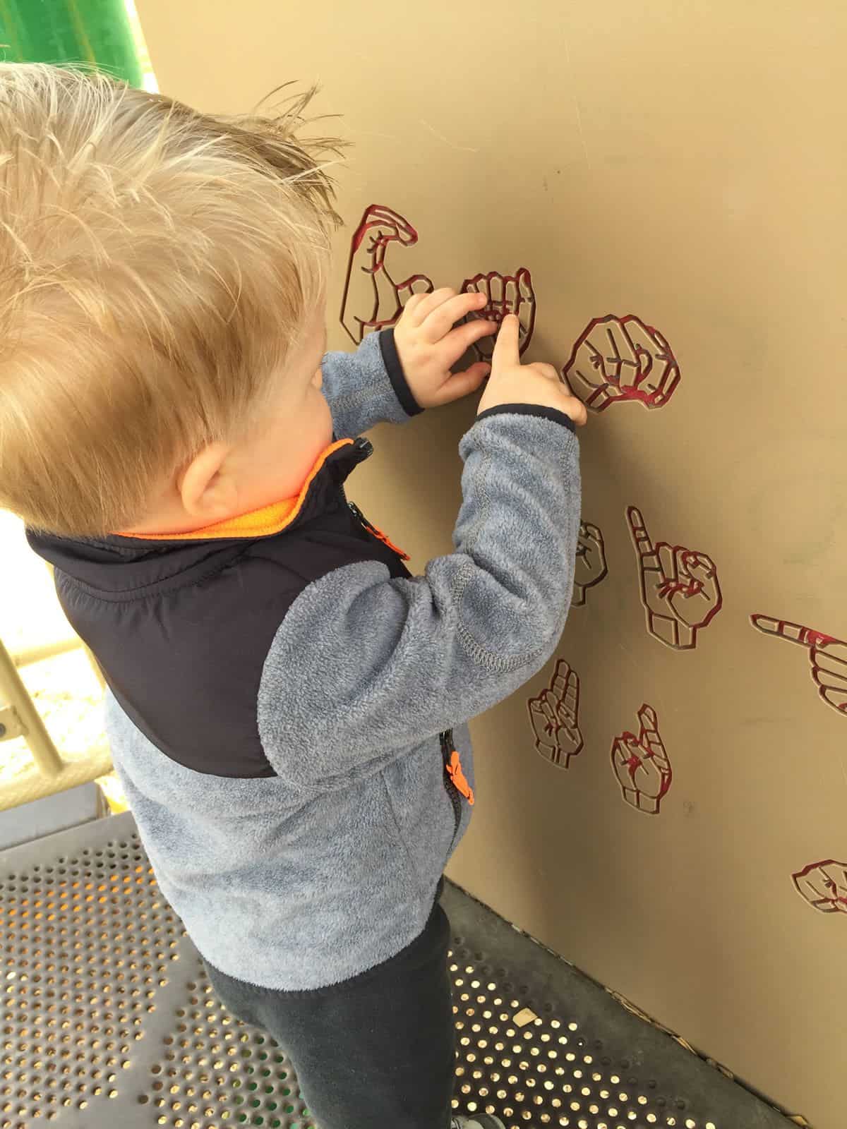
What does this have to do with children? Well, when designing for mobile, successful developers who make apps for kids take into account the fact that their hands tend to be tiny. That makes certain gesture-based design choices more ideal than others. Developers also have to take into account that children are in a different stage of learning than adults, and simply have different cognitive needs. All of that is important when crafting a user experience that won’t be a chore for a new user to interact with.
But children aren’t the only demographic with different needs when it comes to user interface design. On an obvious level, a 5’0’’ woman will likely have a different experience using an app than a 7’0’’ man, if you only take hand size into account (take note, QA testers: ask a few people you know, of different shapes and sizes, to interact with your app and report on their experiences).
But if you dig a bit deeper, it’s a good reminder that to maintain a broad demographic appeal, you need to build accessibility into your design. Do you include focused-based navigation for users with visual difficulties? If your app contains video or audio content, are you providing closed captioning? Android and iOS both provide accessibility resources for developers, so make sure to reacquaint yourself with those periodically and include their checklists as part of your testing and QA process.
3. Designing for mobile is a constant interplay between concrete and formal, or abstract.
But back to children’s psychology for a moment, because the way the mind of a child works can tell us a lot about why we use certain mobile design tropes, or interface metaphors.

Visual metaphors are at the heart of how developers go about designing for mobile. A quick look at our own demo page reveals countless such metaphors: the Facebook Paper prototype shows, pretty obviously, a digital metaphor for paper. Scrolling up and down the Instagram interface is a metaphor for moving actual photos around, or even spinning a reel. (Remember when you were a kid and you wondered what happened to the movie credits after they reached the top of the screen, then disappeared? Today’s kids might wonder the same thing about scrolling through a mobile app.)
In fact, the whole flat design vs. skeuomorphism debate focuses on the extent to which we use visual metaphors, and how literal they are. Skeuomorphism uses textures to imitate nature and clue the user into how to interact with an object: highlights and shadows may indicate depth, showing which layers are “on top of” other layers. Flat design argues that these cues are too literal, that digital design need not rely so much on the physical world to convey abstract concepts.
And then, of course, there is Google’s Material Design, which seeks to create its own set of visual metaphors in the digital realm.
But wait, weren’t we talking about child psychology? Actually, as a matter of fact, we were, because the interplay between abstract digital concepts and the concrete world once again goes back to how we learn, particularly as children.
Jean Piaget’s Stages of Cognitive Development
According to legendary developmental psychologist Piaget, children go through four main stages of cognitive development: sensorimotor, preoperational, concrete operational and formal operational. In each of these stages, the way children see the world and themselves evolves in a significant way.
For example, children in the sensorimotor stage, according to Piaget, are only beginning to tell themselves apart from the objects around them, and learn things like object permanence — when you hide something from them, this is the stage (infancy to two years old) that they realize those things don’t completely disappear.
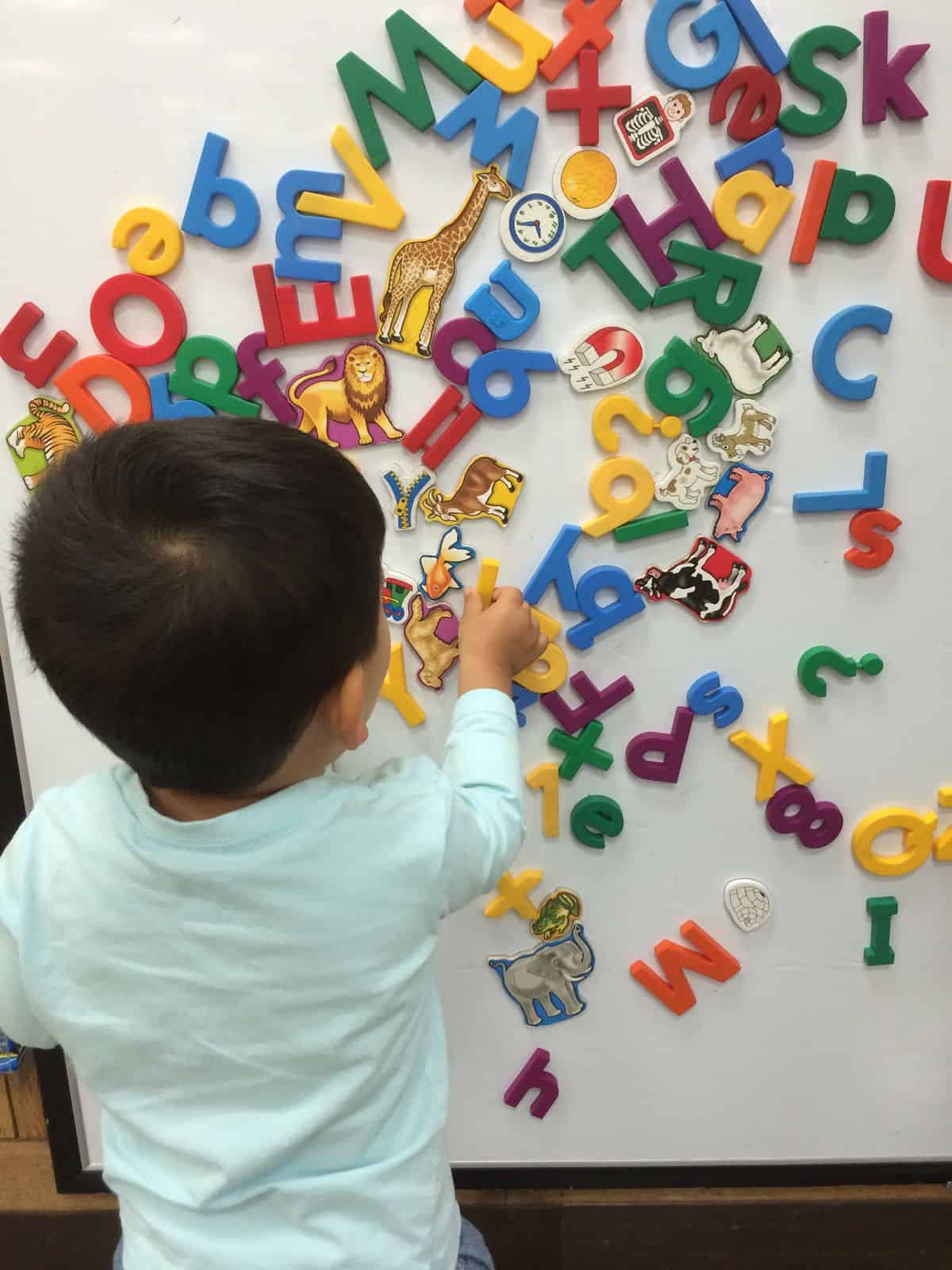
When children get a little bit older, from toddler years to second grade, they enter the preoperational stage, where they can begin to tell objects apart by one characteristic at a time. For example, if you give them blocks of different shapes and tell them to group all of the red blocks, they’ll be able to do it. Tell them to group all of the triangular blocks, and they’ll be able to do it. But if you ask them to portion off all the triangular, red blocks, they might struggle with the task.
Getting into the older elementary and middle school years, children move into the concrete operational and formal operational stages. This is when they can classify objects by multiple characteristics, and later, start to conceptualize abstract concepts like morality, or hypothetical scenarios.
Concrete Objects, Abstract Concepts and Designing for Mobile
Piaget started conducting his research on child development in the twenties and thirties, and though his theories are still influential, we know now that cognitive development is much more fluid than that — a child might pick up abstract concepts long before age 11, for example. But it is excellent food for thought when designing for mobile: as the human brain develops, we go from understanding extremely concrete concepts (“these are the red blocks”) to grasping more complex ones (“the green light in The Great Gatsby represents Gatsby’s dreams.”)
If the skeuomorphic designers of the world need ammunition to defend their highly textured aesthetics, this may be a good one: the more concrete the visual metaphor, the easier it is for the user to grasp. But then, even flat design deals in visual metaphors, with imagery representing various concepts (how about a cloud icon representing a pool of shared storage or computing resources? How’s that for a metaphor?).
In fact, it could be said that any illustration — flat or skeuomorphic, digital or drawn on a piece of paper — is a visual metaphor for a concrete concept.
When designing for mobile, keep all of this in mind. Even grown adults in the final stages of formal operations might not intuitively draw a connection between your interface elements and the concepts they’re supposed to represent. Create visuals that can be tied to a concrete concept the user is already aware of (like a cloud, as opposed to an abstract shape), and strive for a coherent, consistent visual language.
4. Security and control are important aspects of any mobile app.
Imagine you let a child play with your iPad or smartphone for a few minutes as a distraction during a long car ride, or when they’re otherwise bored. What would be your main concern?
Most likely, your own security and control over your personal data. Unless your device has a special child mode or you configure certain security controls before handing it off, your seven-year-old niece now has the ability to purchase a series of Dora the Explorer DVDs from your Amazon account, access parts of the web only intended for adults or even unintentionally send a text to your boss.
Okay, so these are device-wide concerns — what does this have to do with designing for mobile? Well, consider all the popular freemium apps that prompt you to make in-app purchases: do you trust your ten-year-old with these? Or, have you ever unintentionally made a purchase using them? (It’s okay. We won’t tell.)
When you design an app for a child, parents like to know that the app is safe, secure and easily controlled. And when you design an app for adults, adult users like to know that the app is safe, secure, and easily controlled. Make your security and usability features simple to configure for a user experience that feels empowered and comfortable.
Putting It All Into Practice: Hand a Kid Your Digital Prototype!
When you look at how children interact with the world around them, and how that interaction evolves every day, things get fascinating very fast. Even the youngest children can teach us something about the work we do, whether we’re designing for mobile or testing a new application. At Proto.io, we strive to make creating a prototype as easy and fulfilling a process as possible, with a simple drag-and-drop interface and tutorials to help scaffold you along the way — and, of course, a sense of accomplishment when you see a lifelike, gleaming mobile prototype.
Want to get another angle on your app idea? Create a prototype, and then ask your kids, nieces or younger siblings to give it a spin. You might get some valuable feedback!
(Don’t have Proto.io? Come see what we’re all about! Sign up for a free 15-day trial, or take a brief tour of the place.)


