Visual designers have a tough job. They frequently have to take written information and transform it into an aesthetically pleasing image, remembering that color heavily influences how people feel about your product, while incorporating the science behind design philosophy. And all that before clients even see a mock-up.
Those of us that have known good visual designers know that they are worth their weight in gold. Recently, a group of designers told us all about their favorite tools for design, so we put a list together. There is something in here for everyone — whether you are a new or aspiring designer or an entrepreneur who will be doing her own visual design, we’ve got you covered with eight of the best tools for visual designers out there.
For Inspiration:
Inspiration Grid
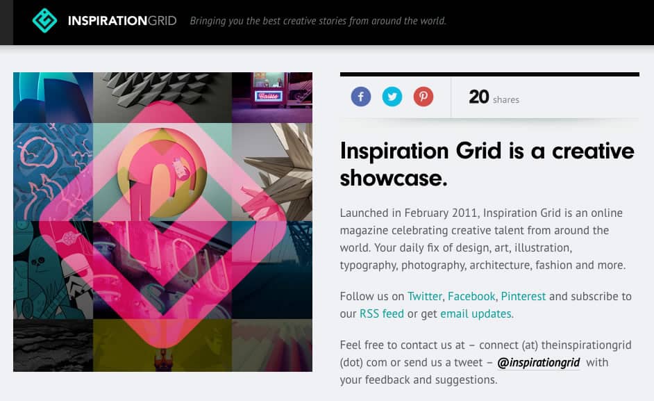
We all know that feeling of being creatively drained. If visual design were easy, everyone would do it, right? Some days, pumping out unique designs one after another is easy-peasy, but other times, it can feel like pulling teeth. On those days, Ron Larracas, Head of Design at Insureon, looks to Inspiration Grid to get out of his creative slump.
Inspiration Grid has plenty of categories to choose from (including art, graphic design, and interior design), so regardless of your area of expertise, you should be able to find something that appeals to you. Seeing beautiful work that others have done might just get your creative juices flowing — perhaps by seeing a layout or font that could be adapted to fit your client’s branding guidelines.
Awwwards
Source: Awwwards
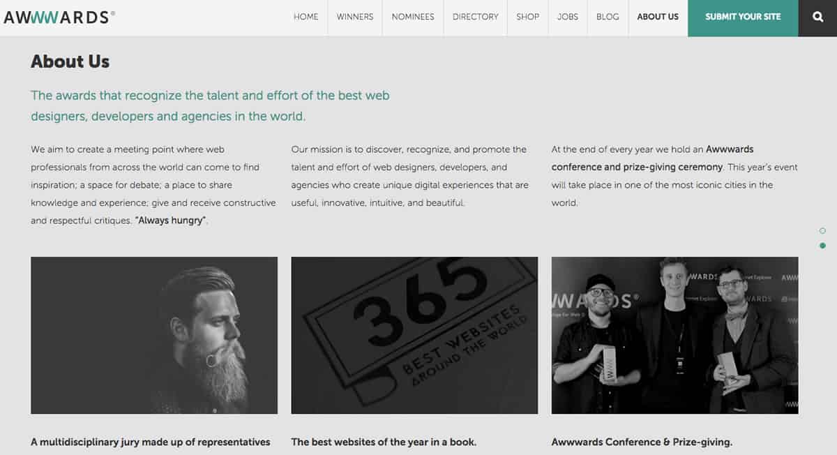
Whether you are a visual designer working in an office or at home in your pajamas, it’s easy to fall into a rut. A photo here, text block there — you might start to realize that your 30th promotional flyer this month looks a lot like the 25th. And the 26th, and 27th. Just like anything else, visual design can be a bit formulaic. But you owe it to your client to make the 30th look like it’s the 1st, which is why sites like Inspiration Grid and Awwwards are so helpful.
Larracas says that “sites like these remind you that you can completely rethink your design — and often that’s what’s going to generate the biggest impact on your UX” and we couldn’t agree more. Rethinking your design doesn’t have to mean scrapping everything you’ve done thus far. Perhaps it just means giving it a facelift. Just like writers are encouraged to read frequently, visual designers can learn a lot from studying what makes their colleagues’ work effective.
For the Visual Design Process:
Adobe Creative Suite
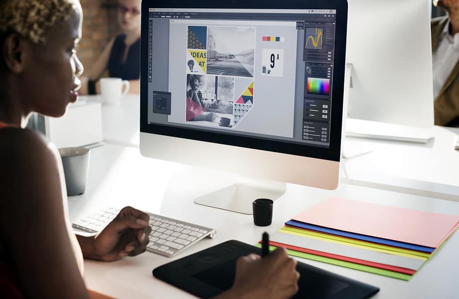
We’re willing to bet there’s not a single visual designer who wouldn’t recommend that the Adobe Creative Suite be included on a list of the best tools for designers. Between Photoshop, Illustrator, and InDesign, the Creative Suite gives you a huge arsenal of powerful tools to help you create anything you can possibly imagine. Literally, if you can dream it, you can do it.
One of our favorite features of the new-ish Creative Cloud (CC) setup is that updates occur more easily and regularly. Adobe simply tells you when there is a new version and asks if you would like to download it. This also means that any sweet new features Adobe adds to the programs (like filters, tools, or plug-ins) are automatically added to your toolbox at no additional cost. Believe the hype: Adobe CC offers the most robust tools for designers on the market. And to make it even better, Proto.io and Photoshop go together like peanut butter and jelly.
Sketch
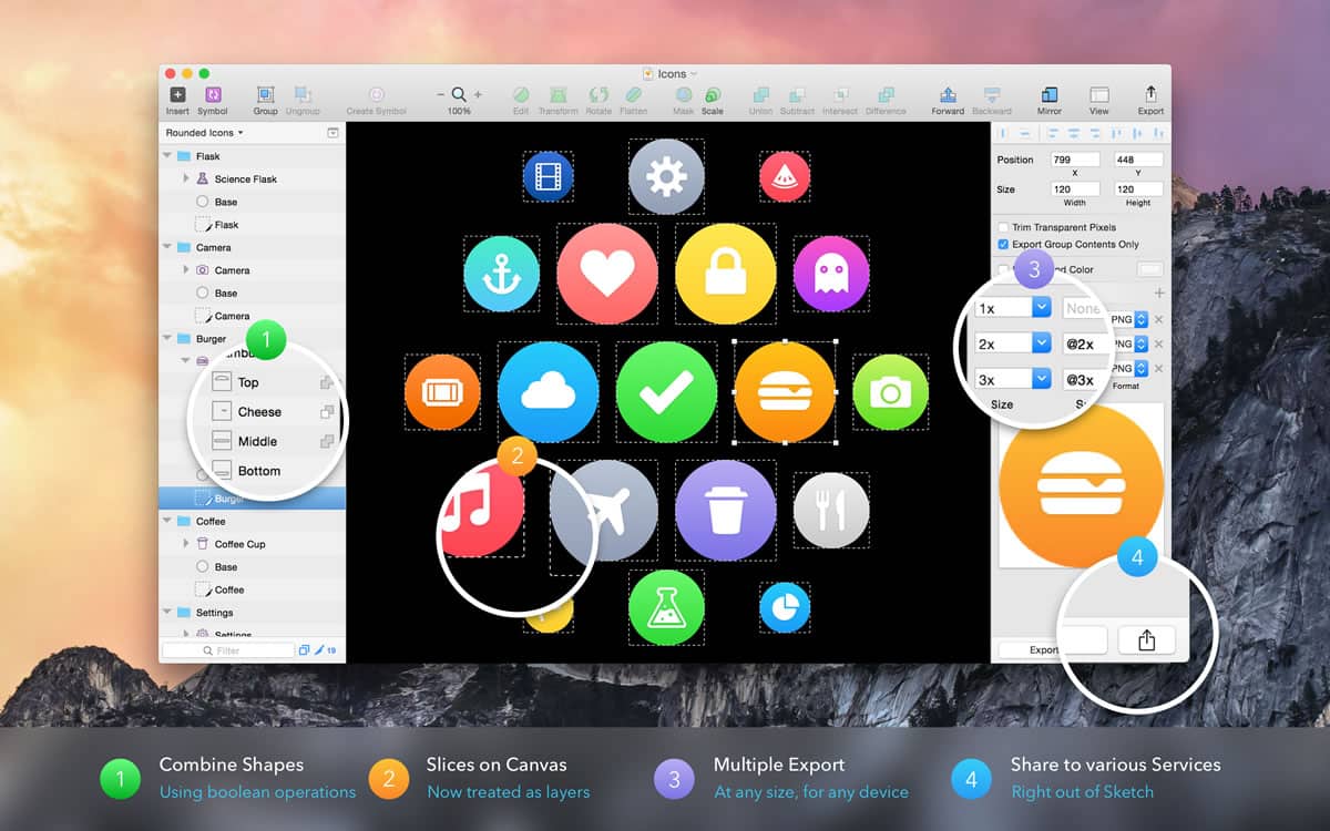
Source: Sketch Press Kit
Victor Xie is a visual designer for the study tool app StudyBlue. He is a recent convert to Sketch from Photoshop (after using it for 13 years) and feels that Sketch has simplified his workflow. Xie told us Sketch has all the tools he needs and that he likes the simple user interface — that overall, his “time spent in the visual design process has been cut down heavily.”
Our favorite feature of Sketch (it was tough to choose) is the unique way of exporting. You can export individual slices, as well as multiple file formats all at once. It is perfect for entrepreneurs who are doing their own visual design work and may not be familiar with Photoshop, Illustrator, or InDesign. The only downside to Sketch is that it’s for Mac only. There is no PC version at this time. But Mac users can delight in the fact that Sketch is a fraction of the price of Photoshop. (Pro Tip: Proto.io and Sketch work together seamlessly. Here are our best practices.)
Canva
Source: Canva Media Kit
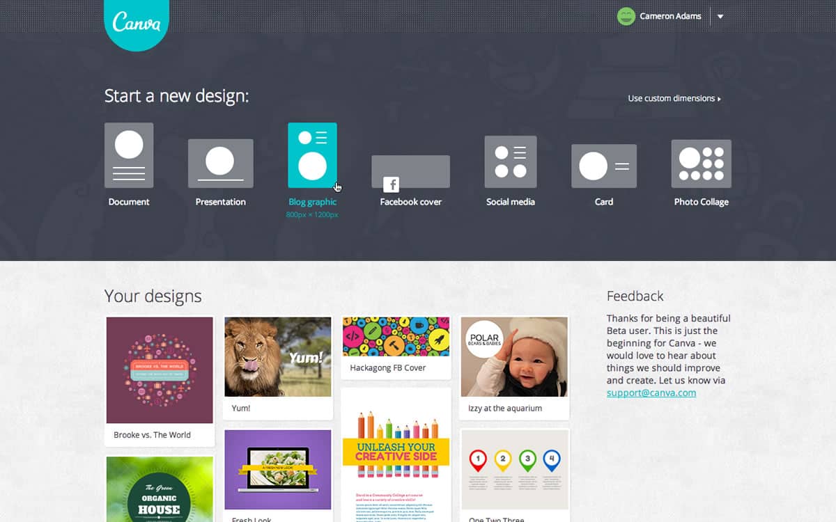
Another excellent tool for designers is Canva. We’ve mentioned it before and we’re bringing it up again because it really is that awesome. It’s free to sign up and it’s super easy to use. They have a design school for those who want to learn more about visual design, but they also have templates if you just need a quick social media graphic, poster, or banner.
Beth Adan is the Senior Publicist & Graphic Designer at Three Girls Media. Adan likes Canva for its user-friendliness, saying that it’s a “simple way to add text or graphics to an image without having to use a bulky program like Photoshop.” Photoshop and InDesign each have their own place in visual design, but you don’t necessarily need all those tools for simple projects.
Color911 App
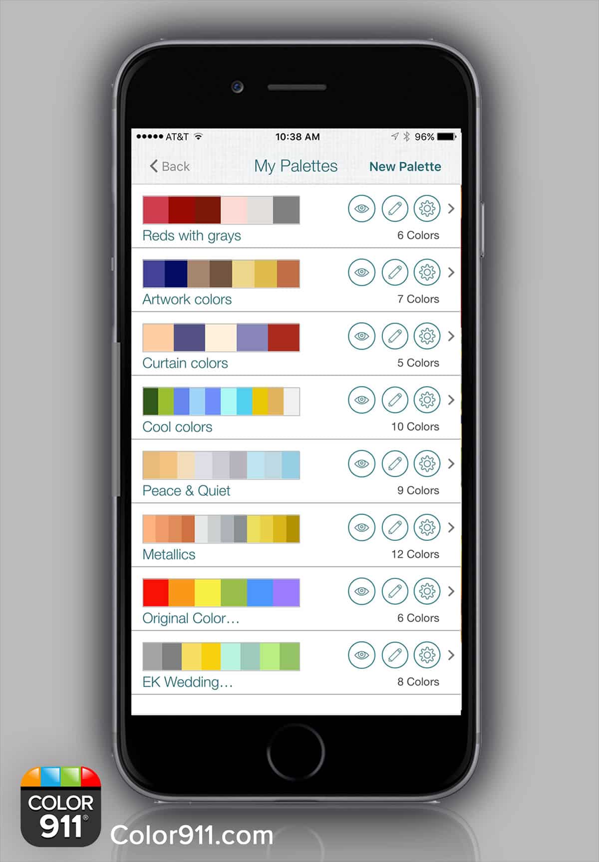
Source: Photo courtesy of Amy Wax.
All of us are better at some aspects of our jobs than others, and for visual designers, that might mean you breeze through layout, but struggle with color selection. Maybe you’ve nailed down most of it, but want to find an accent color for image borders to make them pop. Amy Wax has you covered with Color911.
Color911 offers over 100 pre-made color palettes (that follow themes, like “Ambiance” with warm golds, soft blues, and understated neutrals), each created by Amy herself. You can choose from one of her ideas, or make your own — even from a photograph! Color911 is pretty legit, earning acclaim from Architectural Digest, This Old House, and Elle Decor. And for additional inspiration, you really must check out her Instagram.
Piktochart
There is really no doubt that infographics are taking over the Internet — and it’s understandable on a lot of levels. If you are scrolling through a Facebook feed on a mobile device, it’s easier to check out an infographic and keep scrolling than click on a link and go to a web browser to read something. All in all, infographics can be a really excellent way to use visual design skills to convey information quickly.
That’s what drew HireKeep Digital Growth Strategist, Camille Uzel, to Piktochart. Uzel loves that Piktochart offers a “wide range of graphs and charts that allow you to display statistics in a unique way to captures the reader’s attention.” Piktochart is effective and easy to use, which means that entrepreneurs will be as satisfied with the results as experienced visual designers.
For Communication:
Hightail
Once your latest, greatest visual design concept is ready for approval, it’s important to have a place where people can submit their feedback without cluttering up your inbox. With written content, this process is easier — you can share a Google Doc and let people leave comments all over it or have editing rights, but with images, it’s a bit more difficult. But not anymore, because Hightail is saving the day.
Hightail makes the approval process so easy — you upload files to a “space” and then email it out. Deborah Holstein, Vice President of Marketing at Hightail, described the process to us: “[Hightail] lets teams comment directly on creative content – audio, video, photos, graphics, and copy, without the need for additional software. All the work happens in one place and Hightail keeps work flowing and teams accountable.” They also have a pretty killer video to demonstrate and it’s worth a watch.
At Proto.io, we LOVE this feature. Hightail makes it so simple to share a design and keep everyone on the team up to date on feedback and newest versions. This really takes them from a simple file sharing site to an essential tool for designers.

Giving Visual Designers What They Need
There’s no doubt about it, visual designers hustle hard. Why make them work harder than they need to? The right tools can make their lives easier (and more productive). While we’re on the subject: we can’t possibly leave ourselves off this list. Proto.io 6 can help you bring your latest mobile app design into fruition with our easy to use drag-and-drop format. You already did all the hard work — showing the coders what to do shouldn’t be a chore.
Proto.io is an excellent tool for visual designers and can help them build mobile app prototypes that feel real. No coding required. Bring your ideas to life quickly! Sign up for a free 15-day trial of Proto.io today and get started on your next mobile app design.
What is your favorite design tool? Let us know by tweeting us @Protoio!
