Why reinvent the wheel when templates can make you much more efficient? While many designers insist on starting with a blank slate — and with plenty of valid reasons — iOS design templates can help you streamline your process while maintaining a look and feel iPhone and iPad users have come to expect from their mobile apps.
We’ve asked five mobile app experts to share their reasons for and against using iOS design templates in their process, and the templates they can’t live without. If these aren’t already in your mobile app design arsenal, you might want to give them a shot (and let us know what you think)!
1. SketchSheets — Because sometimes it helps to draw it out.
John Turner (@UsabilityGuyPGH) is CEO/Founder of QuietKit, a free guided meditation app, and UsersThink (@UsersThinkapp), which allows marketers to get on-demand user feedback on their landing pages.
“A recent addition to the sea of iOS template resources is SketchSheets, which is perfect for sketching on paper. Taking a prototyping on paper approach isn’t really designed to replace prototyping on a computer, but it is another way to frame some of the basics of what you want to do quickly,” says Turner. “Those broad strokes of working on paper can then help you develop a higher fidelity mockup on a computer at a much faster pace.”
It’s sort of like sketching out an idea on the back of a napkin, except way better. “It’s simple, easy to find the format you want, and the templates easy to download and print out for easy sketching on paper,” says Turner.
2. Teehan+Lax and Mercury Intermedia — Beyond Mere iOS Design Templates
Cassie Byers is a Visual Designer at Events.com (@eventsdotcom), an app that makes organizing events easier through powerful, but intuitive registration tools. For Byers, Teehan+Lax and Mercury.io have been invaluable resources in her kit.
Though Teehan+Lax recently closed their doors to move to the Facebook Design team — which speaks, we think, to the high quality of their product — they’re still a staple for many designers. “My favorite iOS design templates are the Teehan+Lax templates,” says Byers. “Not only did they stay up to date on their software releases, but they also kept current also on Apple’s product releases. It’s also helpful that you could access all of their tools for free!”
Thankfully, despite their recent closure, Teehan+Lax has still left their high-quality iOS templates on the site for designers, developers, and mobile app entrepreneurs who love the company’s tools. If you’re designing apps for iOS and Android, you can also access their Android GUI templates, as well.
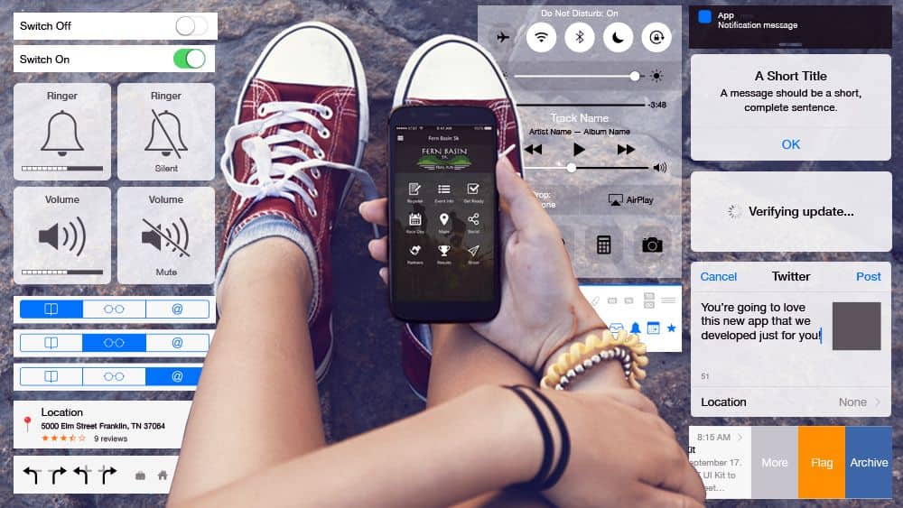
“Another great resource I use is from Mercury Intermedia,” says Byers. “They have a great iOS kit for all things iPhone! Whether it’s a pop-up, text message, keyboard, or control, this kit has each piece laid out individually in vector format. Better yet, they’re editable!”
3. iOS 9 GUI iPad for Sketch — Taking Sketch to the Next Level
John Geletka is Executive Vice President of Digital Strategy at Duffy (@duffydesignx), an agency with over three decades of design experience. Like Byers, Geletka has a lot of fond feelings for Teehan+Lax. However, he’s set his sights on new iOS design templates since his team incorporated Sketch more heavily into their mobile app design process.
“Since we moved our team to Sketch — which integrates nicely with Proto.io — the iOS 9 GUI iPad for Sketch has been a go-to,” says Geletka. “What makes this kit so great is really quite simple. It’s built for iPad, in the latest iOS version, and it’s Sketch ready. While there’s a wealth of tools out there for the iPhone, the iPad toolset is lacking in this space. Sure Teehan+Lax used to put out amazing tools, but ever since the Facebook acquisition, we need to build things ourselves or look elsewhere.”
“This library, in particular, is built by pros with a rich set of reusable symbols and key starter screens,” says Geletka. “What does that mean for a design team? Faster production work and more time to devote to the things that matter. The grunt work has been done, and the team can focus on unique features, the brand, and proper messaging. Designers are happier because they don’t have to reinvent the wheel, and all the advantages of Sketch plugins and exports to tools like Proto.io are there.”
The Case Against Using iOS Design Templates
Brandon Termini is a Founder and Creative Director at Handsome (@HandsomeMade), an agency that bills itself as “a human-centered design and technology company.” As Termini explains, a more hands-on approach has helped Handsome develop some pretty innovative designs over the years:
“I tend to stay away from using any design templates – the reason being is that it puts a restraint on creativity. When you create UI from scratch, you’re naturally more likely to come up with unique designs and interactions that push conventions. I will say that I admire UI8’s iOS Templates due to their consistency and beauty.”
Alexander Zub, Founder and Director of Technology at Handsome, agrees with Termini — for the most part, at least. Zub does conceded that “there are lots of great and beautiful design templates out there,” but “at Handsome, we always work with unique, made-from-scratch designs, based on users wants and needs. This approach also makes the engineering solutions unique.”
Should I Use an iOS Design Template or Start From the Ground Up?
To use a template, or not to use a template? Whether ‘tis nobler in the mind to suffer the slings and arrows of doing it all from scratch, or to take arms against reinventing the wheel and by doing so, saving precious, precious time, there are plenty of arguments to be made either way. Deciding whether to go the route of pulling a well-rated, painstakingly developed iOS design template or working from a fresh, clean document depends on a few things: your goals, your timeline and budget, your level of experience and, most importantly, what the clients and/or stakeholders want. Let’s take a look at each factor in greater detail:
Project goals.
One of the biggest things you need to consider when deciding whether to use iOS design templates — and choosing the right one for your particular app — is the ultimate end vision for your app. Are you creating a basic e-commerce app for a mom and pop shop? A scheduling app for small business? A simple mobile port for an existing desktop experience? In these cases, it might behoove you to use a template. Not only have template designers addressed and tested many of the requirements you have for the app, but using a template will make your app easier for your users, who will identify the visual language and cues set up in the template.
However, if you’re designing a mobile game, creating a mobile experience for a bigger brand that demands a real “wow factor” or simply building a seriously outside-the-box, innovative mobile experience, you might want to veer away from iOS templates. (The exception, of course, would be templates like SketchSheets, which basically give you structure for free-form creative noodling.)
Level of experience.
We’re big believers that you don’t have to be a veteran designer to create an inspired mobile app. With a great idea and the right tools, even an entrepreneur with little-to-no experience can self-learn their way to the Apple App Store, and iOS templates are a fantastic way to scaffold your way there. After all, if the term “hamburger menu” just leaves you puzzled (and a little hungry), there’s no shame in standing on the shoulders of giants. A template can help guide you through the first few versions of your mobile app, and if you want to strike out a bit later, you can try a new app — or test a new version of your current app, this time a bit more off the rails.
What the client, investor or other stakeholder wants.
This circles back a bit to the first point: whether or not you use iOS templates should hinge not only on your own personal vision for the app, but also on what the client or stakeholder wants. Obviously this doesn’t apply as much to someone creating an app without a contract or funding, but even then, you should always keep your audience in mind. What sort of UI would work best for the end user? Are there iOS templates that fit that ideal, or will you need to create a bespoke solution? These are all questions you should ask before settling the template dilemma.
The Best of Both Worlds: Interactive Mobile App Prototype Tools
Still can’t decide whether or not to use a template for your iOS app? With prototyping tools like Proto.io, you can try it both ways — in a matter of minutes. Proto.io allows you to upload your own design quickly and easily, or you can access the built-in, native-looking UI libraries to make sure that your iOS app maintains the look and feel of an iPhone or iPad app. That leads to a more streamlined user experience with less need for extensive user onboarding. Better yet, your digital prototype will be completely interactive, so you can plan out all user gestures and animations right within the prototype.
Whether you’re using your favorite iOS templates or starting with a tabula rasa, all it takes is a disruptive idea, some elbow grease and plenty of testing and QA to build an app your end users will be coming back to day after day. What are your favorite iOS templates? Tweet us @Proto.io to let us know!


