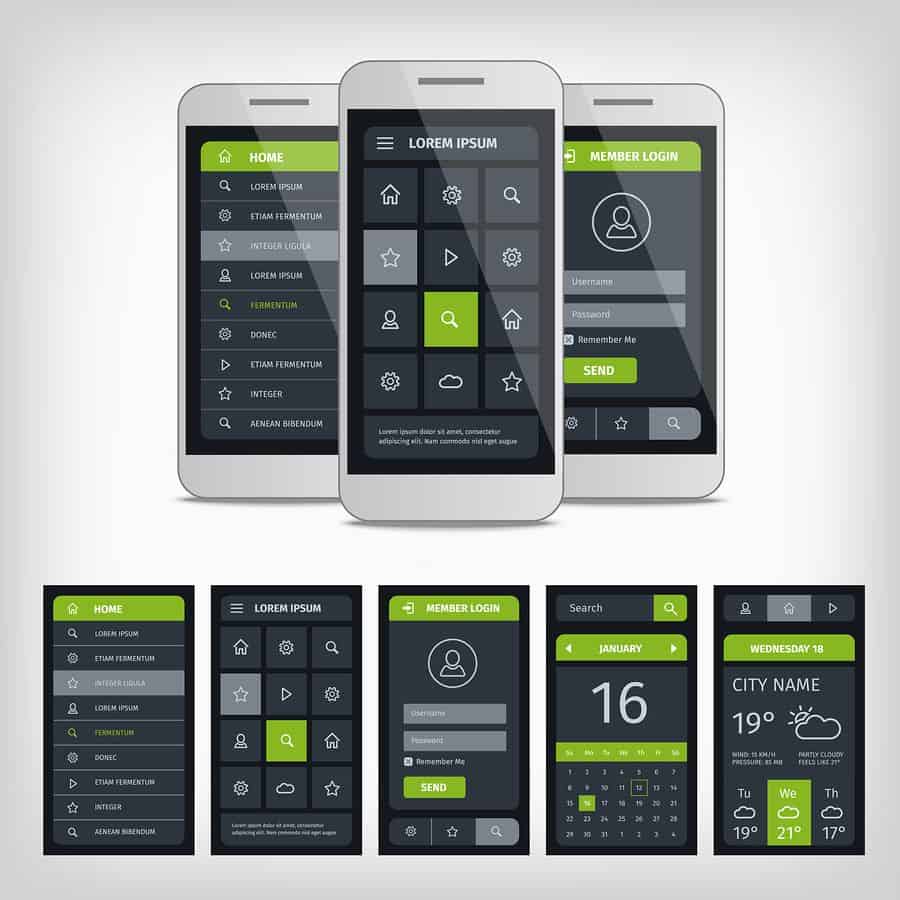
Your mobile app mockup is more than just a way to show potential users what your app looks and feels like — interactive prototypes make for invaluable business tools, from finding new leads to converting them into loyal customers (who then spread the word far and wide about how awesome your app is!).
But beyond showing your potential clients a digital prototype as part of a pitch for a new contract, or using your prototype as a front-and-center interactive asset on your website, there are plenty of ways to make sure you’re getting the most business bang for your buck. These are just a few ways that savvy mobile app entrepreneurs can make creative use of their mobile app mockups:
1. Create email marketing people actually want to open.
It seems like every year brings with it new, fervent think pieces on the subject of whether or not email marketing is dead. Some go so far as to say email itself is dead, to be superseded by messaging platforms like Slack (which, by the way, we wholehearted recommend you add to your workflow management arsenal!).
And each year, just as email’s death certificate is about to be signed, the statistics start cropping up showing that no, email is not dead — not even close — and that email marketing is still an effective vector to meet customers and leads. Take a look at these email marketing statistics if you’re not convinced. According to Outbound Engine, the ROI from email marketing can range from 400% to 4,000%, and despite the rise of social media and instant messaging, email marketing is still 40 times better for customer acquisition than Facebook and Twitter.
So for the time being, email marketing isn’t going anywhere. The real question is: how can you make your email marketing efforts more effective? One way is by making your email visually stunning.
Why You Should Use Mobile App Mockups in Email Marketing
Compared to boring plain text, slightly dressed up HTML and even beautiful static designs, animation is visually arresting. As with anything in design though, using animation in emails can go horribly wrong if you don’t do it in a way that’s both beautiful and functional. Mail Bakery put together a great list of brands using animated GIFs to beautiful effect in their email marketing. This is a trend that seems to be catching steam, as brands ranging from ModCloth to Amazon are using GIFs to make their emails stand out in your inbox.
One of the examples Mail Bakery points out is that of Sprout Social, which used an animated GIF of their interactive prototype to announce the new Sprout app for iOS. What better way to announce a new app (or new feature) via email than by including the mobile app mockups in all of their fully animated glory? Customers can then click through to your website, where they can interact with the prototype themselves and decide whether or not to download the app (we think they will!).
As with any type of marketing, giving somebody a demonstration is always more powerful than describing what the product can do, whether verbally or visually. Mobile app mockups are great not only for email marketing but for social media sharing, landing pages and anything else you need visual assets for. Show, don’t tell.
2. Give your customers a sense of choice — and be the cool brand.
As we noted in What Can Cars Teach Us About Mobile Design?, people love options, whether it’s leather seats and a heated steering wheel or a few choices in layout color schemes. Customers, users and clients want to feel like their voices are heard and their opinions valued. That’s the crux not only of great customer service, but also incredible mobile app design and development.
As it turns out, your mobile app mockups can be a fantastic way to build a relationship with your customers and help you achieve the elusive, but highly coveted status of a “cool brand” — you know, the type of brand customers actually enjoy following on social media, or start identifying with. Are you an Uber user or Lyft? PowerPoint or Keynote? ModCloth addict or Nasty Gal aficionado? Chances are, part of it has to do with the way each brand advertises itself to you, and the personality it puts off.
Not every brand manages to be lovable, but being lovable garners customer loyalty. And by giving your customers options and chances to voice their opinions, you can be the cool mom instead of the one who nags you to wear a jacket and sets an early curfew.
We might have gotten a little bit away from ourselves there — let’s bring it back to mobile app markups, and how they endear you to your user base.
A/B Testing With Mobile App Mockups
Can’t decide whether to implement a hamburger menu or not? Did your designer bring you two layout options, both of which look incredible in the mobile app mockups, and you can’t decide which is better? While there are worse problems out there than having too many options, you never know what features will be a bigger hit with users until the users get their hands on them. Luckily, there’s a very easy way to make these calls: ask your customers!
If you’re creating a new mobile app, or even just updating the old one, you have a powerful tool with which to conduct A/B testing. Plus, many prototyping tools (like Proto.io) provide all the features necessary to test out various design features — with Proto.io, you can test them both in your browser and on the device itself.
Show that you are invested in your customers’ feedback by sending two versions of your mobile app mockups, and polling them on which they prefer. You can do this not only with initial app designs and new features, but also with rebranding. Remember the hue and cry in 2010 when The Gap attempted to change its iconic logo? By A/B testing your mobile app mockups, you can avoid that particular pitfall. Not only does this give you actionable data with which to perfect future iterations of your design, but it also builds rapport between you and your users — a total win-win.
If you’re satisfied with that explanation, skip to #3. But if you want to know why, psychologically, customers love putting a bit of effort into the products they purchase and use, read on, because we’re about to nerd out a little.
What Does a Swedish Furniture Store Have to Do With Your Mobile App?
Let’s talk briefly about a powerful psychological phenomenon known as the Ikea Effect. We’ve written before about how the Ikea Effect can work to your advantage when creating a mobile UI design prototype your clients can’t resist, essentially by hacking the human brain.
Harvard psychologists once divided test subjects into two groups. One of the groups had to put together some Ikea furniture, after which they were given the opportunity to buy the piece they had just assembled. As it turned out, many were eager to pay for their Malm dressers or Billy bookcases.
The second group was simply brought in after the first had built their furniture, and asked how much they would pay for the pieces. Even though the first group actually had to put labor into the furniture, they valued their particle board creations more than the second group did.
As pointed out in this great piece on the Ikea Effect by Riskology, the conclusion that Harvard psychologists drew — that people become emotionally attached to items they put effort into — can also explain the price people are willing to pay for Build-A-Bear plushes, or the emotional attachment they have to cars they’ve worked on or fixer-upper houses they’ve, well, fixed up.
While your customers might not be able to assemble your app with a few Allen wrenches and a crash course in Java programming, they can still put effort into your mobile app mockups by offering their opinion. If you want to take the Ikea Effect a step further, though, why not enlist your loyal customers and users as beta testers? Which leads us to our next item…
3. Offer mobile app mockups and beta testing as a customer incentive.
Mobile app designers and developers can learn a lot from the video game industry, especially when it comes to user onboarding best practices (and especially, obviously, if they make mobile games!). If you want to see what customer loyalty looks like, show up to BlizzCon, the annual Blizzard Entertainment convention, and shout, “For the Alliance!” You’ll quickly be met by throngs of World of Warcraft players screaming, “For the Horde!” until a veritable shouting match ensues between the Alliance and Horde factions.
While you won’t likely see, say, Evernote users cosplaying as the elephant logo, you can still harness some tactics used by gaming companies to build customer loyalty — and get more ROI on your mobile app mockups. How? Two words: beta testers.
If getting your customers to submit their opinions on your mobile app mockups is invoking the Ikea effect, then getting them to sign on as beta testers is like asking them to build an entire pre-fab Ikea house (yes, that is a thing that exists). And with games like World of Warcraft (and its many expansions), Overwatch and Battlefield, users are chomping at the bit to get an early sneak peek at the anticipated games, and also have a say in how they’re made and revised.
A Few Ways to Use Beta Testing as an Incentive
One of the core tenets of marketing is to offer your leads value in exchange for some amount of buy-in on their end. Your mobile app mockups give you plenty of opportunities to entice your leads, loyal customers and potential investors.
Let’s say, for example, that you’re a mobile app startup with a Kickstarter, and you need to think of incentives for every level of contribution. On the lower end of the incentive ladder — maybe a $5-10 investment — you could make your backers beta testers, giving them access to your interactive prototype and allowing them to offer feedback in the form of comments. (Proto.io allows you to share your prototype with an unlimited number of commenters, making it the perfect tool for this application!)
If your app involves any sort of premium feature set, you might offer your free customers the prototype of those premium features, and a coupon code they can use after offering their feedback. Not only are they putting in “Ikea Effect” effort and getting used to features they’ll likely miss if they don’t upgrade, but they’re also getting a discount. As a result, you get valuable customer data as well as a new cohort of premium users.
Now it’s your turn — what other clever and creative ways have you seen businesses use their mobile app mockups? What plans do you have for your digital prototype? Let us know by tweeting us @Protoio!
Turning Rough Mobile App Mockups into Beautiful Interactive Prototypes
Like a beautiful image asset created by a top-notch designer, your mobile app mockups are a valuable piece of marketing collateral, and the opportunities to use them to drive new business are as endless as your imagination.
But while scribbling on the back of a napkin with a Sharpie might be a great way to get your creative juices flowing, it doesn’t exactly make for a great marketing asset. A 2D illustration or slideshow may be better, but for maximum impact, you’ll want to take your mobile app mockups into the current century with a fully interactive digital prototype. That’s where Proto.io comes in.
With Proto.io, you can take your mobile app mockups to the next level. With an easy-to-use drag-and-drop editor and libraries of interactive UI elements at your fingertips, Proto.io gives you everything you need to create digital prototypes of any mobile app idea you can dream up. Check out our demo page to see how popular apps like Tinder and Instagram look and feel in Proto.io, or see Proto.io users’ creations showcased in Proto.io Spaces.
Like what you see? Sign up for a free 15-day trial of Proto.io today!


