UX designers never stop learning, because technology never stops changing. More powerful computing and graphics, more immersive VR and AR, an ever-expanding range of connected devices and a brand new generation of users require industry professionals to continually refine and update their approaches to user experience and design.
We asked mobile app designers and other tech professionals what UX design principles they see as most important for making better apps. Here’s what we learned:
Bandwidth: Consider the Entire User Lifecycle
As the User Experience Manager at Bandwidth, Josh Gibbs understands the importance of considering every aspect of UX design better than most.
Bandwidth provides companies and developers with integrated text, emergency access, and other communication services, working with partners across a huge range of industries and use cases. Doing so requires an approach to UX design principles that considers what the user sees at every stage.
“At Bandwidth, we focus beyond just the app. It isn’t so much about the aesthetic for us (though we do care about that part a lot). We consider the entire lifecycle — the entire process of someone moving through our interface. What’s it like the first time you log in? What happens when you encounter an error? What if you haven’t used a particular feature in a while and you need a refresher on how it works? Answering these questions is what make apps both unique and successful,” says Gibbs.

Too often developers and designers focus on initial quality — when the user boots up the app for the first time, they want them to be blown away. But what about the second use? Or fourth? Or thousandth? Gibbs elaborates:
“Let’s say you have an app or interface for a B2B team. They sign up for the product and get a fantastic white-glove onboarding experience! Now let’s look 7 or 8 months down the road. The initial users that received the white-glove onboarding are now all over the place. Jenny got a promotion and isn’t in charge of logging in anymore. Joey left the company. Janet is on maternity leave. You’ve now got three new people that have to fill their shoes. Are they getting that same white-glove treatment? Probably not.”
So how do you design around your users evolving?
Bandwidth solves this problem by considering how the user would experience five explicit user states.
“We consider five separate states: the first time the user boots up the app, how the app should look in a perfect state, what it should look like when the user has only made it partially through our app (or any forms within it), what it should look like when a user is navigating to a page with a long loading time, and finally, what it should look like when an error happens,” says Gibbs.
With this method, Bandwidth is able to predict just what a user needs when they move through the app. By imagining what the app should look like at first boot, for example, UX designers are able to consider a process of continuously onboarding users. In a way, your app is a school that’s always open — it has to continuously train new users on how to use its features.
On the other hand, an interface should look different when it’s obvious a user knows what they’re doing, and they just need it to work.
And yes, the best designers will even be able to help emotions from boiling over when an error pops up. We’re not saying it’s easy — but it’s necessary if you want your UX to shine.
Testing, of course, isn’t optional. It’s imperative. “All of this is tested over and over again. At Bandwidth, we test the 5 states via mockups and prototypes with customers, then we iterate and either test again or build an alpha based on the feedback.”
Gibbs emphasizes that the testing doesn’t just end there, however. “Again, we collect feedback and iterate. After that, we determine a small set of customers to try out our updates in a beta. They get the updates for a period of time, giving us feedback along the way.”
Creating a beautiful user interface isn’t as simple as sketching, prototyping and throwing whatever you come up with at your users: you’ve got to iterate, iterate again, and then continue that process until you start getting rave reviews (and then some).
Makers Empire: Understanding the Why, Respecting Your Users
Makers Empire is a company with a mission. The company works with teachers “to help create a new generation of creators, problem solvers and innovators.”
The company provides a combination of technology and pedagogical support, supplying schools with 3D printers, software, a curriculum, training, and professional development to teach students how to think about design.

That mission is reflected in the two UX principles Matthew Stuckey, Director of User Experience, sees as most important. Although these tips are geared toward app users, Matthew says they apply to anything you build, be it “an app, a physical product, a house [or] a brand identity.”
Stuckey’s first principle? “Always ask ‘why?’ — ask yourself. Your team. Your boss. Ask your client, ask your users. Why are we making this thing? Is it bringing value to the world? Is it solving a problem? Is it being useful — even to a small audience? If the answer is no, do something else.” We’re inclined to agree.
Too many developers and designers are happy with making something without actually considering what it does and who it’s for. If you’re able to be honest with yourself when you start your project about what it is you’re trying to do, you can end up saving yourself (and your team) a lot of time.
“Conversely, it’s always good to ask, ‘Why do other good things look the way they do?’ Don’t be different just for the sake of being different — novelty wears off very quickly. It’s okay to build on what exists,” adds Stuckey.
His second principle is a simple demand we think every designer needs to put above their monitor (or drafting table, or wherever). “Design like you care,” says Stuckey. “Try to know your audience, market, and users. Even if you don’t like them or understand them, try to empathize with them. Don’t be cynical. Don’t insult or disparage your users — with your words or with the quality of your design.”
Scott Amyx: Empowering Users in an Age of Tech Transformation
Although he isn’t a designer himself, Scott Amyx has deep knowledge of the UX principles behind great apps. Scott is a speaker, author, and venture capitalist whose tech expertise has appeared in everything from the New York Times and Wired to respected thought leadership establishments like the European Commission and the Pew Research Center.
For Scott, the key to good design isn’t so much about adhering to fixed principles, as it is adapting new UX methods to address the challenges posed by rapid technology change.
“The days of purely static mobile apps are behind us. AR/VR/mixed reality, speech, gesture and multi-modal human machine interfaces (HMI) are all changing UX design — it’s no longer two-dimensional,” Amyx says. “IoT-based device, TV remotes, gaming consoles and home automation hubs are using more short-range gesture control. Some gestures and hand movements are universal, but there are many cultural nuances that need to be factored in.”
In short? The game is changing. UX isn’t flat anymore. Good designers aren’t just thinking about what’s on the screen — they’re thinking about the incredible amount of ways you can interact with what’s on it.
“There’s also a need for greater accessibility to accommodate those with disabilities or less fine motor control. On top of that, there’s the challenge of designing to mitigate repetitive movements that could lead to injury such as carpal tunnel, joint pains and tennis elbow,” says Amyx.
Amyx notes that all of these advances in technology require us to think about UX design in an entirely different way — at the same time, however, it’s important to not simply think that a great UX can be built by taking an old interface and slapping on VR support. Good next-gen UX will be built by people who are natively creating it — making it part of the product, instead of just something added randomly for bonus points.

Gunner Technology: App Design ≠ Web Design
When experts talk about designing an app to complement a website, the conversation is usually about consistency. Change the user flow, look, and feel of the app too much and users can get confused — or so conventional wisdom goes.
But that’s not the whole story. Apps aren’t websites, and as Cody Swann points out, design methods and conventions don’t always translate effectively.
Cody is the CEO and founder of Gunner Technology, a software development firm that builds JavaScript solutions on AWS in both the public and private sector. To share his insights into the differences between good app UI design and good website design, Cody drew on three major aspects of his career: technical knowhow, software development experience (for Disney, ABC, and Major League Baseball), and deep understanding of business optimization and automation.
We see a lot of firms moving from website design to app design, trying to apply the same principles to apps as they did to websites. That’s a major problem. Most websites are the same — they have the same pages, or at least the same types of pages. There will be an about us page, a blog page, and so on,” says Swann.
“Apps are almost entirely unique because most of them represent a unique idea. For that reason, unlike a website, there will always be a learning curve for users when it comes to learning how to use an application.”
This key difference informs how Swann and his team approach app design. You shouldn’t fight convention: navigation buttons and back arrows are there for a reason — people will recognize them, and that’s good. Don’t reinvent the wheel, as every time you introduce a new feature to your users, you’re potentially bogging them down with interactions they have to learn.
Aceable: It’s Still All About the Users
When you design an app or finetune an upgrade, are your users part of the process? Most app designers will say they’re user-focused, but aside from some basic UX research, actual user input is treated as an afterthought.
As design professionals at a mobile education startup, Matt Mannello (Lead Product Designer) and Phillip Fuller (Senior Product Designer) are naturally focused on UX.
The two work at Aceable, an online drivers ed and defensive driving app, as well as Aceable Agent, an app offering real estate education and licensing. Both apps replace the traditional in-person experience of gaining a license with a streamlined, mobile experience. Because providing a better experience than traditional classes is crucial to success, it’s no surprise that Matt and Phillip center user feedback.
“You have to listen to your users,” say Mannello and Fuller. “Whatever problem you’re trying to solve, the user is key to understanding how to solve it. We use feedback, surveys and analytics to gather as much data as possible, as quickly as possible before we start.”
Gathering feedback is just one step toward respecting your users, however. You have to figure out how to make their ideas workable — even if it isn’t obvious or easy.
“In a startup, especially a marketing driven one, you’re going to get requests that, as a user advocate, make your stomach knot up. It’s your job to mold those ideas into solutions that are in a user’s best interest. You’re the user’s champion — don’t mess it up.”
Fueled: Keeping Perspective
Keeping everything in perspective can be a challenge for mobile app designers. It’s easy to get caught up with an exciting aesthetic concept idea or a new approach to a UX challenge, even when it should be clear to us that it’s not the best design method for a particular project.
As a leading app development agency in New York City with expertise in branding, websites, and user acquisition, Fueled does everything from integrating in-store and digital experience for Verizon shoppers, to building successful games and other consumer apps.
That requires a solid approach to UX design principles that keeps every project on track. Here are a few tips from Senior Product Manager, André Gonçalves:
“Iterate on usability — it seems obvious, but in my experience, what I feel has improved the success of apps the most is making them more, well, usable! Listen to users and keep iterating until they’re happy.”
Iteration keeps popping up — and there’s a good reason for that. You can read all the textbooks and guides to UX design in the entire world, but if you don’t actually know how your users respond to what you’re designing, you’re not going to be delivering the UX your users actually want.
“Don’t overthink your app — when you’re creating your product, it’s easy to get lost designing the perfect app. Keep your original vision in the back of your mind, and don’t stray too far from it,” says Gonçalves.
Finally, Gonçalves notes that you don’t have to be better, you just have to approach your users’ problems in a different way from your competition. “Someone else might solve a problem better than you can, but you shouldn’t be intimidated by that. Everyone is different. Even the best solutions don’t work for everyone. Find that edge case and try to tackle it.”

EventMobi: Strong Design Fundamentals
Billed as “the most comprehensive Event Experience Platform on the market,” EventMobi provides just about every function you’d want from an event app. Users can register, view their agenda, ask questions during Q&As, and interact with each other and the event organizers in real-time — all in a fully customizable, branded experience that supports engagement throughout the event lifecycle.
With all that functionality and the need to serve a broad range of users with different capabilities and degrees of technical competency, making everything as easy as possible for users is a crucial priority.
It’s not surprising that Senior Product Designer Franchesca Tingting emphasizes the importance of strong UX design fundamentals. Here’s what she had to say:
- Design with accessibility in mind. This includes legibility, visibility, colors and text-to-speech capabilities, among other things.
- Make sure your navigation is easy to understand; don’t rely only on icons.
- Be mindful of tap target sizes and hand positioning.
- Take opportunities to reduce the amount of typing needed. Removing unnecessary fields, providing autocomplete, having cascading fields and listing available options for data inputs are some ways to increase task success or completion rates.
- Less is more. Real estate is valuable on mobile devices.

Never Stop Becoming a Better Designer
Design is something you never really master — you’re always growing and learning. There are new technologies and methodologies to incorporate in your app, new user requests to turn into innovative features, and new methods to deliver value to your users.
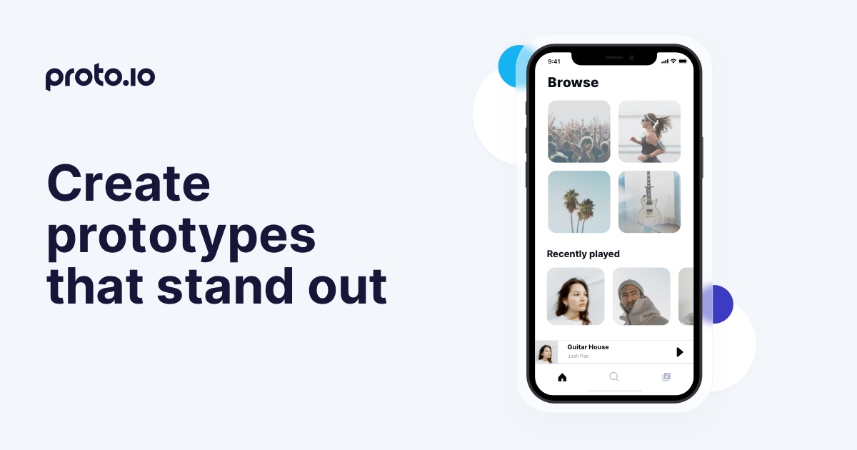
As a powerful, intuitive mobile app prototyping tool, Proto.io makes it easy to experiment and put your knowledge to use, so you can hone your craft and make better apps.
Proto.io lets anyone build mobile app prototypes that feel real. No coding or design skills required. Bring your ideas to life quickly! Sign up for a free 15-day trial of Proto.io today and get started on your next mobile app design.
What UX design principles do you live by? Let us know by tweeting us @Protoio!


