Mobile app design doesn’t miss a beat. Even in the depths of winter, there is always something exciting coming out. Here at Proto.io, we do a monthly roundup of the latest and greatest mobile app UI designs. This month, we’ve found apps that feature bright and bold colors and beautifully designed icons. Let’s get into what makes these apps stand out.
1. Studio by Morsel Inc.
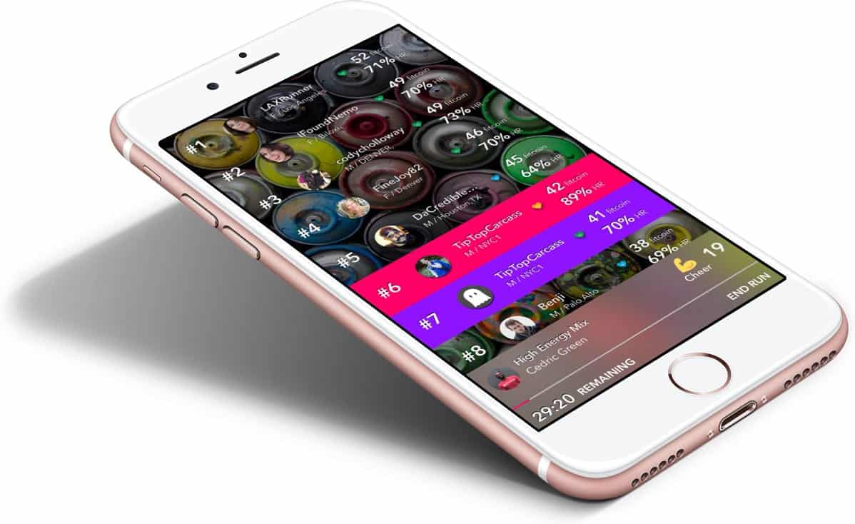
Anything that helps us meet our fitness goals and makes the experience fun is a welcome new app. Studio is an app that makes running classes competitive and encourages users to run a bit harder to unlock the next level. All the while, they are completing fitness classes with top trainers. The mobile app UI features bright and bold colors along with inspiring fitness images to pump users up before, during, and after workouts. The leaderboard is most notable with a layout of which users are winning this class, where they’re located, and more. Although it is a virtual class, this screen of the app makes it much more personal and competitive at the same time.
Get Studio on iOS.
2. SoundHound by SoundHound, Inc.
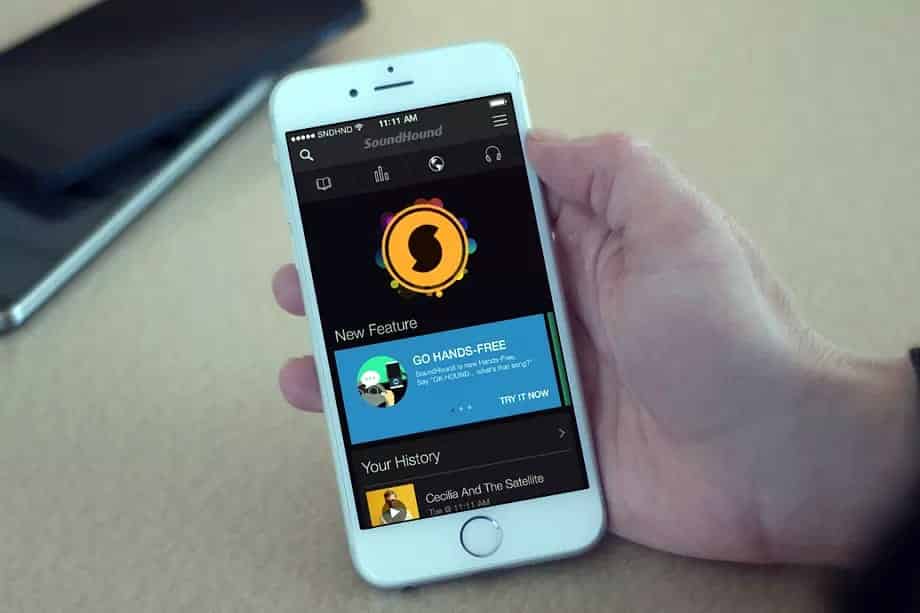
SoundHound is much more than just a music discovery app. While, you can say “OK, Hound,” and ask it to name the great new song you’re hearing, it can also provide lyrics and stream music for free. This voice controlled app has dark, muted colors and features bright orange to contrast and highlight lyrics, for example. It also features attractive icons on the bottom of the screen to avoid the outdated hamburger menu. All of these new features have gained it much success in the tech world and even raised it to unicorn status, with a $1 billion valuation.
3. Patreon by Patreon
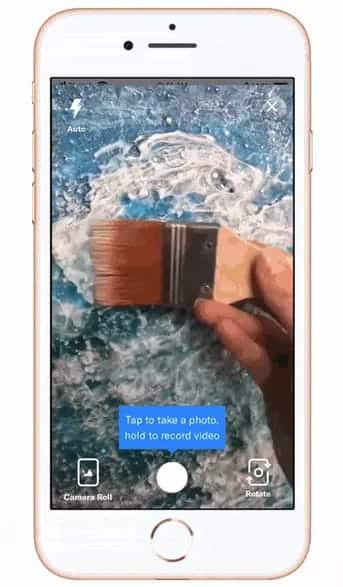
It seems that every app is experimenting with a Snapchat inspired “Stories” function and some apps are much more conducive to the feature than others. Patreon is an app that helps artists get paid for their work, so naturally their patrons will want to see their progress. This is where the Stories function comes it. It lets artists upload images and videos for their patrons to see for just 24 hours, so they can check in and see what the artist is up to. Artists can publish their stories for all subscribers to see, or just send videos and images to specific patrons, if they happen to be working on an exclusive piece for them. The mobile app UI of this feature mirrors the design of social apps, though, to make it easy to use with minimal buttons: flash, exit, rotate, camera roll, and of course an action button to capture the image.
4. Die With Me by Dries Depoorter
This app definitely shows where we are as a society in 2018. Having a dead phone is an unfortunate situation to most, but what you do with that last fleeting 5% just got much more interesting. While most of us might try to send a few more emails or texts, or maybe memorize the directions we’ve looked up, Die With Me goes in a completely different direction. Instead, this new app only opens up when your phone is at 5% battery or lower and is essentially a chatroom for other users in the same predicament. This chat app seems to be designed in a way that saves your battery, as it is all black with minimal white and red accents to show messages and the status of your battery. Whether this app becomes a sign of the mobile-obsessed times or just a blip on the mobile app design radar, only time will tell.
5. Gboard by Google, Inc.
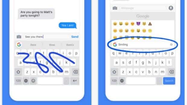
Gboard is a keyboard app from Google that makes it easier to text, insert gifs, and search Google, all within one app. A feature that was recently added to the iOS version of the app is one small button on the keyboard. It is a gif maker, much like a Boomerang. This one simple button makes it quick to add in a selfie gif when chatting with friends. In all, Gboard has an easy to understand keyboard that has self explanatory icons to make chatting intuitive and fast.
6. Oh She Glows by Oh She Glows
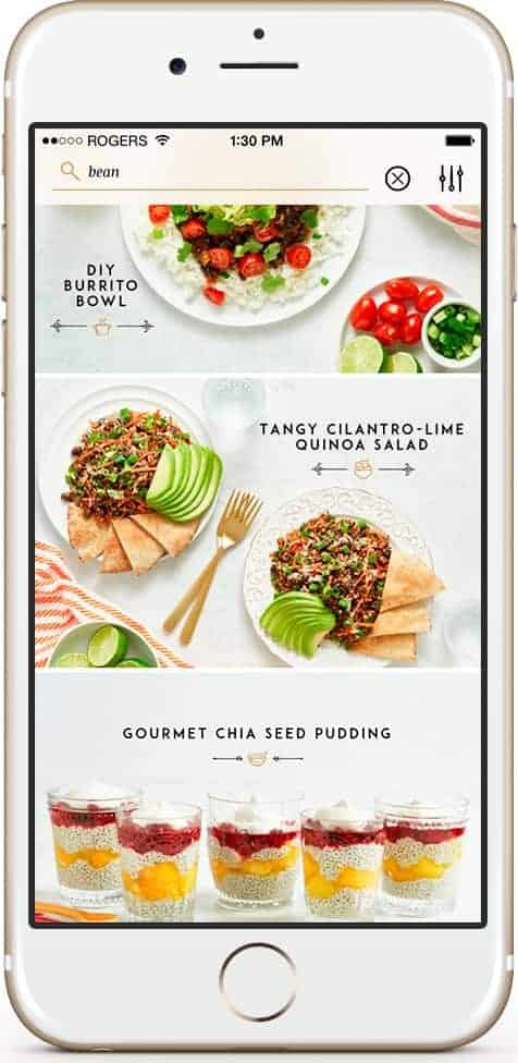
As the near year rolled around, it seemed like everyone was starting a new diet, Whole 30 to be exact. While having such an extreme diet may not be your cup of tea, making more of an effort to eat healthier is never a bad idea. Angela Liddon came up with the idea for Oh She Glows, an app for plant-based recipes, and the mobile app UI design does not disappoint. It is a crispy white, with golden accents, and delectable looking healthy foods every time you scroll through a screen. On top of that, as you complete parts of the recipe, they cross out—making it easy to visualize what steps are coming up, without confusion. This is definitely one of the most aesthetically pleasing recipe apps we’ve seen recently and if it helps get us a bit healthier, we’re in!
7. GroupMe by Skype Communications
Group chats can get messy. With so many messages coming in from a big group of friends or family members, it’s easy to get overwhelmed. GroupMe adds a layer of organization to it all and manages to make group chatting even more fun. With the ability to mute notifications and leave groups, the user is fully in control of their group messages. Add on top of that exclusive emojis, integrations to easily send YouTube videos and more, and you’ve got the answer to your group chatting problems. The mobile app UI design is a crisp white that is accented by a calm blue. There are minimal buttons to help you get in and out of group chats, in addition to starting new ones, in no time.
8. Amazon Go by AMZN Mobile LLC
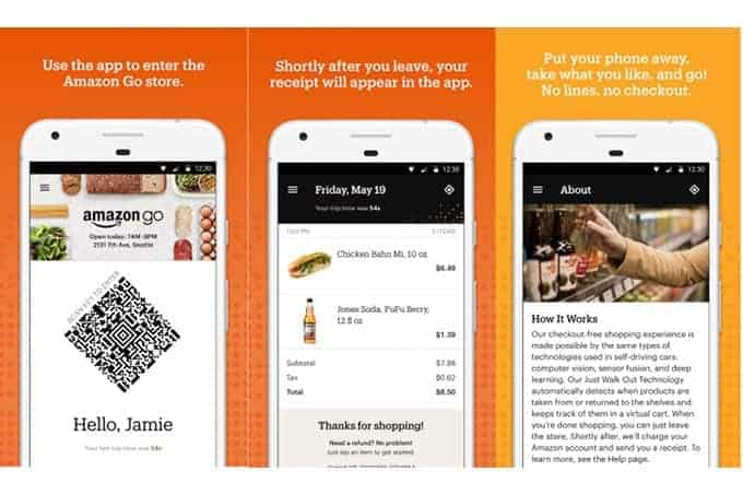
We’ve all heard the stories about AmazonGo being the grocery store of the future. And, to be honest, we’re pretty excited about the prospect of not having to stand in line at the grocery store. The Amazon Go mobile app is at the center of the magic. You must use it in order to shop in the store and your phone can stay in your pocket the entire time you’re shopping, as it records all the items you pick out and charges only those ones to your Amazon account. Then, after you leave the store, it provides you with a receipt of everything you bought. The app itself is very simple, with just a few icons on the bottom in the iOS version, a hamburger menu in the top left corner, and a shape in the top right that serves as your unique code in the Android version, like a QR code almost. Tapping on the code enlarges it and when placed over the scanner at the Amazon Go store entrance, allows you to go in. Overall, the app is uncluttered and facilitates the future of grocery shopping, much like the design and logistics of the Amazon website.
9. WhatsApp Business by WhatsApp
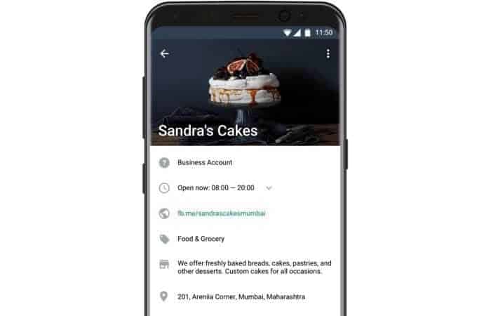
Calling up a business is almost a thing of the past. With mobile integrations galore, you can easily chat with businesses using your favorite social media site or messaging app. Whatsapp is no different. They recently created a business app to help business owners easily display important information and chat with customers. It streamlines communication by allowing businesses to send template replies for frequently asked questions and even get messaging stats to understand how their customer interactions are performing. The business app fits in with the aesthetics of the consumer facing WhatsApp offering. It has muted green, cream, and blue colors, and allows for customization on the business page.
Get WhatsApp Business on Android.
That wraps up the apps for February, but if you’d like to explore some of our other favorite mobile app UI designs, check out our January installment.
Feeling inspired? Sign up for free with Proto.io and prototype your own app in minutes.
If you enjoyed this curated list of great mobile app designs, share it with your social network! Do you have a suggestion for the next edition of our Top 10 Mobile App UI series? Reach out to us via Twitter @Protoio or on Facebook.
 Source:


