If you’ve used the Internet at all this year, you’ve probably noticed national parks are getting quite a bit of attention recently. It’s well-deserved, welcomed, and frankly overdue. Our nation’s parks have been delivering a master class in visual design for hundreds of years, so it’s about time that they get some credit — and thanks to the centennial celebration of the National Parks Service (NPS), they are finally getting it.
Many of the parks under the NPS umbrella have obviously been around for far longer than 100 years (as they resulted from geological evolution over thousands of years), so you may be thinking that a centennial celebration is a tad odd. Yet, the centennial actually marks the creation of the NPS itself — not the natural wonders.
A (Very) Brief Overview of the National Parks Service
Yellowstone was named the very first national park by President Ulysses S. Grant on March 1, 1872. But it wasn’t until 1916 that President Woodrow Wilson signed an act creating the NPS for the purpose of preserving “unimpaired the natural and cultural resources and values of the National Park System for the enjoyment, education, and inspiration of this and future generations.”
Since then, the responsibilities of the NPS have vastly expanded, thanks in large part to the reorganization of 1933. Two executive orders from President Theodore Roosevelt transferred all monuments and parks under control of the Forest Service and War Department to the NPS. This action added historic preservation to their mission and is the reason that sites like the Washington Monument, the Lincoln Memorial, and the Martin Luther King, Jr. Memorial are managed by the NPS today.
In many ways, the national parks provide us with a snapshot of their respective part of the country at any given time. From mammoth rock formations to boiling mud and spontaneous hot springs, these protected pieces of land are some of the most awe-inspiring visual spectacles that you’ll ever see. Using the national parks as our original inspiration, we decided to look at a handful of the most visually stunning parks in America — in and out of NPS domain, both natural and man-made — and why visual design teams really must visit them.
Yellowstone National Park
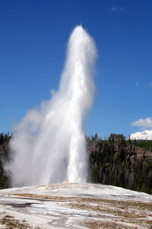
As Yellowstone was the first national park, it’s fitting to begin here. The park largely rests within the boundaries of Wyoming, but also stretches into neighboring Montana and Idaho. Yellowstone is estimated to encompass nearly 3,500 square miles (2,240,000 acres) — most of which is inaccessible backcountry — but the NPS has never been able to calculate its exact size.
Yellowstone is known for many different and fascinating natural phenomena, including Old Faithful, a multitude of hot springs, paint pots, mudpots (a natural double boiler), its very own Grand Canyon, and everyone’s favorite existential nightmare: the Caldera Volcano.
If Yellowstone can teach anyone anything, it’s the sheer power of nature, but the reason that visual design teams should visit has more to do with the unexpected beauty you’ll find. We don’t get to see things like naturally colorful paint pots or geysers that shoot 50 feet into the air in our everyday lives. Yellowstone is definitely a bucket list item, so if taking your visual design team is out of reach, encourage them to go on their own.
Yosemite National Park
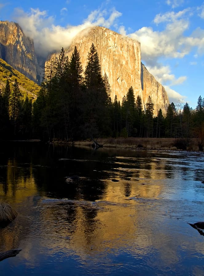
Yosemite National Park has a complicated history with a lot of different settlers (summed up well here), but according to the NPS, its official birthday is October 1, 1890. Spanning over 1,100 square miles (704,000 acres) in eastern California, Yosemite is a visual designer’s dream. Between the vast valleys, giant waterfalls, and massive rock formations, you could spend days inside the park and still not get enough.
It could be argued that Yosemite actually began the movement for a National Parks System when President Abraham Lincoln granted this land to the state of California in 1864. Dayton Duncan, writer and producer of the Ken Burns film The National Parks: America’s Best Idea, points out that our forefathers were quite taken by Yosemite. They knew that the park was special and that it must be protected.
Duncan describes Yosemite as being a sort of “sanctuary” due to the calming effect it tends to have on people. This is a great place to take your visual design team to get them out of the hustle and bustle of their ordinary daily grind. We lead busy lives full of notifications and commuting, but our brains need time to slow down every once in awhile. Sometimes, the slower pace opens new doors for creativity. Maybe this is the perfect place to work on your new meditation app?
Glacier National Park
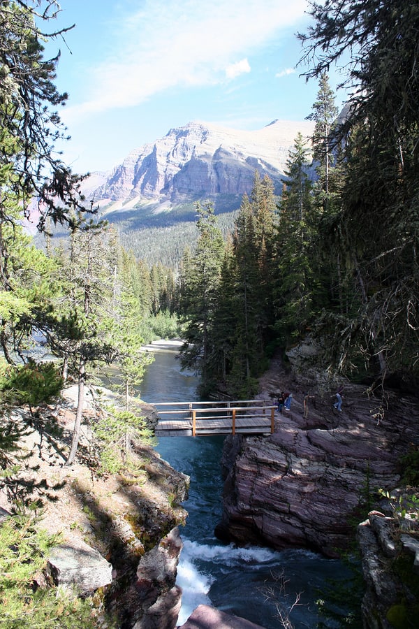
Glacier National Park was established in 1910 and encompasses just over 1,500 square miles (960,000 acres) of northwestern Montana. A smaller portion of the park continues over the Canadian border, where it is known as Waterton Lakes National Park. In 1932, the two were joined and named the Waterton-Glacier International Peace Park, establishing the very first international peace park.
As the name may suggest, Glacier is known for its plentiful water in the form of lakes, rivers, and yes, glaciers. Though they are not the same massive chunks of ice that helped form this incredible marvel of nature, the smaller ones that remain are still shaping the earth today.
Because of the aquatic properties of the park, water-sports like boating and rafting are common, along with fishing and river camping. Camping is certainly not going to be an activity that all visual design teams will jump on (it gets pretty cold at night in the mountains), but a relaxing boat ride or ranger-led tour could be a great team building activity for your crew. Perhaps the serene setting of peaceful lakes could inspire your next mobile app design over a picnic lunch.
Central Park
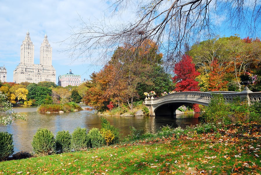
National parks are not the only parks guaranteed to inspire growth in your design philosophy. Many cities have incorporated good visual design into urban parks, helping to break up the concrete jungle and provide a space for residents and tourists to relax. One of the most famous examples is Central Park in New York City.
Stretching over 1.3 square miles (832 acres) on the 22 square mile island of Manhattan, Central Park is one of the most visited tourist attractions in the world, welcoming about 40 million visitors per year. It is managed by the Central Park Conservancy, which offers daily tours of various sections of the park and features ice skating rinks in the winter, a zoo, museums, plenty of running and walking trails, and even a castle.
Central Park really set the gold standard of design philosophy for urban parks. It seems to be every city planner’s benchmark. Each of the following parks on this list incorporate elements from NYC’s most famous park, whether in terms of visual design, activities offered by park management, or even by the park management system itself (typically a non-profit conservancy).
If your business is located in the greater NYC area, Central Park is a given for work outings. There are plenty of activities to spark inspiration for your visual design team, whether as part of a group or an individual in need of a break at lunchtime.
Millennium Park
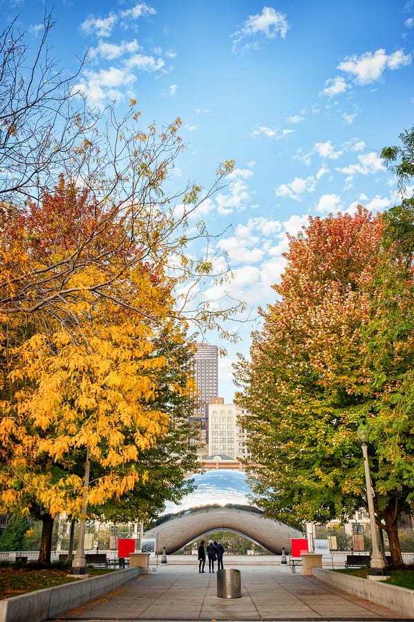
For nearly 150 years, the space that is now known as Millennium Park in downtown Chicago was essentially an industrial wasteland. In the 1800s, the Illinois Central Railroad used it for operations, and former leaders generally conducted city planning around it. But by 1997, this prime real estate located so close to Lake Michigan was being wasted on unsightly train tracks and parking lots.
That’s when then-Mayor Richard M. Daley decided it was time to turn things around and give the city a proper, beautiful public space. Working with the private sector, he was able to raise enough funds to develop and execute good visual design plans for a 24-acre urban park that included plenty of green space, an outdoor music venue, rotating art displays, and of course, that reflective oddly-shaped sculpture most commonly known as “The Bean” (but is truly a work of art called Cloud Gate).
Taking its cue from Central Park: there are daily activities, plenty of trees and grass to freshen the air, and even an ice skating rink in the winter. It’s the perfect place for a midday refresher or better yet — an outdoor meeting. Remember when you were a kid and the teacher would hold class outside in the spring? Adults get spring fever, too. Get outside for a bit and soak up the vitamin D. You’d be amazed at how quickly ideas start flowing when people get out of the cubicle and into natural light.
Schenley Park
Schenley Park began as a land donation from heiress Mary Schenley at the tail end of the 1800’s. Since then, it has grown into a 435 acre visual designer’s paradise in Pittsburgh’s Oakland neighborhood, adjacent to the renowned Carnegie Mellon University. Schenley Park has the usual hiking, biking, running trails, but they also have a sports complex with a swimming pool, track, and tennis courts. Not to mention a disc-golf course, a traditional golf course, an ice skating rink, and a Botanical Garden.
This stunning park boasts a design philosophy that is nothing short of impeccable. It’s rare to be in an urban park and be unable to see city buildings and yet, there are bike paths in Schenley Park that would make you believe you are miles away from civilization. By the same token, you can play volleyball on a grass court with the Pittsburgh skyline in the background, just across the Monongahela River.

What Visual Design Teams Can Learn from Parks
Visual designers can pick up a lot of good design tips from parks, but the biggest lesson of all is often overlooked. Visual design doesn’t stop at how something looks — it’s part of the overarching design philosophy set by the vision and mission of the company. A visual designer’s job is to create something that both carries forward and enhances the project and a mobile app is no exception.
While the national parks in particular might not have needed a lot of visual design work in terms of creation, they did need quite a bit of logistic planning in the form of visitor centers, parking lots, roads, and ranger stations. The unique caveat in this case is that the mission of the NPS is to preserve, so the design team had to adjust their design philosophy accordingly.
On the other hand, urban parks need heavy visual design help because they serve many different purposes. Some people go to the park for peace and quiet, while others are looking for community sports or exercise, which means that “good visual design” means something different to each visitor. With this in mind, designers might be prudent in placing tennis courts and rock climbing walls away from quiet spaces intended for reading or meditation.
Just like writers are encouraged to read to expand their creative abilities, visual designers should be taught to go out and see new things. Urban parks are great for breaking up your day, but be sure to find a national park near you to see wildly impressive things guaranteed to change the way you look at visual design. So get outside and let the sunshine do a hard reboot on your brain.
From all of us at Proto.io, happy 100th birthday to the National Parks Service. Thanks for all that you do.
Proto.io lets anyone build mobile app prototypes that feel real. No coding or design skills required. Bring your ideas to life quickly! Sign up for a free 15-day trial of Proto.io today and get started on your next mobile app design.


