Visual designers tend to find inspiration in a large variety of places. Sometimes, it’s a simple shape or a sound. Sometimes, it’s an experience in a new place or a building they saw while on vacation. No matter what it is or where they find it, creative people will always find inspiration — and the realm of visual design is certainly no different.
When it comes to mobile apps, visual design is just as important as functionality. If someone doesn’t like the “look” of your app, it doesn’t matter how well it works — they will still dump the product you worked on for months, or even years, for an alternative that looks beautiful.
The role of visual design may seem obvious to most, but learning how to incorporate gorgeous visual elements can be daunting at times. It’s difficult to come up with new design. How do you make something familiar, yet unique? How do you stand out, but still easily onboard users into your product? The answer, sometimes, isn’t exactly what you would expect: take, for example, an airport.
#1. Airports: Visual Design Made Simple to Get You In and Out
Even experienced travelers agree that airports can be stressful at times. Airports are full of people who are not watching where they are going, bickering with their loved ones, angry that the security line is taking so long — all of this alongside thousands of other anxious travelers.
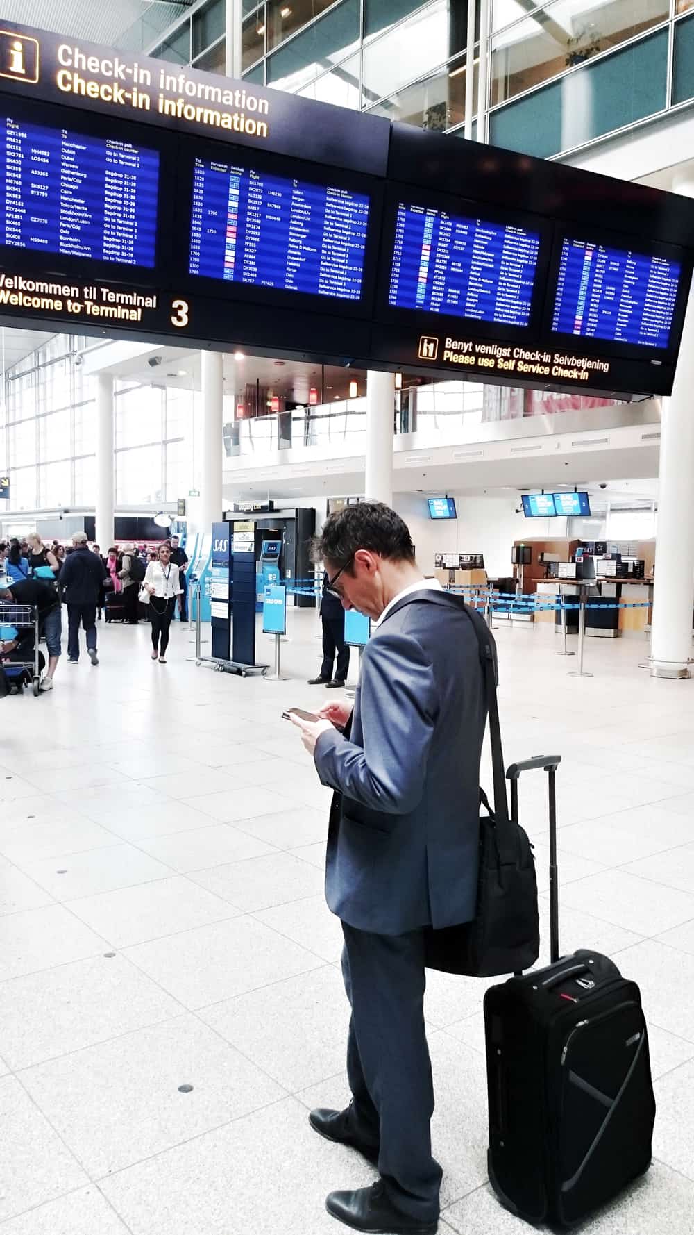
In many ways, airports are like mining tunnels: everybody goes to the same door and then spreads out toward their destination. Visual design in airports is dedicated to getting a large number of people in and out quickly. In 2013, Forbes ranked the Hartsfield-Jackson Atlanta Airport (ATL) to be the most crowded airport in America, with over 250,000 people flying on about 2,500 flights every single day. Moving that many people through long corridors is no easy task — it requires an elegant design to work efficiently.
In the case of airports, the design is instrumental in organization. There is only one way to enter and one way to exit. All of the directional signs are hanging from the ceiling so that they are visible to everyone. The signs are full of arrows to guide people in the right direction. Each terminal has its own restaurants and shops, allowing the passengers to stay close to their gate to hear announcements (without jumping from one side of a mile-long complex to the other just to grab a bite, or to accomplish some basic task — like getting to a bathroom or buying last-minute souvenirs).
Using Design to Highlight and Clarify Information — Not Obscure It
The lesson here can be simple. Your mobile app UI must be clean and organized. Users are there to accomplish a task — be it finding something they need, paying a bill, or keeping track of information. Don’t make it too complicated for them. Beyond that, bear in mind that a little extra polish may take the UX up a notch. Visual design can be greatly improved by adding a striking background, the right font, or a smooth, adaptive UI.
While “visually stunning” may not leap to mind when thinking of most airports, one smaller-scale airport is polishing their building with the local culture. In an effort to encourage travelers to rest and relax, Cleveland Hopkins International Airport (CLE) keeps multiple art installations on display at all times. Organizers rotate local artists through the exhibits, in addition to boasting terrazzo floors and photo galleries throughout the airport.
Tapping into the “Birthplace of Rock and Roll” mentality of the region, CLE features Rock and Roll Hall of Fame related displays, such as GuitarMania: a community public art project that displays guitars painted by celebrities and local artists. Another art installation currently running is a Superman Exhibit celebrating the creation of the original Superman character by Jerry Siegel and Joe Shuster in the city of Cleveland.
If you think about it, airport design is a bit brilliant. They are all the same (the signs, terminal layout, baggage claim), yet each is completely different (size, shape, local flavor). The next time you are at the airport, take a moment to appreciate all the elements of visual design at play around you. Maybe you’ll even find a fun art display to keep you occupied during your layover.
#2. Parks: Visual Design Meant to Relax and Amaze
The USA is full of parks, both big and small. Most cities feature parks of some kind, even if you have a bit of a drive to get there. Channeling our inner Leslie Knope, we have to admit that here at Proto.io, we enjoy the occasional jaunt in the park. It’s great for walking meetings, brainstorming, and unwinding. Something about the green-space is refreshing and inspiring.
Parks are the most perfect example of effortless visual design. While some parks are modified by humans, others are simply just works of the Earth, doing what it wants to. We don’t choose the color scheme (they’re called Earth tones for a reason). We don’t make the grass greener or the trees taller. Each park is different and can teach you invaluable lessons about visual design through breathtaking landscapes, vibrant color, and rich texture.

With Visual Design, Let the User Experience Guide You
Perhaps what we can learn here is that mobile app design doesn’t have to be rocket science. Be sure to look at the UX from just that — the user’s point of view. When a pop-up reminder appears, what happens to the background? Maybe it should blur slightly so the user is focused on the reminder. Is there a sound? A vibration? Let the app’s intended purpose by your guide.
In 2016, the National Parks Service is celebrating its 100th anniversary, so it only seems fitting that Parks should be featured in listicles that discuss gorgeous visual design. There are literally hundreds of historical sites and parks that fall under the purview of the National Parks Services (you can find one near you by searching or using the interactive map).

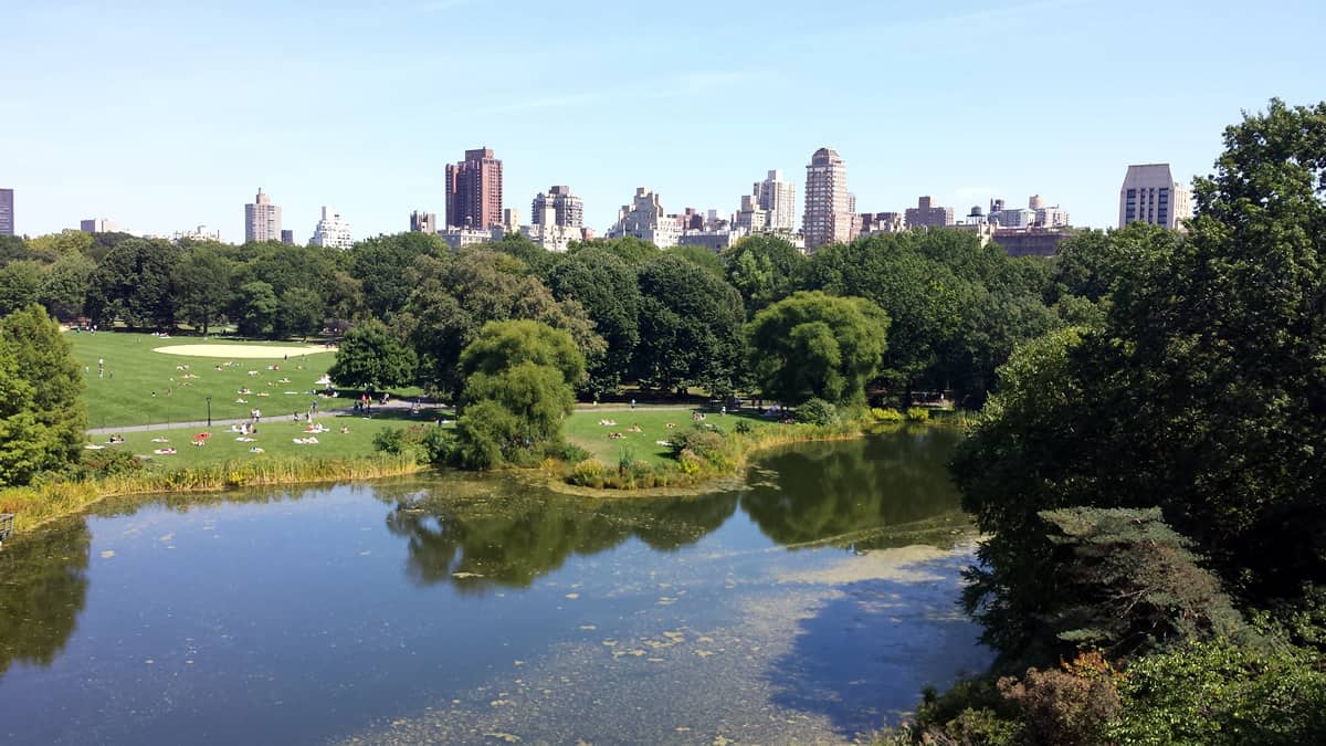
A famous park within reach of 8.5 million New Yorkers is Central Park. This park itself has been in existence for over 160 years, enduring booms and busts along the way. After a serious era of decline in the 1950s and 60’s, the Central Park Conservancy was founded to “restore, manage, and enhance Central Park in partnership with the public,” leading us to the park that we know and love today.
Central Park can serve as a valuable lesson in visual design: most of the park’s “design” comes from necessity. Paths through the park aren’t necessarily designed to move people efficiently from point A to B, like in an airport — instead, they meander and allow visitors to see the beauty of the park. After all, that’s what they are likely there for in the first place! When building any kind of UI, you need to always keep in mind why your user is using your app. Are they playing a game? Are they doing their taxes? Either way, you need to make sure your design matches their needs.
#3. Grocery Stores: Visual Design Meant to Fill Your Cart (And Your Belly)
People either love or hate grocery shopping. Haters complain that aisles are crowded, pre-occupied people run into you with their carts, and that the long lines are a waste of time. Lovers (who we still aren’t sure actually exist) take their time picking out their favorite ingredients, always on the lookout for the best deals.
Traditionally, all brick and mortar grocery stores follow a similar layout principle: perishables on the outside ring, non-perishables on the inside aisles. Most retail environments follow the rule stating that “eye level is buy level,” and some even allow brands to purchase more advantageous shelf space to boost sales.
Grocery store science claims that it is best to place colorful produce by the front door in order to put you in a better mood. Bakeries are pumping out fresh-baked goods and those delightful rotisserie chickens are constantly spinning for a reason: to make you hungrier. Have you ever grocery shopped on an empty stomach? We don’t advise it. Your cart will fill much quicker.
What Wegmans Can Teach Us About Good Design
It might be a bit more complicated to add scent to your mobile app design (we’d love to see it happen), but it’s easy to see that streamlined organization is the lesson here. If you are looking for milk at the grocery store, you’ll assume that the cheese won’t be far from there. Perhaps yogurt is another case down, along with creamer. Drop down menus can serve a similar function in this regard, giving users additional, appropriate options under each major heading.
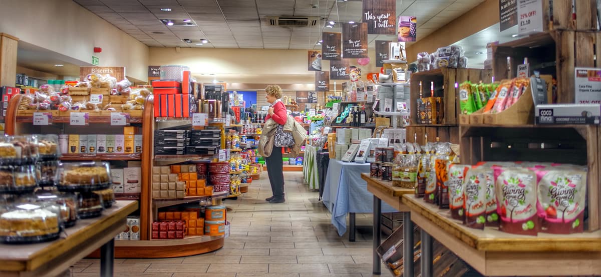
If you’ve ever met anyone who regularly grocery shops at Wegmans, you may have given them a strange look as they pontificated on the glory of their shopping experiences there. Wegmans is a (very!) popular grocery chain in the American Northeast that is known for having stores that are actually enjoyable to be in. Sure, on a base level, all grocery stores have food for sale. But none of them can hold a candle to Wegmans, who has done a marvelous job at differentiating themselves.
People do not hate grocery shopping at Wegmans. Even people who don’t love Wegmans don’t necessarily hate shopping there. The bakers are still there, pumping out delightful smelling goods all day — this is science, after all. But, the stores are clean and tidy. Prices are reasonable. Many of the stores have restaurants where you can purchase food made daily in the store (including sushi, which is where you’ll find the Proto.io staff). Not to mention that massive cheese selection.
If most grocery stores have the same visual design philosophy as Aldi (bland wall color, sterile looking shelves, fluorescent lights), compare Wegmans to Trader Joe’s (homey feel, warmer tones, wood accents). The science is still there. You just feel happier when you’re spending your hard-earned money. Remember — gorgeous visual design can heighten the user experience and convert “visitors” into long-term customers.
#4. Theme Parks / Zoos: Visual Design Intended to Keep People Flowing (And Spending)
Whereas airports are designed to get people in and out, theme park and zoo design are meant to get people in — and keep them in. The hope is that visitors will spend the whole day there, winding through the “streets”, seeing exhibits around the park, eating lunch, and getting some souvenirs for the kids. In short: the longer they stay, the more money they spend. And it works like a charm, doesn’t it?
Anyone who has spent a day with their kids in a theme park knows this crucial design element to be totally true. Much like the candy and gum at the checkout counters in the grocery store, theme parks are relying on impulse buys. If it starts raining, you better believe those ponchos and branded umbrellas are fully stocked in every single shop.
Most theme parks follow a similar design philosophy: divide the park into thematic regions, and in the case of zoos, house geographically appropriate animals in each section. Each designated section of the park flows into the next with purposeful changes in visual design to create a new mood, promote a different activity, or showcase a certain exhibit. As mobile app designers, this is a great lesson to take by the hand and run with it.
If your app is designed to show various aspects of your business, changing up your design accordingly is a way to visually differentiate one from another. If your veterinary practice develops an app to help educate pet owners about their animals, you might want pictures of kittens in the background on the “Cats” page, but puppies on the “Dog” page.
And don’t forget the impulse buy element. Take a page from the theme park playbook and ask for the sale. Perhaps a push notification to remind users of their bill coming due is a good way to incorporate this. Be sure to tell users about new offerings while the app is loading or performing another task (Is your pet due for an appointment? By the way, treats are on sale!). The more users think about your product, the more likely they are to consume it.
A great example of this strategic visual design is the San Diego Zoo. Stretching over 100 acres, the San Diego Zoo is one of the largest in the country and was voted in 2015 as the #1 Zoo in the World by TripAdvisor. A series of walkways and paths let you meander through the exhibits, which, of course, visually change according to geographic region. If you need a break from walking, the San Diego Zoo even offers a bus tour, which can be a good way to get the lay of the land and decide where you’d like to go next.

What Epcot Can Teach You About Using Design to Bring Users Through Your App
Another example of gorgeous (yet incredibly practical) theme park visual design is Disney World’s Epcot. Specifically designed to follow a global motif, Epcot is essentially a large loop. The entrance is dedicated to futuristic ideas, which leads to a trek around the world that surrounds a lagoon. Epcot uses the same idea of changing themes and visual design with geographic regions as you journey through the park.
Famous for its “go the extra mile” mentality, Disney not only changes visual elements, but local cuisine. You can get authentic fish and chips in the United Kingdom, delicious pastries and champagne in France, and enjoy a tequila tasting in Mexico. This extra element has an immersive effect on visitors, giving you a feel for each country without leaving the park.
Epcot does a great job of moving you through each theme, allowing the visual design of the park to speak for itself. When you arrive in Canada, there’s no question that you’re no longer in the UK (or Florida, for that matter). Likewise, when you’re there, the design tells you everything you need to know (and where you need to go to get the most out of it). In a weird way, Epcot is basically like a brilliant guide to creating a great onboarding experience: show the user what they need to do (and where they need to go) through your design. If it’s good enough, it’ll speak for itself.
No matter what type of visual design you are aiming for, we are here to help. Our easy to use drag-and-drop interface will help you show your developers exactly what you want your new mobile app to look like. Sign up for a free 15-day trial of Proto.io today and get started on your next mobile app design.
Where do you find your visual design inspiration? Let us know by tweeting us @Protoio!


