It’s hard to believe, but September is coming to a close. Students are gearing up to have a great semester and professionals are locking down their projects for the last quarter of the year. Here at Proto.io, we’ve put together the monthly roundup of our favorite mobile interaction designs. Read on to learn about all the app concepts that have captivated us.
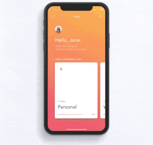
1.iPhone X – Todo Concept by Jae-seong, Jeong for Norde
As we hunker down for the colder months, it’s a great time to check things off your to-do list. This app concept has different todo cards based on home, work, and personal to help users stay organized. As you swipe through each of them, you can select the one you’d like to expand by tapping on it. This mobile interaction design has very smooth swiping transitions, especially when a to-do section expands and returns back to the bottom of the screen. There are two interactions in particular that I like about this concept. First, as you swipe through the todo categories, the color palette of the entire screen transitions to that of the category. For example, an ocean blue or sunset orange color scheme. Second, when you complete an item on a to-do list, it crosses out in a very satisfying motion. Besides, the percentage of the items you’ve completed goes up, helping you visualize your progress.
 Source: Dribbble
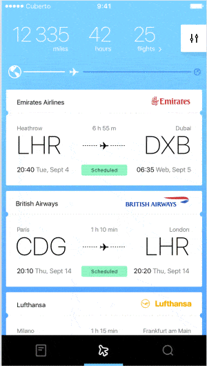
2. Skylovers Animated Interface by Cuberto
I can never get enough of travel apps. This one caught my attention because of its flipping motions. When a user clicks into a flight, the flight options above flip up and those below flip down to the bottom, making room on the screen for a map. On that map you can visualize the route, you will fly, any stops along the way, and points of interest between the start and end points of your trip. Tapping the bottom of the screen with your flight information flips the expanded travel details back to the top of the screen, this time with reviews of the flight.
 Source: Dribbble
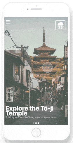
3. Day 14 Location App by Thomas Malone
As usual, another travel app caught my attention. But this one helps with the process of booking excursions while traveling. As you swipe through the options, you get to see different places you could visit, and the weather in the top right corner updates for each location with each swipe. Also, the title of the card drops down in a gentle motion. Once you tap into a particular activity, the attraction and its location pop up to the top of the screen with options slowly trailing up the page. Those are also tappable and expand quickly with additional information about the excursions. This mobile interaction design would make it more pleasant to get all the details ironed out to explore new places.
 Source: Dribbble
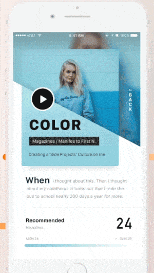
4. Two Invitations by Leo Leung
The seesaw motion of this app concept is what drew me in. When you tap into one of the top cards, the line that had divided colors below the header moves in a seesaw motion, slanting down. Another motion that is very pleasing is the “back” button that falls down in a cascade from the top of the screen, next to the expanded card. Tapping out of the selected card teeters the divisions line back up to the other side until the image disappears, and you’re left with the original colored card. There are a lot of dynamic motions in this mobile interaction design that I appreciate, and I hope to see them in a popular app sometime soon.
 Source: Dribbble
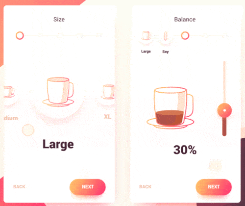
5. Coffee Maker Interface by Gal Shir
This is a fun app concept for customizing a coffee drink. It allows you to pick the size, what type of milk you want, and more with just a swipe of your finger. The size and milk options are round animated icons that users can swipe through to choose what they’d like. Deciding on a size and tapping “next” sends the selection up to the top left corner in a bouncing motion, completing the first step of making a drink. As that happens, the first option for milk bounces to the center of the screen in a complementary motion. After you choose the milk, you have options for the percentage of “balance” and foam. These take on a different form, with the animated cup showing the changing percentage as you toggle the scale. Going back or forward at this stage makes the animated cup jump ever so slightly. In an increasingly mobile world, this mobile interaction design could help coffee lovers get their drinks just right.
 Source: Dribbble
That’s all for September, but be sure to check out last month’s edition, featuring the best mobile interaction designs of August 2017.
Feeling inspired? Sign up for free with Proto.io and prototype your own interaction design in minutes.
Proto.io lets anyone build mobile app prototypes that feel real. No coding or design skills required. Bring your ideas to life quickly! Sign up for a free 15-day trial of Proto.io today and get started on your next mobile app design.


