The days of summer are waning, and whether you’re going back to school or just facing the fact that colder fall days are on their way, we’ve got some mobile interaction designs to keep a smile on your face. Apps got you where you were going this summer and helped you prepare for going back to school. Now it’s time to check out some app concepts making a splash in the design world.
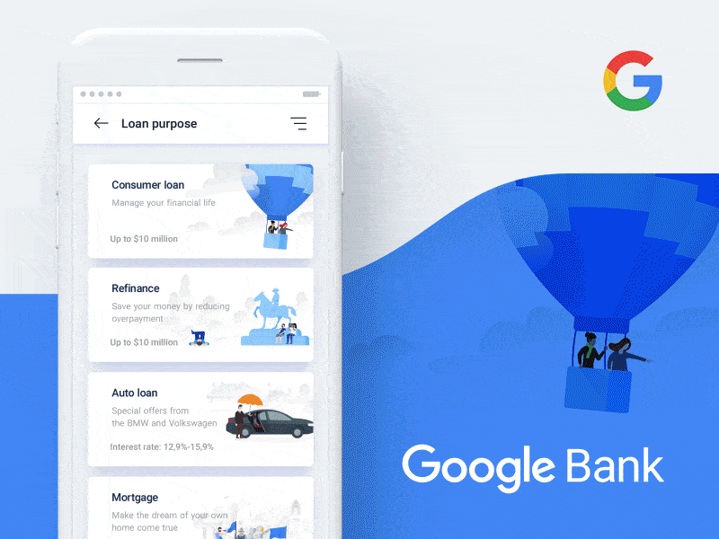
1. Google Bank Application Concept by Nick Taylor for humbleteam.
Getting a loan is not an exciting process, and it’s generally done in a stuffy bank. However, this mobile interaction design aims to make it enjoyable with a straightforward and beautiful design. This seamless process starts off when you tap to select the type of loan you want. It then transfers the color of the loan you select onto the next step where you choose the loan value you’re requesting. You toggle between the left and right sides of your screen and watch the amount rise and fall. Next, you select the term of your loan based on preset options. Another motion in this app concept that I really like is the chat feature once you choose the bank from which you want to get a loan. As a first time or even experienced loan recipient, you will often have questions. Having help built right into the app and pop up as you’re finalizing the details of your loan is certainly handy.
 Source: Dribbble
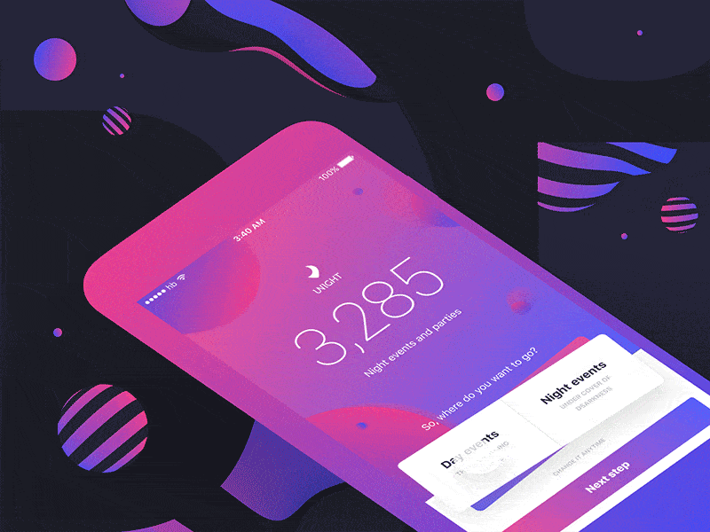
2. Unight — discover the night by Stan Yakusevich for Heartbeat Agency
Where do I even start with this beautiful concept? The goal of this app seems to be getting its users out and about to have more fun. What’s not to love? Then you see the design, and it’s clear that the designers wanted to start the fun even before users even pick an event. It has a great seesaw motion that shakes into place when you toggle between day and night events. As you do that, the color scheme changes to deep purple for evening events and bright peach for daytime events. At the same time, the numbers tick up until it reaches the number of events for that time of day. In all, this mobile interaction design conveys the point of the app successfully with a playful motion
 Source: Dribbble
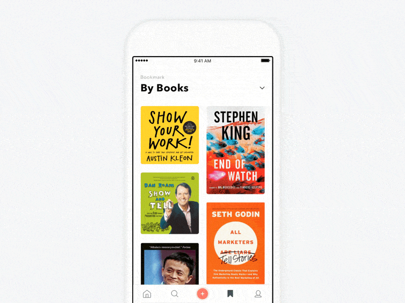
3. #Exploration – Book Quotes – Open Detail by Dwinawan for Paperpillar
This app concept helps users share quotes based on specific books. It has crisp movements that feel very practical and natural based on the function of the app. Scrolling through the different apps is a fluid motion. When you pick a book and tap on it, it moves up to the top right corner with additional information about the book and quotes fading in slowly. The one movement that stands out in this mobile interaction design is the price tag. It pops up after the book fully migrates to the top of the screen. It is the fastest movement in this app concept, but it still fits in nicely with the other slower movements.
 Source: Dribbble
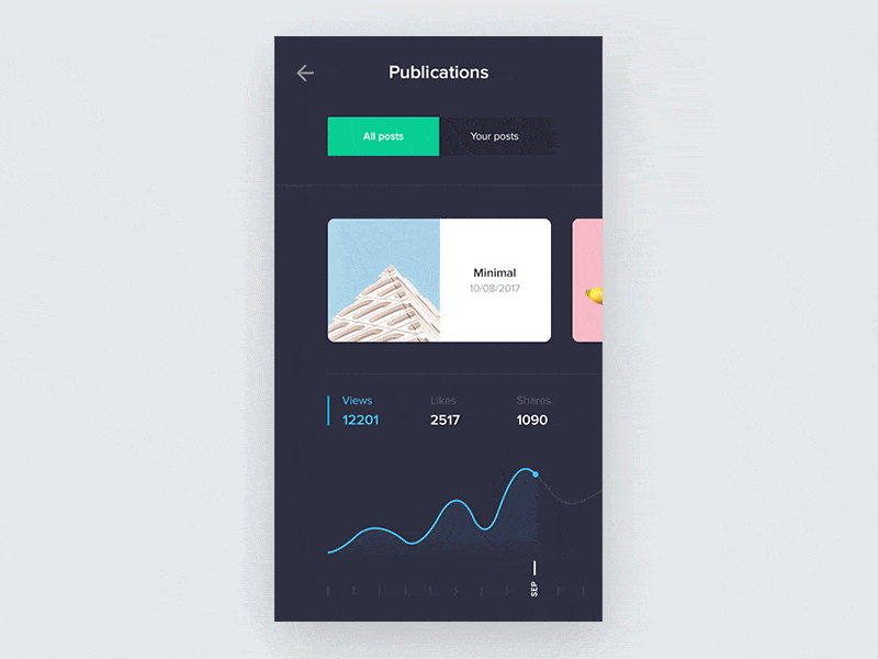
4. Mobile Stats Exploration by Grégoire Vella for Minimal Apps
Data is everywhere, and you can collect stats on just about anything. This is a smooth mobile interaction design to show the views, likes, and shares on your social images. As you swipe through images near the top of the screen, the graphs showing your stats change and show how many interactions it got over several months. I love the simple and very visually pleasing way that the graph is traced in the particular color for that interaction. It’s an extra moment of delight that changes color as you switch between views and likes.
 Source: Dribbble
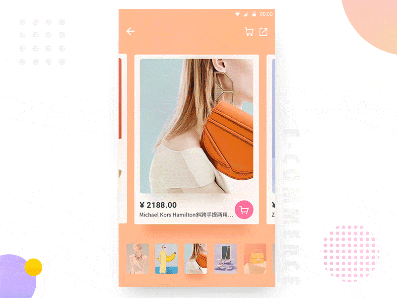
5. E-Commerce App-Event Cards Interaction by LINA_ for UIGREATY
Shopping online misses the excitement of being in the store and being able to touch products. This app concept tries and succeeds at making the online shopping experience a little more life-like. As you swipe left and right through products, it allows you to move around the product image and get a unique view of it. This motion almost feels like you’re touching the purse, in this case. Then you can tap the image, and it jumps out at you and provides the full product information. If you decide against it, with a tap of your finger, it jumps right back into place in the product list.
 Source: Dribbble
That’s all for August, but be sure to check out last month’s edition, featuring the best mobile interaction designs of July 2017.
Feeling inspired? Sign up for free with Proto.io and prototype your own interaction design in minutes.
Proto.io lets anyone build mobile app prototypes that feel real. No coding or design skills required. Bring your ideas to life quickly! Sign up for a free 15-day trial of Proto.io today and get started on your next mobile app design.


