We’re smack dab in the middle of summer and there are tons of new mobile interaction designs popping up to keep the industry on its toes. If you’re ready for sparks and sizzles, read on for the designs we picked out for you this month.
1. Marketplace Animation by Alex Bender
This marketplace app concept is a ton of fun, mainly due to the flittering movements as you move between categories and expand to view specific categories. When you get to the main wishlist, there is a nice upward bouncing motion to settle the header and first category into place. Then you can crisply scroll through the wishlist categories, coming to a hard stop at each one. Finally, tapping into a category expands it and the product images move fantastically, expanding from left to right, with the text quickly appearing between them.
 Source: Dribbble
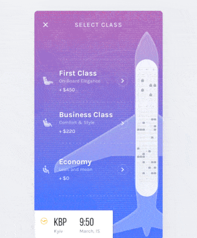
2. Select Seats & Payment Flow by Vitaly Rubtsov
Saying that I love to travel is quite the understatement, but what I don’t love quite as much, is the process of booking travel. This app concept revisits the booking process and makes it design friendly. It is intuitive and the detail involved is nothing short of remarkable. This concept takes us through the process of picking which type of plane seat you’d like to purchase, then the background image of the plane takes over the screen and rotates to take you straight to the seat selection process. Once you select an available seat for the class you’ve chosen, you can quickly pay via Apple Pay and have your boarding pass in no time. The animations make the flight booking process much easier and more pleasant. Less time searching for flights and more time seeing the world? Count me in!
 Source: Dribbble
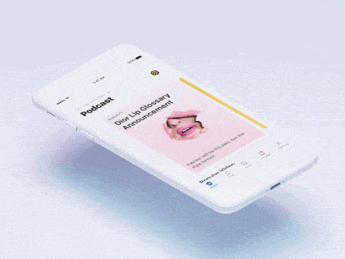
3. Card Interactive Demo by Chris Yang for New Beee
This podcast app concept has a mobile interaction design rooted in cards. I especially like the way the cards change from portrait mode to landscape, when switching from clicking on them to what seems to be the main menu. Along those same lines, it is also interesting how the text is on top of the image in portrait mode, but once it switches to landscape, the text scrolls up to be below the images.
 Source: Dribbble
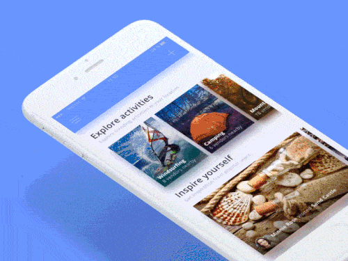
4. Sticky UI Elements by Lukáš Straňák for PLATFORM
This app concept is an exploration into sticky UI elements. It tackles exploration and inspirational activities. In particular, it drills down into exploring through camping. When you tap into the camping section of the app, the small camping icon expands to take up the top almost half of the screen and it acts as a header for that section. Then, popular and local camping suggestions populate below as the camping header image continues expanding slowly. This is the most fluid movement in this mobile interaction design, as the other transitions are rather blunt, with no extra movement. The other notable interaction is the way the camping location suggestions filter down when you return to the options under the main camping header.
 Source: Dribbble
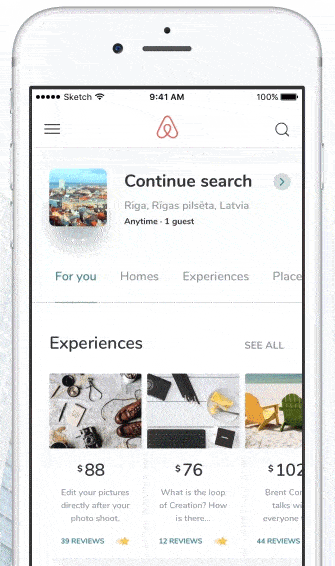
5. Airbnb Resent Search Result by Vlad Tyzun for Mind Studios
If you’re an avid traveler like me, you probably spend a good amount of time combing through Airbnb listings to find a great place to stay. This app concept approaches the more recent “experiences” feature where you can explore a city with guides, learning to cook, walk through areas with street art, etc. Vlad has some interesting mobile interactions going on here in his concept. One of my favorites is the expanding and shrinking of what you searched (where, when, how many people) as you scroll down through the options that populated. This would be helpful for users because it allows them to focus on the results after they narrow down what kind of experience they’re looking for. On top of that, when you go back to other searches you’ve done, there’s a fun interaction in which you click the landscape image and it expands up to the top of the screen and additional images slowly pop up near the bottom of it. This neatly reverses with the tap of your finger.
 Source: Dribbble
That’s all for July, but be sure to check out last month’s edition, featuring the best mobile interaction designs of June 2017.
Feeling inspired? Sign up for free with Proto.io and prototype your own interaction design in minutes.
Proto.io lets anyone build mobile app prototypes that feel real. No coding or design skills required. Bring your ideas to life quickly! Sign up for a free 15-day trial of Proto.io today and get started on your next mobile app design.


