With a full week of spring already under our belts, it’s only natural to wonder what designers have been cooking up during the colder months. In this roundup, you can find our favorite mobile interaction designs from up and coming designs and established professionals as well. Let’s jump right into these innovative designs that are sure to inspire you.
1. Asana Proofing – Add Actionable Feedback by Greg Lilley for Asana
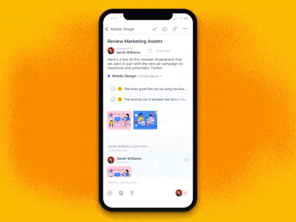
No matter what productivity tool you choose to use, it must facilitate easy feedback and communication features to keep projects moving forward. Asana is one of the bigger productivity apps, and they released this app concept to show how teams can give feedback. In this example, a user can upload text and files to their group projects. When someone on their team taps into the project to get an update, they can see that there is a yellow circle in the corner of the image, showing that there are comments on it. Tapping the image expands it, and one more tap of the checkmark at the top of the screen pulls up the places where the team member had comments. Lastly, tapping on the specific comments on the image gives the yellow circle a halo, and a card with the comment text slinks up the screen. Easy collaboration on mobile app designs? Count us in!
 Source: Dribbble
2. Human Body Scanning by Taras Migulko for Awsmd
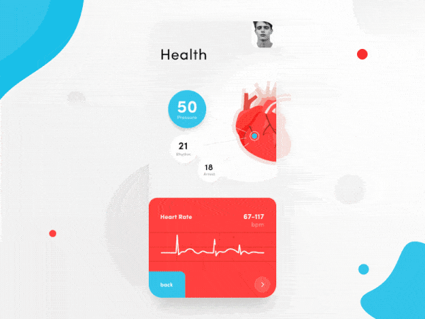
As technology improves at the speed of light, designers keep thinking of crazier things we could use it to help the human race. This designer, in particular, imagines a mobile app interface for a full body scan. With the camera pointed at a patient, a doctor performs a test that looks almost like an animated x-ray to determine what’s wrong with them. As the scanner moves up and down the patient’s body, there is a blue line moving back and forth within the cream colored box, trying to determine the area the problem is coming from. It eventually determines that the patient has a problem with their heart and show this by having a beating red heart show up in an otherwise empty skeleton. To learn more about the health issue, the heart pops out of the skeleton to provide additional information, as well as vitals that are important to heart failure. The movements here are especially exciting to watch. The one in particular that caught our eye was the heart rate monitor tracing along from left to right.
 Source: Dribbble
3. Petiole Vase by Kate Laguta for Laguta & Laguta
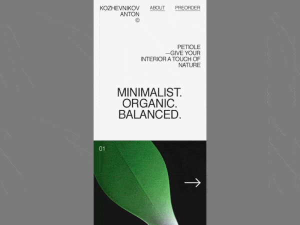
This app concept is the definition of sleek. With such crisp transitions, we can’t help but love it. The text appears on the screen in waves, giving the user a moment to wonder and get excited about what is coming next. An interesting thing to note is that this app seems to have deliberately slow transitions. And in a time when consumers expect everything to be as fast as possible, a slow down to actually enjoy the app design and the product it aims to show is quite refreshing. Next, arrows let users know which direction to swipe to reveal more content. Then, as with many commerce related apps, users can swipe through cards of different angles of the product to get a better understanding of it.
 Source: Dribbble
4. Photo Editor by Sebastian Jungbluth
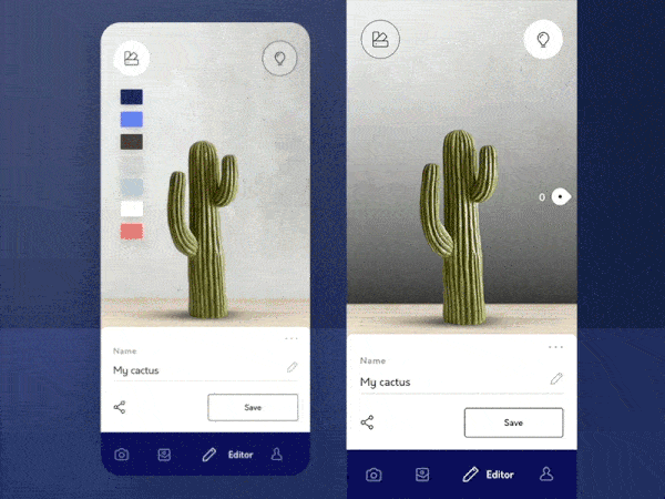
This app concept is a wonderful take on the photo editing apps we’ve grown used to. Tapping the icon in the top left corner with paint swatches turns the icon from gray to white and cascades down the color options. Tapping on them changes the color of the object being edited. Next, tapping the light bulb icon in the top right makes an arrow pop onto the screen. Dragging your finger up and down the screen near the arrow changes the lighting from darker to lighter as you swipe up the screen. This take on a photo editing app is a welcome change to the status quo and includes some motion interaction design components that will make any designer swoon.
 Source: Dribbble
5. Short Story of a Badge by Paarth Desai
We love to save the best for last, and this installment is no different. In such a connected world, notifications have become the norm. Sometimes these are good notifications, like friends commenting on your new profile picture. Other times, such as when you have a mountain of mentions on Jira out of nowhere, they are not quite as enjoyable. This designer decided to bring a moment of delight to the notification process. To show that the user has a new notification, a pink arrow zooms around the bell (making it jingle, in a lifelike motion) and lands in the upper right corner of it. Once the user taps the notification to dismiss it, the pink circle tumbles down the bell and disappears. This take on classic notifications is one we wouldn’t mind seeing in apps we use each day.
![]() Source: Dribbble
Source: Dribbble
That’s all for this installment, but be sure to check out our previous edition, featuring the top mobile interaction designs of October 2018.
Feeling inspired? Proto.io lets anyone build mobile app prototypes that feel real. No coding or design skills required. Bring your ideas to life quickly! Sign up for a free 15-day trial of Proto.io today and get started on your next mobile app design.


