We’re back with another edition of our favorite mobile interaction designs. This month we think you’ll be blown away by these app concepts because of their smooth transitions and delightful color palettes. Not to mention little Easter eggs hidden in unexpected places.
Let’s jump right into these interaction designs and discuss why we find them so noteworthy.
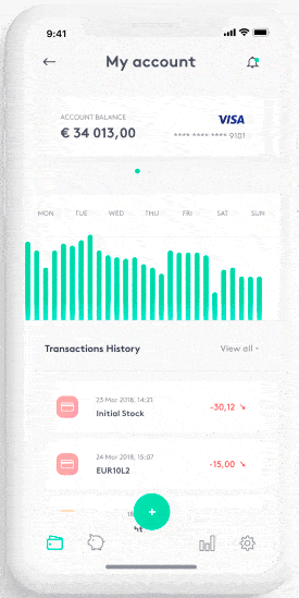
1. Banking App #1 by Tomasz Dyrks
When you think of your favorite apps, it’s very unlikely that you think of your financial apps. Useful, yes. Fun? Not so much. Tomasz makes app-based banking a much more enjoyable process with his animated transitions between different credit cards. Up at the top of the screen are cards the user can swipe through. As they do this, the graph showing when transactions were made comes to life and changes accordingly. Simultaneously, the transaction history below the graph quickly contracts and expands to show the recent transactions made using that particular card.
 Source: Dribbble
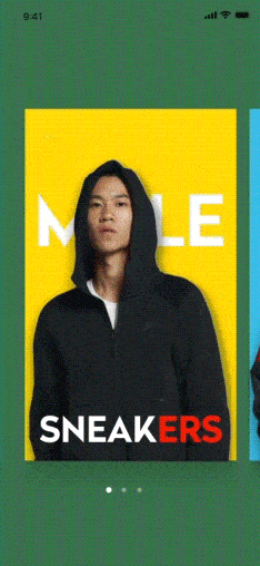
2. Transition Animation by lix2 for UIGREAT
This fashion app has many quick transitions that make it quite pleasing to the eye. While swiping through clothing options, tapping on one brings some product information to the screen by using motion as if the user is pulling down the model in the picture and flinging him towards to top of the screen. This momentum creates the space below for the preliminary product information to populate by moving down the screen slightly. Tapping on the card with a model one more time opens the image as if it’s a book and populates the full product information that travels up the screen before settling in.
 Source: Dribbble
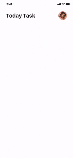
3. Fitness Today Task by X.2.P for Dreamotion
When fitness apps were introduced to the world, it got way easier to track progress. From steps taken to calorie intake, this app concept packs it all in to help users get and stay healthy. The first mobile interaction that caught our eye was the circular meter near the top of the screen. To help users understand how they are doing compared to their average, it acts almost like a snow globe, with water sloshing around inside it, going up to the level that corresponds with the percentage the user is at for that day. Secondly, on that same screen, the user can quickly tap the bar charts at the bottom of the screen to take note of another glass of water they drank, for example. This ticks the number for the day up, moving smoothly from one to the next. Lastly, when tapping into the specific activities the user is monitoring, the bar charts show which one is currently being viewed by elongating it.
 Source: Dribbble
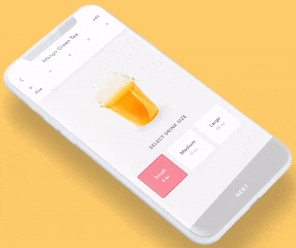
4. Drink Ordering by Bre Huang
Boba drinks are so tasty and fun, it was only a matter of time before someone created an app concept that captured the ordering experience so perfectly. Bre makes it possible to customize a drink, starting with picking the size. Once the user selects size and hits “next,” the fun begins. Users can slide their finger along a line indicating sweetness and ice levels, helping the user get every detail just as they like it. As they select these specifications, the image of the drink above updates to show what the selection will look like. Lastly, the user selects the toppings by tapping on the ones they want. This fills the cup with exciting colors and is the last step before finishing up and submitting the order.
 Source: Dribbble
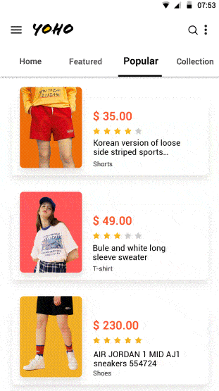
5. Design of E-commerce App by Yinggang Chen
To finish up this month’s roundup of the best motion interaction designs we came across is another one from the fashion world. It has enticing, bright colors and transitions to match. Tapping on a product image for a pair of shorts flips it up to the top of the screen to become the header image. Next, the reviews scooch up the screen and cover part of the product image with a star rating and reviews from customers who bought it. Tapping on a reviewer’s image takes users to their profile with additional reviews for other products. A nice interaction we weren’t expecting was pulling down on an image. That action “likes” it, adding a heart in the space above it quickly before it moves up the screen to go back to its previous place.
 Source: Dribbble
That’s all for October, but be sure to check out last month’s edition, featuring the best mobile interaction designs of September 2018.
Feeling inspired? Proto.io lets anyone build mobile app prototypes that feel real. No coding or design skills required. Bring your ideas to life quickly! Sign up for a free 15-day trial of Proto.io today and get started on your next mobile app design.


