Here at Proto.io we can’t believe it’s fall already. As we close up the warmer months and get ready for intense focus this fall and winter, we couldn’t help but notice the amazing work designers have done recently on Dribbble. This month we bring you some mobile interaction designs from around the world that have swiped and tapped their way into our hearts.
Read on below to see the latest and greatest in mobile interaction design.
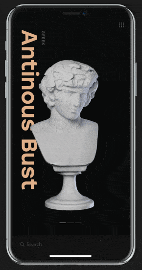
1. Museum App Interactions by tubik
Going to iconic museums can be an overwhelming experience—there is so much to see and it’s easy to miss some of the important pieces if you don’t have a gameplan. This museum app concept helps art lovers learn more about works of art, then locate them within the museum. The feature of this concept that we love the most is the rotating of the statues. As a user swipes left or right to discover more, the statue they’re viewing rotates to show a different angle, as if they are on swivels. In addition, swiping up to learn more about a certain statue sends it spinning in the opposite direction to show the other side, as information about its history populates below. Tapping “get directions” at the bottom of the screen brings up a map and has a delightful yellow line that traces the route from the user’s location to the statue.
 Source: Dribbble
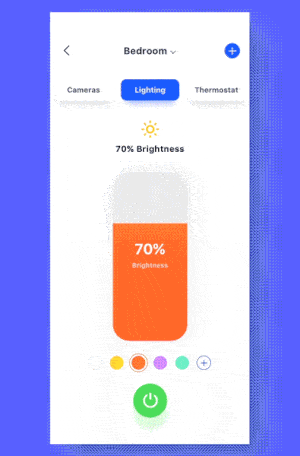
2. Dynamic Design of Smart Home by Hoveny for UIGREAT
Smart home tech is becoming increasingly popular and this app concept fits nicely within the trend. It allows users to pick colored light for their bedroom. First the color wheel spins onto the screen and the user is able to tap and drag to get their desired color. Tapping “add” in the hard to miss button below adds it to the colors they’d like to use. Then they are able to see all of the colors in their collection. While a user might find it a bit unintuitive, from a design perspective, deleting a color from the options is a very interesting process. It involves dragging a color from the color options arranged in a pentagon. To show that it’s gone, the color makes a splattering motion, disappears, and the shape the colors were reconfigured to make use of the extra space.
 Source: Dribbble
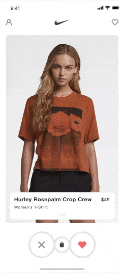
3. Nike + Tinder by Vlad Fedoseyev for Norde
What if retail apps could gamify the online shopping experience? Would shoppers enjoy it more? Would they add more to their carts? This app concept takes on the task of making shopping fun with the swiping motion Tinder has popularized. First there are cards to swipe through, showing models wearing the shirts and basic product information below. Tapping on a shirt brings up a video showing how the shirt moves. Lastly, once the shopper gets to what seems like the product page by swiping up from the bottom of the video, they can choose color and size options.
 Source: Dribbble
4. Études Studio by Kévin Gautier for Norde
Fashion interaction designs clearly caught our attention this month. This app concept takes fashion in a different direction, but still has some really smooth interactions that pop up when the user swipes. When checking out products, users can swipe to the left to see the item styled in a different way. Swiping up shows product information and gives the option to buy. And an interesting interaction is hard to miss when the bar at the top of the screen flips down to return a user to the product image after looking at product information. Just like with the product images, the user can swipe through the top bar options as well. We found this particularly interesting because we hadn’t seen multiple card based designs of different shapes and sizes displayed on a screen at the same time quite like this before.
 Source: Dribbble
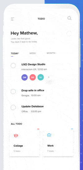
5. Task Manager – TODO Interaction UX by Dh:pu Mathew
Adding a meeting to your calendar can be anywhere from a clunky to a mundane experience, but this app concept aims to make it sleek and enjoyable. This interaction design shows the process of entering an event into a user’s calendar. One aspect of this app concept that we appreciated was the button motion when a user presses starts adding an event to their calendar. Tapping the small purple square at the bottom of the screen expands it to take over the entire bottom of the screen. The text “add task” also appears to make it very clear what action the user is about to take. This app concept keeps it basic with an overlay on top of the typical calendar view that asks the user to name the event, tap a button for when the event will take place and color code it based on what type of meeting it is.
 Source: Dribbble
That’s all for September, but be sure to check out last month’s edition, featuring the best mobile interaction designs of August 2018.
Feeling inspired? Proto.io lets anyone build mobile app prototypes that feel real. No coding or design skills required. Bring your ideas to life quickly! Sign up for a free 15-day trial of Proto.io today and get started on your next mobile app design.


