Design standards are higher than ever and, lucky for us, we get to see the latest and greatest apps here at Proto.io. We’ve rounded up some really impressive mobile interaction designs that we came across over the course of the month. From lifelike animations to interactive photos, these app concepts will get you thinking.
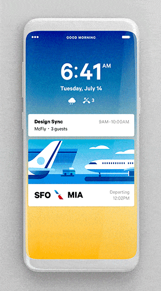
1. Lock Screen Calendar by Alex Sol for FΛNTΛSY
This app concept is a fun take on the boring calendars we’ve gotten used to. Instead of looking at plain time slots during a specific day, it features a colorful vertical layout that allows you to swipe through your day from your phone’s home screen. The day that it highlights shows the alarm you set, the current time, then the first meeting of the morning with details on where and with whom it is, and flight details for later in the afternoon. Two of our favorite features are the related call to action buttons: a “running late” button to notify the group you’re meeting with. Then, am “order Uber” button so that you can make it on time to the airport. Lastly, the motion interaction showing your route to the airport with the estimated amount of time it will take is both helpful and visually pleasing.
 Source: Dribbble
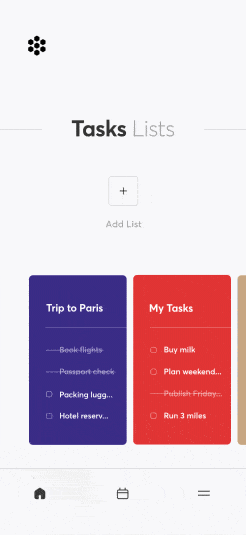
2. Task Manager Animated by Cuberto
If you’re anything like us, you’ve got so many lists, it’s hard to keep track. Lists keep us organized, so why shouldn’t they be a joy to look at? Cuberto created an app concept that color-coordinates your task lists as you create them. After swiping through the cards that contain all of your lists, you can tap into one to expand it and see all of the items on it. Both the items you’ve crossed off and what’s remaining. While enlarging the particular list, the others shoot down to the bottom left corner of the screen. All of your lists are represented by colored lines and the one you’re currently looking at grows taller than the others. Swiping left and right takes you to the next list and gives a great bouncy motion with each swipe. We especially appreciate how focused this concept is on color, as each list’s color is also demonstrated with the “plus” button that adds items to the list in the bottom right corner and the lines in the opposite corner.
 Source: Dribbble
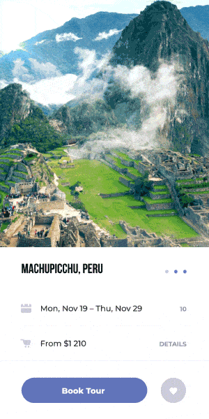
3. Book a Flight by UI8
Traveling is the best, but ironing out the details? Not so much. This app concept aims to streamline the vacation booking process. First, you choose where you’d like to go. The screen’s background image has a tantalizing photo of the destination, with practical items, such as the dates you’d like go and the starting price. Tapping “book tour” slides all the content to the left side and a plane icon pops onto the screen and flies across to the right to show that flight options are loading. Next, the flights load and move up the screen in a smooth movement. Then you can swipe up through the options to pick the option that is best for you.
 Source: Dribbble
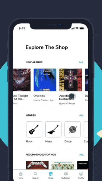
4. Vinyl Shop by Mat Przegietka for EL Passion
There is so much goodness in this one mobile interaction design! First, when you tap on a specific album, it pops up to the top of the screen with all of the information such as the tracklist populating below. As this happens, the album comes to life and a vinyl album comes rolling out of the album cover. This animation really sold us on this design, as it is so lifelike and a perfect microinteraction we wouldn’t have expected. Next, in order to buy the album, you tap the shopping basket icon and the album at the top on the screen drops down and falls into the basket that opens up at the bottom of the screen. This is another motion that makes the album shopping experience in this app concept so real.
 Source: Dribbble
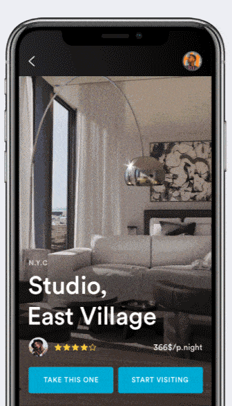
5. Airbnb App Concept by Kévin Gautier for Norde
Booking somewhere to stay on Airbnb is always an easy experience, but sometimes the pictures don’t portray the accommodations very well. A little more light here and a specific angle there—and suddenly the space looks much larger than it is. This app concept puts an end to that with a drone-like photo experience. Tapping the “start visiting” button allows you to move around the space, either by swiping through the rooms that appear at the bottom of the screen or moving your finger around the image. Recently 360 degree video has become mainstream, and it’s only a matter of time until Airbnb and similar sites give more comprehensive views of their offerings using something like this. Beyond the function, the form is also amazing: tapping to view the space flips the rectangular cards on the bottom of the screen. When you’re done looking through the property, tapping the back arrow flips the “take this one” and “start visiting” buttons back to the bottom of the screen in an equally satisfying motion.
 Source: Dribbble
That’s all for August, but be sure to check out last month’s edition, featuring the best mobile interaction designs of July 2018.
Feeling inspired? Proto.io lets anyone build mobile app prototypes that feel real. No coding or design skills required. Bring your ideas to life quickly! Sign up for a free 15-day trial of Proto.io today and get started on your next mobile app design.


