Here at Proto.io, we’re back again with the key mobile interaction designs that you need to know about. This month we selected some great app concepts that are sure to delight you. What stood out to us this month was their fluid transitions that made for fast and enjoyable changes. Without further ado, let’s explore these interactions and discuss what designers can learn from them.
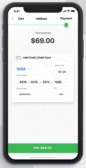
1. E-commerce Shopping App by Divan Raj
Shopping on mobile has been a pain point for e-commerce businesses because typing in all the necessary information on a tiny screen is a less than enjoyable experience. This designer reimagines the payment process to use interactions to make it clearer. As the shopper progresses through the information they need to enter, a red rectangle lights up around it, showing them what they need to complete next in order to finish the transaction. This interaction is especially helpful when you’ve forgotten a step. Instead of having to look for the red asterisk next to the box you forgot to fill in, the rectangle serves as a visually exciting way to pinpoint what you need to do to complete your purchase.
 Source: Dribbble
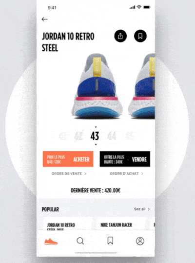
2. Gotz M App by Barthelemy Chalvet
From the wavy to fast moving motions in this interaction design, there is a lot to love. Sneaker culture is more exciting than ever, with countless designers in the game and frequent releases. This sneaker buying app full of fluid transitions helps hypebeasts explore popular shoes, images of them, and find their size. Popular shoes are arranged as cards in the middle of the screen that users can swipe through to explore. Tapping into a specific shoe moves the title of the shoe to the top of the screen in a smooth, wave-like motion. Swiping to the left through the image options offers a zooming motion, with the former image stretching to leave the screen and make room for the next.
 Source: Dribbble
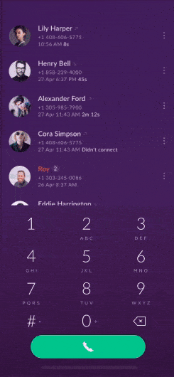
3. In-App Calls by Cuberto
Remember the good ol’ days when you actually had phone numbers memorized? Now our phones are full of contacts and phones are no longer tethered to the wall. This app concept takes it back a bit to make the calling experience based on number search instead of name. While scrolling through your contacts in the app, you have the option of expanding the dial pad icon by dragging it to the left. This allows you to enter in digits of a phone number and find all contacts that include them. Once the appropriate contact pops up, swiping right on it begins a call. Alternatively, swiping left on it gives more options of ways to contact that person, such as sending a text message.
 Source: Dribbble
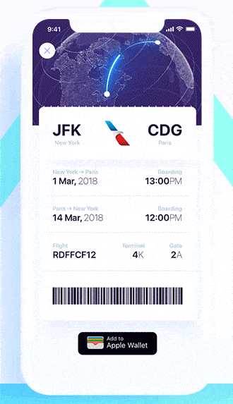
4. Luxury Flights App UI Bill by ALEX BENDER for G R A V I T Y
This app concept reimagines the process of buying a plane ticket. It streamlines it by allowing users to pay with Apple Pay, instead of having to enter their credit card information. After scrolling through options, users can select and pay for a flight within seconds. The transitions between screens are clean, with smooth drop downs appearing when a user selects a flight. Completing the transaction brings an image of Earth onto the screen and shows the departure and arrival locations on the 3D map, connected with a bright blue line. Next, this map travels up to the top of the screen where it settles in as the ticket information occupies the space below it.
 Source: Dribbble
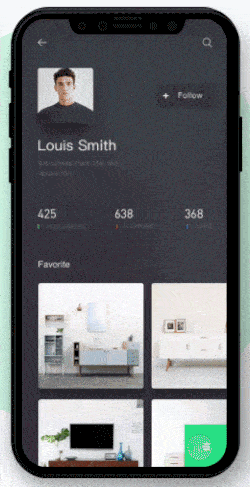
5. Interactive Experiment by BP for DWTD
Houzz is an interior design website and this app focuses on picking furniture and saving collections easily. The app creates a social profile for each user with their followers, who they follow, and their favorite furniture from Houzz. Users can scroll through their favorites, which are presented as square cards. Tapping into one of the favorite collections transitions to a screen with a header image, with a title and brief description, and additional filtering options below. Swiping through the images toward the bottom allows the user to explore specific products that fit their criteria within the collection.
 Source: Dribbble
That’s all for July, but be sure to check out last month’s edition, featuring the best mobile interaction designs of June 2018.
Feeling inspired? Sign up for free with Proto.io and prototype your own interaction design in minutes.
Proto.io lets anyone build mobile app prototypes that feel real. No coding or design skills required. Bring your ideas to life quickly! Sign up for a free 15-day trial of Proto.io today and get started on your next mobile app design.


