Mobile interaction designs make or break our favorite apps. Sure, apps need to function well, but adding in a few moments of unexpected delight helps keep app users coming back for more. This month we’ve got an exciting lineup of app design concepts that have fluid motions that make them a joy to use. Let’s get right into why we chose these app concepts.
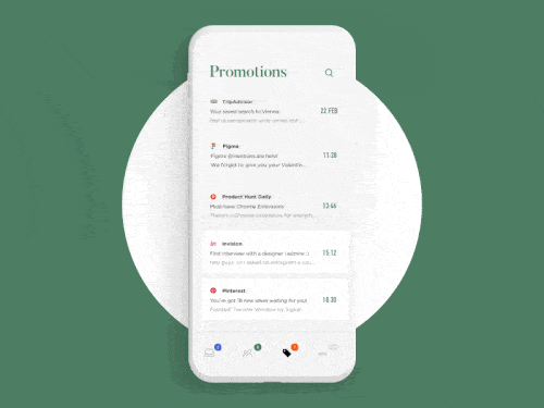
1. Deleting Mail from Inbox by Cuberto
The first app design concept we have for you offers a playful way to delete an email from your inbox. Currently, in most email apps, deleting an email requires a swipe of the finger, or tapping into it to delete it. Cuberto takes a conventional approach, swiping to the left and right on the email you’d like to delete. But the way that they accomplish this is the most interesting part. As the user swipes to the left or right, an “x” that denotes email deletion pops out, almost like a small droplet separating from a larger collection of water. Instead of having to click the “x” to delete the email, simply swiping your finger completely to the left or right will delete it.
 Source: Dribbble
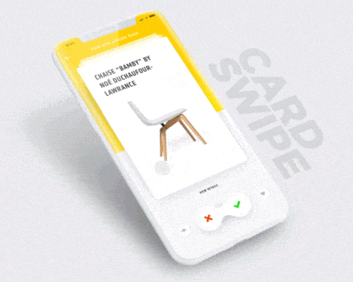
2. Card Swipe Interaction by Minh Pham
Shopping online isn’t always exciting, and this is especially true when it comes to buying from our tiny smartphone screens. Minh Pham puts a Tinder lens on the mobile shopping process, allowing users to swipe left and right on the products available on the website. It’s as if shopping has become a game, swiping through the options to add the ones you like to your cart. Instead of having to click the green checkmark or red “x”, as you swipe right to like the products displayed on the cards or left to discard, the corresponding reaction below lights up and expands to show your selection. On top of that, swiping right also makes a plus sign extend from the green checkmark to show that the item is added to your cart.
 Source: Dribbble
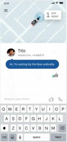
3. Uber Chat by Uber Design for Uber
One problem with the Uber app is communicating with the driver. This chat feature improves the communication process in a few easy steps. First, tapping on the bottom of the screen, where the driver and car information is housed, shows text messages from your driver. That way, you can get detailed information on where they are, instead of only having to rely on the map above to find them. Then, swiping up can expand this communication with the driver and make it easy to respond. A keyboard appears at the bottom of the screen to make it easy to text your response. Or, to make things even simpler, simply tap the thumbs up to affirm the driver’s message.
 Source: Dribbble
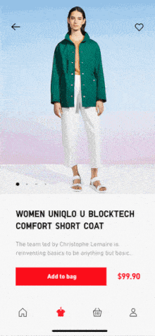
4. Uniqlo E-Commerce App Animation by Michal Skvarenina for PLATFORM
This app concept has some great transitions that occur at lightning speed. First, the company name zooms onto the screen and quickly keeps moving to the left until all we’re left with is a blank red screen. The app designer makes this basic card design much more interesting because as you scroll to the left in a category to explore the product options, the category header stays firmly in place. Tapping into a product seamlessly expands it to take over the top half of the screen. with crisp images of the product on a model.
 Source: Dribbble
5. Furniture by Dimest
Shopping for furniture online is tricky because you can’t experience it fully and have to base your decision off of a few photos, a description, and dimensions. This mobile interaction design app concept takes it further than that. As the user swipes up to reveal more pieces of furniture, the color options that had been toward the top of the screen collapse into it. Then tapping on a particular product expands it to show the product page. Many questions can be left unanswered based on confusing product images in average furniture apps. In this app concept, users can clear that up by tapping the product image to show a visualization of the length, width, and depth of the piece of furniture.

That’s all for March, but be sure to check out last month’s edition, featuring the best mobile interaction designs of February 2018.
Feeling inspired? Sign up for free with Proto.io and prototype your own interaction design in minutes.
Proto.io lets anyone build mobile app prototypes that feel real. No coding or design skills required. Bring your ideas to life quickly! Sign up for a free 15-day trial of Proto.io today and get started on your next mobile app design.


