How is it that we’re at the end of February already? It seems like just days ago we were thinking of our New Year’s resolutions and planning out the design projects we were going to conquer. Mobile app designers across the globe have been busy with the latest and greatest mobile interaction designs and, lucky for you, we’ve rounded them up. Read on below to learn about the ones that made our list this month.
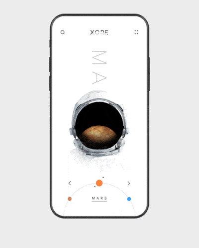
1. xore — solar system by Anton Skvortsov for Norde
Space is fascinating, and this designer took on the wonder and awe and wrapped them up into a smooth mobile interaction design. First, the planets appear inside and below the astronaut’s helmet. Swiping in a circular motion to the left changes the planet and shows the moon(s) orbiting that planet as well. Tapping on a particular planet zooms in on it and takes you to space, where you can swipe through and find the planet’s moon(s). Next, tapping Earth’s moon reduces the image and tucks it into the header where it still rotates. In the cleared space below, additional information about the moon flips onto the page. In all, this design is quite crisp and makes learning about space a blast. On top of that, there’s even a nod to current events: there is a Tesla flying through space near the moon, as Elon Musk recently sent off a rocket to space and included one of his Tesla sports cars in it.
 Source: Dribbble
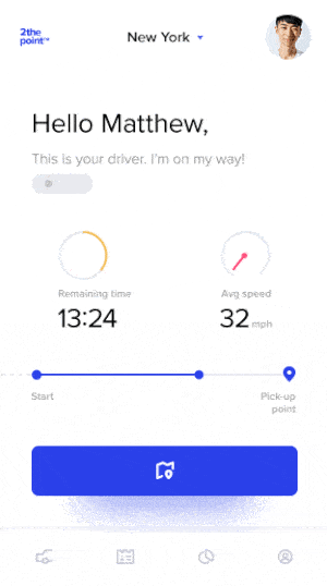
2. 2thepoint™ — Ridesharing App by Adam Zielonko for Netguru
The fact that we can open an app and within a few minutes hop into a car that will whisk us away to our destination has arguably redefined the way urban populations view transportation. This mobile interaction design works out some of the snags that users usually hit with mainstream ridesharing apps, especially when it comes to communication with the driver. The motions that we find especially pleasing have to do with the unfortunate circumstance when your driver is late. Instead of watching the map and seeing them at a halt for a long period of time, when a user taps the driver location pin, it shows their speed and estimated time of arrival. Toward the bottom of the screen, there is a line showing how far the driver has gone so far to pick you up and as the dot on that progress bar moves forward, there is a nice zooming motion that appears. In addition, as their speed changes, the dial showing speed tips back and forth, as if you could see their speedometer yourself.
 Source: Dribbble
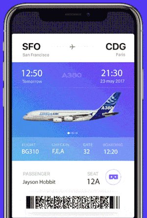
3. Airbus ifly A380 by Gleb Kuznetsov
We’re big fans of AR and VR, here at Proto.io. Flying long distances means that you’re going to be spending a good amount of time in that seat. It’s best to be comfortable and know exactly what the plane will look like. But when trying a new airline, it’s hard to know how they fit in with the status quo. This designer took on the challenge and added an icon to the typical boarding pass. This icon looks like AR or VR goggles and once tapped, the boarding pass collapses into a white space before it transitions screens to show the plane. The user can then look around the cabin from the vantage point of their exact seat by moving their phone around to explore. While this app concept is new and exciting, a lot is coming soon with the advent of VR prototyping.
 Source: Dribbble
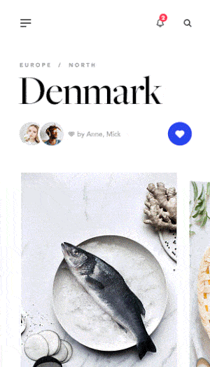
4. Journey App Content by Adam Zielonko for Netguru
Whether you’re into the motion blur or not, you can’t ignore how slick this mobile interaction design is. We’re travel lovers and getting inspired to travel based on comprehensive information about a new place helps us choose the best destination to explore next. This app concept is a play on the popular card design, as users can swipe through images of regional cuisine. Then as you swipe up to move down the screen, there is a delightful graph motion that goes along with the longitude, latitude, and average temperature on that particular day. A purple line traces the graph that drops down and arrives at the present day.
 Source: Dribbble
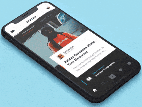
5. Skateboarding App Concept by Lukas Svarc for Norde
While our skateboarding days are (mostly) behind us, experiencing a mobile app design that brings back the job of skateboarding is a welcome novelty. This app concept has a map that shows places where your friends skateboard, alongside other places of interest. It also features skateboarding related content, such as blog posts that users can swipe through. The movements here are worth noting. Swiping the content to the left or right sends that block spiraling mostly off the screen. And as the article title changes, so does the header image. They interchange, forward and back, depending on the direction you’ve swiped the article, almost like an old school slide projector.
 Source: Dribbble
That’s all for February, but be sure to check out last month’s edition, featuring the best mobile interaction designs of January 2018.
Feeling inspired? Sign up for free with Proto.io and prototype your own interaction design in minutes.
Proto.io lets anyone build mobile app prototypes that feel real. No coding or design skills required. Bring your ideas to life quickly! Sign up for a free 15-day trial of Proto.io today and get started on your next mobile app design.


