As we gear up for warm weather, there are a number of mobile interaction designs sprouting to bring us inspiration. The designs we picked out for you this month come from some of the brightest designers on Dribbble. They incorporate innovative toggles, card layouts, and hyper-realistic buttons. Read on below to find out what designs caught our attention this month.
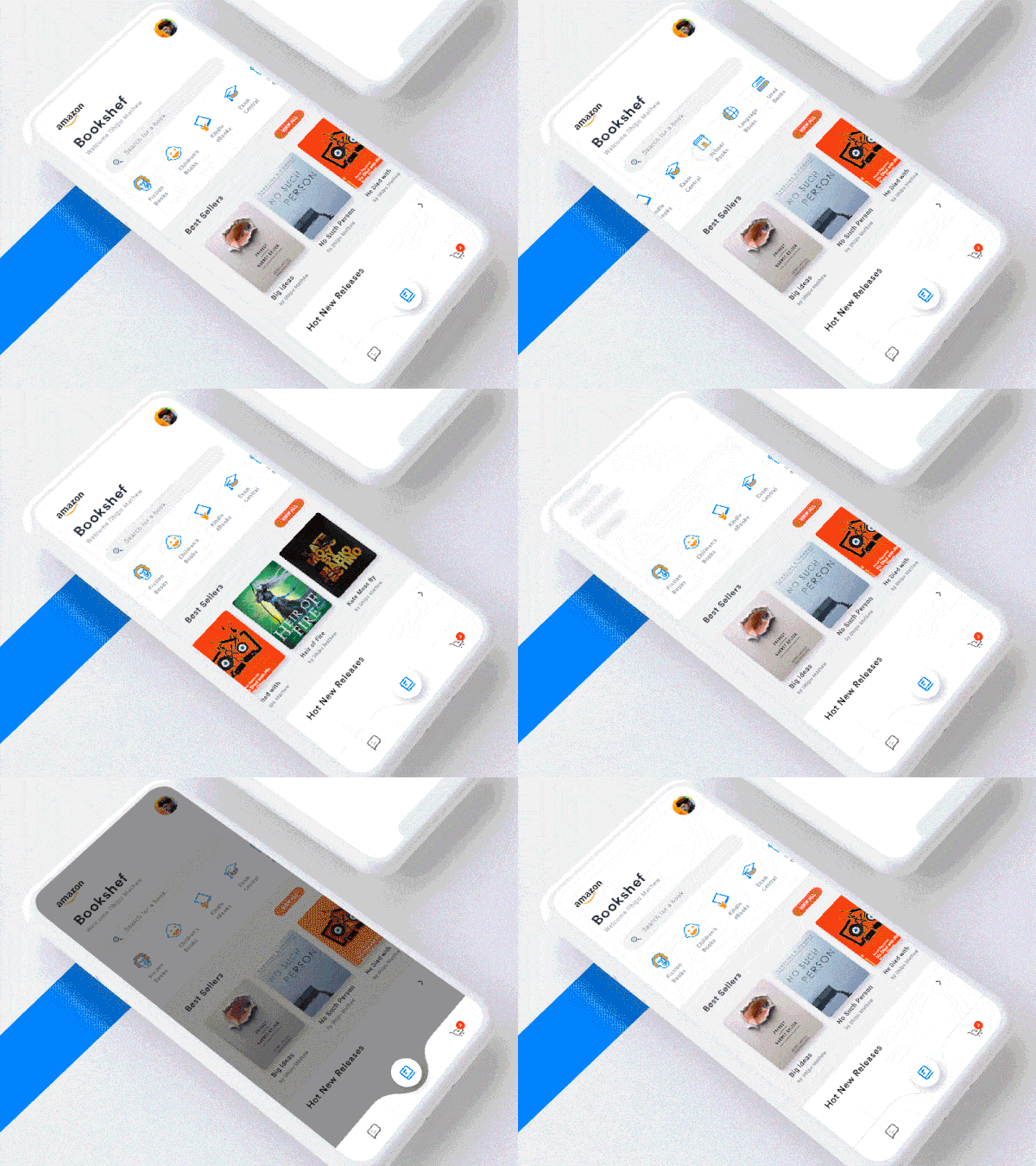
1. Amazon Mobile App by Dhipu Mathew
The experience of shopping online misses the crucial aspect of browsing. Especially when it comes to buying books; being able to hold one in your hands, flip through pages, and see what’s on the shelf next to it are all enjoyable parts of the process. This app concept brings that browsing feeling back with a section of books users can scroll through. Taking it a step back, when the user taps on the book category, they are met with a search bar, and categories and bestsellers to swipe through. The search bar is a sneaky design element here, as tapping it pulls it down to take over the screen with quick search categories and recent searches. Swiping up on this search content neatly tucks it back in to the top of the screen.
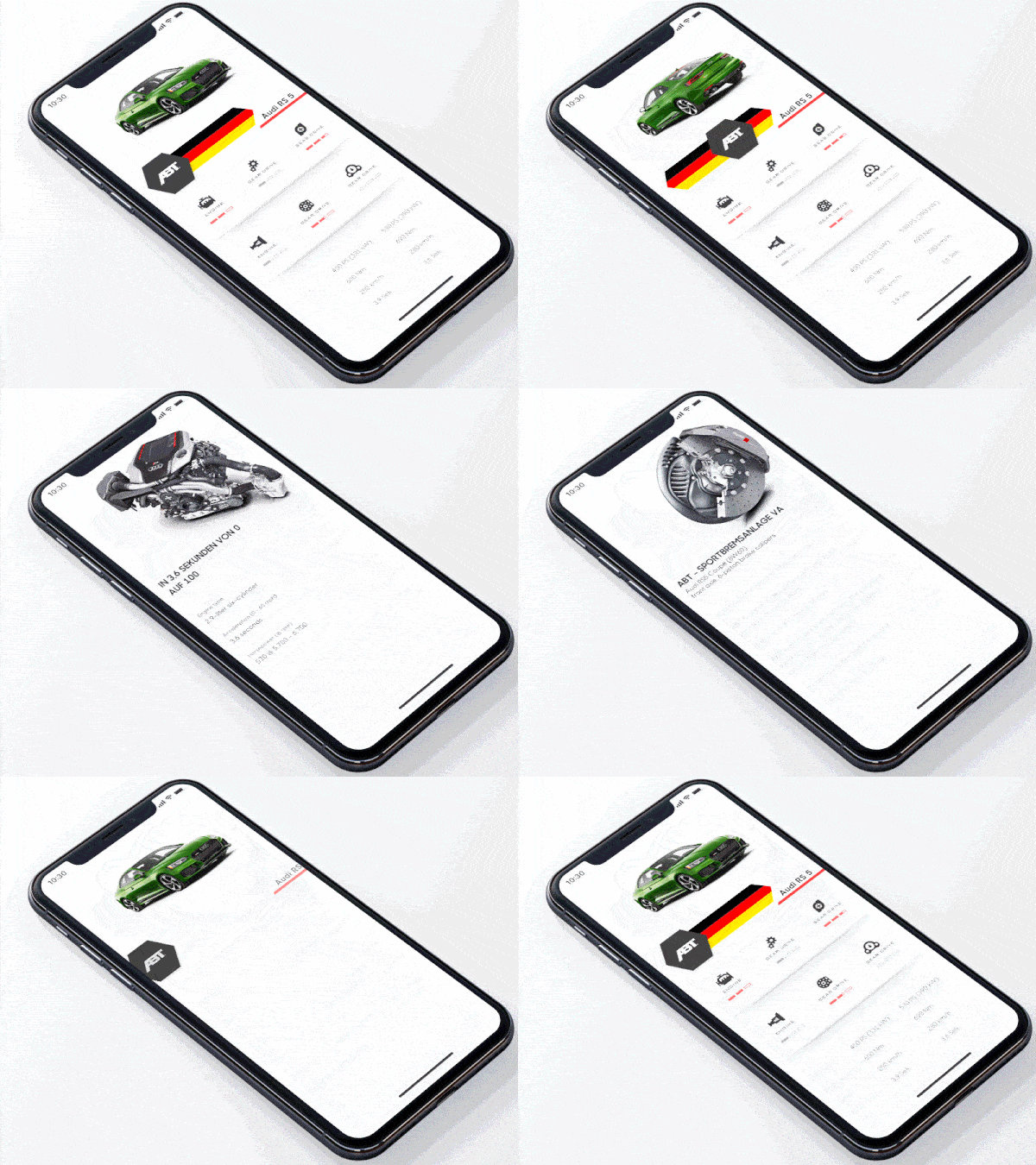
2. Car Modification by Zachery Wang for Radio Design
In the age of Teslas, the car buying and modification experience needs a major upgrade to stay relevant. This app concept brings exciting interactions to the process of doing research on modifications you could make to your car. It starts off with the car nearly driving onto the screen, then the specifics about the car parts fade onto the screen after. There is a nice movement at that last moment that shows the level of each part, with a sweeping motion that fills in the boxes below each one. The toggle under the car allows is the best interaction in this concept, as it allows users to spin the car around and see it from different angles. Lastly, tapping into the specifics of the car below the image bring those parts, like the engine, sliding up the screen.
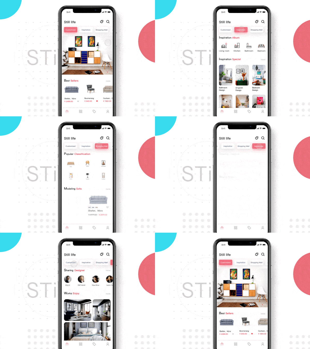
3. Still Life | Furniture App by PLORY
This app helps design-focused folks pick out furniture from specific designers, based on the room and aesthetics they’re after. It evokes an Airbnb feel, with a crisp white design with pink accents and beautiful images to draw users in. Across the top bar of the app concept are categories for the user to scroll through and pick from. Tapping into each of them brings products, designers, and inspiration zooming onto the screen. Each category has its distinct motion and “Shopping Mall” is one of our favorites. There are two sections for popular products toward the top of the screen and sofas near the bottom. The popular products fade onto the screen, with product categories and their titles. And the sofas push onto the screen, starting on the right side and settling in on the left.
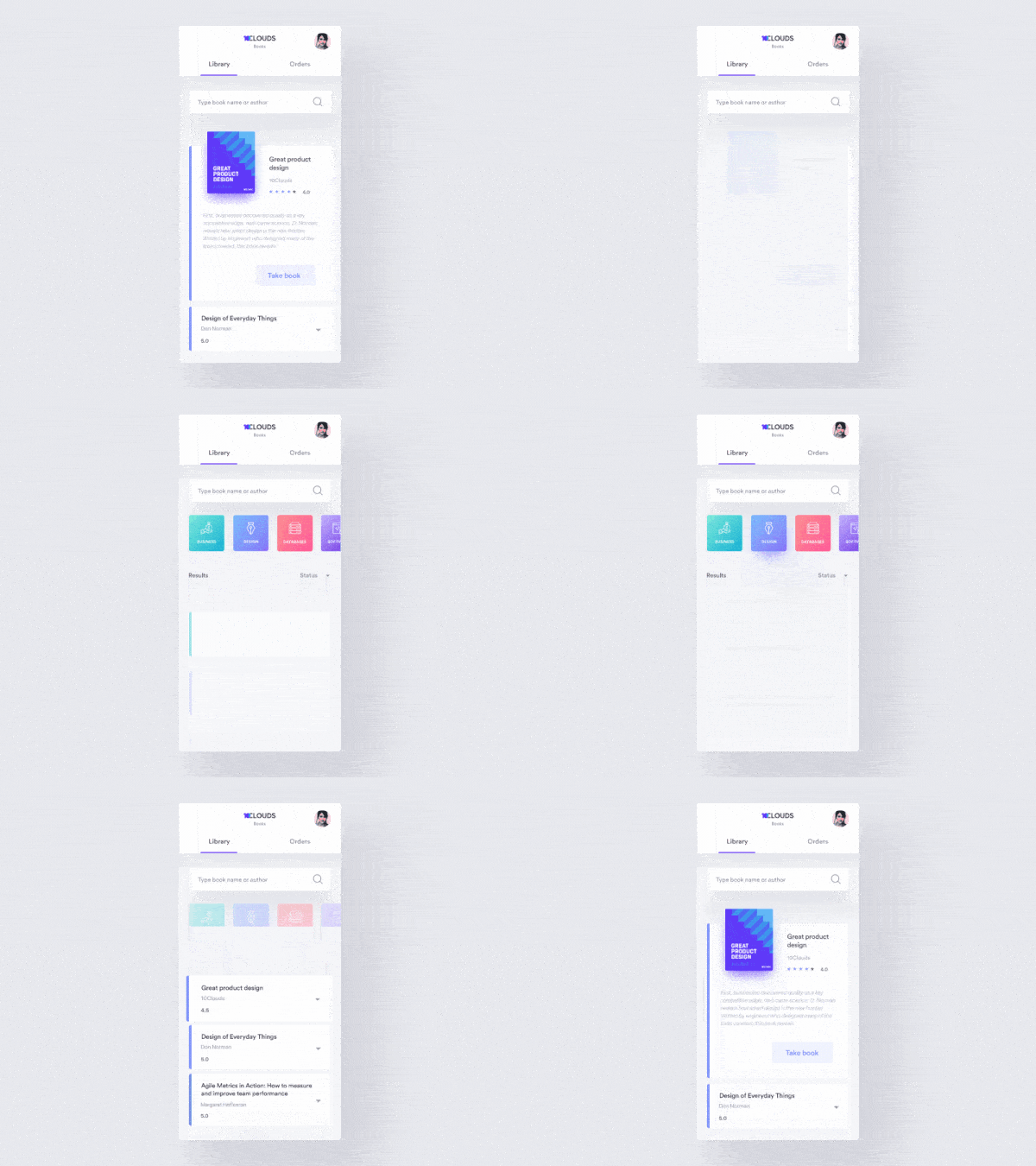
4. 10C Books – Animation by Aga Ciurysek for 10Clouds
This book app concept caught our attention due to its slow and smooth transitions. It allows users to look through book reviews based on specific categories and choose ones to read. Tapping into one of the pastel cards along the top of the screen takes users into book reviews for that category. The button is realistic, as it not only takes users to the category they requested, but also gives a visual representation of the clicking motion, as if the user had hit a button in 3D space. Next, tapping on the book review of their choice expands the minimal information into the book title, cover, and description. One motion interaction design component that caught our eye was the change that occurs when the user taps the “Take book” button and it transforms to a darker color and a check mark that moves clockwise to be right side up. Microinteractions like these make apps a joy to use.
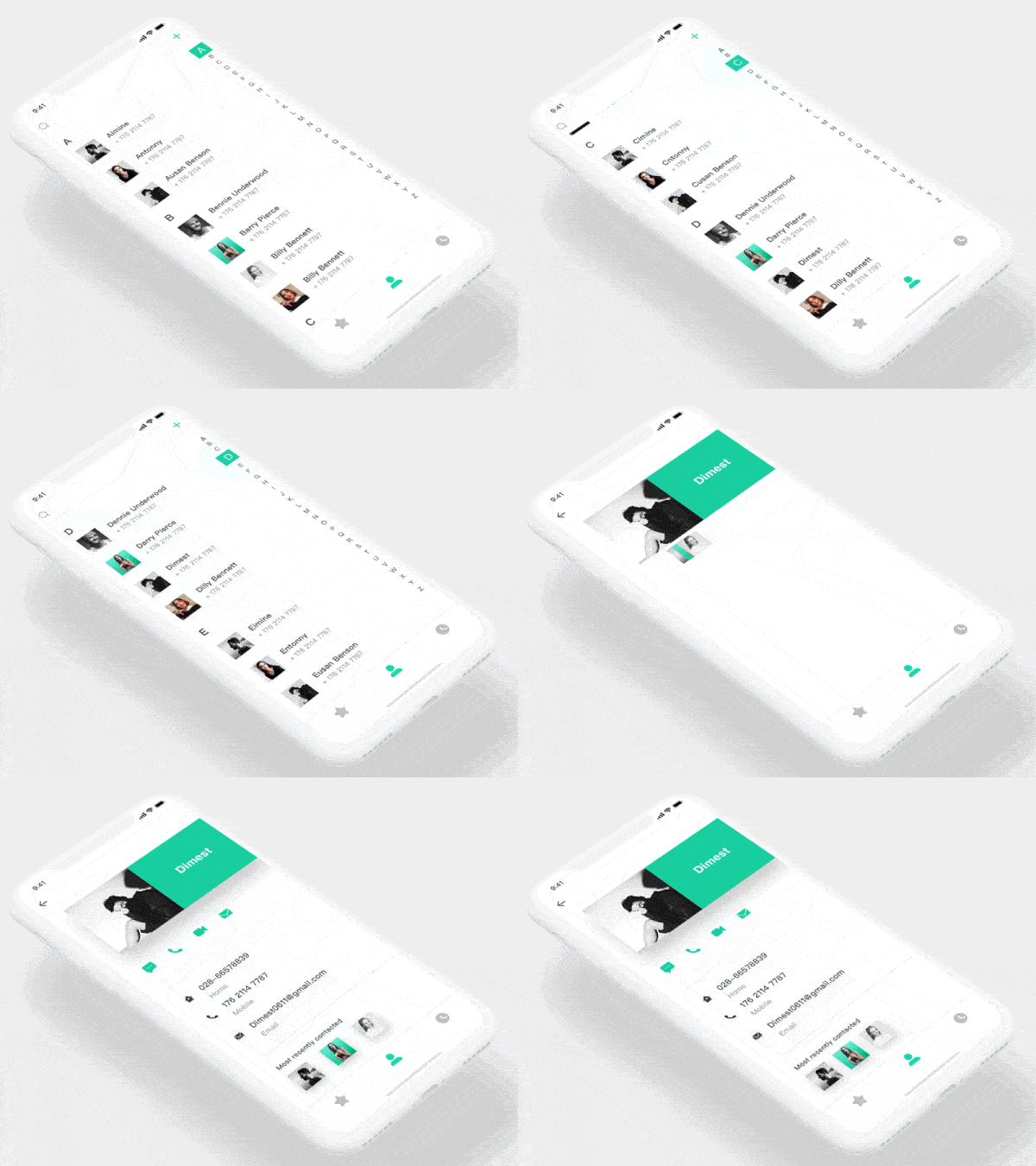
5. Phone Book by Dimest for Hiwow
The act of scrolling through your phone book has never been the most exciting mobile experience. But this designer turns that idea on its head and brings delightful design features to the process. First, as the user swipes up and down through contacts in alphabetical order, when the first letter of the contact changes to the next letter, dual movements pop up. There are two “pop” movements, both illuminating the new letter on the right sidebar and that same letter popping up in a large font briefly on top of the contacts the user is scrolling through. Lastly, when tapping on a specific contact, there are bouncing motions to bring the contact information to life. The contact’s information falls down from the contact name and image at the top of the screen in a liquid motion. And the people they recently contacted fan out at the bottom of the screen, as if these cards are literal cards in a deck.
That’s all for April, but be sure to check out last month’s edition, featuring the best mobile interaction designs of March 2018.
Feeling inspired? Sign up for free with Proto.io and prototype your own interaction design in minutes.
Proto.io lets anyone build mobile app prototypes that feel real. No coding or design skills required. Bring your ideas to life quickly! Sign up for a free 15-day trial of Proto.io today and get started on your next mobile app design.
