Fall is here, and as we cozy up and get ready for ice skating, skiing, and brisk weather, many designers have been hard at work. The cold weather certainly makes me want to stay inside and get working on new projects and the designers I found this month feel the same way. These app concepts from all over the world show great mobile interaction design promise. Let’s explore the designs I chose for October.
1. Cinema App Concept by Anton Skvortsov for Norde
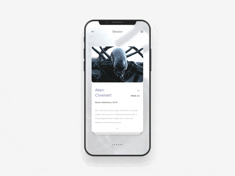
This app concept is a take on the old and stuffy mobile apps on which we’re used to picking movie tickets. It has an expandable card layout that allows you to swipe through the movies that are out and swipe down to get more information on the movie you selected. Next, you can swipe through clips and images from the movie, in the cards at the top. Once you decide on it and tap into the movie times, you can swipe through day and time options. After you decide on when to see the movie, a delightful theater (although much smaller than most) pops up so that you can choose the exact seats in which you’d like to sit. The cards near the top of the screen that show clips and images from the movie transform as well and rotate to an angle that would make sense to see, as if you were looking over the theater and picking out your seats while the movie was playing. Lastly, the seats dissolve, and the movie screen rotates one more time to disappear, and you’re left with a movie stub to reveal the barcode of your ticket with a peeling off motion.
 Source: Dribbble
2. Loading Animation for iPhone X by tubik
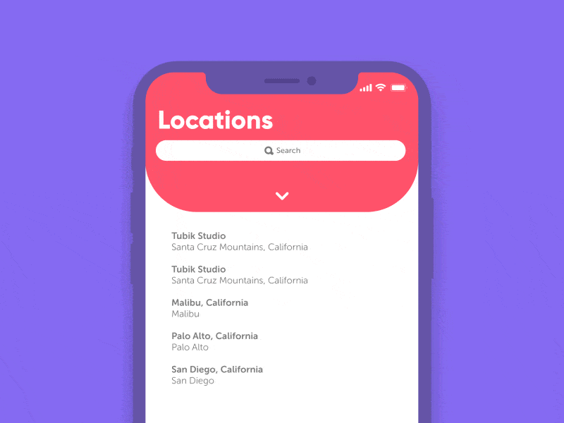
iPhone X is nearly here and whether you’ve pre-ordered and can’t wait to have it in your hands or have been working on a cool new mobile app design for it; this phone just might be a game changer. This mobile interaction design is so simple but so appealing. It’s a loading interaction within a locations page in an app. When you pull down to refresh the options, the down arrow does a 180-degree turn, and a trippy movement of colors takes over the status bar. These bright colors emanate out from the area with the front-facing camera and as the locations tab that you pulled down returns closer to the top of the screen, your service, wifi, and battery all return to their former places sequentially. This is undoubtedly a much more exciting way to wait for an app to load and I look forward to more designs for iPhone X that take regular interactions and make them extraordinary.
 Source: Dribbble
3. Drop a Piñata by ⋈ Brandon Termini ⋈ for Handsome
Have you ever tried to meet up with friends, but get lost, so you ask them to drop a pin with their location? This app concept takes it a step further and allows you to drop a pin…piñata that is! When you tap into a group of your friends within the app, a map pops up with different piñatas that drop down, representing where your friends are. Next, you can tap the plus button and add your own. A menu rotates out from the bright pink button, with the options to drop a piñata, take a photo, send a message, and more. Once you tap into the piñatas, your specific piñata drops at your location and moves slightly as if it’s hanging from a tree and full of candy. Now your friends know exactly where you are, without needing to use a boring pin.
 Source: Dribbble
4. Colors berlin app by Kévin Gautier
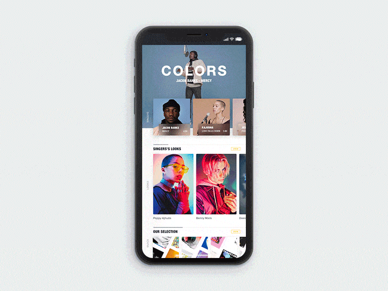
A lot is happening in this busy card based app concept. You can swipe through music artists at the top, and as you choose one, the information about that artist updates in the bottom half of the screen, and at the top, a video of them performing their music automatically populates. Along the bottom of the screen are the songs the app recommends. When you tap one, the screen clears to make way for albums and their songs moving to meet in the middle of the screen in a smooth motion. Tapping the play button creates a loading interaction I haven’t seen before, as an arch pops out of the the album you aim to play and has a line moving through it to show that it’s loading.
 Source: Dribbble
5. Photo App Interactions by tubik
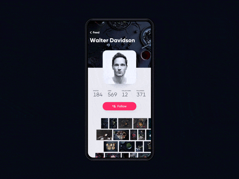
Tubik is doing something right, as they’ve made it onto this short list twice! This mobile interaction design concept is a photo app that turns things like Instagram on their head. Instead of swiping up to see more images, users swipe left and get to see many more images than if they were scrolling through a photographer’s Instagram feed. The interaction begins like other social media sites in that it has the account holder’s name, profile picture, number of followers, number of images on their account, and a big “follow” button. As you swipe to the left, these numbers vanish and the profile picture contracts and travels further into the header image, to give users more screen space to view photos. The photos aren’t all the same size, which is visually appealing and realistic, neither do the rows of pictures travel at the same speed as you scroll through them. Tapping into an image expands it seamlessly to take over the screen.
 Source: Dribbble
That’s all for October, but be sure to check out last month’s edition, featuring the best mobile interaction designs of September 2017.
Feeling inspired? Sign up for free with Proto.io and prototype your own interaction design in minutes.
Proto.io lets anyone build mobile app prototypes that feel real. No coding or design skills required. Bring your ideas to life quickly! Sign up for a free 15-day trial of Proto.io today and get started on your next mobile app design.


