As we finally get comfortable with the new year and stop writing 2017 by accident, mobile interaction designers have been busy. The designs we have for you this month have many fluid movements, such as rotating wheels to make a selection. These mobile app concepts show how exciting online retail and cryptocurrency management can be, with smooth motions to maximize graphs with the swipe of a finger. As always, there are some delightful card-based designs and some speedy transitions to keep your attention. Let’s explore these forward-looking mobile interaction design concepts.
1. Add to Cart Interaction by Dannniel for Norde
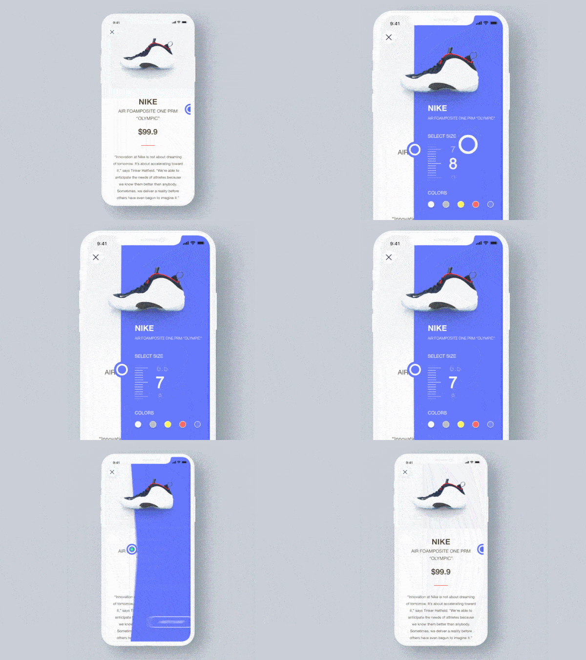
Online shopping is taking off around the world and designers are devoting time to making the shopping experience much more visually pleasing. This app concept features a shoe with full product and pricing information. When you swipe to the left, a rainbow of colors slide to the left of the screen, pulling up additional product information. As you scroll up and down the sizes, the shoe grows and shrinks accordingly, mirroring the size you’ve selected. When you tap into the different style options, the shoe transforms into that style, with the new one taking over the shoe from the bottom and moving towards the top. There are many memorable movements in this app concept that make the online shopping experience more delightful.
2. Hype Clothing App UI by dzn.nsn
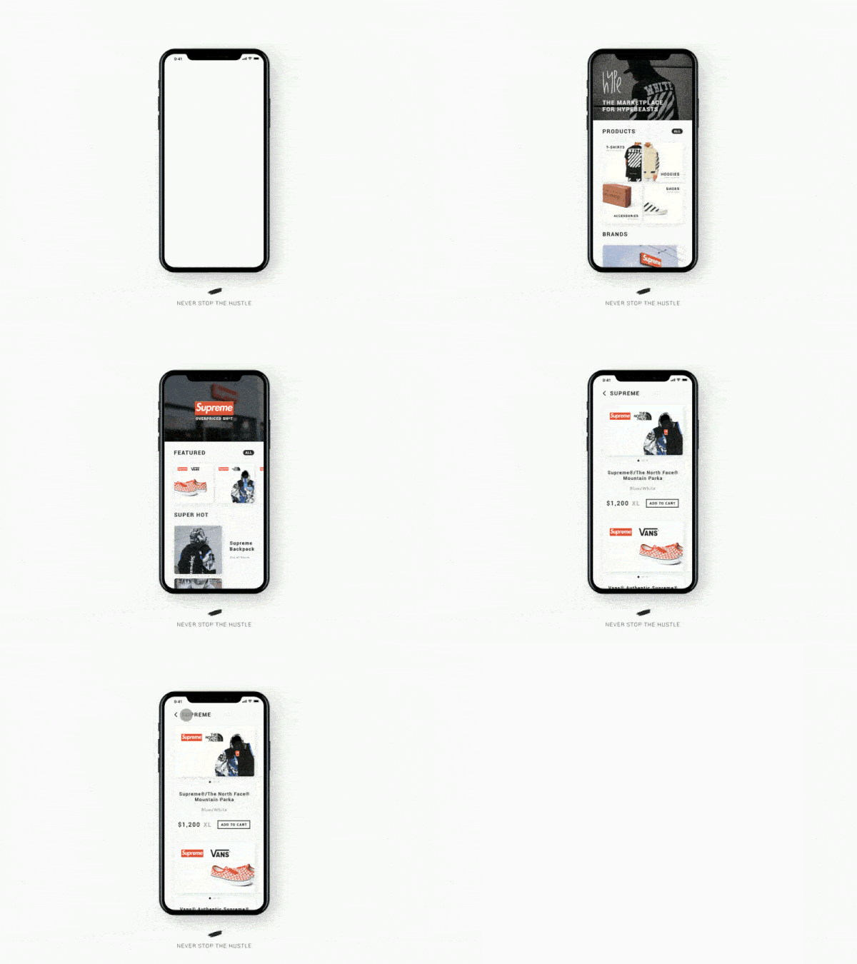
This is another online shopping concept that we chose because of the speed and directions in which the different components move. When scrolling through products and brands, tapping into a specific brand brings the three sections of the page zooming in from different directions. The header drops in from the top of the screen, while the “hot products” appear from the bottom. We really appreciate how quick the transitions are between pages. It allows users to get the information they’re looking for in a way that keeps the user’s attention, as it appears on the screen in such a fast motion.
3. Add Credit Card Animation by Arvin
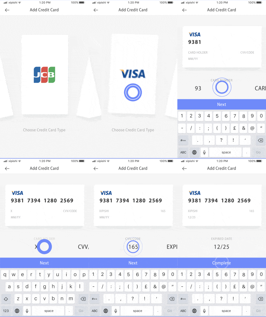
An increasing number of apps require us to add in our credit card information and this app concept aims to make that process smoother. As the first step in this concept, the user must pick the type of credit card they’re inputting into the app. Swiping through the options has a circular feel, as if the different credit card options are spinning around in a circle. When you choose the correct card type, the card switches from vertical to horizontal and moves to the top of the screen. Typing in the credit card information makes it appear on the card at the top of the screen, recreating your card information as you type it in. This mobile interaction puts a different spin on a typically mundane, but required process within apps.
4. Cryptocurrency Wallet Animation by Pawel Kwasnik for 7ninjas
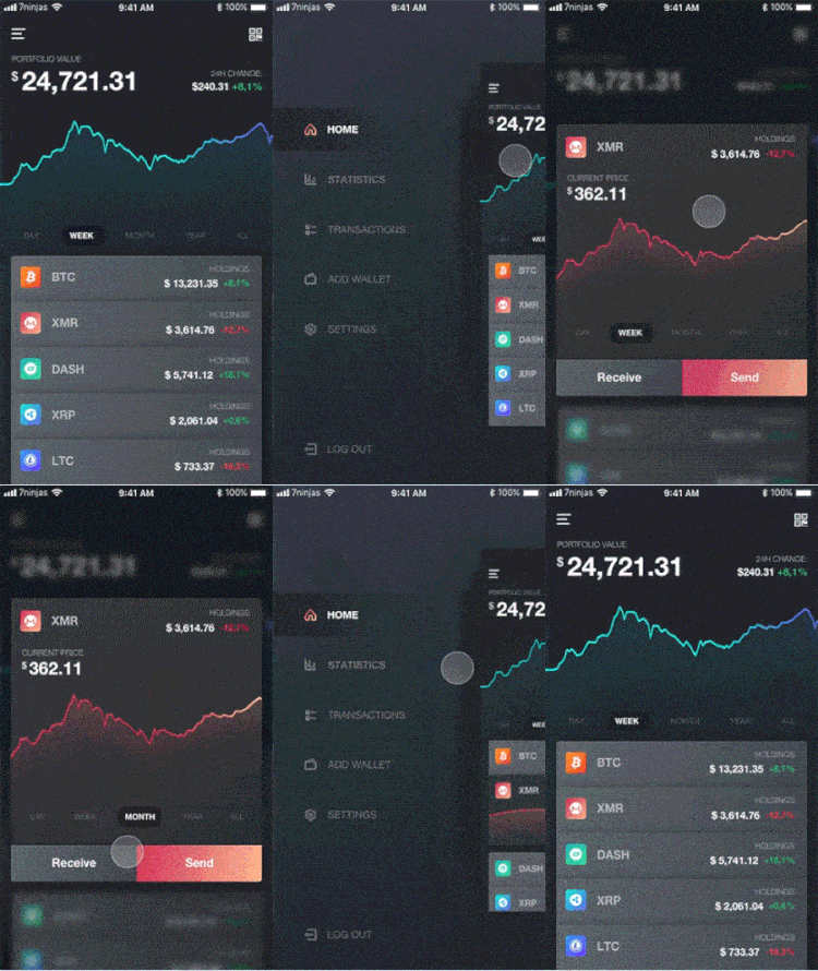
With the explosion of cryptocurrencies comes the need to keep them in a safe place. This wallet helps users keep track of value trends for the major currencies. At the top, it shows the total value of your different currencies and breaks it down by each individual type below that. You can learn how the value of each currency has changed and what the current value of your holdings is. Tapping into a particular currency you hold shows a quick graph of its value over time. Swiping up from that graph expands the information so that you can change the time frame to show the value by day, month, or year. Swiping down on the graph retracts it back to the original minimal graph. The app concept condenses a lot of complex crypto information into one neat and organized mobile interaction design.
5. Crypto Alert by Hoang Nguyen for Interactive Labs
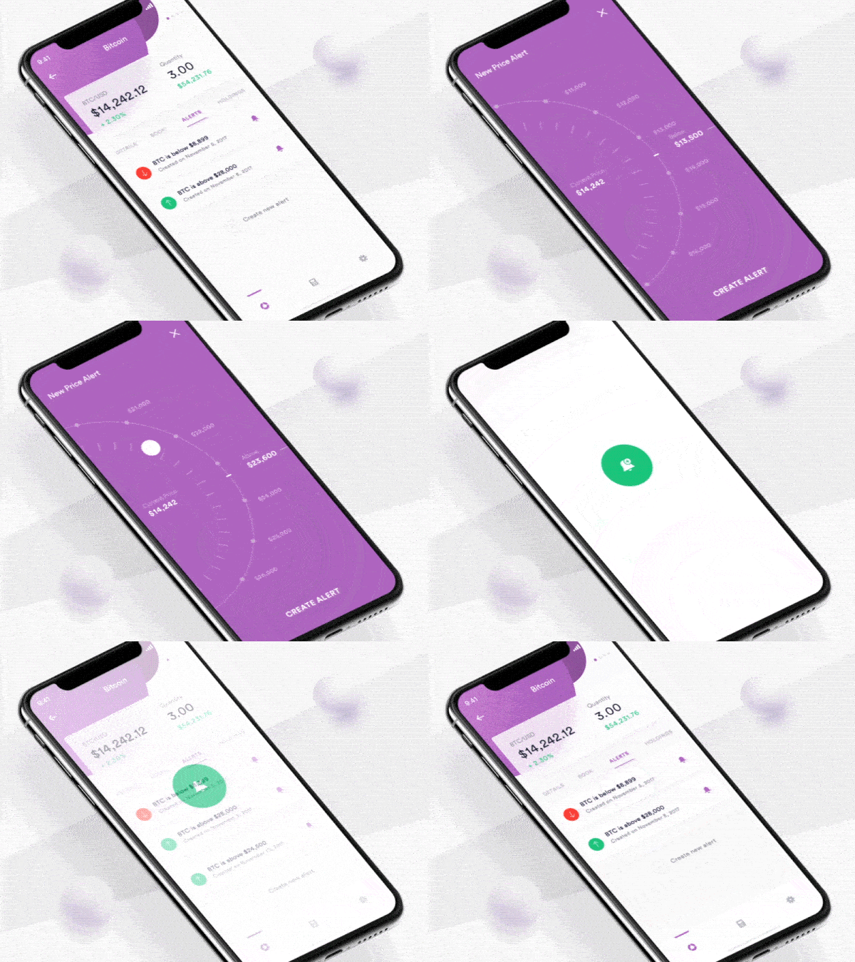
As with any investment, when it comes to cryptocurrencies the best philosophy is to buy low and sell high. But with the value changing so often, it’s hard to keep up, while also keeping track of your day to day life. This app concept helps the crypto-obsessed keep track of value by setting alerts that go off when the currency reaches a specified value. App users choose the value by dragging their finger around a wheel, until it lands on the value that they are looking for. Swiping up allows you to choose to get an alert when the currency is above that amount and swiping down allows you to set up an alert when the value is below that amount. Lastly, another mobile interaction in this concept that I’m a fan of is deleting an alert. Swiping left on an alert makes a red garbage can appear next to the alert and swiping all the way to the left opens the garbage can wider and fully deletes the alert.
That’s all for January, but be sure to check out last month’s edition, featuring the best mobile interaction designs of December 2017.
Feeling inspired? Sign up for free with Proto.io and prototype your own interaction design in minutes.
Proto.io lets anyone build mobile app prototypes that feel real. No coding or design skills required. Bring your ideas to life quickly! Sign up for a free 15-day trial of Proto.io today and get started on your next mobile app design.


