With winter in full effect and new year around the corner, it’s time to celebrate some of the best mobile interaction designs we’ve seen this year. From small moments of delight to big pops of color, there was a lot to explore this year. Before we’re fully into 2018, let’s take one last look at some of the designs that show how far mobile app design has come in the last several years.
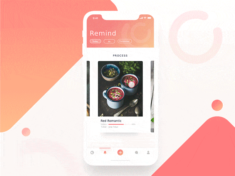
1. Food Community by GruBei for B&B
Food apps are among my favorite and this app concept does not disappoint. As you swipe through recipe options, the image and (while I’m not sure what it stands for, exactly) the index changes as well. The index is a scale and adjusts accordingly when you swipe to a new recipe. Tapping into a particular recipe makes the image take over the screen to become the background and the text slowly cascades down the screen in a gentle motion. Similar desserts populate from left to right. Lastly, the app menu repopulates at the bottom of the screen. Overall, the image based concept is effective in encouraging potential users to get cooking.
 Source: Dribbble
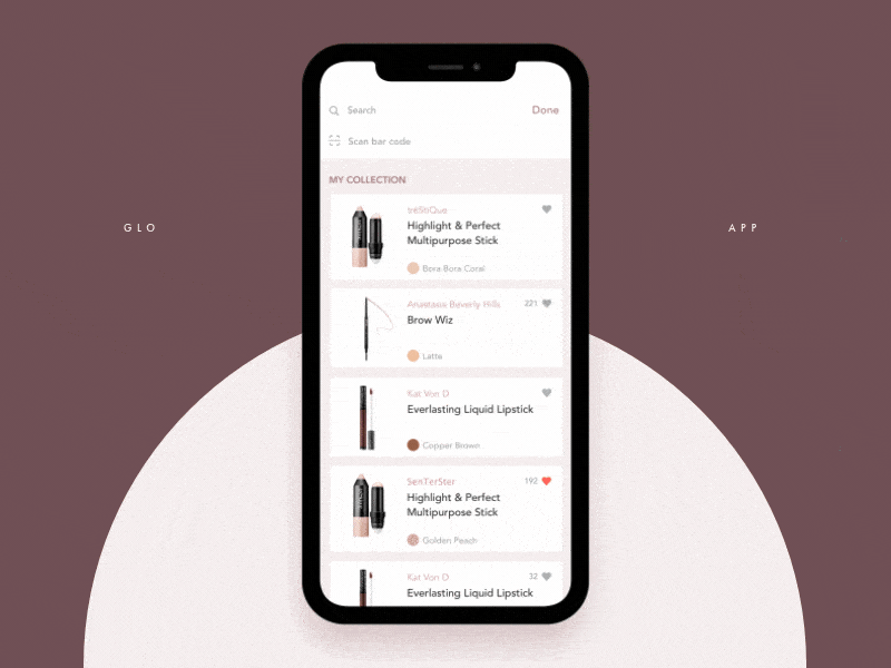
2. Product Details Screen Animation by Zhenya & Artem for Sochnik
There are countless beauty apps out there, but this concept in particular, can condense a lot of product information into bite-sized screens. While looking at your collection of makeup items, you can click into them individually to learn more. The product image zooms to the top of the screen and gets a bit bigger to serve as the header image. Next, the product information slides onto the screen from right to left. And additional pictures appear, starting at the bottom of the screen. To see more images of the product, simply swipe from right to left. Lastly, you can clear the entire screen by swiping left.
 Source: Dribbble
3. Watering Tracker App by tubik
If you want your plants to thrive, you’ll need to water them at the right frequency. I personally have reminders set on my phone and tubik has a similar (but much better designed) way of doing it. The app concept lets you know which plants need to be watered and gives you the opportunity to change the frequency based on the specific plant, so that you’ll get alerts at the right time to water each plant. When tapping into a specific plant, it features a beautiful image of it, along with plant and watering information for it. When you complete a watering, you tap the water icon, and it moves down the screen and transforms into a check mark. Look into all the plants that need to be watered by swiping up on the row of cards, which makes them line up near the top of the screen. Then a handy graph appears, showing how many plants you need to water each day of the week. This mobile interaction design does a great job of helping visualize a household chore with appealing imagery.
![]() Source: Dribbble
Source: Dribbble
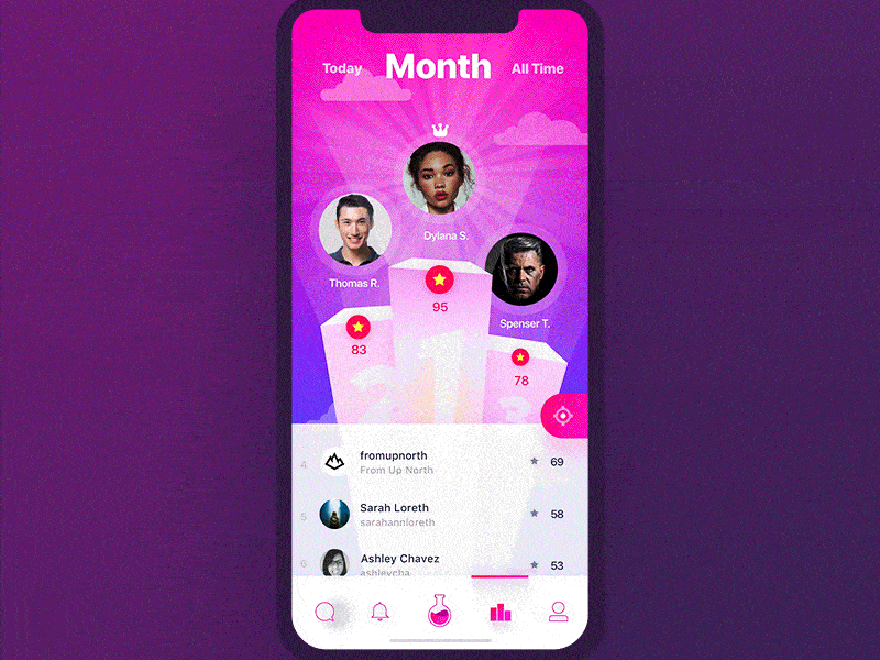
4. Leaderboard Interaction by Yaroslav Zubko in Fame Lab
With so many games out there, we see a lot of leaderboards these days. This interaction concept has a different take on the average leaderboard. As you swipe left and right to reveal the leaders based on specific time frames, the images jump left and right to transform into the correct leaders. When you scroll up to see some of the other top players, the three best players vanish, and the design of the top of the screen changes significantly. It takes on a slanted line, highlighting the time period of leaders you’re exploring and allows you to scroll through as many top players as you’d like. On the other hand, pulling down on the screen from the top three leaders elongates their bar graphs, until you let go and they hop back up to where they were.
 Source: Dribbble
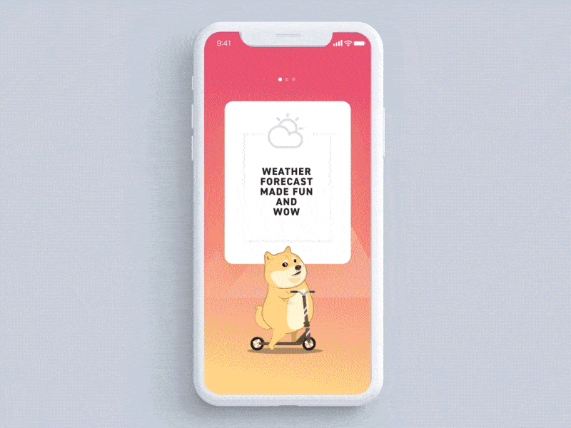
5. Doge Weather App by Minh Pham
Minh Pham has made our list of the top mobile interaction designs more than once. This latest design was impossible to leave off of this list. The setup flow shows Doge literally scooting through each section on his scooter. The motions are so delightful, as Doge appears to be working hard to get to the next card when you swipe to the left. The wheels of the scooter spin fast and he even creates a little cloud of dust from going so fast. The text of the cards is overshadowed by Doge’s scooting, but it is nice to see the background change colors from pink and orange to purple to blue. The realistic motions of Doge make this weather app one of the best mobile interaction designs I’ve seen lately.
 Source: Dribbble
That’s all for December, but be sure to check out last month’s edition, featuring the best mobile interaction designs of November 2017.
Feeling inspired? Sign up for free with Proto.io and prototype your own interaction design in minutes.
Proto.io lets anyone build mobile app prototypes that feel real. No coding or design skills required. Bring your ideas to life quickly! Sign up for a free 15-day trial of Proto.io today and get started on your next mobile app design.


