How we move through apps has a big impact on our opinions of them. Swiping and tapping have become the most common ways to get from screen to screen. These mobile interaction designs take some of the best and brightest UX trends and use them to help us in our everyday lives. From planning trips to mapping out projects at work, these app concepts deserve some time in the spotlight.
Here’s why:
1. Colorsup by Vijay Verma
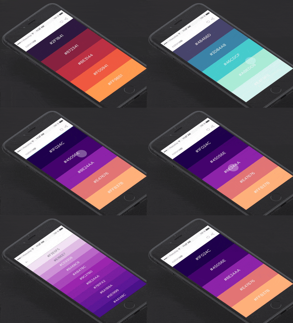
This app concept is literally what designer dreams are made of. Sifting through color palettes can be helpful when you’ve hit a mental roadblock and need to find inspiration for your next creation. It allows you to swipe through numerous colors and when you find one you like, you tap it to find a full palette with multiple shades of that original color. You can then add it to your favorites and go back to it whenever you need. My favorite part of this mobile interaction design is the way the shades trickle down the screen when you select a color. That is the feature that makes this app concept so visually delightful.
2. Hotel Date Picker by Daniel Thomas
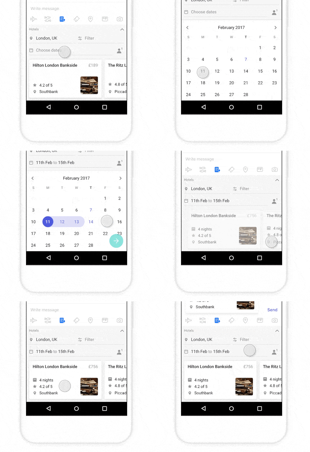
I love traveling, but booking my trips is generally a stress-inducing experience. The part that I often have trouble with is picking the dates. There are some airlines that make it hard to click the dates of your trip and it’s unclear if you’re revising the departure date or not. This app concept takes that guesswork out of the process and connects your dates with a colorful line so you know that you’ve selected the right dates. It’s a very simple motion and fits with the minimal design of the app concept. In addition, there are smooth transitions when interacting with different parts of the trip planning process, making it as seamless as possible.
3. Filters transitions by Vitaly Rubtsov
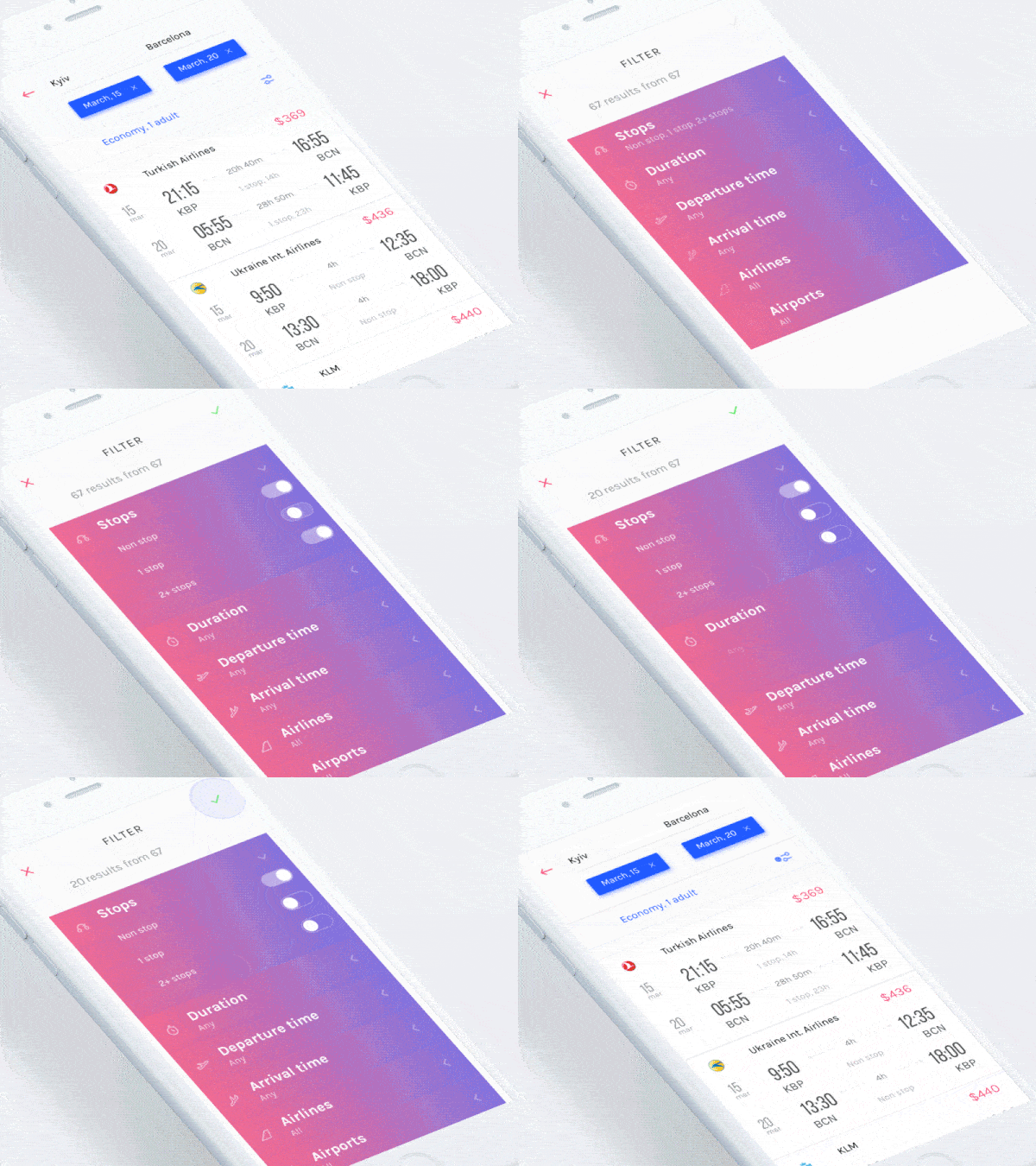
Continuing on the travel app theme, this app concept takes on the mobile interaction design side of planning a flight. It manages to make it a visually enjoyable experience with a soft gradient color palette. The trip planning process becomes a swipeable and tappable process, like we’re used to when adjusted our phone settings (“on” and “off” for the number of stops you’re willing to endure and a toggle for the number of hours you’d be willing to travel). Once you finish up picking all of your travel specifics and click the green checkmark, your options glide onto the screen with a smooth transition leading to a clean and easy to understand layout with your flight options.
4. History Animation by UISTAR
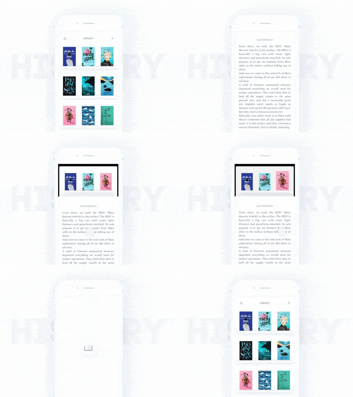
I’m typically a physical book kind of person, but this app concept has me seriously considering reading on my phone. It lets you click and swipe through book titles and when you choose one, it pops up and the front cover opens to take over the screen. Even while reading the book, you can still swipe through book options, in case you’d like to switch over to a different title. This mobile interaction design takes the good things about reading a book in real life and brings that experience to an app. It employs the swiping and tapping motions that we’ve gotten used to and embeds them in the age-old pastime of enjoying a good book.
5. Omelo by Caleb Barclay
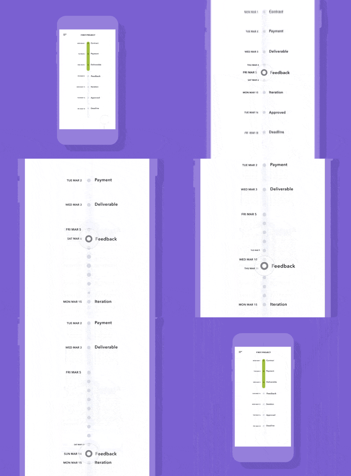
Project management can seem like a chore when there are numerous teams working on all the moving parts of a project. And if those teams are distributed in offices around the world, you’ve got an even bigger task in front of you. With the help of Omelo you can track each stage of your project and how teams are progressing. I appreciate the movement in the Omelo app because it introduces a rhythm into the process of completing a project. Moving towards the finish line expands the roadmap and shows the small deadlines that need to be met before the overarching goals. Omelo has a high level view, giving the big deadlines, but also gives you insight into the small parts of a project that keep the entire team focused day by day.
That’s all for April, but be sure to check out last month’s edition, featuring the best mobile interaction designs of March 2017.
Feeling inspired? Sign up for free with Proto.io and prototype your own interaction design in minutes.
Proto.io lets anyone build mobile app prototypes that feel real. No coding or design skills required. Bring your ideas to life quickly! Sign up for a free 15-day trial of Proto.io today and get started on your next mobile app design.


