Intriguing mobile interactions make the app world go round. Otherwise, we’d be stuck with apps that work, but we wouldn’t want to spend any more time in them than we had to. When you think of your favorite products, I’d be willing to bet that they help you accomplish something important to you, as well as looking nice. Mobile apps take it beyond just aesthetics because you’re interacting with them, so when designers create new apps they always keep in mind ways to make those necessary interactions fluid.
Here are my picks for the top 5 mobile interaction designs this month:
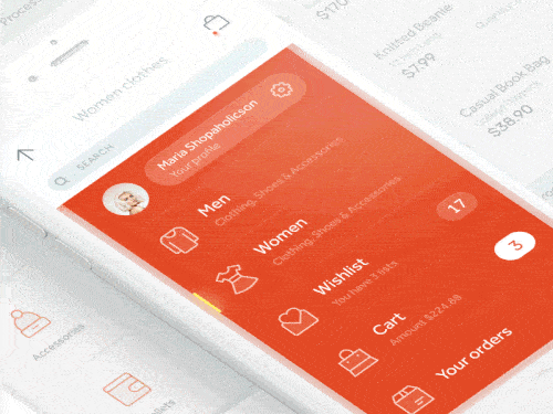
1. Accordion Fold Menu by Alex Khoroshok
This mobile interaction design brings me so much joy. These days there are so many menus we go through. We tap them and the information flows down, but this app concept adds an element of interaction design to a rather mundane task. It’s a part of a shopping app concept and it’s pretty much perfect in my eyes because it does exactly what you need it to do (switching categories or tapping into your cart), but it also has a bit of bounce and flair to it. Not to mention the bright and inviting color Khoroshok chose! I think this is a great take on the average hamburger menu drop down that makes finding information in an app much more enjoyable.
 Source: Dribbble
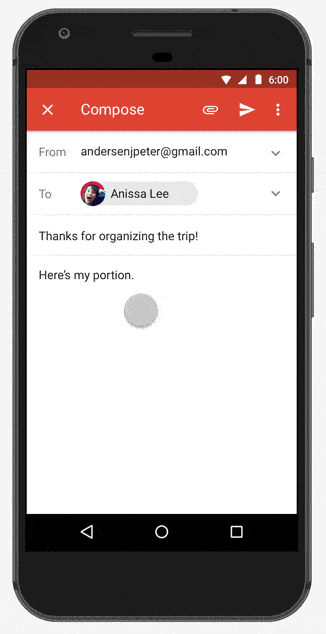
2. Gmail for Android by Google
From Paypal to Square Cash to Venmo, there are a ton of ways to send money to your friends. Now Google is jumping in the game again by making it possible to send money straight from your Gmail Android app to anyone with an email address (the recipient doesn’t need a Gmail account). While unseating the money transfer app kings seems dubious at best, it is a helpful feature for Google to offer their Android using email account holders. The best part of this new feature is that you can send money right in your email, instead of having to switch to Venmo. It streamlines the process and there’s a smaller chance you could be sending money to the wrong person, as you don’t have to deal with a pop up menu with several recent friends. The numbers are bouncy and the process has a much slicker UI design than competitors.
 Source: Google
Get Gmail on Android.
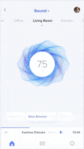
3. Smart Home UI by Lukáš Straňák for PLATFORM
In 2017 you can control almost anything in your home with an app. This app concept takes on the task of reducing the bass on the stereo in your living room. Usually, when turning something up or down on an app, there are up and down arrows and you have to tap them until you get to the number you want. This app concept instead incorporates a fluid movement in which you pull down the number and watch it turn from a circle into a droplet shape. When you reach the number you were after, you simply let it go and then it returns back up to its circular shape near the top of the screen. Beyond this innovative mobile interaction feature, the rotating and pulsating images that flow around the circle are a beautiful way to visualize the music you’re listening to.
 Source: Dribbble
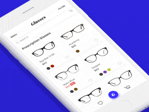
4. Filter by Vladimir Gruev for Heartbeat.UA
As someone who wears glasses, shopping online for them can be tough. You don’t know how they’re going to look on your face or if the lighting in the image is changing the color slightly. This app concept makes the buying glasses process better by simplifying the filtering function. At the same time, they added lots of bounce effects to improve the user experience. They step away from the typical formatting of having filter options at the top of the screen, but it still works in my opinion. When you click the category you want to focus on at the bottom of the screen, more options pop up fluidly with a little bounce so you can get even more specific in what you’re searching for. Then once you make your second selection, the glasses options update by popping out with new products you can choose from.
 Source: Dribbble
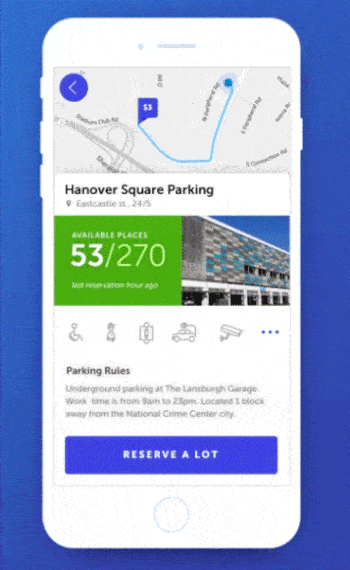
5. Parking Search by SELECTO
Driving can be great fun, but driving in a big city comes with an added nuisance—I’m talking about parking. Parking lots are often the best course of action when streets are packed with cars and circling for 20 minutes isn’t your idea of a good time. That’s where SELECTO’s app comes in. They give you access to a map with all the nearby parking lots with the price you’ll have to pay. Once you decide on one and tap it, you’ll get information on how many spots are free, so you don’t rush several blocks away just to find a full garage. It gives the option to reserve a spot, which is a great idea if only a few are available. What I like most about this mobile interaction is the way that the information populates once you choose a parking lot. The best route there is quickly drawn out in a zooming motion and the tile containing the number of spots intersects with and then takes over the image of the lot.
 Source: Dribbble
That’s all for March, but be sure to check out last month’s edition, featuring the best mobile interaction designs of February 2017.
Feeling inspired? Sign up for free with Proto.io and prototype your own interaction design in minutes.
Proto.io lets anyone build mobile app prototypes that feel real. No coding or design skills required. Bring your ideas to life quickly! Sign up for a free 15-day trial of Proto.io today and get started on your next mobile app design.


