Mobile animations make an app dazzling and usable, even if they aren’t usually the first things that a user would notice. Try making an app with a static UI and the difference will be more than noticeable. You’ll realize in an instant just how dull and unattractive it is. That’s why many UI/UX designers choose to create interactive mobile app prototypes with powerful tools such as Proto.io. Mobile animations and interactivity give life to a mobile app that allows designers to make better decisions on how to anticipate and meet the user’s needs. For inspiration on how to apply mobile animations to your next design, here are 5 apps that will give you fresh new ideas. In no particular order:
1. redBus App by ibibogroup
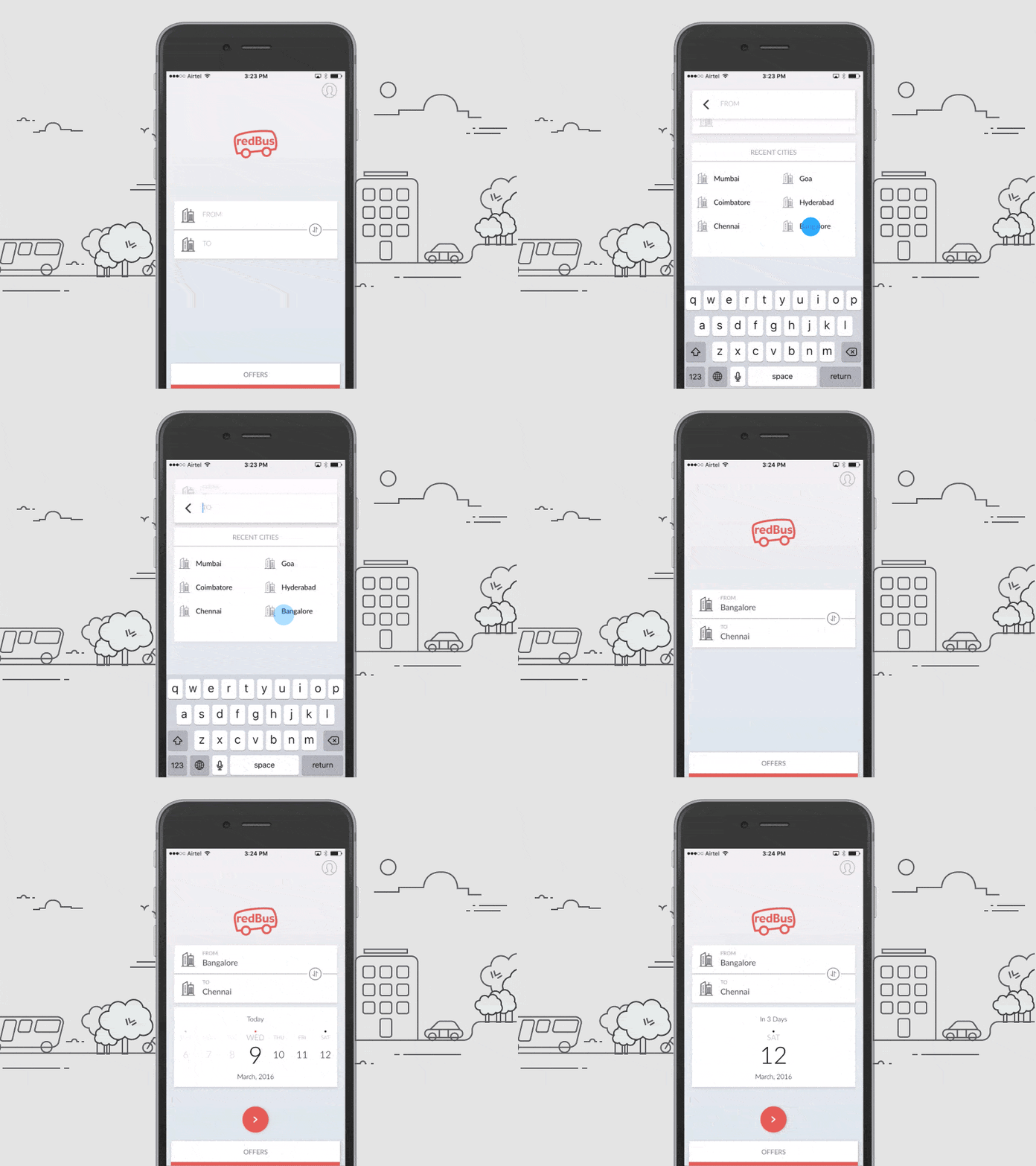
India’s most popular online bus ticketing platform just got a fresh new design update for their iOS app. I’ve never been to India much less say taken a bus there. But thanks to the Internet, I came across Ranganath Krishnamani’s Dribbble and got to appreciate redBus’ gorgeous mobile animations. Selecting the city of departure brings up a list of destinations with a smooth sliding up animation. The custom date picker is also a delight compared to the default iOS date picker. When it comes to sleek mobile animations for a travel app, redBus has nailed it with their classy, stylish app. Whether you’re planning a trip to India or not, it’s worth checking out for some interaction design inspiration.
Get redBus on iOS and Android.
2. Location Scanner by Minh Pham
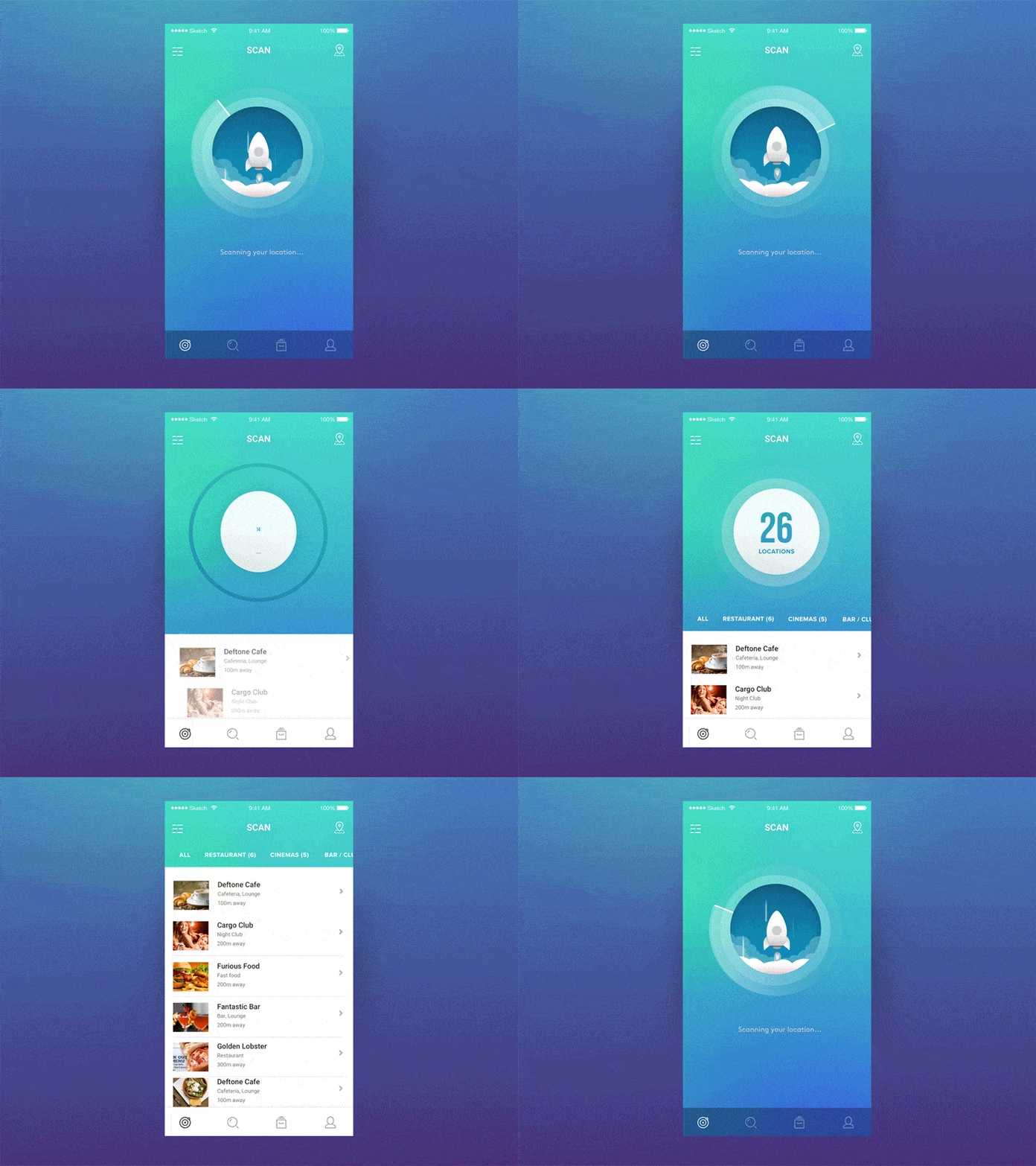
The talented Minh Pham has already amazed us once with the mobile animations of his Doge-based weather app. He’s done it again with a location scanner mobile animation that’s just too cool to be true. But it is, for sure. The slow-launching rocket when the app is scanning for locations is a touch of fun that helps to ease the user’s waiting time. Together with the spinning ‘radar’ scanner, the mobile animation is effective in filling in the gap for when the app needs time to load results. This is especially useful for cases when mobile connectivity isn’t tops. This makes a world of difference when designing mobile apps, it creates the magic that users expect to experience these days.
3. Service by Service Technologies
Anyone who has had the experience of being put on hold for what seems like forever would understand this hilarious sketch by Amy Schumer. Dealing with customer service over the phone or by email can be tedious and frustrating. Likewise, being on the other end of the line and listening to frustrated customers is equally frustrating. Service wants to be the solution to a real problem by taking the problem out of your hands. I included Service not so much for the mobile animations of the app but for the great interaction design approach behind the app itself. Service puts your customer service issues in the hands of friendly professionals so that you can go about your daily life without worry. This app would definitely be welcomed in my life.
Get Service on iOS.
4. Shipping App Login by Siranush Hovsepyan
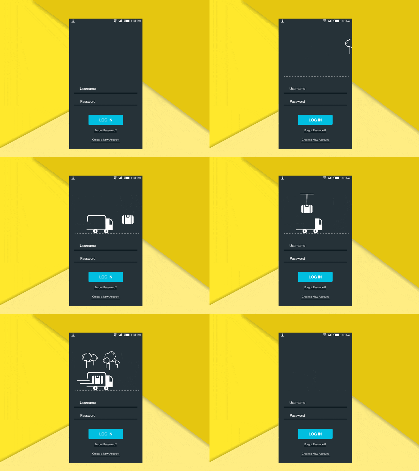
Login screens. They’re everywhere and they’re usually kind of boring. Nonetheless, it’s no excuse for designers to not go out of the way to spice up the regular app login. Craig Dehner, former UI and Motion Designer at Apple, has recently published a bunch of possibilities for animating your mobile app logins. This shipping app login example is another possible approach that spruces up the login view for apps with the use of relevant and delightful mobile animations. The animations are not focused on the username and password input but rather, on the logo that usually sits above the input fields. The playful animation beautifully depicts the process of shipping, transforming a rather mundane process into something slightly more exciting.
5. Wallet App Concept by Cleveroad
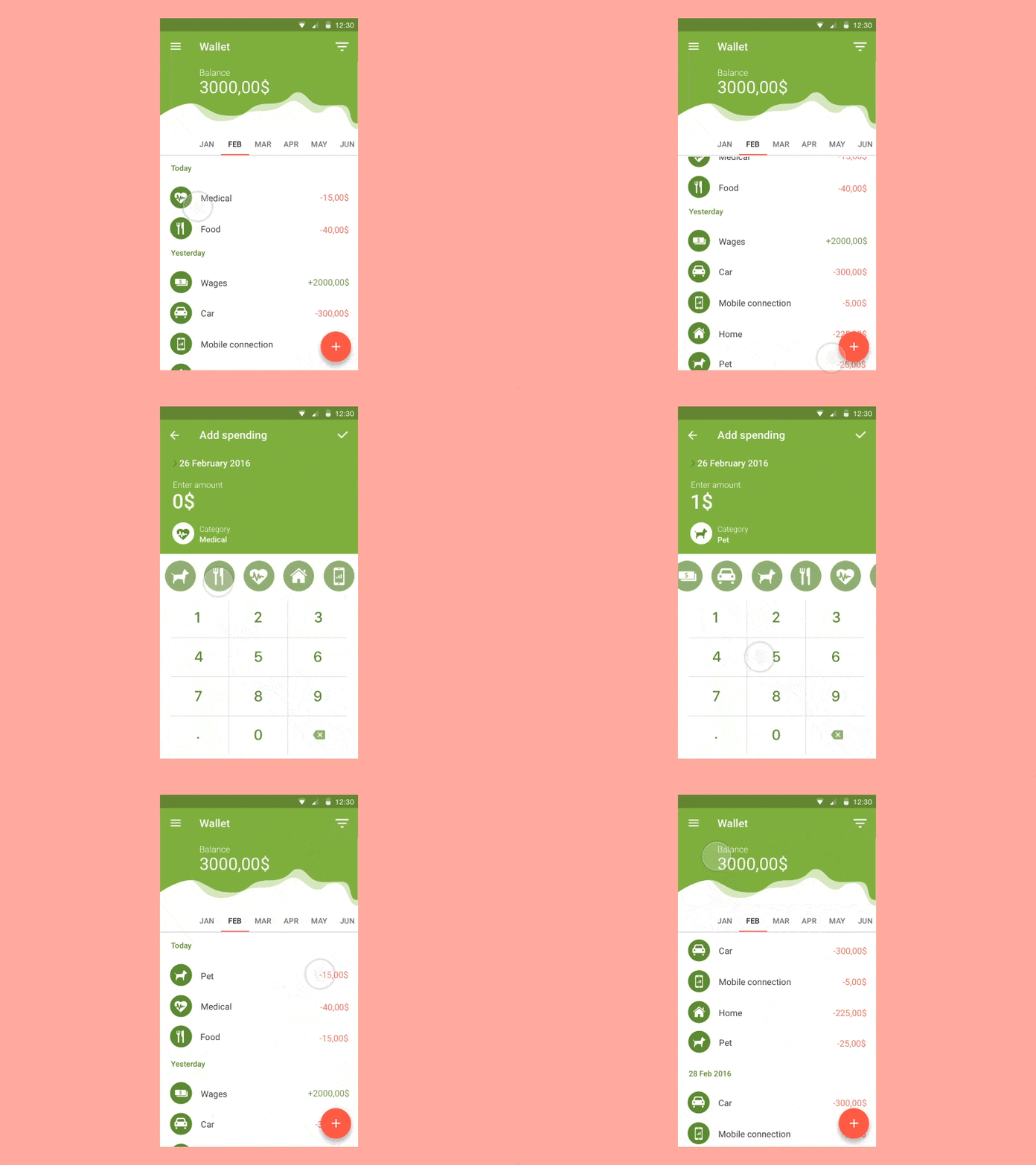
Recently, I’ve been searching for an app to track my personal expenses. One that is well-designed, syncs across multiple devices, and is packed with powerful features that enable me to better manage the family budget. In my search, I came across this lovely wallet app concept with great mobile animations by Cleveroad, a web and mobile development company. The UI design of the app concept sports classic Material Design style with well-placed mobile animations. The slider of icons for choosing categories is a good alternative to the usual list-style view. Screen transition to add a new expense is expeditious and effective.
We would love to showcase your mobile animations and designs on our blog. Tweet us @protoio or send us a message via our Facebook page!


