When it comes to great mobile interactive design, being able to emotionally connect with the user makes a world of difference. Many apps try to achieve this by the use of animations to simulate motion and complex algorithms to mimic the human mind. We look at 5 app designs that inspire us to strive for higher standards of mobile interactive design. Here they are, in no particular order.
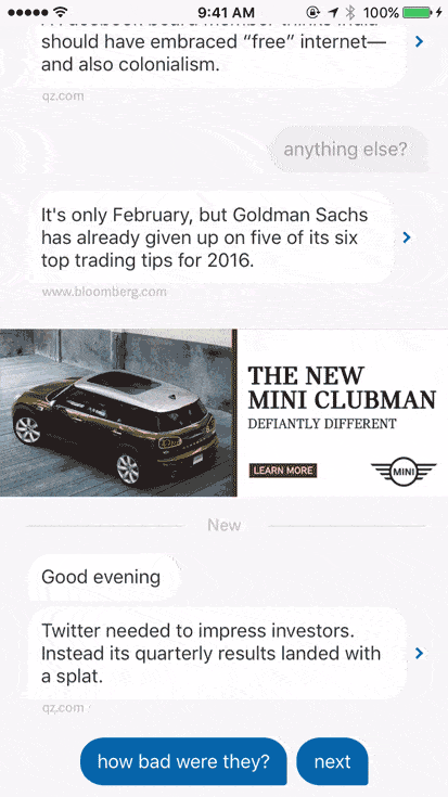
1. Quartz by Quartz Media
For many of us, the morning paper and the local news station are no longer the only means for us to get to know about what’s going on in the world. We’re constantly connected to the world via mobile apps and social media networks. It has become so easy to share information wirelessly that we hardly think twice about sending our contacts a link to some news article or another. Quartz is a truly unique app that texts you the news and in return, lets you ask questions in the form of canned responses. It might even send you gifs or images. In a way, it’s like having a friend who’s always eager to chat about the news. Or one of those Facebook friends who floods your feed with news articles. This approach of achieving more human-like interaction with users is becoming rather popular in mobile interactive design and we believe that it’s a great approach when applied to the right context.
2. Sunrise Calendar by Microsoft Garage
Sunrise is a special keyboard to ease the process of scheduling meetings, which we all know can be a real pain in the neck. It’s such a simple idea that I now wonder how is it that nobody has thought about it before. But of course, great mobile interactive design depends a lot on the little details that aren’t too obvious but have potential to truly delight the user. To use Sunrise, you just have to open the keyboard, pick the times that work for you and send it to the invitee. Then, they choose the time that works best for them and you’re all set. Sounds amazing, doesn’t it? It eliminates the need to send multiple emails in the feat to settle on a time that works for both parties. No doubt, it’s such thoughtful mobile interactive design that truly adds value to the everyday user.
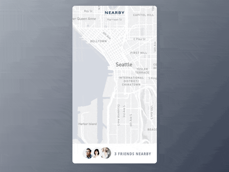
3. User Flow by Bryce Komae
Creating custom maps can be a lot of hard work but it could be well worth the effort if the app’s main feature is location-based. This mobile interactive design by Bryce Komae really makes the case for custom maps. The user flow of the app shown here locates your friends who are nearby and lets you send them messages to invite them to hang out. The transition from aerial view to street view places your friends’ images as pins on the map. Selecting a friend enlarges the pin to a circular profile image and brings it forward at the same time. The animation is silky smooth and super sleek. It makes the entire flow from map to message feel very natural.
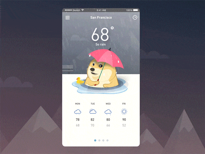
4. Cloudy with a Chance of Doge by Minh Pham
Internet memes are probably one of the more definitive cultural elements of our digital age. And of all the memes there are, who doesn’t love Doge? The Shiba Inu with the raised eyebrows that glares sideways has more fans than any other dog in the world. This weather app concept by Minh Pham featuring a lifelike illustration of Doge as its mascot is bound to have a following when it’s eventually released. Cuteness aside, the mobile interactive design is top-notch. The flash of lightning, the splattering rain, and the rendition of Doge holding an umbrella with the caption, “WOW much thunder” — the animations are beautiful and very convincing. They make it look like it’s actually raining in your device. What can I say but “WOW” to this mobile interactive design.
The design community benefits greatly from knowledge exchange and mutual sharing. Would you like us to feature your amazing mobile interactive design? Let us know @protoio!


