The mobile app design space moves fast as consumer needs change, and technological advances in the design industry come to fruition. Here at Proto.io, we’re at the forefront of mobile app design, and we always keep our eyes out for the latest and greatest creations. This month is no different. We’ve rounded up four of the best apps we’ve seen over the course of the month to bring you this curated list of design excellence. Let’s dive right in and get to the apps.
1. Foodvisor – Calorie Counter by Foodvisor
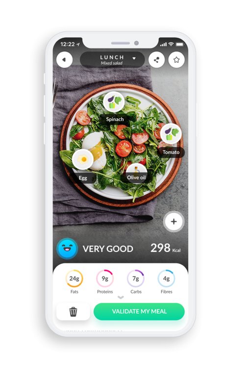
Foodvisor is a food app that aims to determine the calories and weight of food using deep learning. This is especially helpful for people who want to keep better track of what they’re eating. Many restaurants might not have caloric information, and while cooking at home, you can only guess about the nutritional information when you are using countless ingredients. With Foodvisor, it is all possible to gain all this information with just a quick photo of the dish. This colorful mobile app design makes eating healthy easier. It includes a pastel palette and delightful animated characters to bring life to the dieting and exercise process.
Source: Foodvisor
2. Emojivision by GabrielOC
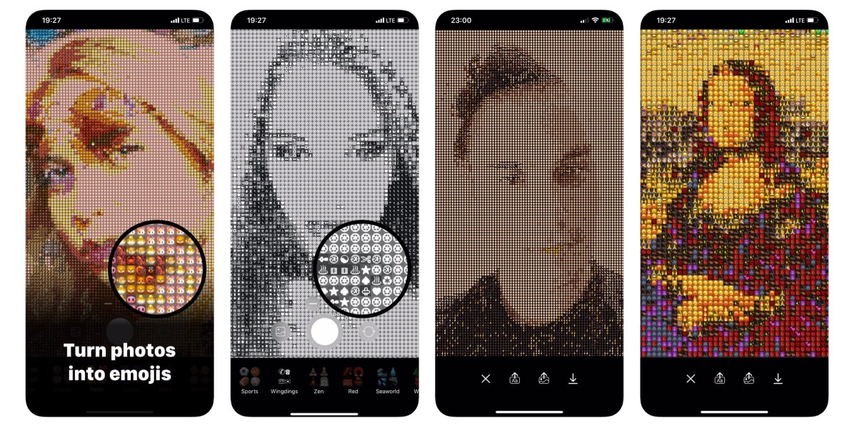
Next, we have a fun app called Emojivision. This app focuses on computational photography and makes wild creations using iPhone cameras. Basically, the app has its palettes broken down by color that correspond to specific emojis. When the user takes a photo, the app maps the image to the emoji sets and creates a version of the image using only emojis. The app has emoji sets broken up by interests, such as sports or aquatic creatures. These buttons along the bottom of the screen allow the user to toggle through the different options and make an image that aligns with their interests. Beyond these icon sets along the bottom of the screen, the app utilizes just a few other buttons to take, upload, and share these unique creations.
Source: TechCrunch
3. Moodnotes by ThrivePort, LLC
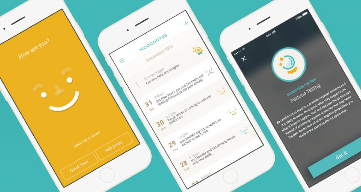
In such a fast-paced world, being able to slow down and reflect is key to mental health. Moodnotes is an app that enables users to check in with themselves, track their moods, and think more positively over time with helpful tips and tricks. The app fits within the healthcare realm, with muted colors, and charts and graphs to measure progress. Most importantly, the mobile app design allows users to focus on themselves and put Cognitive Behavioral Therapy best practices to use with the help of a minimal user interface that cuts out the “feeds” and endless scrolling that can amplify stress.

4. Fender Songs | Guitar Chords by Fender Digital
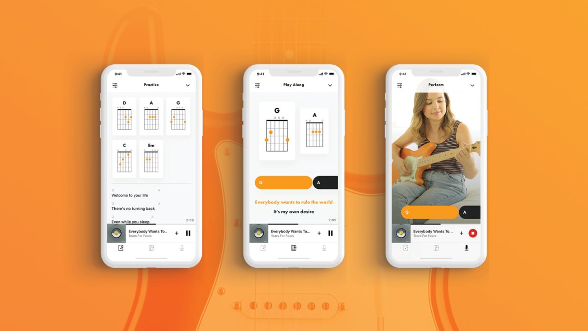
One thing we can’t get enough of are awesome integrations. Fender, for example, integrates with Apple Music to help musicians on the go access the chords and lyrics to their favorite songs. While Fender is best known for their guitars, the app also provides notes for ukulele and piano. The mobile app design is quite simple, following a black and white color scheme with orange accents. The integration is more than just enabling notes from Apple Music songs, and the app designs also sync up nicely. Apple is known for their sleek and minimal design, and Fender similarly makes good use of white space and doesn’t crowd user screens with too much information.
Source: MusicRadar
That wraps up the apps for October, but if you’d like to explore some of our other favorite mobile app designs, check out our September installment.
Feeling inspired? Sign up for free with Proto.io and prototype your app in minutes.
If you enjoyed this curated list of great mobile app designs, share it with your social network! Do you have a suggestion for the next edition of our Top 5 Mobile App Designs series? Reach out to us via Twitter @Protoio or on Facebook.


