As the weather continues to get cooler, there’s one thing that keeps heating up: the mobile app design space. No matter the weather, designers around the world are churning out designs that rock our world. This month we bring you five app designs that piqued our interest, from animated call to action buttons to cinematic color schemes.
Let’s check out the top mobile app designs of the month.
1. Freetrade by Freetrade Limited
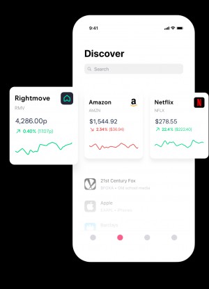
Investing doesn’t have to be expensive—in fact, it can be free. Freetrade is a mobile app that helps users buy whole stocks or portions of the ones listed on the US and London Stock Exchange. It comes in a cleanly designed layout, with a minimal color palette. It features pops of color when demonstrating stock performance or encouraging users to take action with bright colored buttons, such as buying or selling a stock. The mobile app design reminds us of Apple’s iconic style, with crisp white backgrounds, while adding playful animations to the mix to spice it up.
2. Fabric · Effortless Journal by echo.works
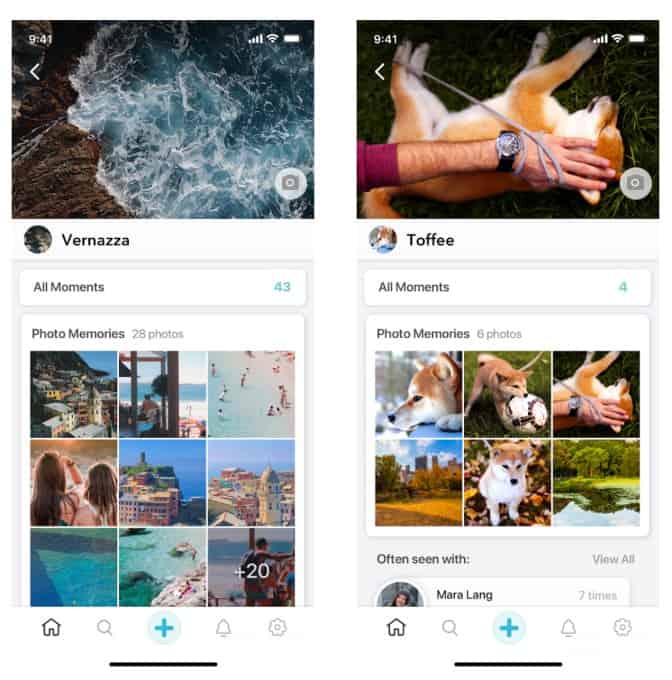
With data breaches and eerily accurate ads, some are choosing to delete Facebook. But the underlying interest in sharing what we’re up to with those that we care about is ever present. That’s where Fabric comes in to help users create a “live journal” based on their locations and photos. This privacy-centered app effortlessly combines many different design elements that we’ve gotten used to in social media apps, such as card based options users can swipe through, grid layouts to see many photos at once, and strong hero images that anchor a screen focused on one experience. In all, this is a nice alternative to Facebook that makes the sharing experience even more visual and especially enjoyable for those who appreciate minimal design.
Source: TechCrunch
3. Miles by ConnectIQ Labs Inc
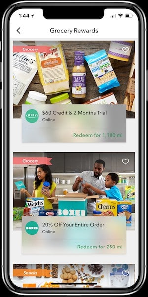
Continuing on the topic of apps that benefit users by tracking their location, Miles is an app that offers rewards based on how far users travel using certain modes of transportation. The more environmentally friendly the better, with walking gaining users the most amount of points and flying the least. These rewards points can be cashed in for discounts and gift cards once a certain point threshold is met. When it comes to the mobile app design, it is focused on app accumulation and rewards. The screen that features the amount of points a user has earned so far for the month easily breaks it down by type of transportation, complete with colorful icons for each one. When it comes to the rewards section of the app, the layout feels like an online retail app—featuring appealing photos of the products and a banner with information regarding what the reward is and how many points it requires.
4. Reelgood – Streaming Guide by Reelgoodapp
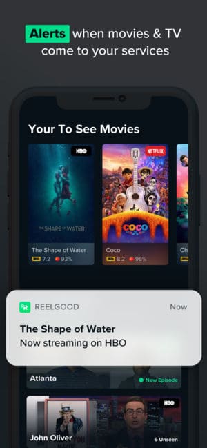
With so much quality content out there, it’s often hard to keep up. Reelgood helps cinephiles (not to mention binge watchers) stay up to date with the latest releases they are likely to enjoy based on reviews. What we like most about this mobile app design is that it’s so comprehensive, but still maintains a clean design. The underlying design features a dark background with pops of color—this reminds us of being in a dark movie theater with an action-packed film up on the big screen. With so many streaming platforms to keep track of, Reelgood makes it clear where shows and movies are playing with tags on each one in the top right corner featuring a color coated label explaining where it can be found.
5. Zyl – Memories by Comet SAS
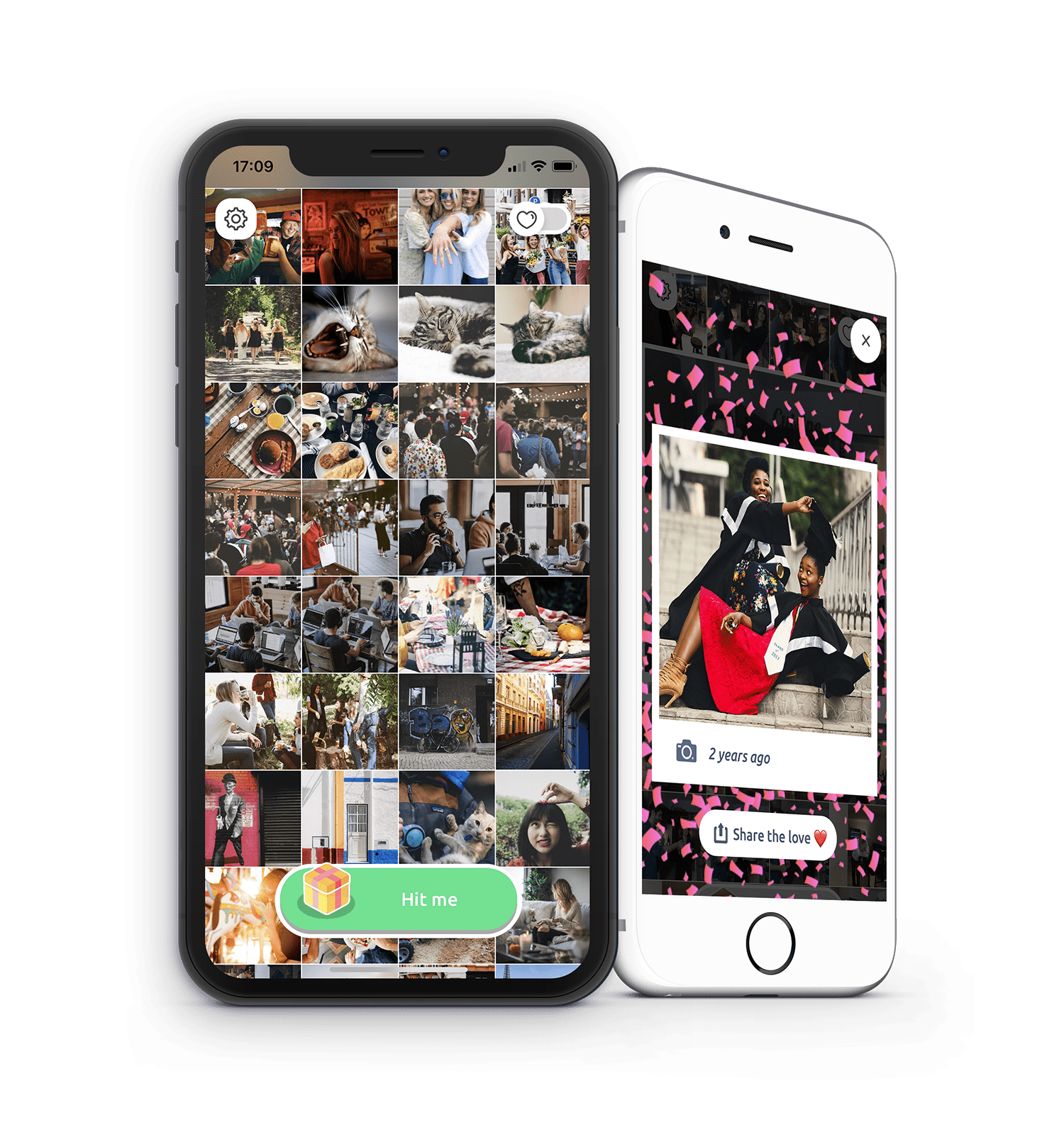
As storage on our smartphones increases, the number of photos we can store has skyrocketed and this often means that great ones end up forgotten. Zyl brings an element of surprise into your photo album by suggesting one forgotten picture a day, making it easy to share with friends. The app is focused on images, avoiding any unnecessary text or buttons. The main button in the app is a rounded green “hit me” button with an image of a present. If scrolling through endless pictures gets tiring, hitting this button will bring up an old photo that you are bound to love. The app creators even suggest GIFs if you have taken multiple versions of the photo of the day, adding an element of delight.
That wraps up the apps for October, but if you’d like to explore some of our other favorite mobile app designs, check out our September installment.
Feeling inspired? Sign up for free with Proto.io and prototype your own app in minutes.
If you enjoyed this curated list of great mobile app designs, share it with your social network! Do you have a suggestion for the next edition of our Top 5 Mobile App Designs series? Reach out to us via Twitter @Protoio or on Facebook.
