With summer coming to a close, it’s only natural to look back at some of the mobile app designs that rock our world. Some of these sleek designs are barely out to the public, while others have been wow-ing the design community for years. Regardless, these rounded, card-based designs are something you’ll want to check out if you’re looking for inspiration for your next project.
Let’s dive right into our favorite mobile app designs of the month!
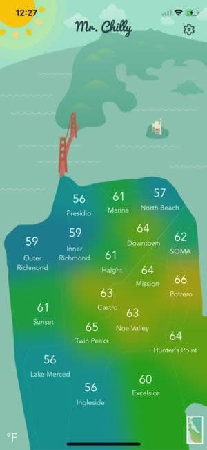
1. Mr. Chilly by Anna Bleker Alexander Chia
Here in the Bay Area, traveling from one part of San Francisco to another can mean dropping 10 degrees. In any area with microclimates, typical weather apps no longer make the cut because weather varies significantly. Luckily there is an app called Mr. Chilly that breaks down San Francisco’s weather by neighborhood. This fun app is an animated and colorful take on the typical weather app—and the waves around the Golden Gate Bridge even move! It is beyond simple to use, as it has color coordinated temperature estimates for each neighborhood in San Francisco and the ability to zoom out to the greater Bay Area by tapping the bottom right button. Mr. Chilly makes it easy to see how temperatures will change by holding your finger down on your screen and swiping to the right.
 Source:
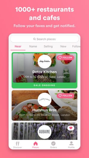
 2. Karma by Karmalicious AB
Food waste is a massive problem, as many don’t have enough to eat, while others let groceries and prepared food expire. Karma is helping address food waste by connecting businesses with food nearing its sell-by date with consumers who want great food at half price. The app has green accents, but has a mostly white and pink layout that highlights actions app users can take, such as following a certain restaurant or selecting a dish. The mobile app design has a comfortable feel, with rounded buttons and cards alike. To top it all off, Karma finds a way to make two menus work at once: one at the top to select restaurants using specific criteria, and another at the bottom with options to toggle back and forth between the underlying sections of the app.
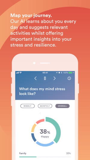
3. BioBase by BioBeats
Mindfulness and meditation are much more than a fad, in fact they are essential to reducing stress and living a healthier life. BioBase is an app that helps users get to the root of their stress and keep it at bay with wellbeing courses. It has a soothing design with pastel colors and round buttons. The color scheme changes for each different course, such as focusing on sleeping quality and body stress. We appreciate that this app keeps buttons to a minimum and really allows users to focus in on what’s stressing them out so that they can resolve it and feel better.
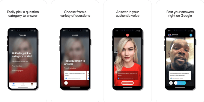
4. Cameos on Google by Google, Inc.
Ever want to ask a celebrity a question? Google’s Cameos makes that possible with their video-based Q&A app. In typical Google fashion, the mobile app design is minimal, with a natural focus on the questions celebs can choose to answer. The app easily categorizes questions into three groups to help address the best questions. The look of the app is reminiscent of a Google search, featuring white question cards with blue accents. When a question is selected it’s time for action! The celebrity is able to take a quick video of their answer, with the question below their image the entire time to stay focused on what viewers want to know.
 Source: TechCrunch
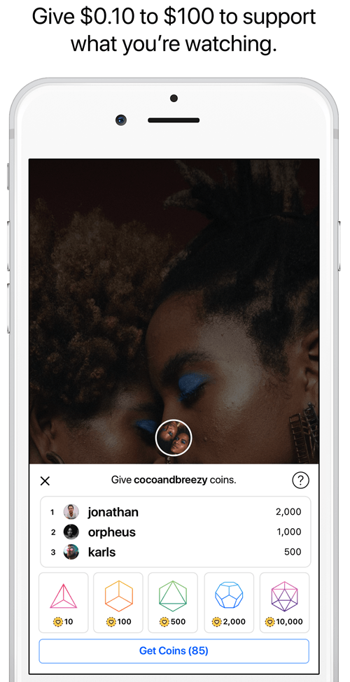
5. Portal by Mass Lab, Inc.
There is so much content surrounding us, but are the artists always paid when we consume their content? Portal aims to solve this with a platform that allows creators to set a price for their content, for example requiring each viewer to pay 10 cents (or they can choose to give more). The mobile app design is sleek and image-focused. App users can scroll down their feed and see rich colors and previews of the content they might want to check out. The design feature that stood out the most to us are the icons for the different payment tiers. Bright and increasingly complex shapes signify the amount of “coins” a viewer can give to a creator to show their appreciation.
 Source: iTunes
That wraps up the apps for August, but if you’d like to explore some of our other favorite mobile app designs, check out our July installment.
Feeling inspired? Sign up for free with Proto.io and prototype your own app in minutes.
If you enjoyed this curated list of great mobile app designs, share it with your social network! Do you have a suggestion for the next edition of our Top 5 Mobile App Designs series? Reach out to us via Twitter @Protoio or on Facebook.


