The most successful products on the market have one major thing in common: they’re focused on the user experience. We’ve seen it time and time again with cellphones, mobile apps, cars, and almost every other product you could possibly think of. It makes sense, doesn’t it? Users determine the success of your product, so why wouldn’t you focus on their experience?
However, designers haven’t always been so laser-focused on UX. While it isn’t like they were sitting around trying to design things that were miserable to work with, it’s fair to say that UX wasn’t at the top of their minds. Aesthetics, features, and other considerations came first: even if it meant a miserable UX. That’s changed.
Regardless of product or industry, UX design is more important than ever — so important that it could make or break your product. User experience can be the difference between a bestseller and a total dud. You simply can’t afford not to make it your main focus.
Since designers began to focus on the user experience, product design has made great strides. Plenty of items we use every day have been greatly improved by this shift in thinking. In fact, this is so ingrained in a designer’s workflow at this point, it’s hard to remember what life was life before.

Mid-20th Century: Expanding in Size
Shifts in design trends can be influenced by societal changes, which can impact the size and scope of a product design. Pretty much everything in the mid-20th century grew in size as people moved out of cities and into the suburbs, affording them more room than city-dwelling did in every imaginable way.
One of the most obvious examples is cars, which stretched to incredible (and unnecessary) lengths. The luxury Lincoln Continental with its suicide doors reached 216.3 inches (about 18 feet) long. The more economical 1957 Chevy Bel Air wasn’t far behind at 200 inches (just over 16.5 feet).
There could be some argument here that parts were bigger and therefore, the body needed to be larger — and as for the trunk, suitcases were hard and boxy, so more room was necessary. Big cars sort of became the trend and for the most part, this was fine. People who needed cars lived in suburbs, so space wasn’t really a problem. They had plenty of room and maybe even a two-car garage.
The same went for refrigerators, which grew in size to incorporate larger freezers in the 1950s. Much to our modern-stainless-steel-obsessed chagrin, it was during this time period that matching your refrigerator to your cupboards became all the rage. It was in the 1960s that a big, colorful, “futuristic” fridge was found in most suburban kitchens.
It’s fair to say that most designers weren’t considering the user experience of the person driving the car or using their refrigerator on a daily basis. Bigger was better — and that was the extent of it. It didn’t matter if your car struggled to handle the most basic of curves, or if your refrigerator door was heavy enough to double as a fallout shelter.

Late 20th Century: The Tech Explosion
In the latter quarter of the 20th century, rapid technological advancements were made. As one would expect, developers of the first cellphones and computers weren’t as focused on user experience as they were the novelty of them — those who could afford them would definitely buy them — and early adopters are usually willing to live with hard-to-use products, as long as the novelty is there.
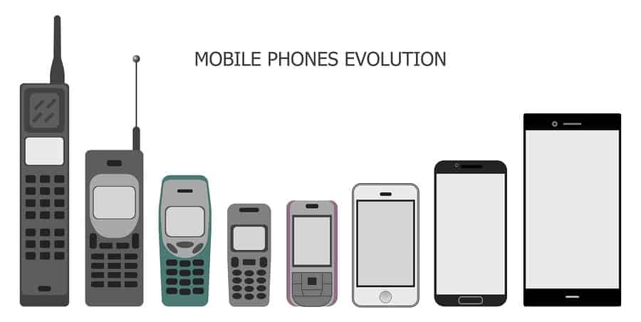
Cellphones started off as boxy monstrosities that didn’t really fit in anything smaller than a large purse or briefcase. But back in 1973, that huge brick Martin Cooper used to make the first cellphone call needed to be huge in order for it to work. The components that made the phone function weren’t compact. That original prototype weighed more than two pounds and the battery only lasted for 20 minutes when the phone was in use. Even ten years later when the first cellphone was released commercially, it wasn’t small by any means.
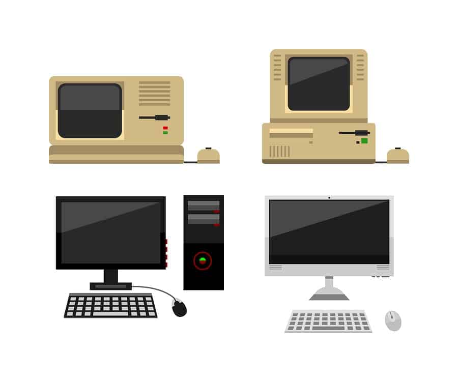
Likewise, the first laptops started out as bulky, heavy boxes (the first computers literally took up entire rooms — not exactly user-friendly). The same rules applied: people who could afford them bought them and they weren’t too concerned about the design because for the first time ever, they could take a computer with them wherever they went — as long as they had the strength to carry a 25 pound box around and they could read that teeny tiny screen.
Designing with the User Experience in Mind
Throughout the past couple decades, we’ve seen a major shift in product design. Nowadays, the focus is largely centered on how potential customers can make the most of the product and the overall user experience. This is a very broad description, of course, as the UX design can cover physical characteristics, as well as programmed interactions.
Revisiting everyone’s favorite household staple, refrigerators have grown to accommodate the “stock up” mentality of families — especially in households where both parents are working. There may be weekly or bi-weekly trips to the grocery store because parents rushing to pick up kids from daycare simply won’t have time to stop at the store during the week.
We need our fridges to be obscenely large. Yet, unlike the fridges (and freezers) of the 50s and 60s, they’re actually easy to use now: the doors aren’t heavy, it’s easy to move shelving around to make room for larger items, and some even incorporate digital interfaces that help you keep tabs on your shopping list. Not to mention those fabulous external ice and water dispensers.
Cars on the other hand, have shed some pounds, as well as inches. Remember that boat of a Lincoln Continental? The 2017 model is still long, but not quite as long as its 1960s counterpart, at 201.4 inches (about 16.75 feet). More economical sedans usually run a couple feet shorter — around 15 feet, with hatchbacks shorter still, just over 13 feet. These modifications change the user experience in an interesting way: they cut down on a person’s gas tab because the lighter weight means better gas mileage.
And that’s just on the outside. Cars — even economy cars — are putting a premium on the driver’s user experience. Touchpoints (anything your hands or feet touch in the car) are often covered in nicer materials. Control surfaces have gone digital, with touch screens replacing knobs and switches. The whole UX has been redesigned to allow more customization and comfort.
Technological advancements that enhance the driver’s user experience have become a selling point. The technology in our cars is on par with the technology in our hands — and if it’s not, we’ll consider an upgrade. If the model we’re considering doesn’t have Bluetooth or smartphone integration, we might consider the next model up. To some extent, we’re talking about the price of convenience.
Thinner, Lighter, Faster
Cellphones have gone through an interesting progression, first getting smaller and then more recently, getting bigger. Our phones have gone from bulky, ugly black boxes with tiny monochromatic screens to large screens with only a button or two — sometimes not a single button anywhere — on an impossibly thin frame weighing only ounces.

As more competition entered the market in the 1990s and technological advancements allowed the components to be smaller, design standards started to change.
The bulkiness of early cellphones is undoubtedly one of the reasons the the Motorola Razr grew so popular. It was thin, it flipped shut (but could be flipped back open with one hand), and you couldn’t possibly butt-dial anyone. It was perfect for nearly everyone, but especially women, who could slide it into a back pocket without it being uncomfortable.
Flash forward a decade and smartphones have further adapted to suit a different user experience entirely. People aren’t really using their phones as phones anymore — they’re using them to watch movies, TV shows, YouTube videos, and to film moments in their own lives. And for this, we need larger screens with impeccable resolution. In fact, some smartphone screens are literally bigger than the first laptop screens.
As screens have increased in size, Apple realized that people with smaller hands may not be able to reach the top of the screen one-handed. To make sure the user experience didn’t suffer with their plus sized retina displays, designers added in a feature that would slide the app down the screen, temporarily hiding the bottom so the top could be reached with the thumb. And as for women’s often nonexistent pockets, thin smartphones slide into that back pocket just as easily as those flip phones did, but without compromising on the screen size or resolution.
Our laptops have also followed suit, with almost all of them getting lighter and thinner. Now, some laptops are thinner than cellphones were a decade ago — and that trend is likely to continue.
Beyond that, tablets have even begun to replace laptops, largely thanks to their incredibly thin, light frames. The Microsoft Surface has seen a lot of success thanks to their detachable keyboard that gives users the feel of a laptop, but the convenience of a tablet.

Adapting Your Design in Favor of the User Experience
It’s not hard to figure out why user experience should be every product designer’s top priority: the customer is the one buying (or not buying) your product. If customers like it, they’ll buy it and hopefully tell a couple friends how much they love it. If they don’t, they’ll stop using it and tell at least ten people how much they hate it. It’s their satisfaction that matters the most.
But perhaps the most important lesson in UX design is that you must learn to adapt to changing preferences. Who knows better about the user experience than the user? Listening to your customers’ feedback is crucial because they’ll be able to tell you what they’re enjoying (and not enjoying) about your product. From there, you’ll be able to better adapt your design for the end user.
A fabulous user experience is not the only key to successful products. Anticipating your user’s needs is also crucial. Reactive design is certainly common (and important), but proactive design can help your product get a leg up on the competition. Of course, this requires paying attention to other products (and maybe even industries) so you can anticipate what your customers might want or need. But then again, customers don’t always know what they want — until you show it to them.
The user experience is completely dependent upon your ability as a designer to understand the wants and needs of your customers. Focusing on user-centered design elements can extend your product life cycle and help your product be more successful than you could have imagined — but you should always be anticipating and experimenting to find new ways to take the user experience to the next level.
Proto.io lets anyone build mobile app prototypes that feel real. No coding or design skills required. Bring your ideas to life quickly! Sign up for a free 15-day trial of Proto.io today and get started on your next mobile app design.
How do you keep your focus on user experience? Let us know by tweeting us @Protoio!


