With spring fully in swing, limitless designers are releasing their new mobile interaction designs for the world to see. This month we dig into five designs that caught our eye due to their ability to take popular design philosophies and approach them from a new angle. Let’s get to the designs!
1. Day Planner iOS App by Gleb Kuznetsov
Calendar apps haven’t usually been the most design-centric as highly utilitarian tools, but this designer takes it to the next level by offering a minimal, focused design. What we appreciate about this mobile interaction design is its layout of cards that make it easy to see the calendar from multiple views. From a macro view, a user can see the events they have for the day lined up in chronological order. Tapping on one expands it so that you can see more details about the event, such as the address and geolocation. To put a cherry on top, the entire layout has a clean, white color scheme to keep things simple and purple accents to add a little flavor.
Source: Dribbble
2. Jobler by RD UX/UI for RonDesignLab
Products that help candidates find jobs usually have pretty plain designs, which is why this mobile interaction design caught our attention. It is less of a job board and more of a full-featured applicant portal. Yes, it has the typical job listings, but it offers them in more of a gamified scenario. Candidates can use the app to swipe through job openings in their city of choice along the bottom of their screen and swipe up on any that catch their eye. That expands the card to take over the screen and provides further information on how much experience the candidate needs to have, how much the starting salary is, and who the hiring manager is. Lastly, it allows the candidate to house multiple resumes, view listings for different job titles, and understand how much traction they get from recruiters.
Source: Dribbble
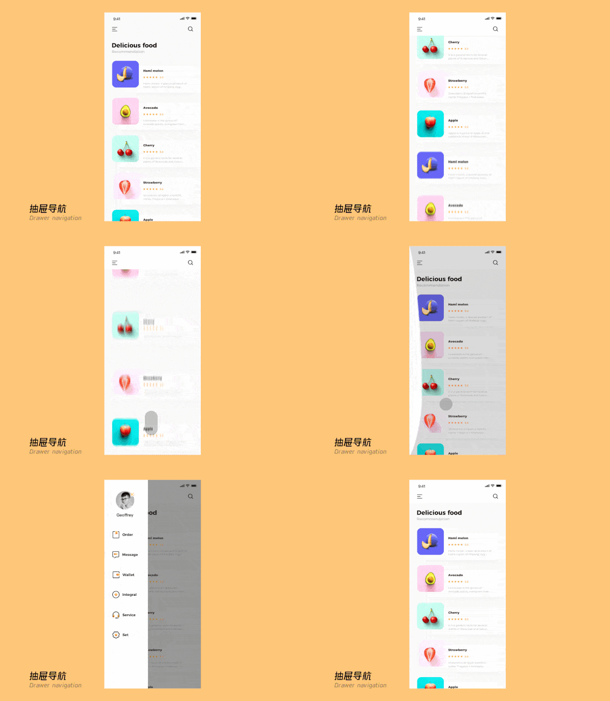
3. Drawer Navigation by Geoffrey
In what appears to be a grocery shopping app, we found some delightful movements that leaders in the space might try adding to their current designs. The way that a user scrolls through fruit offered on the app takes from popular design trends in which cards cascade up or down the screen. But what we most appreciated about the app was the motion associated with the menu popping out. Swiping right from the main screen of the app pulls the menu out from the left side. The bar oscillates in a ricocheting motion, with all the menu options moving to the right quickly. The user’s account photo and name zoom over to the right slowly, landing last.
Source: Dribbble
4. Workout Configuration by Den Klenkov for Fireart Studio
There are many fitness apps out there, and the most effective ones allow for personalization. In order to help users customize their workouts, this mobile interaction design allows them to choose what they want to work out today from a drop-down. Below that, they can use the scroll buttons to toggle to the right and left to adjust how much cardio, weight lifting, and stretching they want to do. As they customize the makeup of their workout, the suggested exercises appear on the cards below and flip to the other side to reveal a new workout that meets the user’s changing requirements. Also, the percentage that each section of the workout accounts for pops up above the toggles, so let users know that they will now complete 20% cardio and 40% weight lifting as they drag their finger from right to left.
Source: Dribbble
5. Online Digital Loan Exploration by Azie Melasari for Odama
This mobile interaction design makes it easy to apply for any kind of loan and keeps all of that financial information in one place. Applying for a loan is as easy as making a phone call (which might end up being detrimental for some users, honestly). They simply enter in the loan amount, then swipe the arrow at the bottom of the screen from left to right to get access to the loan funds. Once approved, the loan terms; how much it is for, how many payments the user needs to make to pay it back, and when the first payment is due appear on the screen as a confirmation.
Source: Dribbble
That’s all for May but be sure to check out last month’s edition, featuring the best mobile interaction designs of April 2021.
Feeling inspired? Proto.io helps you bring your idea to life in no time, with no coding skills required. It’s ideal for UX designers, entrepreneurs, product managers, marketers, students, and anyone with a great idea. Sign up for a free 15-day trial to start building your first prototype today!


