Have you heard of Hyperloop?
Hyperloop is entrepreneur Elon Musk’s proposed method for a super high-speed ground transport system. Elon Musk and SpaceX, explicitly made the development of Hyperloop technology open-sourced as a way to encourage companies and student-led design teams to develop their ideas even further.
If you conduct a quick Google search on the Hyperloop design competition, you will come across a plethora of student submissions, including the winning team, MIT. Many of the submissions lacked important details on what the user experience would be like on these futuristic transportation pods. In my opinion, that is a problem.
In early November I was in Lisbon, Portugal attending the Web Summit conference. It was there that I had a chance to attend a session at the massive Centre Stage with the co-founders of Hyperloop One, Josh Giegel and Shervin Pishevar.
Giegel and Pishevar spoke about how the creation of Hyperloop has immense potential to transform cities and reshape communities around the world. This has the power to change the way we view transportation. I remember watching the futuristic cartoon show, The Jetsons, as a kid. Hyperloop is definitely embarking on Jetson territory.
Before we can dive into how designers of Hyperloop can incorporate user experience research and processes into their workflow, let’s take some time to learn about what Hyperloop is really all about.

What is Hyperloop?
At the Web Summit, the Hyperloop team shared this video depicting how one can go from Dubai to Abu Dhabi in only 12 minutes. The background music is intense and feels like the soundtrack to a trailer for a sci-fi movie. While the excitement of having such a short commute time definitely took center stage, I couldn’t help but ask “what will the user experience be like on the Hyperloop?”
Hyperloop One defines their transport system as:
“A new way to move people and things at airline speeds for the price of a bus ticket. It’s on-demand, energy-efficient and safe. Think: broadband for transportation.”
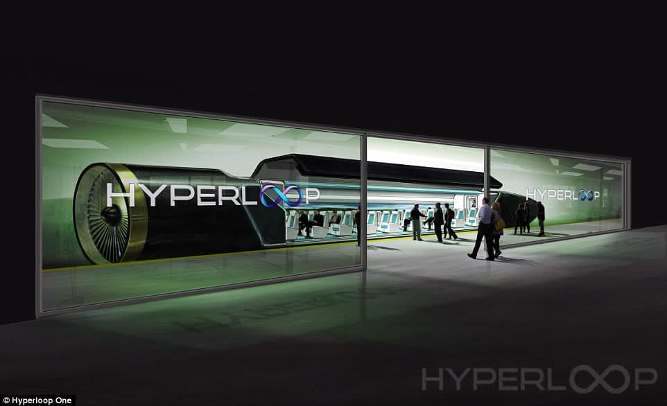
It is a super-charged high speed transport system that suggests that levitated pods or capsules containing people, cars, and cargo could be pushed through a low-pressure tube at supersonic speeds, bringing people from one city to another at lightning fast speeds. Hyperloop asserts that these pods would glide through the tubes silently and with little turbulence.
“It’s a smooth experience that feels like an elevator ride…This is grandma-friendly, kid-friendly and vomit-free.” -Josh Giegel
While a lot of talk is emerging regarding the high development costs, engineering hurdles, and the technology behind Hyperloop, we are not hearing as much about what the experience would be like for the average user and if they are central to Hyperloop’s design process.
It is important to note that some experts are skeptical of Hyperloop, saying that the proposals dismiss the expenses and risks of developing the technology and that the proposed project ignores major practical problems, such as how the tubes will withstand earthquakes and power outages. I won’t go into these details in this post, but if you interested I suggest reading these articles to find out more here and here.
Human Centered Design
Critics express worry that the customer experience on the Hyperloop could prove to be scary and unpleasant for some. They suggest it will be like riding in claustrophobic quarters with no windows, travelling at frighteningly high speeds. They also express concern that initial designs do not provide provisions for accessing bathrooms or a place to stretch and move around.
Hyperloop will be transporting people. These people are the users we need to design for and who we, as UX designers, need to connect with in order to create a successful product and customer experience. The best way to accomplish this is through human centered design that is based on empathy, testing, and iteration.
Designing products through a human-centered lens allows designers to connect with their users, improving the chance of long-term success.
UX designers have a unique strength in understanding people’s motivations, goals, and pain points by always putting the users at the center of their work. They are also particularly skilled at gathering that information, analyzing it, and sharing those insights with all the relevant stakeholders in a way that is clear and actionable.
The user experience should be intuitive, functional, and delightful at every touch point, including the moment users start researching commuting and travel options, booking tickets online or through a mobile app, and getting to the Hyperloop station. You will also need to consider how they navigate the station and experience traveling in the pod itself.
In order to find out more about user pain points, motivations, and goals for traveling, it is highly recommended that designers spend a substantial amount of time on user research, prototyping, testing, and iteration.
User research will also help define the problems that need to be solved. Some user research techniques that should be used in the case of the UX design for Hyperloop include:
Interviews
Use these interviews to find out more about what the traveling and commuting experiences are like for users and what they wish their traveling experiences would be like. This is a great opportunity to explore what their pain points and goals are. You can also use your interview time to explain the concept of the Hyperloop and see what they are most excited, fearful, and confused about.
Make sure to create an interview script and plan before you begin the interview process. A plan will help you stick with your intended goals while also allowing you some space to dive a little deeper when you need to. Here is an article with some great tips on conducting user interviews. My favorite interview question is to ask “if you had a magic wand, how would you….?” In the case of the Hyperloop perhaps ask, “if you had a magic wand, what would your perfect travelling or commuting experience look like?”
Empathy Mapping

Empathy is putting yourself in someone else’s shoes. It is also a way to keep designers humble by taking their own assumptions out of the picture. People are at the heart of user-centered design and designers need to take the time to understand who they are creating for.
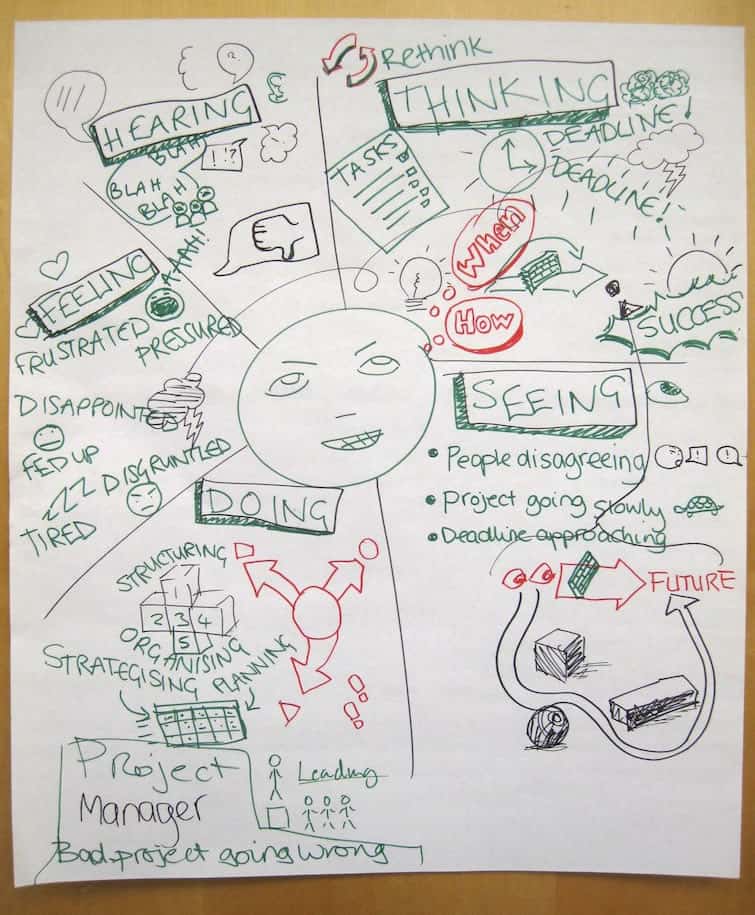
Empathy mapping will help better understand how people are feeling and thinking regarding a new high-speed transit system like Hyperloop. It is a collaborative research tool used to help us understand how users are feeling, what they are thinking, what they are doing, and what they are saying. This type of mapping is a great tool to help us bridge the gap between personas and the design process.
Keep in mind that empathy mapping works best when using real data, so if possible they should be used after conducting user research like interviews and ethnographies.
Personas
A persona is a depiction of a type of user. Personas answer the question, “Who are we designing for?” They also help to align strategy and goals to specific user groups. Even though a persona is depicted as a person, a persona is not a singular person but is rather something synthesized from a set of observations and analysis of a group of people in the real world.
Personas are a great tool to help the team of designers, developers, and all the relevant stakeholders focus on a cast of characters instead of trying to focus (and often become overwhelmed) on the hundreds of thousands of potential users of the Hyperloop.
You can learn more about persona creation here.
Journey or Experience Mapping

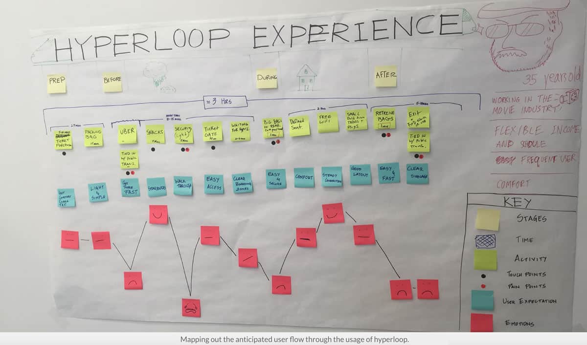
Experience mapping is a collaborative process that will help your team study customer behavior and interactions across all touch points and synthesize the key findings. This map helps tell the story visually in a way that creates empathy and increases understanding about the customer experience.
Prototyping, Testing, and Iteration
Once sound user research is conducted, the team can move on to prototyping, testing, and iteration.
Here are some problems that should be tackled through prototyping, testing, and iteration:
- What sound level is ideal in the pod?
- Will there be bathrooms?
- What are ways to tackle the problem of claustrophobia?
- Will there be access to customer service within the pods, similar to flight attendants on airplanes?
- Should Hyperloop go slower than the proposed 760 miles an hour?
- Where will customers store their luggage and personal belongings?
It is imperative that the design teams for the Hyperloop are made of multi-disciplinary team members from a variety of backgrounds in engineering, architecture, public policy, urban planning, fine arts, etc. to design a great human experience. Collaboration between team members that have a complementary and diverse range of skills in multiple disciplines will only make the team richer and more successful, just like the great benefits enterprise companies get from hiring liberal arts graduates.
We at Proto.io would love to know what user experience design ideas or problems you would like to share regarding Hyperloop.
Proto.io lets anyone build mobile app prototypes that feel real. No coding or design skills required. Bring your ideas to life quickly! Sign up for a free 15-day trial of Proto.io today and get started on your next mobile app design.


