Let’s face it. If we could, we would use our mobile devices to do just about everything that we could imagine to be possible. From adjusting the temperature of our houses to making appointments with doctors, we want to have the power of action within our hands and without too much effort. Mobile devices and powerful applications promise us such a future within our grasp.
However, reality paints a different picture. Often enough, we still face annoyances that disrupt our experience of providing input. Such as a login screen or a form that is too tricky to manoeuvre. We’re simply forced to ditch our mobile devices and to reach for the computer instead. Sad to speak, mobile apps and the mobile web are often not optimized to capture valuable mobile user input.
As Luke Wroblewski himself puts it, “Being able to access content on mobile devices is only half the battle.” Increasingly, users rely more on their mobile devices for everyday activities. The potential is there. Designers have to try harder in order to capture mobile user input. To do so, we have to first acknowledge the constraints and then to implement the best practices for designing for mobile user input.
1. Use the Relevant Keyboards
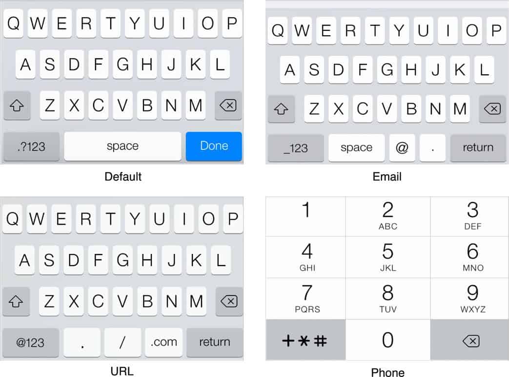
There’s a reason why different types of keyboards exist for the input of different types of data and that reason being, to kill pain of mobile user input. It won’t make or break an app, but it could turn the mobile experience from good to great.
For instance, if a field requires solely numbers, whether it’s a phone number or otherwise, then it’s sufficient to provide the numeric keyboard. Be sure to determine whether you need the input type to be ‘tel’ or ‘number’. The latter offers extra non-numeric keys that might be more of an annoyance than a help to the user.
Source: iOS Developer Library
2. Know the Native UI Controls
Designing for mobile user input requires an intimate knowledge of both iOS and Android platforms. It’s important to take into account each platform’s particular design style and native UI controls when designing and developing for mobile user input. After all, we don’t want to scare the user out of participating by throwing something unfamiliar in their way.
In certain cases, the iOS vs Android lines of division get a little blurry as elements and trends crossover from one platform to another. One such incident is the floating action button (FAB) introduced by Google upon the release of Material Design. The FAB is now commonplace in many Android apps. Increasingly, we’ve seen more iOS apps incorporating the FAB, or some variant of it, as a custom control. Only time will tell as to whether the FAB will become easily available for iOS developers.
Source: Giridhar’s Github
3. Keep the Labels Above the Fields
One way to encourage mobile user input is to provide feedback, at times in more obvious ways and in this case of ensuring input visibility, in a more subtle manner. The problem of placing labels to the left of an input field, as we’re very used to seeing on web forms, is that it truncates the input text. Mobile users don’t always get to see the full input and as we’re prone to typing errors while on mobile, this can be a real problem.
Now, let’s assume, for argument’s sake, that a user named Alexander Montgomery McMillan-Altman tries to sign up for an account. Poor Alexander doesn’t get to see either of his last names in the input field.
There is one mobile use case for which labels should go to the left: landscape view on mobile tablet. The issue of user input content being truncated is less relevant as in this orientation, the screen is much wider and accommodates lengthy inputs.
4. Integrate Social Login Methods
When I was taking an online Javascript course, I remember having to repeatedly type in those endless loop statements more times than desirable. Signing up and logging in by filling in my email and password feels exactly like that.
The physical constraints of mobile devices don’t make typing the most enjoyable of mobile user experiences. Mobile users don’t like typing and they go to great lengths to avoid it. This only means that designers and developers have to think creatively to capture mobile user input in ways that won’t bore or frustrate users.
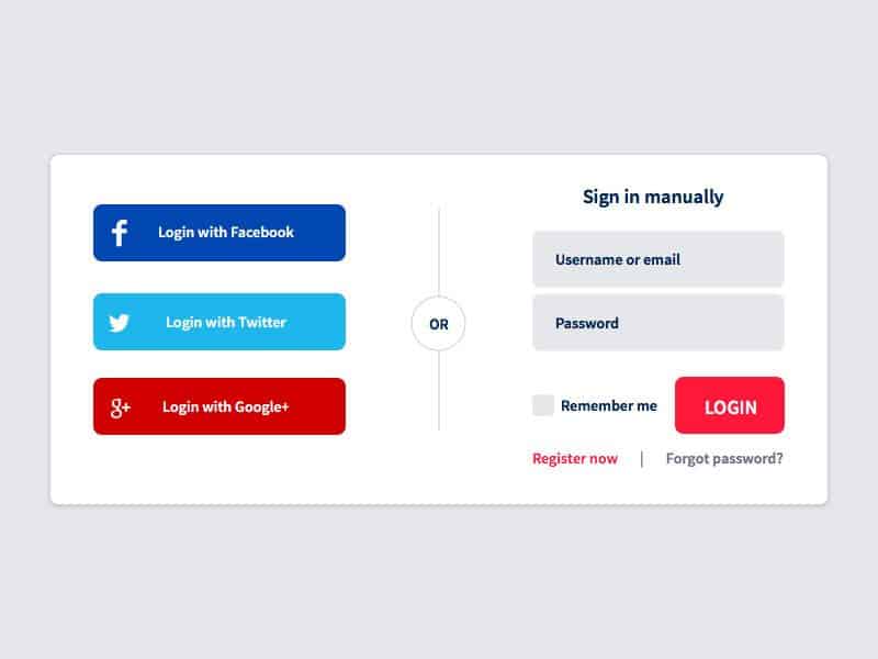
Social login is a great way to skip over the tedious sign up/login process. It’s also good to collect basic data on your users. While it’s not uncommon for people to have multiple emails, one of which might be dedicated just for spam and promotional marketing emails, it’s rare for anyone to have multiple Facebook or Twitter accounts that they regularly log in and out of.
5. Make Use of Defaults and Autocompletes
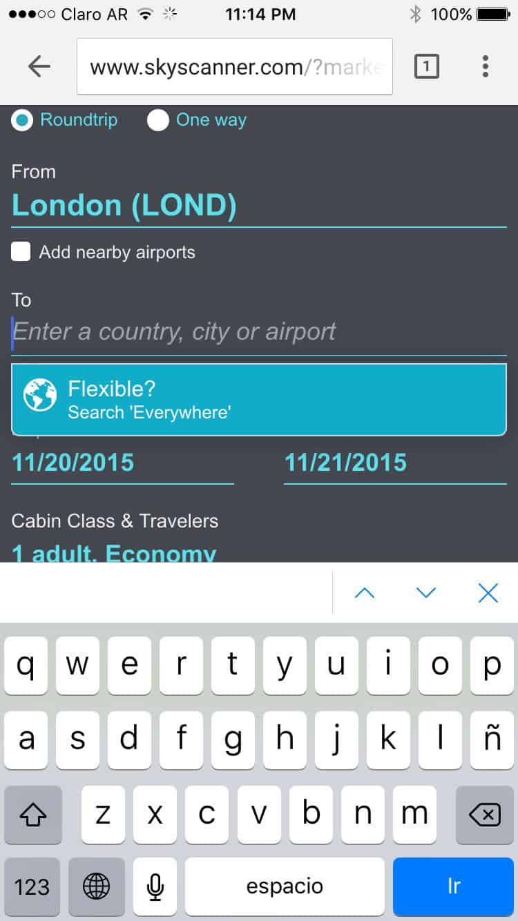
If you know that most of your users are from the US, it makes sense to set the US as a default in the country field. Especially since the classic country dropdown menu is appallingly long and having to deal with it while on mobile is migraine-inducing.
Source: Jack O’Connor’s Github
Besides Google’s search engine, many mobile websites and mobile apps of travel companies make very good use of autocomplete. As their entire product mostly involves filling in a search form, travel companies should know better how to capture mobile user input and avoid dropouts.
6. Create Shortcuts Whenever Possible
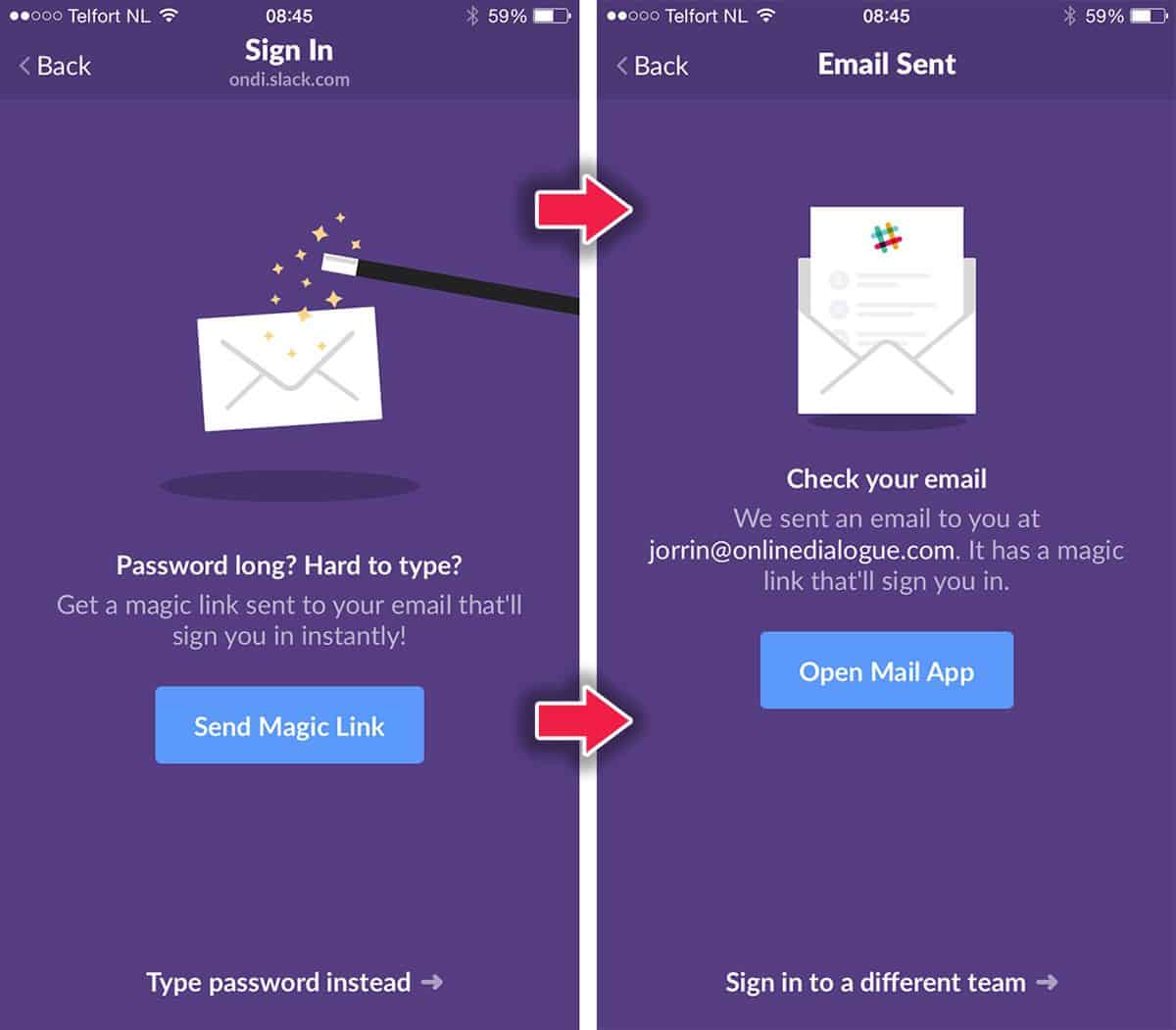
One of the best shortcuts made available for the betterment of mobile user experiences is Slack’s ‘magic link’. Slack understands that typing in password these days is a chore, since password requirements oblige us to create one that pretty much looks like this: n3R|)z4ev3r.y3ah. Who can type that in perfectly on a mobile device every single time?
Slack lets you bypass that pain by sending you a magic link via email that logs you into the Slack app on your iPhone or Android device.
Source: UX Candy
Another possibility to design for a more enjoyable, painless mobile user input in applications is to consider gestures and voice input. Of course, there is a learning curve to overcome and the user onboarding process has to be thoroughly defined. Many email client apps already incorporate this with swipe gestures to display further actions or the classic “pull to refresh”.
Voice controls also have great potential for capturing mobile user input. We don’t always have our hands available for typing. And even if we do, it’s so much easier to simply talk to our mobile devices. The popularity of WhatsApp’s voice message function and the major improvements in Siri’s capabilities in iOS9 both point to the potential of voice control.
7. Be Generous and Offer App Trials
Demanding that a user sign up immediately upon downloading your app may be great for your email marketing lists but not so wonderful for capturing mobile user input or customer retention for that matter. Maybe they’ve been recommended the app by a friend and wanted to check it out. Maybe they just don’t bother to look up the app on the web before downloading it. Whatever the case, it’s still a strange new app asking for their details.
Think about a website. When you enter a website, you don’t get slammed with a sign-up blockade. Usually, there’ll be some information about the product, you get walked through some of their best features, and along the way, you might get asked several times for your email address for a 14-day free trial.
Offer new users the experience of trying out your app and it’s only after they’ve gotten to know the best you’ve to offer that you should bombard them with the “Like what you see? Sign up here for more!” screens.
