Trends come and go in the design industry. Years ago, skeuomorphism (or UI designs that mimic real-world objects) was in, but as of 2018, we announced its impending demise. Why? Well, a number of consumers are now digitally native, and many more are increasingly comfortable online. We no longer need a visual guidebook to be able to figure out new digital products. We’ve been using them so long at this point, and design has become so intuitive that skeuomorphism might not be useful anymore. And skeuomorphic designs were not always the most appealing. Yes, users will know what the icons or buttons mean without prior knowledge, but soon it became time to move beyond such literal designs.
More recently, the neumorphism design trend has replaced skeuomorphism as the latest in UI adaptations. It came alive on Dribbble and Behance and was coined by Jason Kelly as “new skeuomorphism” (and later shortened by Michal Malewicz). It is a softer approach to skeuomorphism that incorporates the rounded, layered look and feel that designers often use these days. In many ways, it is a design-first concept, as it incorporates decades of design knowledge and creates its own style that no longer has to be defined by real-world objects that consumers are used to.
While neumorphic designs aim to be simple and intuitive, they also seem to pop out of the screen. This can be problematic for buttons, but visually appealing choices for cards. If you are going to create neumorphic designs, you will have to pay extra attention to accessibility, as contrast can often be a complicating factor. On top of this, buttons created in this style often look like they have already been pressed or lack the contrast that typically denotes a button. So designers opting to use this style will have to tread carefully. But before we get into actionable tips for designers that want to explore this trend, where did neumorphism even come from?
How Design Arrived at Neumorphism
Design trends are often cyclical: they start off as cutting edge, get absorbed into the drab mainstream, and fall out of favor—just to be “rediscovered” a few decades later and revived. Neumoprphism is no different.
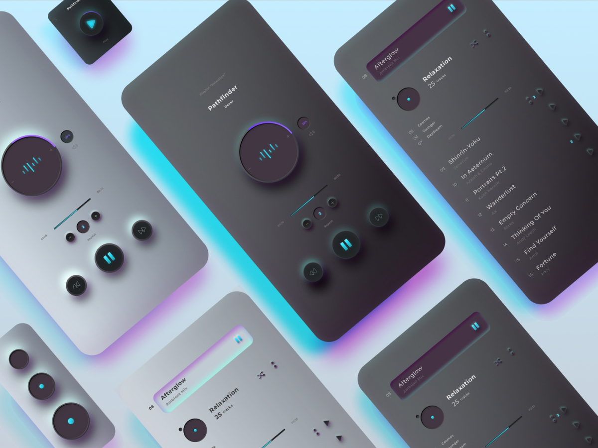
![]()
By Natalka Smoczynska via Dribbble
This trend goes back to the flat design trend that was all the rage about 8 years ago. It was straightforward and designs didn’t include any depth. Although all components seemed to exist on the same plan, the design still came together nicely on mobile and beyond. Flat design was possible because digital fluency was skyrocketing around the world. As more people got smartphones and learned how to interact with digital icons, they no longer needed the designs to exactly mimic real-world objects in order to understand what they were. This gave rise to a simplistic UI design style that top design purveyors, like Apple, ran with until it fell out of favor.
If we are honest, flat design can be a bit boring. Yes, it communicates all the necessary information users need in order to take action, but it can lack pizazz. As time progressed, other schools of thought influenced the design community, which made flat design less popular. Chief among them was Google’s material design, which many have credited for the emergence of the neumorphism design trend.
In many ways, neumorphism brought back the complexity to design, making buttons look like buttons again. Complete with shadow and depth that make it clear that these elements are clickable or tappable. But just as some fought against the ironing out of designs in flat design, others are also rebelling against neumorphism as well. It’s safe to say that design trends include a healthy degree of personal preference; it’s unlikely that every designer will agree on the best look and feel for every mobile or desktop interface.
Regardless, the neumorphism design trend is most likely here to stay for the time being. So, as they say, if you can’t beat them, join them, right? If you want to give neumorphism a try, there’s a handy website called neumorphism.io that generates soft-UI CSS code. Simply pick a color, drag the circle along the spectrums to change the size, radius, distance, intensity, and blur, then choose from four shapes. While you are playing with these options you can see a preview of what your neomorphic button will look like. Lastly, copy the code and apply it to a UI design you’re working on! It’s much faster than creating from scratch every time.
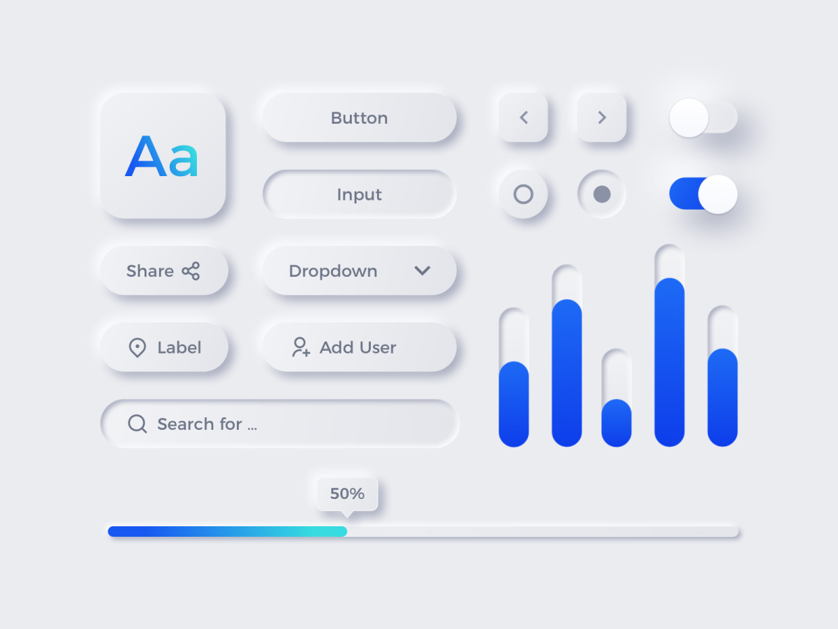
By Elena Zelova via Dribbble
The Role of Color in Neumorphism
Color makes neumorphic designs pop. You must move beyond white and black backgrounds for this style to reach its potential. The color you go with can be informed by branding or take from the research you’ve done on usability. A lighter shade of the color you land on allows the designer to create layers and depth, helping certain elements seem to stick out or get pushed to the background. Similarly, in order to make a shape an obvious button on top of a lighter background, you can make it a darker shade with shadowing around the edges to help it protrude and appear clickable. Or, some designers may take the opposite approach and choose to focus on pushing certain elements to the background for a neumorphic feel.
While flat design leveled out interfaces, the neumorphism design trend has added those layers back in. And in some ways, neumorphism seems to make UI more intuitive for the uninitiated. Could first-time users better understand how to get started with a new product if it follows neumorphic design trends? It’s definitely possible but will require some user testing to get a definitive answer.
If you’ve come out in favor of neumorphism, it’s time to get hands-on with a design to see if the style will be effective in any of your upcoming projects.
How to Be Successful with the Neumorphism Design Trend
Malewicz admits that neumorphism is a design trend within a larger ecosystem: no UI design will be successful just because it embodies these principles. He explains on UX Collective that neumorphism “won’t be able to carry an entire product to success. Sure — a couple initial products done this way can be successful, but this will get more tiresome than even material design.
“However mixing parts of this style with parts of other styles will definitely be a trend in 2020 and beyond.
“Making a product that is both beautiful and functional means not going over the top in any direction.”
By Emy Lascan via Dribbble
His advice can help designers across disciplines: just because a design style is trendy doesn’t mean it has to guide your entire project. Trends come and go. Creating a design that can last the test of time means incorporating styles that enable a focus on form as much as function.
In all honesty, neumorphism requires some adaptations in order to make it into mainstream designs. One thing that we are especially focused on is accessibility: your users need to be able to understand and use your designs without needing a magnifying glass or a 100-page manual. The fact that color variations are core to the shadows and layers means that they need to be chosen cautiously. If the difference is too faint, then a button might fade into the background—creating a confusing user experience.
One way to adapt the neumorphism design trend into a more user-friendly style would be to incorporate it with more tried and true designs. If you’ve already conducted hours of user interviews and have landed on core elements of your app that users understand and enjoy using, then try adding small neumorphic aspects before doing anything radical. After all, design concepts on Dribbble are nice, but if they are ever going to be useful to the general public, then they will have to get a thumbs up from multiple potential users with different abilities and preferences.
Final Thoughts
Design isn’t a static industry. The status quo doesn’t last for very long with innovators around the globe trying to improve user experience and make increasingly appealing designs around the clock. As with any design trend, you should take neumorphism with a grain of salt. It doesn’t have to revolutionize the way you approach your UI designs unless you want it to. All good designs borrow from a number of styles and schools of thought to create a new approach to usability issues.
Even if you aren’t convinced that the neumorphism design trend isn’t for you, it’s clear that it brought new life to UI designs. We look forward to the next design trend that emerges and builds upon this soft and simple approach.
What do you think of the neumorphism design trend? Let us know if you think it will stick around and why by tweeting us @Protoio.
Proto.io lets anyone build mobile app prototypes that feel real. No coding or design skills required. Bring your ideas to life quickly! Sign up for a free 15-day trial of Proto.io today and get started on your next mobile app design.


